


转载请标明出处:
http://blog.csdn.net/developer_jiangqq/article/details/50589570
本文出自:【江清清的博客】
(一)前言
【好消息】个人网站已经上线运行,后面博客以及技术干货等精彩文章会同步更新,请大家关注收藏:http://www.lcode.org
今天我们一起来看一下文本输入框TextInput组件的相关使用讲解以及模仿实现一下QQ登录界面的效果。具体环境搭建以及相关配置的请查看之前的相关文章。
刚创建的React Native技术交流3群(496508742),React Native技术交流4群(458982758),请不要重复加群!欢迎各位大牛,React Native技术爱好者加入交流!同时博客左侧欢迎微信扫描关注订阅号,移动技术干货,精彩文章技术推送!
TextInput组件允许用户在应用中通过键盘进行输入文本信息。并且该组件还提供了多种配置属性例如:自动拼写修复,自动大小写切换,占位默认字符设置以及多种不同类型的键盘切换例如:我们可以弹出数字键盘。
(二)实例
TextInput组件和前面讲的Image或者Text组件差不多,用起来都非常简单。我们直接在应用中添加一个TextInput组件,然后给该组件添加相关属性(例:边框颜色,粗细,背景,默认值)以及监听方法(例如:输入信息,焦点变化等事件)。我们首先看一下官方提供的一个简单例子:
<TextInput
    style={{height: 40, borderColor: 'gray',borderWidth: 1}}
    onChangeText={(text) =>this.setState({text})}
    value={this.state.text}
/>该直接定义了TextInput组件,同时设置组件的风格高度,变宽粗细以及边框颜色。并且我们这边监听了TextInput的onChangeText的事件来进行获取用户的输入信息。除了该监听事件方法以外还有onSubmitEditing(提交编辑)以及onFoucs(输入框获取焦点的时候调用)等相关的监听方法。
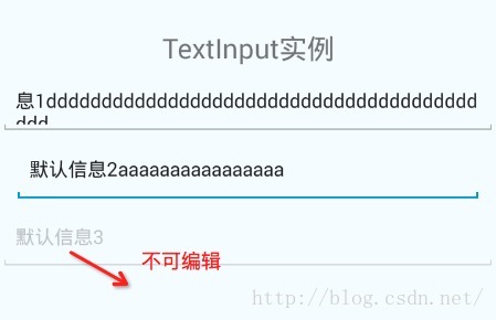
下面在演示另外一个TextInput实例,该创建了三个TextInput,同时每个TextInput都添加了默认信息(hit),第一个TextInput组件设置高度40,边框粗细和边框的颜色,切可以输入多行信息。第二个TextInput设置左右额边距以及自动获取到焦点。第三个TextInput设置不可编辑状态。具体代码如下:
<View style={styles.container}>
        <Text style={styles.welcome}>
          Welcome to React Native!
        </Text>
         <TextInputstyle={{height:40,borderColor:'red',borderWidth:1}}
          multiline={true}
          defaultValue='默认信息1'
         />
        <TextInput
           style={{marginLeft:10,marginRight:10}}
            autoFocus={true}
            defaultValue='默认信息2'/>
        <TextInput
            editable={false}
            defaultValue='默认信息3'/>
</View>具体运行效果如下:
(三)属性方法(这边讲解平台公用以及Android生效的属性方法)
3.1.View 支持View的相关属性
3.2.autoCapitalize 控制TextInput输入的字符进行切换成大写(可选择参数:'none', 'sentences', 'words','characters')
- none:不自动切换任何字符成大写
- sentences:默认每个句子的首字母变成大写
- words:每个单词的首字母变成大写
- characters:每个字母全部变成大写
3.3.autoCorrect bool 设置拼写自动修正功能 默认为开启(true)
3.4.autoFocusbool 设置是否默认获取到焦点默认为关闭(false)。该需要componentDidMount方法被调用之后才会获取焦点哦(componentDidMount是React组件被渲染之后React主动回调的方法)
3.5.defaultValue string 给文本输入设置一个默认初始值。
3.6.editablebool 设置文本框是否可以编辑 默认值为true,可以进行编辑
3.7.keyboardType 键盘类型(可选参数:"default", 'email-address','numeric', 'phone-pad', "ascii-capable", 'numbers-and-punctuation','url', 'number-pad', 'name-phone-pad', 'decimal-pad', 'twitter', 'web-search') 该用来选择默认弹出键盘的类型例如我们甚至numeric就是弹出数字键盘。鉴于平台的原因如下的值是所有平台都可以进行通用的
- default
- numeric 数字键盘
- email-address 邮箱地址
3.8.maxLength number 可以限制文本输入框最大的输入字符长度
3.9.multiline bool 设置可以输入多行文字,默认为false(表示无论文本输入多少,都是单行显示)
3.10.onBlur function 监听方法,文本框失去焦点回调方法
3.11.onChange function 监听方法,文本框内容发生改变回调方法
3.12.onChangeText function监听方法,文本框内容发生改变回调方法,该方法会进行传递文本内容
3.13.onEndEditing function监听方法,当文本结束文本输入回调方法
3.14.onFocus function 监听方法 文本框获取到焦点回调方法
3.15.onLayout function监听方法 组价布局发生变化的时候调用,调用方法参数为 {x,y,width,height}
3.16.onSubmitEditing function监听方法,当编辑提交的时候回调方法。不过如果multiline={true}的时候,该属性就不生效
3.17.placeholer string 当文本输入框还没有任何输入的时候,默认显示信息,当有输入的时候该值会被清除
3.18.placeholerTextColor string 设置默认信息颜色(placeholer)
3.19.secureTextEntry bool 设置是否为密码安全输入框 ,默认为false
3.20.style 风格属性 可以参考Text组件风格
3.21.value string 输入框中的内容值
以上是一些Android,iOS平台通用的属性,下面根据官网的文档,我这边组要讲解一下适用于Android平台的属性方法
3.22.numberOfLinesnumber设置文本输入框行数,该需要首先设置multiline为true,设置TextInput为多行文本。
3.23.textAlign 设置文本横向布局方式 可选参数('start', 'center', 'end')
3.24.textAlignVertical 设置文本垂直方向布局方式 可选参数('top', 'center', 'bottom')
3.25.underlineColorAndroid 设置文本输入框下划线的颜色
(四)TextInput实战-仿照QQ登录界面
下面我们来仿照QQ登录界面的效果,进行布局一下,具体实现代码如下:
/**
 * Sample React Native App
 * https://github.com/facebook/react-native
 */
'use strict';
import React, {
  AppRegistry,
  Component,
  StyleSheet,
  Text,
  Image,
  View,
  TextInput,
} from'react-native';

class TestInputextends Component {
  render() {
    return (
      <Viewstyle={{backgroundColor:'#f4f4f4',flex:1}}>
          <Image
              style={styles.style_image}
             source={require('./img/app_icon.png')}/>
          <TextInput
              style={styles.style_user_input}
              placeholder='QQ号/手机号/邮箱'
              numberOfLines={1}
              autoFocus={true}
             underlineColorAndroid={'transparent'}
              textAlign='center'
          />
          <View
             style={{height:1,backgroundColor:'#f4f4f4'}}
          />
          <TextInput
              style={styles.style_pwd_input}
              placeholder='密码'
              numberOfLines={1}
             underlineColorAndroid={'transparent'}
              secureTextEntry={true}
              textAlign='center'
          />
          <View
              style={styles.style_view_commit}
           >
            <Text style={{color:'#fff'}}>
               登录
            </Text>

          </View>

          <Viewstyle={{flex:1,flexDirection:'row',alignItems: 'flex-end',bottom:10}}>
             <Textstyle={styles.style_view_unlogin}>
                 无法登录?
            </Text>
            <Textstyle={styles.style_view_register}>
                 新用户
            </Text>
          </View>
      </View>
    );
  }
}
const styles =StyleSheet.create({
  style_image:{
    borderRadius:35,
    height:70,
    width:70,
    marginTop:40,
    alignSelf:'center',
  },
  style_user_input:{
      backgroundColor:'#fff',
      marginTop:10,
      height:35,
  },
   style_pwd_input:{
      backgroundColor:'#fff',
      height:35,
  },
   style_view_commit:{
      marginTop:15,
      marginLeft:10,
      marginRight:10,
      backgroundColor:'#63B8FF',
      height:35,
      borderRadius:5,
      justifyContent: 'center',
      alignItems: 'center',
  },
  style_view_unlogin:{
    fontSize:12,
    color:'#63B8FF',
    marginLeft:10,
  },
  style_view_register:{
    fontSize:12,
    color:'#63B8FF',
    marginRight:10,
    alignItems:'flex-end',
    flex:1,
    flexDirection:'row',
    textAlign:'right',
  }
});

AppRegistry.registerComponent('TestInput',() => TestInput);运行效果如下:

(五)最后总结
今天我们主要给大家介绍TextInput组件,以及通过一个QQ登录界面具体实例把之前的View,Text,Image组件的基本使用串联了一下。大家有问题可以加一下群React Native技术交流群(282693535)或者底下进行回复一下。
尊重原创,转载请注明:From Sky丶清(http://blog.csdn.net/developer_jiangqq) 侵权必究!
关注我的订阅号(codedev123),每天分享移动开发技术(Android/IOS),项目管理以及博客文章!(欢迎关注,第一时间推送精彩文章)

关注我的微博,可以获得更多精彩内容


 扫一扫
扫一扫
 7487
7487

 被折叠的 条评论
为什么被折叠?
被折叠的 条评论
为什么被折叠?
 到【灌水乐园】发言


