


自定义View分为三步:
1. 设计属性
2. 实现View
3. 引用View
这里已自定义顶部的TopBar为例讲解,效果如下图:
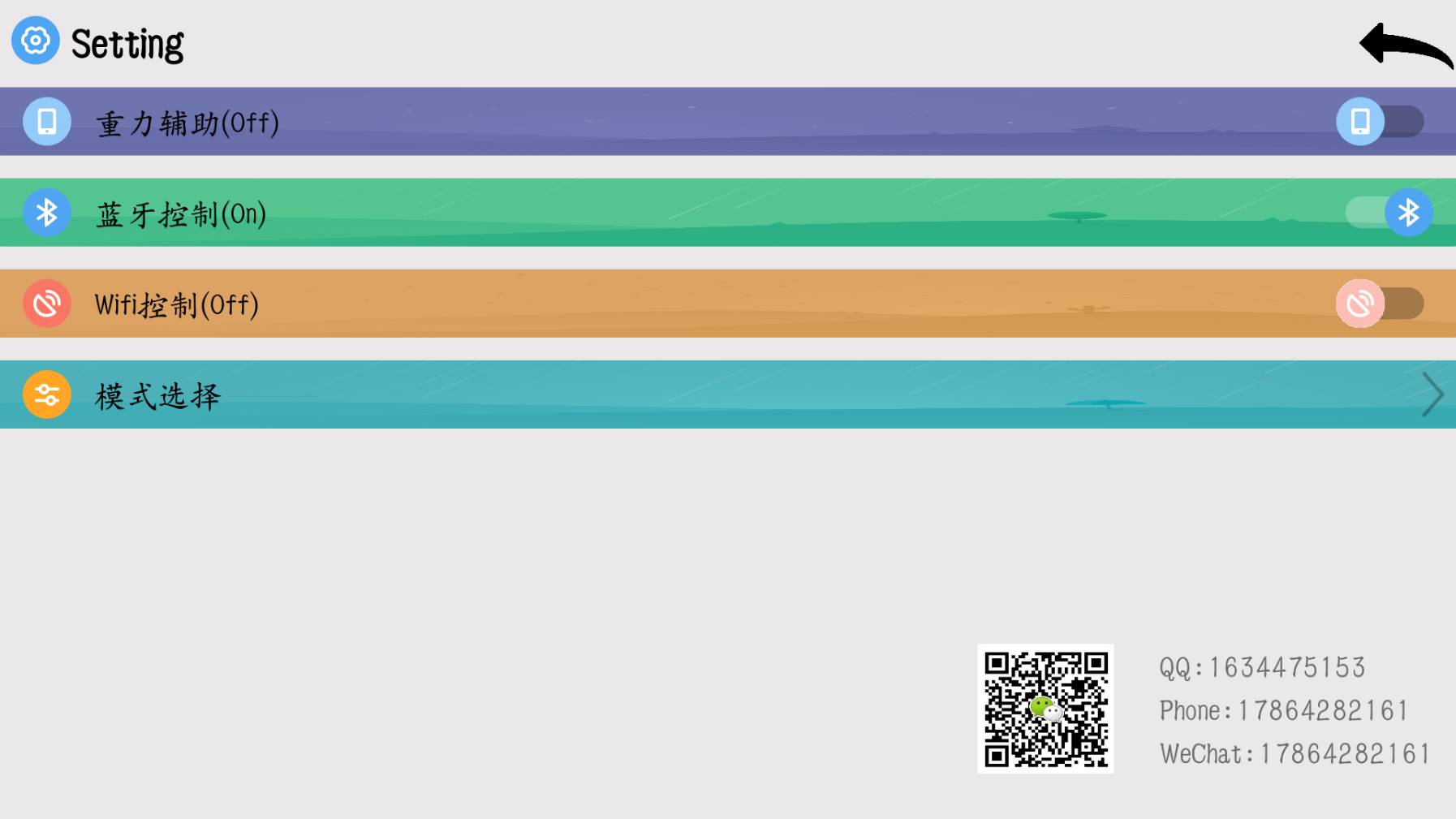
其中由两部分组成,依次是左边ImageView 右边Switch。
第一步:设计需要的属性
在Android Studio的Values中右键新建XML文件atts.xml,内容如下
<?xml version="1.0" encoding="utf-8"?>
<resources>
<!--1.设计需要的属性-->
<!--自定义属性-->
<declare-styleable name="MySwitch">
<!--大背景-->
<attr name="bigBackground" format="reference|color"/>
<!--左边图片-->
<attr name="leftPicture" format="color|reference"/>
<!--switch开关-->
<attr name="switchThum" format="reference|color"/>
<attr name="switchText"format="string"/>
<attr name="switchChecked"format="boolean"/>
</declare-styleable>
</resources>
declare-styleable:告诉系统,以下是我们自定义的属性
attr标签为自定义属性
format为所引用资源类型
Reference为drawable中的文件
第二步:创建自己的View
1.新建JavaClass,命名为switchPlus并继承一个布局,此处我们使用RelativeLayout,然后系统会提示添加构造方法,这儿有四种构造方法,如下:
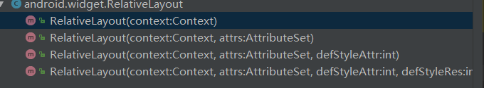
其中第一个为一般的控件,不需要自定义属性;而自定义属性需要一个Attrs参数,因此选第二个构造方法。
2.然后在switchPlus中声明所需要的控件,左边ImageView 右边Switch
//定义需要的控件
ImageView leftPictureView;  //功能图片
Switch switchOption;        //switch选项
3.其次声明所需要的属性
//定义需要的控件
private Drawable bigBackground;
private Drawable leftPicture;
private String switchText;
private Drawable switchThum;
private Boolean switchChecked;
4.之后要做的就是赋值,进行控件和属性的关联
在构造方法中获得在attr.xml中自定义的属性,并把属性值赋值给控件
通过TypedArray获得存储在attr.xml中所定义的值,如下
TypedArray typedArray = getContext().obtainStyledAttributes(attrs,R.styleable.switchPlus);
其中R.styleable.switchPlus的switchPlus即在atts的declare-styleable中的name
5.通过TypedArray,就可以获得自定义的属性的值,其中属性名为styleable的名字加下划线,加自定义属性名,如下:
//从TypedArray取出自定义属性值,并赋值给相应的变量
bigBackground = typedArray.getDrawable(R.styleable.MySwitch_bigBackground);
leftPicture = typedArray.getDrawable(R.styleable.MySwitch_leftPicture);
switchText = typedArray.getString(R.styleable.MySwitch_switchText);
switchThum = typedArray.getDrawable(R.styleable.MySwitch_switchThum);
switchChecked = typedArray.getBoolean(R.styleable.MySwitch_switchChecked,false);
6. TypedArray使用完要进行回收,避免浪费资源,如下:
//使用TypedArray后,要回收资源
typedArray.recycle();
7.之后需要实例化控件,这里我们使用动态加载布局的方法,在layout中新建my_switch.xml,这个比较简单,直接给出代码,如下:
<?xml version="1.0" encoding="utf-8"?>
<RelativeLayout xmlns:android="http://schemas.android.com/apk/res/android"
    android:layout_width="match_parent"
    android:layout_height="40dp">

    <ImageView
        android:id="@+id/left_picture_view"
        android:layout_width="wrap_content"
        android:layout_height="wrap_content"
        android:layout_marginLeft="10dp"
        android:layout_centerVertical="true"/>
    <Switch
        android:id="@+id/switch_button"
        android:layout_width="match_parent"
        android:layout_height="20dp"
        android:layout_toRightOf="@id/left_picture_view"
        android:layout_marginLeft="10dp"
        android:layout_marginRight="10dp"
        android:layout_centerVertical="true" />
</RelativeLayout>
然后在switchPlus中动态加载,如下:
//动态加载布局
View view = LayoutInflater.from(getContext()).inflate(R.layout.my_switch,this);
最后实例化控件:
leftPictureView = (ImageView) view.findViewById(R.id.left_picture_view);
    switchOption = (Switch) view.findViewById(R.id.switch_button);
8.有了控件,之后就需要把自定义属性赋值给控件,如下:
//把自定义属性赋值给控件
leftPictureView.setBackground(leftPicture);
switchOption.setText(switchText);
switchOption.setThumbDrawable(switchThum);
switchOption.setChecked(switchChecked);
//设置switchPlus背景
setBackground(bigBackground);
9.最后就是点击事件了,我们只给Switch控件设置点击事件,他有两个点击事件,一个是点击,一个是状态改变。
通过三步完成接口回调机制,
(1) 定义接口,在点击接口中设置点击虚函数,状态改变接口设置状态改变虚函数,如下
//点击接口
public interface SwitchClickListener{
    public void switchListener(View v);
}
//状态改变接口
public interface SwitchCheckedChangeListener{
    public void switchCheckedChangeListener(CompoundButton buttonView, boolean isChecked);
}
(2) 设置一个监听方法,给调用者,参数为接口类型,如下:
//接口对象
public SwitchClickListener listener;
public SwitchCheckedChangeListener checkedChangeListener;
//设置监听的方法
public void setListener(SwitchClickListener listener){
    this.listener = listener;
}
public void setSwitchCheckedChangeListener(SwitchCheckedChangeListener changelistener){
    this.checkedChangeListener = changelistener;
}
(3) 修改控件点击事件,如下:
//点击监听
switchOption.setOnClickListener(new OnClickListener() {
    @Override
    public void onClick(View v) {
        if (listener != null)
            listener.switchListener(v);
    }
});

//状态改变
switchOption.setOnCheckedChangeListener(new CompoundButton.OnCheckedChangeListener() {
    @Override
    public void onCheckedChanged(CompoundButton buttonView, boolean isChecked) {
        if (checkedChangeListener != null){
            checkedChangeListener.switchCheckedChangeListener(buttonView,isChecked);
        }
    }
});
第三步:引用自定义View
1. 添加到布局文件,如下:
2. <?xml version="1.0" encoding="utf-8"?>
<LinearLayout xmlns:android="http://schemas.android.com/apk/res/android"
xmlns:tools="http://schemas.android.com/tools"
xmlns:switch="http://schemas.android.com/apk/res-auto"
android:layout_width="match_parent"
android:layout_height="match_parent"
android:orientation="vertical"
tools:context="com.liang.settingswitch.MainActivity">
<com.liang.settingswitch.switchPlus
android:id="@+id/gravity_switch"
android:layout_width="match_parent"
android:layout_height="30dp"
android:layout_marginTop="10dp"
switch:bigBackground="@drawable/gravity_2"
switch:leftPicture="@drawable/gravity_1"
switch:switchText="重力辅助(On)"
switch:switchChecked="true"
switch:switchThum="@drawable/gravity_1" />
<!--蓝牙-->
<com.liang.settingswitch.switchPlus
android:id="@+id/bluetooth_switch"
android:layout_width="match_parent"
android:layout_height="30dp"
android:layout_marginTop="10dp"
android:layout_below="@id/gravity_switch"
switch:bigBackground="@drawable/bluetooth_2"
switch:leftPicture="@drawable/bluetooth_1"
switch:switchText="蓝牙控制(On)"
switch:switchChecked="true"
switch:switchThum="@drawable/bluetooth_1"/>
<!--wifi-->
<com.liang.settingswitch.switchPlus
android:id="@+id/wifi_switch"
android:layout_width="match_parent"
android:layout_height="30dp"
android:layout_marginTop="10dp"
android:layout_below="@id/bluetooth_switch"
switch:bigBackground="@drawable/wifi_2"
switch:leftPicture="@drawable/wifi_1"
switch:switchText="Wifi控制(Off)"
switch:switchThum="@drawable/wifi_off"/>
</LinearLayout>
这里需要注意,怎么使用我们自定义的属性,很简单类型java的import,首先引入我们的自定义控件,
<!--蓝牙-->
<com.liang.settingswitch.switchPlus
android:id="@+id/bluetooth_switch"
android:layout_width="match_parent"/>
然后按住ctrl加左键单击android会弹到上方的
android="http://schemas.android.com/apk/res/android"
复制这句话,粘贴在下面,并改为,引用第三方包名的时候只需要把末尾的android替换为res-auto即可,如下,
xmlns:switch="http://schemas.android.com/apk/res-auto"
其中这个switch是我们自己决定的,也可以改为qwe之类的,不过不要和系统的android一样
3. 在MainActivity中实例化,并重写点击事件,如下
4.   //自定义switch
private switchPlus gravitySwitch;
//按钮选中开关
private boolean isGravityOpen = true;
gravitySwitch = (switchPlus) findViewById(R.id.gravity_switch);
gravitySwitch.setListener(new switchPlus.SwitchClickListener() {
    @Override
    public void switchListener(View v) {
        if(isGravityOpen == true){
            isGravityOpen = false;
            Toast.makeText(MainActivity.this,""+isGravityOpen,Toast.LENGTH_SHORT).show();
        }else {
            isGravityOpen = true;
            Toast.makeText(MainActivity.this,""+isGravityOpen,Toast.LENGTH_SHORT).show();
        }
    }
});
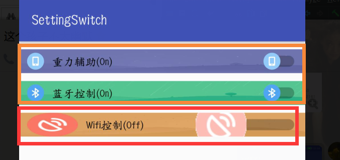
以上就完成了自定义的属性,其中还需要注意一个问题,就是图片放置位置,要放在正确的包下,否则会出现以下效果,这就涉及安卓图片适配的问题了,我的是放在drawable-xxhdp下
部分代码:
switchPlus.java
package com.liang.settingswitch;

import android.content.Context;
import android.content.res.TypedArray;
import android.graphics.drawable.Drawable;
import android.text.TextUtils;
import android.util.AttributeSet;
import android.view.LayoutInflater;
import android.view.View;
import android.widget.CompoundButton;
import android.widget.ImageView;
import android.widget.RelativeLayout;
import android.widget.Switch;

/**
 * Created by Amarao on 2018/4/4.
 */

public class switchPlus extends RelativeLayout {

    //定义需要的控件
    ImageView leftPictureView;  //功能图片
    Switch switchOption;        //switch选项

    //定义需要的控件
    private Drawable bigBackground;
    private Drawable leftPicture;
    private String switchText;
    private Drawable switchThum;
    private Boolean switchChecked;

    //自定义监听
    public SwitchClickListener listener;
    public SwitchCheckedChangeListener checkedChangeListener;

    //点击接口
    public interface SwitchClickListener{
        public void switchListener(View v);
    }
    //状态改变接口
    public interface SwitchCheckedChangeListener{
        public void switchCheckedChangeListener(CompoundButton buttonView, boolean isChecked);
    }

    //设置监听的方法
    public void setListener(SwitchClickListener listener){
        this.listener = listener;
    }
    public void setSwitchCheckedChangeListener(SwitchCheckedChangeListener changelistener){
        this.checkedChangeListener = changelistener;
    }

    //构造方法
    public switchPlus(Context context) {
        super(context);
        initView(null);
    }

    public switchPlus(Context context, AttributeSet attrs) {
        super(context, attrs);
        initView(attrs);
    }

    private void initView(AttributeSet attrs) {
        //动态加载布局
        View view = LayoutInflater.from(getContext()).inflate(R.layout.my_switch,this);
        leftPictureView = (ImageView) view.findViewById(R.id.left_picture_view);
        switchOption = (Switch) view.findViewById(R.id.switch_button);
        //点击监听
        switchOption.setOnClickListener(new OnClickListener() {
            @Override
            public void onClick(View v) {
                if (listener != null)
                    listener.switchListener(v);
            }
        });

        //状态改变
        switchOption.setOnCheckedChangeListener(new CompoundButton.OnCheckedChangeListener() {
            @Override
            public void onCheckedChanged(CompoundButton buttonView, boolean isChecked) {
                if (checkedChangeListener != null){
                    checkedChangeListener.switchCheckedChangeListener(buttonView,isChecked);
                }
            }
        });

        if (attrs != null) {
            //获得xml中的属性,并赋给控件
            TypedArray typedArray = getContext().obtainStyledAttributes(attrs,R.styleable.MySwitch);

            //从TypedArray取出自定义属性值,并赋值给相应的变量
            bigBackground = typedArray.getDrawable(R.styleable.MySwitch_bigBackground);
            leftPicture = typedArray.getDrawable(R.styleable.MySwitch_leftPicture);
            switchText = typedArray.getString(R.styleable.MySwitch_switchText);
            switchThum = typedArray.getDrawable(R.styleable.MySwitch_switchThum);
            switchChecked = typedArray.getBoolean(R.styleable.MySwitch_switchChecked,false);

            //把自定义属性赋值给控件
            //leftPictureView.setImageResource(leftPicture);
            leftPictureView.setBackground(leftPicture);
            switchOption.setText(switchText);
            switchOption.setThumbDrawable(switchThum);
            switchOption.setChecked(switchChecked);

            ///如果这是一个空的
            if (TextUtils.isEmpty(switchText)) {
                //默认
                switchOption.setText("请输入文字");
            }

            //设置switchPlus背景
            setBackground(bigBackground);

            //使用TypedArray后,要回收资源
            typedArray.recycle();
        }
    }

    public void setSwitchThum(Drawable thum){
        this.switchThum = thum;
        switchOption.setThumbDrawable(switchThum);
    }

    public void setSwitchText(String str){
        this.switchText = str;
        switchOption.setText(switchText);
    }

    public void setSwitchChecked(boolean flag){
        this.switchChecked = flag;
        switchOption.setChecked(switchChecked);
    }
}


 485
485


 被折叠的 条评论
为什么被折叠?
被折叠的 条评论
为什么被折叠?
 到【灌水乐园】发言


