


资源字典
一、简单使用
资源字典的使用较为简单,主要有以下2个步骤:
-
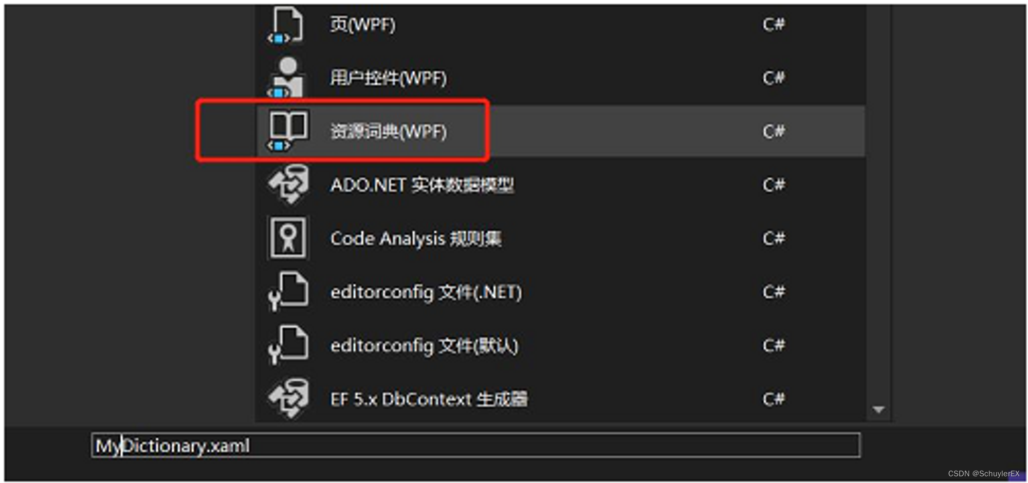
右键项目→添加→新建资源字典,然后在资源字典中编写资源。
<ResourceDictionary xmlns="http://schemas.microsoft.com/winfx/2006/xaml/presentation" xmlns:x="http://schemas.microsoft.com/winfx/2006/xaml" xmlns:sys="clr-namespace:System;assembly=mscorlib" > <sys:Double x:Key="value">100</sys:Double> </ResourceDictionary> -
在需要使用的XAML文件中引入资源字典并使用
<Window ......>
    <Window.Resources>
        <ResourceDictionary Source="pack://application:,,,/WPFResource;component/MyDictionary.xaml"></ResourceDictionary>
    </Window.Resources>
    <Border Height="{StaticResource value}">
    </Border>
</Window>
有一点需要知道的是,我们在定义资源的时候,定义的资源默认就是放在ResourceDictionary元素中的,只不过不需要将ResourceDictionary元素显式的定义出来。如下所示:
<Window.Resources>
    <sys:Double x:Key="value">500</sys:Double>
</Window.Resources>

<!--其实WPF默认已经放入ResourceDictionary中了-->
<Window.Resources>
    <ResourceDictionary>
        <sys:Double x:Key="value">100</sys:Double>
    </ResourceDictionary>
</Window.Resources>
二、字典的合并
多个字典资源
资源字典常用在样式和模板上,那么不可避免的会出现一个XAML文件中需要引入多个资源字典的情况,而一个Resources元素中,只能含有一个ResourceDictionary子元素,此时就需要使用字典的合并了。
<Window.Resources>
    <ResourceDictionary>
        <ResourceDictionary.MergedDictionaries>
            <ResourceDictionary Source="pack://application:,,,/WPFResource;component/ButtonRes.xaml"/>
            <ResourceDictionary Source="pack://application:,,,/WPFResource;component/ButtonRes2.xaml"/>
        </ResourceDictionary.MergedDictionaries>
    </ResourceDictionary>
</Window.Resources>
需要注意的是,如果引入的字典中出现了名字相同的资源,那么以最后引入的资源字典为准。
此外,使用合并字典后,TreeView、ItemsControl等子项控件,可能会出现列表中的第一个数据不会加载字典中的样式,此时将样式抽取出来放在对应控件下的资源下即可,例如<TreeView.Resources>元素或<Window.Resources>下。
字典资源与自定义资源共存
在引入字典资源时,除了会引入多个字典资源外,有时还需要字典资源和自定义资源共存,这时也需要使用到字典合并,并且自定义资源必须显式的放在ResourceDictionary元素内。
<Window.Resources>
    <ResourceDictionary>
        <ResourceDictionary.MergedDictionaries>
            <ResourceDictionary Source="/Assets;component/Styles/ButtonStyles.xaml"/>
            <ResourceDictionary>
                <BooleanToVisibilityConverter x:Key="booleanToVisibilityConverter"/>
                <Style x:Key="PasswordBoxStyle" TargetType="{x:Type PasswordBox}">......</Style>
                <Style TargetType="Hyperlink"> ...... </Style>
            </ResourceDictionary>
        </ResourceDictionary.MergedDictionaries>
    </ResourceDictionary>
</Window.Resources>
啰嗦的解释一下为什么这里要使用合并资源字典,原因很简单,哪怕只是引用了一个外部的资源字典,想要直接进行自定义资源是会报错的,上文说了我们自定义的资源WPF会自动放在ResourceDictionary中,也就相当于此时同时出现了两个资源字典,而一个Resources元素中,只能含有一个ResourceDictionary子元素,因此需要使用合并资源字典。
<Window.Resources>
    <ResourceDictionary Source="/Assets;component/Styles/ButtonStyles.xaml"/>
    <!--如果直接定义资源,这里就会报错了-->
    <BooleanToVisibilityConverter x:Key="booleanToVisibilityConverter"/>
</Window.Resources>
三、资源字典的动态修改
在xaml文件中加载资源字典后,有时候需要在运行中跟据用户的交互来进行资源字典的动态修改,此时可以通过如下C#代码来进行xaml文件上资源字典的修改。
资源字典联合情况下
private void buttonOne_Click(object sender, RoutedEventArgs e)
{
		//resDic为字典联合情境下,父类ResourceDictionary的实例名称
    resDic.MergedDictionaries.ToList()[0].Source = new Uri("pack://application:,,,/WPFResource;component/ButtonRes2.xaml");
}
单个资源字典情况下
private void buttonOne_Click(object sender, RoutedEventArgs e)
{
		//buttonRes为ResourceDictionary的实例名称
    buttonRes.Source = new Uri("pack://application:,,,/WPFResource;component/ButtonRes2.xaml");
}
通过Application实例进行资源字典的切换
可以通过当前应用的实例对象进行资源字典的切换:
var uri_cn = new Uri("pack://application:,,,/MultiLanguage;component/cn.xaml");
var uri_en = new Uri("pack://application:,,,/MultiLanguage;component/en.xaml");
var re = Application.Current.Resources.MergedDictionaries.Where(r => r.Source == uri_cn).FirstOrDefault();
Application.Current.Resources.MergedDictionaries.Remove(re);
ResourceDictionary re_en = new ResourceDictionary() { Source = uri_en};
Application.Current.Resources.MergedDictionaries.Add(re_en);
四、FindResource
当资源字典被引入到应用中后(局部xaml引入或全局App.xaml中引入),可以在代码中通过FindResource方法根据输入的key获取到对应的资源对象。
定义资源字典
<ResourceDictionary xmlns="http://schemas.microsoft.com/winfx/2006/xaml/presentation"
                    xmlns:x="http://schemas.microsoft.com/winfx/2006/xaml">
    <Image x:Key="MyIcon" Source="/Icons/bitbug_favicon.ico" x:Shared="false"/>
</ResourceDictionary>
引入资源
<Window ......>
    <Window.Resources>
        <ResourceDictionary Source="Icons.xaml"/>
    </Window.Resources>
    ......
</Window>
代码中获取(或创建)资源对象
public partial class MainWindow : Window
{
    public MainWindow()
    {
        InitializeComponent();
        var img = FindResource("MyIcon");
    }
}
样式定义
在WPF中,针对控件的样式提供了更加便捷的资源用法,即使用样式元素<Style>。
样式元素中常用的属性有Setters、Resources、Trigers、TargetType、BasedOn。
一、样式的定义与使用
1、定义
<Window.Resources>
    <Style x:Key="borderStyle" TargetType="Border">
        <Setter Property="BorderThickness" Value="2"/>
        <Setter Property="BorderBrush" Value="Red"/>
        <Setter Property="Height" Value="100"/>
        <Setter Property="Width" Value="100"/>
    </Style>
</Window.Resources>
Setters
与资源定义时一样,定义样式元素的Setter属性元素时,默认都是放在Setters属性元素中的,因此Setters可以不用显式的编写出来。
TargetType
TargetType表示这个Style是用于哪种类型的控件,如果不设置TargetType而直接在Setter属性中设置Property,会提示找不到对应的属性。
TargetType还有另外一种写法,具体如下:
<Window.Resources>
    <Style x:Key="borderStyle" >
        <Setter Property="Border.BorderThickness" Value="2"/>
        <Setter Property="Border.BorderBrush" Value="Red"/>
        <Setter Property="Border.Height" Value="100"/>
        <Setter Property="Border.Width" Value="100"/>
    </Style>
</Window.Resources>
统一样式
定义样式资源Style时,可以不使用key属性,此时会将作用域下的同类控件全部使用该样式,且其优先级低于指定样式。如下例中,会将作用域内的所有Border都使用该样式资源
<Window.Resources>
		<Style TargetType="Border">
				<Setter Property="Background" Value="Red"/>
		</Style>
</Window.Resources>
2、使用
Style样式资源的使用跟其他资源的使用是一样的,每个控件对象内部都有一个Style类型的属性成员,定义样式资源的过程其实就是创建了一个Style对象,使用资源的过程则是将创建的Style对象赋值给控件对象的Style属性。
<Border Style="{StaticResource borderStyle}">

</Border>
二、BasedOn
Style样式元素的BasedOn属性相当于C#中对类的继承,当多次出现重复Setter时,可以考虑将其抽取出来作为基础样式供与继承。
<Window.Resources>
		<Style x:Key="baseStyle" TargetType="Border">
		    <Setter Property="BorderThickness" Value="2"/>
		    <Setter Property="BorderBrush" Value="Red"/>
		</Style>
		<!--继承-->
		<Style x:Key="borderStyle" TargetType="Border" BasedOn="{StaticResource baseStyle}">
		    <Setter Property="Height" Value="100"/>
		    <Setter Property="Width" Value="100"/>
		</Style>
</Window.Resources>
需要注意的是其优先级关系,子类中的同名属性高于父类的同名属性,元素内联样式高于Style元素样式。
触发器
一、样式触发器
样式触发器可以在指定的控件属性满足某种条件后进行一些样式的变换,当触发条件不满足时恢复原样。
样式触发器的简单使用
<Window.Resources>
    <Style x:Key="checkBoxStyle" TargetType="CheckBox">
        <Style.Triggers>
            <Trigger Property="IsChecked" Value="True">
                <Setter Property="Foreground" Value="Red"/>
            </Trigger>
        </Style.Triggers>
    </Style>
</Window.Resources>
<Grid>
    <CheckBox Content="Schuyler" Style="{StaticResource checkBoxStyle}"/>
</Grid>
样式触发器的优先级
使用时需要注意,如果使用内联样式直接在控件属性中进行设置,由于内联样式的优先级最高,所以触发器不会有效果。因此触发器设置的样式,如果在触发前需要进行设置,可以配合Setter进行设置。
<Window.Resources>
    <Style x:Key="checkBoxStyle" TargetType="CheckBox">
        <Setter Property="Foreground" Value="Green"/>
        <Style.Triggers>
            <Trigger Property="IsChecked" Value="True">
                <Setter Property="Foreground" Value="Red"/>
            </Trigger>
        </Style.Triggers>
    </Style>
</Window.Resources>
<Grid>
<CheckBox Content="Schuyler" Style="{StaticResource checkBoxStyle}"/>
</Grid>
使用触发器的时候会发现有些样式是无法展示效果的(例如Button控件的Background属性),这是因为WPF的控件模板对其控件进行了设置,而模板中设置的属性、触发器优先级别高于外界的触发器,因此外界触发器不会触发(或者说触发了但是被覆盖了?)。
控件状态作为触发条件
触发器将控件的样式作为触发条件外,还可以将控件的状态(例如鼠标的悬浮、按压等)作为触发条件。
由于后面定义的触发器会将前面的触发器效果覆盖,因此在使用时要注意触发器的位置。
<Window.Resources>
    <Style x:Key="buttonStyle" TargetType="Button">
        <Style.Triggers>
            <Trigger Property="IsMouseOver" Value="true">
                <Setter Property="Foreground" Value="Blue"/>
            </Trigger>
            <!--这里注意按压触发器放在悬浮触发器之后,否则会被悬浮触发器覆盖,导致无法展示效果-->
            <Trigger Property="IsPressed" Value="True">
                <Setter Property="Foreground" Value="Red"/>
            </Trigger>
        </Style.Triggers>
    </Style>
</Window.Resources>
<Grid>
    <Button Content="Schuyler" Height="100" Width="100" Style="{StaticResource buttonStyle}"/>
</Grid>
多条件样式触发器
多条件触发器是指只有当指定的多个属性满足条件时,才会触发。
<Window.Resources>
    <Style x:Key="buttonStyle" TargetType="Button">
        <Style.Triggers>
            <MultiTrigger>
                <MultiTrigger.Conditions>
                    <Condition Property="Width" Value="100"/>
                    <Condition Property="IsPressed" Value="True"/>
                </MultiTrigger.Conditions>
                <MultiTrigger.Setters>
                    <Setter Property="Foreground" Value="Red"/>
                </MultiTrigger.Setters>
            </MultiTrigger>
        </Style.Triggers>
    </Style>
</Window.Resources>
<Grid>
    <Button Content="Schuyler" Height="100" Width="100" Style="{StaticResource buttonStyle}"/>
</Grid>
指定触发条件的源
触发器的触发条件默认是当前使用触发器样式的控件的属性,如果希望使用指定控件上的属性来作为触发条件,可以通过SourceName属性设置对应的控件名称(控件上设置Name属性)来进行指定。
<ControlTemplate TargetType="ComboBoxItem">
	  <Grid>
		    <Popup x:Name="Popup" .../>
				......
	  </Grid>
		<ControlTemplate.Triggers>
			  <Trigger SourceName="Popup" Property="AllowsTransparency" Value="true">
            ......
        </Trigger>
	  </ControlTemplate.Triggers>
</ControlTemplate>
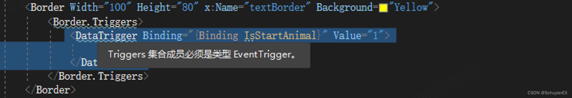
二、DataTrigger
当触发条件不是元素的属性,而是指定的某个绑定数据的时,可以使用DataTrigger触发器。
<Style x:Key="UserNameTextBoxStyle" TargetType="TextBox">
    <Setter Property="Template">
        <Setter.Value>
            <ControlTemplate TargetType="{x:Type TextBox}">
                ......
                <ControlTemplate.Triggers>
                    ......
                    <DataTrigger Binding="{Binding Path=Text, RelativeSource={RelativeSource Mode=Self}}" Value="">
                        <Setter Property="Visibility" Value="Visible" TargetName="markText"/>
                    </DataTrigger>
                </ControlTemplate.Triggers>
            </ControlTemplate>
        </Setter.Value>
    </Setter>
</Style>
DataTrigger上除了进行简单的控件属性设置外,还可以使用DataTrigger.EnterActions与DataTrigger.ExitActions,定义在触发器条件满足时执行的动作和触发器条件不再满足时执行的行为(动作的集合),这里的动作是指任何派生自TriggerAction类的对象,常用BeginStoryboard、StopStoryboard等动画操作动作。详细案例可以参考动画章节中的动画操作内容。
三、事件触发器
事件触发器EventTrigger可以在指定控件的指定路由事件发生时触发,通常会通过<BeginStoryboard>、<StopStoryboard>、<PauseStoryboard>、<ResumeStoryboard>等进行一些动画操作。
EventTrigger可以放置在<Window.Triggers>元素中,与<Window.Resources>元素保持同级,此时需要设置SourceName和Storyboard.TargetName属性,用来指定使用此事件触发器的控件名称,设置后作用域内对应的控件会自动绑定该事件触发器。
<Window.Triggers>
    <EventTrigger RoutedEvent="Button.Click" SourceName="btn">
        <BeginStoryboard>
            <Storyboard>
                <DoubleAnimation Duration="0:0:1" To="300" Storyboard.TargetName="btn" Storyboard.TargetProperty="Width"/>
            </Storyboard>
        </BeginStoryboard>
        <!--<StopStoryboard></StopStoryboard>
        <PauseStoryboard></PauseStoryboard>
        <ResumeStoryboard></ResumeStoryboard>-->
    </EventTrigger>
</Window.Triggers>
EventTrigger还可以放置在<Style.Triggers>元素中,此时不能设置SourceName和Storyboard.TargetName属性,事件触发器跟随样式,哪个控件采用该样式,哪个控件就绑定了这个事件触发器。
<Window.Resources>
    <Style x:Key="buttonStyle" TargetType="Button">
        <Style.Triggers>
            <EventTrigger RoutedEvent="Click">
                <BeginStoryboard>
                    <Storyboard>
                        <DoubleAnimation Duration="0:0:1" To="300" Storyboard.TargetProperty="Width"/>
                    </Storyboard>
                </BeginStoryboard>
                <!--<StopStoryboard></StopStoryboard>
                <PauseStoryboard></PauseStoryboard>
                <ResumeStoryboard></ResumeStoryboard>-->
            </EventTrigger>
        </Style.Triggers>
    </Style>
</Window.Resources>
除了Window、Style外,EventTrigger还可以设置在任何其他控件的Triggers属性下
- 注意,事件触发器与样式、数据触发器所不同的一个特点是,对于控件的内联触发器设置,仅能设置
EventTrigger。
<Button>
    <Button.Triggers>
        <EventTrigger RoutedEvent="MouseDown">
            ......
        </EventTrigger>
    </Button.Triggers>
</Button>
RoutedEvent属性的有效值
在使用事件触发器的时候,由于RoutedEvent属性在赋值时是没有提示信息的,因此会产生一个疑问,有效值是什么?要去哪里找?这里提供两种方法,一种是直接去官网找一下公布的路由事件,另外一种就是通过静态方法EventManager.GetRoutedEvents()可以获得内置的所有`
类型。
-
有效值列表
[0]: {FrameworkElement.RequestBringIntoView} [1]: {FrameworkElement.SizeChanged} [2]: {FrameworkElement.Loaded} [3]: {FrameworkElement.Unloaded} [4]: {ToolTipService.ToolTipOpening} [5]: {ToolTipService.ToolTipClosing} [6]: {ContextMenuService.ContextMenuOpening} [7]: {ContextMenuService.ContextMenuClosing} [8]: {Mouse.PreviewMouseDown} [9]: {Mouse.MouseDown} [10]: {Mouse.PreviewMouseUp} [11]: {Mouse.MouseUp} [12]: {UIElement.PreviewMouseLeftButtonDown} [13]: {UIElement.MouseLeftButtonDown} [14]: {UIElement.PreviewMouseLeftButtonUp} [15]: {UIElement.MouseLeftButtonUp} [16]: {UIElement.PreviewMouseRightButtonDown} [17]: {UIElement.MouseRightButtonDown} [18]: {UIElement.PreviewMouseRightButtonUp} [19]: {UIElement.MouseRightButtonUp} [20]: {Mouse.PreviewMouseMove} [21]: {Mouse.MouseMove} [22]: {Mouse.PreviewMouseWheel} [23]: {Mouse.MouseWheel} [24]: {Mouse.MouseEnter} [25]: {Mouse.MouseLeave} [26]: {Mouse.GotMouseCapture} [27]: {Mouse.LostMouseCapture} [28]: {Mouse.QueryCursor} [29]: {Stylus.PreviewStylusDown} [30]: {Stylus.StylusDown} [31]: {Stylus.PreviewStylusUp} [32]: {Stylus.StylusUp} [33]: {Stylus.PreviewStylusMove} [34]: {Stylus.StylusMove} [35]: {Stylus.PreviewStylusInAirMove} [36]: {Stylus.StylusInAirMove} [37]: {Stylus.StylusEnter} [38]: {Stylus.StylusLeave} [39]: {Stylus.PreviewStylusInRange} [40]: {Stylus.StylusInRange} [41]: {Stylus.PreviewStylusOutOfRange} [42]: {Stylus.StylusOutOfRange} [43]: {Stylus.PreviewStylusSystemGesture} [44]: {Stylus.StylusSystemGesture} [45]: {Stylus.GotStylusCapture} [46]: {Stylus.LostStylusCapture} [47]: {Stylus.StylusButtonDown} [48]: {Stylus.StylusButtonUp} [49]: {Stylus.PreviewStylusButtonDown} [50]: {Stylus.PreviewStylusButtonUp} [51]: {Keyboard.PreviewKeyDown} [52]: {Keyboard.KeyDown} [53]: {Keyboard.PreviewKeyUp} [54]: {Keyboard.KeyUp} [55]: {Keyboard.PreviewGotKeyboardFocus} [56]: {Keyboard.GotKeyboardFocus} [57]: {Keyboard.PreviewLostKeyboardFocus} [58]: {Keyboard.LostKeyboardFocus} [59]: {TextCompositionManager.PreviewTextInput} [60]: {TextCompositionManager.TextInput} [61]: {DragDrop.PreviewQueryContinueDrag} [62]: {DragDrop.QueryContinueDrag} [63]: {DragDrop.PreviewGiveFeedback} [64]: {DragDrop.GiveFeedback} [65]: {DragDrop.PreviewDragEnter} [66]: {DragDrop.DragEnter} [67]: {DragDrop.PreviewDragOver} [68]: {DragDrop.DragOver} [69]: {DragDrop.PreviewDragLeave} [70]: {DragDrop.DragLeave} [71]: {DragDrop.PreviewDrop} [72]: {DragDrop.Drop} [73]: {Touch.PreviewTouchDown} [74]: {Touch.TouchDown} [75]: {Touch.PreviewTouchMove} [76]: {Touch.TouchMove} [77]: {Touch.PreviewTouchUp} [78]: {Touch.TouchUp} [79]: {Touch.GotTouchCapture} [80]: {Touch.LostTouchCapture} [81]: {Touch.TouchEnter} [82]: {Touch.TouchLeave} [83]: {FocusManager.GotFocus} [84]: {FocusManager.LostFocus} [85]: {ManipulationDevice.ManipulationStarting} [86]: {ManipulationDevice.ManipulationStarted} [87]: {ManipulationDevice.ManipulationDelta} [88]: {ManipulationDevice.ManipulationInertiaStarting} [89]: {ManipulationDevice.ManipulationBoundaryFeedback} [90]: {ManipulationDevice.ManipulationCompleted} [91]: {Control.PreviewMouseDoubleClick} [92]: {Control.MouseDoubleClick} [93]: {ScrollViewer.ScrollChanged} [94]: {ScrollBar.Scroll} [95]: {Thumb.DragStarted} [96]: {Thumb.DragDelta} [97]: {Thumb.DragCompleted} [98]: {RangeBase.ValueChanged} [99]: {TextBoxBase.TextChanged} -
静态方法查看
var routEvents = EventManager.GetRoutedEvents();
foreach(var routEvent in routEvents)
{
    var name = routEvent.Name;
}


 4万+
4万+


 被折叠的 条评论
为什么被折叠?
被折叠的 条评论
为什么被折叠?
 到【灌水乐园】发言


