


系列文章目录
鸿蒙开发案例:进京赶考(1)
案例介绍
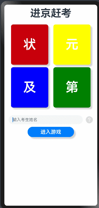
“进京赶考”是一款抽卡游戏,玩家在游戏界面中通过随机抽取到不同颜色的卡片,可获得不 同积分;抽卡结束后,根据积分的高低对游戏成绩进行判定(状元、榜眼、探花、进士)。本篇完成如图1所示的入口界面布局及问号的事件处理
一、准备图片素材
所有图片放入项目-resources-media目录下,如图2所示
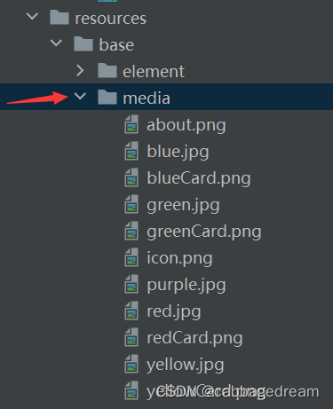
图2
二、分析布局
整体Column布局,内嵌三个Row布局,如图3所示
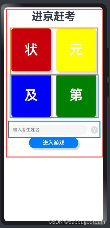
图3
三、实现布局
1.布局代码如下
@Entry
@Component
struct Index {
  build() {
    Column({space:10}) {
      Text('进京赶考')
      .fontSize(40)
      .fontWeight(700)
      .margin({top:10,bottom:10})
      Row({space:20}) {
        Button('状')
          .backgroundColor(0xC7000B)
          .type(ButtonType.Normal)
          .fontSize(50)
          .fontWeight(FontWeight.Bold)
          .width('40%')
          .height('20%')
          .borderRadius(8)
          .fontWeight(600)
          .shadow({radius:10,color:0xD3D3D3,offsetX:20,offsetY:20})
        Button('元')
          .backgroundColor(Color.Yellow)
          .type(ButtonType.Normal)
          .fontSize(50)
          .fontWeight(FontWeight.Bold)
          .width('40%')
          .height('20%')
          .borderRadius(8)
          .fontWeight(600)
          .shadow({radius:10,color:0xD3D3D3,offsetX:20,offsetY:20})
      }
      .width('100%')
      .justifyContent(FlexAlign.Center)

      Row({space:20}) {
        Button('及')
          .backgroundColor(Color.Blue)
          .type(ButtonType.Normal)
          .fontSize(50)
          .fontWeight(FontWeight.Bold)
          .width('40%')
          .height('20%')
          .borderRadius(8)
          .fontWeight(600)
          .shadow({radius:10,color:0xD3D3D3,offsetX:20,offsetY:20})
        Button('第')
          .backgroundColor(Color.Green)
          .type(ButtonType.Normal)
          .fontSize(50)
          .fontWeight(FontWeight.Bold)
          .width('40%')
          .height('20%')
          .borderRadius(8)
          .fontWeight(600)
          .shadow({radius:10,color:0xD3D3D3,offsetX:20,offsetY:20})
      }
      .width('100%')
      .justifyContent(FlexAlign.Center)

      Row({space:10}){
        TextInput({placeholder:'输入考生姓名'})
          .width('80%')
          .fontSize(20)
        Image($r('app.media.about')).width(30)
      }.margin({top:20})

      Button('进入游戏')
        .width('50%')
        .borderRadius(8)
        .fontSize(20)
        .fontWeight(600)
        .shadow({radius:10,color:0xD3D3D3,offsetX:20,offsetY:20})
    }
    .height('100%')
  }
}
2.代码优化
观察初始界面,虽然实现了界面效果,但你有没有发现代码存在重复问题呢?如下图所示4个按钮组件的这部分设置代码完全一样。
我们可以如何对代码优化呢?可以将上述代码提取出来成为组件样式,另外四个组件背景色不同,可以定义为方法参数即可,最后4个组件去调用即可
抽取的组件样式代码如下:
@Extend(Button)
function buttonStyle(color:Color){
  .backgroundColor(color)
  .type(ButtonType.Normal)
  .fontSize(50)
  .fontWeight(FontWeight.Bold)
  .width('40%')
  .height('20%')
  .borderRadius(8)
  .fontWeight(600)
  .shadow({radius:10,color:0xD3D3D3,offsetX:20,offsetY:20})
}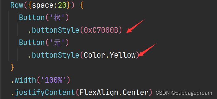
整个入口界面代码优化后如下:
@Entry
@Component
struct Index {
  build() {
    Column({space:10}) {
      Text('进京赶考')
      .fontSize(40)
      .fontWeight(700)
      .margin({top:10,bottom:10})
      Row({space:20}) {
        Button('状')
          .buttonStyle(0xC7000B)
        Button('元')
          .buttonStyle(Color.Yellow)
      }
      .width('100%')
      .justifyContent(FlexAlign.Center)

      Row({space:20}) {
        Button('及')
          .buttonStyle(Color.Blue)
        Button('第')
          .buttonStyle(Color.Green)

      }
      .width('100%')
      .justifyContent(FlexAlign.Center)

      Row({space:10}){
        TextInput({placeholder:'输入考生姓名'})
          .width('80%')
          .fontSize(20)
        Image($r('app.media.about')).width(30)
      }.margin({top:20})

      Button('进入游戏')
        .width('50%')
        .borderRadius(8)
        .fontSize(20)
        .fontWeight(600)
        .shadow({radius:10,color:0xD3D3D3,offsetX:20,offsetY:20})
    }
    .height('100%')
  }
}
@Extend(Button)
function buttonStyle(color:Color){
  .backgroundColor(color)
  .type(ButtonType.Normal)
  .fontSize(50)
  .fontWeight(FontWeight.Bold)
  .width('40%')
  .height('20%')
  .borderRadius(8)
  .fontWeight(600)
  .shadow({radius:10,color:0xD3D3D3,offsetX:20,offsetY:20})
}
四、事件处理
目前点击问号图片没有任何反应,我们希望点击问号按钮时,出现游戏规则介绍弹窗,该如何实现呢?
由于游戏规则描述比较长,直接放在界面里面可读性不好,将游戏规则提取出来,放到单独的存放常量的文件里面。该文件需要单独创建,在ets下新建common文件夹,在common下新建constants文件夹,在constants文件夹下新建CommonConstants.ets文件
CommonConstants.ets文件代码如下:
export default class CommonConstants{
  /**
   * 游戏规则
   */
  static readonly RULES_OF_THE_GAME='' +
  '共有红黄蓝绿四种签;' +
  '红签+50,黄签+10,绿签-5,蓝签归0;' +
  '每轮游戏共3次抽签机会,' +
  '每抽一次、记录一次得分,' +
  '抽签结束后根据总得分进行成绩分段:'+
  '【 状元(≥50)、榜眼(40)、探花(25)、进士(10)、壮志未酬(<10) 】  ' +
  '抽到红签(得分≥50)游戏结束;' +
  '抽到蓝签(得分归0)游戏结束;' +
  '3次机会用完,游戏结束。';
}
弹窗功能模块单独放到一个方法里
 //定义到struct内部
  aboutGame(){
    AlertDialog.show({
      title:'游戏规则',
      message:CommonConstants.RULES_OF_THE_GAME,
      autoCancel:true,
      alignment:DialogAlignment.Bottom,
      gridCount:3,
      offset:{dx:0,dy:-300},
      primaryButton:{
        value:'cancel',
        action:()=>{
          console.info('Callback when the first button is clicked')
        }
      },
      secondaryButton:{
        value:'ok',
        action:()=>{
          console.info('Callback when the second button is clicked')
        }
      },
      cancel:()=>{
        console.info('Closed callbacks')
      }
    })
  }
注意:aboutGame为自定义方法,该方法和样式代码不同,该方法需要定义到struct内部
小技巧:关于AlertDialog.show方法里面的这些参数如果不了解什么含义,可以通过去掉部分属性观察运行效果,改变某些属性观察运行效果,这样你就了解了各个属性具体的作用了
接下来实现问号按钮的点击事件处理,也就是直接调用上面的自定义方法aboutGame
Image($r('app.media.about'))
          .width(30)
          .onClick(()=>{
              this.aboutGame()
          })
总结
本文实现了如何界面布局并对其进行了优化,并实现了问号按钮的事件处理。完整代码如下:
import CommonConstants from '../common/constants/CommonConstants'
@Entry
@Component
struct Index {
  build() {
    Column({space:10}) {
      Text('进京赶考')
      .fontSize(40)
      .fontWeight(700)
      .margin({top:10,bottom:10})
      Row({space:20}) {
        Button('状')
          .buttonStyle(0xC7000B)
        Button('元')
          .buttonStyle(Color.Yellow)
      }
      .width('100%')
      .justifyContent(FlexAlign.Center)

      Row({space:20}) {
        Button('及')
          .buttonStyle(Color.Blue)
        Button('第')
          .buttonStyle(Color.Green)

      }
      .width('100%')
      .justifyContent(FlexAlign.Center)

      Row({space:10}){
        TextInput({placeholder:'输入考生姓名'})
          .width('80%')
          .fontSize(20)
        Image($r('app.media.about'))
          .width(30)
          .onClick(()=>{
              this.aboutGame()
          })
      }.margin({top:20})

      Button('进入游戏')
        .width('50%')
        .borderRadius(8)
        .fontSize(20)
        .fontWeight(600)
        .shadow({radius:10,color:0xD3D3D3,offsetX:20,offsetY:20})
    }
    .height('100%')
  }
  //定义到struct内部
  aboutGame(){
    AlertDialog.show({
      title:'游戏规则',
      message:CommonConstants.RULES_OF_THE_GAME,
      autoCancel:true,
      alignment:DialogAlignment.Bottom,
      gridCount:3,
      offset:{dx:0,dy:-300},
      primaryButton:{
        value:'cancel',
        action:()=>{
          console.info('Callback when the first button is clicked')
        }
      },
      secondaryButton:{
        value:'ok',
        action:()=>{
          console.info('Callback when the second button is clicked')
        }
      },
      cancel:()=>{
        console.info('Closed callbacks')
      }
    })
  }
}
@Extend(Button)
function buttonStyle(color:Color){
  .backgroundColor(color)
  .type(ButtonType.Normal)
  .fontSize(50)
  .fontWeight(FontWeight.Bold)
  .width('40%')
  .height('20%')
  .borderRadius(8)
  .fontWeight(600)
  .shadow({radius:10,color:0xD3D3D3,offsetX:20,offsetY:20})
}


 564
564


 被折叠的 条评论
为什么被折叠?
被折叠的 条评论
为什么被折叠?
 到【灌水乐园】发言


