


转载请注明出处http://blog.csdn.net/crazy__chen/article/details/46278423
源码下载http://download.csdn.net/detail/kangaroo835127729/8755815
dmytrodanylyk/circular-progress-button是github上一个开源的按钮控件,这个是链接https://github.com/dmytrodanylyk/circular-progress-button
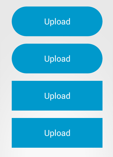
下面是示例图,应该说作为按钮,设计非常的简洁大方,这篇文章就是来介绍一下这个circular-progress-button的源码,让大家明白这么漂亮的控件,是怎么写出来的。关键是思路。
对于控件的简单使用,大家可以看http://www.eoeandroid.com/forum.php?mod=viewthread&tid=535726,我在这里就不必多介绍了,因为这个控件主要涉及一些动画和自定义drawable的知识,有些类或者方法大家没有见过,一定要看api手册,当然我也会做简单的说明。
下面先来介绍一下整个控件书写的大体思路:
首先作为一个按钮,我们自然要继承Button类。另外circular-progress-button有一些自定义的的属性,例如按钮提示字符串,按钮圆角,按钮提示icon,加载圆环的颜色等,这些都是需要我们在attrs文件里面定义然后在控件初始化的时候读取的,这是制作控件的一般步骤。
接着具体就这个控件而言,我们可以看到,有几种状态,一个是初始状态(蓝色),样式为普通按钮,还有是完成(绿色),失败(红色)状态,上述的几个状态,都是button的自带样式就可以解决的(除了圆角)。另外我们还注意到,在加载过程中,有个圆环状态,这里我们就需要重新写ondraw()方法,来制作自己的样式。
对于每种状态,我们在对按钮做不同的操作时,也就是不同的事件(pressed,focused,enabled,disabled,也可以说是状态,但是为了跟我们自定义的状态区分,我说成事件),可以发现按钮颜色有变化,这个我们通常通过定义自己的xml文件selector来定义不同状态下颜色,然后将这个xml设为控件背景就可以了,但是这里的状况有所不同,就是按钮的每个状态,对事件都有自己的一套颜色,这就要求我们在java文件里面,动态地定义这些属性,于是要使用到StateListDrawable,ColorStateList。
所有状态都可以切换,一个比较典型的过程就是,初始状态-》加载-》完成。从gif图中我们可以看到,这个有动画效果(从按钮,缩成圆环,而且带有进度,反之则从圆环到按钮),所有这样我们必定要定义animation。另外一个典型过程是初始状态-》完成,这个过程中,与上述过程相比,没有圆角的变化。
其他状态的相互转化,都是上述两个过程的相似过程,或者反过程,在接下了的源码中大家就可以看到。
OK,我们有了大体的思路,弄懂了那些方面的工作是我们要做的,接下来通过源码,看看要怎么做。
首先来一些基本属性,这些属性供接下来的大家看源码的时候参考,不必每个都细致地看,不知道的时候在回来找
public class CircularProgressButton extends Button {
	/**
	 * 状态代号
	 * 0为初始状态,-1失败状态,100为完成状态,50为不明确中间状态
	 */
    public static final int IDLE_STATE_PROGRESS = 0;
    public static final int ERROR_STATE_PROGRESS = -1;
    public static final int SUCCESS_STATE_PROGRESS = 100;
    public static final int INDETERMINATE_STATE_PROGRESS = 50;
    /**
     * 背景StrokeGradientDrawable
     * A Drawable with a color gradient for buttons, backgrounds, etc.
	 * It can be defined in an XML file with the <shape> element.
     */
    private StrokeGradientDrawable background;
    /**
     * 环形动画背景
     */
    private CircularAnimatedDrawable mAnimatedDrawable;
    /**
     * 环形进度背景
     */
    private CircularProgressDrawable mProgressDrawable;
    /**
     * ColorStateList对象可以在XML中定义,像color一样使用,它能根据它应用到的View对象的状态实时改变颜色
     * 当每次状态改变时,StateList都会从上到下遍历一次,第一个匹配当前状态的item将被使用——选择的过程不是基于“最佳匹配”,
     * 只是符合state的最低标准的第一个item。
     */
    private ColorStateList mIdleColorState;
    /**
     * 完成状态ColorStateList
     */
    private ColorStateList mCompleteColorState;
    /**
     * 失败状态ColorStateList
     */
    private ColorStateList mErrorColorState;
    /**
     * 用于根据状态改变drawable
     * 初始状态背景
     */
    private StateListDrawable mIdleStateDrawable;
    /**
     * 完成状态背景
     */
    private StateListDrawable mCompleteStateDrawable;
    /**
     * 失败状态背景
     */
    private StateListDrawable mErrorStateDrawable;
    /**
     * 状态管理器
     */
    private StateManager mStateManager;
    /**
     * 当前状态
     */
    private State mState;
    /**
     * 初始提示文字
     */
    private String mIdleText;
    /**
     * 完成提示文字
     */
    private String mCompleteText;
    /**
     * 失败提示文字
     */
    private String mErrorText;
    /**
     * 中间过程提示文字
     */
    private String mProgressText;
    /**
     * 中间圆形的颜色
     */
    private int mColorProgress;
    /**
     * 加载进度的颜色
     */
    private int mColorIndicator;
    /**
     * 加载进度的背景色
     */
    private int mColorIndicatorBackground;
    /**
     * 成功时的图标
     */
    private int mIconComplete;
    /**
     * 失败时的图标
     */
    private int mIconError;
    /**
     * 笔触大小
     */
    private int mStrokeWidth;
    /**
     * 圆环与按钮之间的padding
     */
    private int mPaddingProgress;
    /**
     * 按钮圆角
     */
    private float mCornerRadius;
    /**
     * 是否为不明确状态,也就是加载过程中,没有指定process的具体值
     */
    private boolean mIndeterminateProgressMode;
    /**
     * 设备状态是否变化
     */
    private boolean mConfigurationChanged;
    /**
     * 当前状态 enum
     */
    private enum State {
        PROGRESS, IDLE, COMPLETE, ERROR
    }
    /**
     * 最大进度
     */
    private int mMaxProgress;
    /**
     * 当前进度
     */
    private int mProgress;
    /**
     * 是否在加载过程
     */
    private boolean mMorphingInProgress;
上面的属性,我加了注释,可能中文表达不是特别好,大家接下去看就可以知道每个属性的意义。比较重要的,有一些StateListDrawable对象,表示每个状态的背景,还有一些static final的属性,用于标记当前状态(例如-1表示失败,0表示初始,100表示完成等),还有mProgress表示进度值,其他的话就是一些颜色,提示文字,内边距之类的属性。
接下来我们看构造函数和初始化方法
public CircularProgressButton(Context context, AttributeSet attrs, int defStyle) {
        super(context, attrs, defStyle);
        init(context, attrs);
    }

    /**
     * 初始化
     * @param context
     * @param attributeSet
     */
    private void init(Context context, AttributeSet attributeSet) {
        mStrokeWidth = (int) getContext().getResources().getDimension(R.dimen.cpb_stroke_width);//笔触大小,这个笔触用于绘制圆环(决定圆环的厚度)

        initAttributes(context, attributeSet);//加载自定义属性

        mMaxProgress = 100;
        mState = State.IDLE;
        mStateManager = new StateManager(this);

        setText(mIdleText);//设置初始状态提示文字

        initIdleStateDrawable();//创建初始状态drawable对象
        setBackgroundCompat(mIdleStateDrawable);//设置背景
    }
初始化方法首先获得了笔触大小,这个笔触用于绘制圆环(决定圆环的厚度),另外加载了自定义属性,设置当前状态为State.IDLE(初始状态),初始化状态管理器(自定义的一个类),setText(mIdleText)设置初始状态提示文字,initIdleStateDrawable()用于创建初始状态drawable对象,setBackgroundCompat(mIdleStateDrawable)为设置背景。
我们逐个看他们具体是怎么做的。
我首先来看加载自动属性的initAttributes(context, attributeSet)方法
/**
     * 初始化attr属性
     * @param context
     * @param attributeSet
     */
    private void initAttributes(Context context, AttributeSet attributeSet) {
        TypedArray attr = getTypedArray(context, attributeSet, R.styleable.CircularProgressButton);
        if (attr == null) {
            return;
        }

        try {

            mIdleText = attr.getString(R.styleable.CircularProgressButton_cpb_textIdle);
            mCompleteText = attr.getString(R.styleable.CircularProgressButton_cpb_textComplete);
            mErrorText = attr.getString(R.styleable.CircularProgressButton_cpb_textError);
            mProgressText = attr.getString(R.styleable.CircularProgressButton_cpb_textProgress);

            mIconComplete = attr.getResourceId(R.styleable.CircularProgressButton_cpb_iconComplete, 0);
            mIconError = attr.getResourceId(R.styleable.CircularProgressButton_cpb_iconError, 0);
            mCornerRadius = attr.getDimension(R.styleable.CircularProgressButton_cpb_cornerRadius, 0);
            mPaddingProgress = attr.getDimensionPixelSize(R.styleable.CircularProgressButton_cpb_paddingProgress, 0);
            //默认颜色rgb
            int blue = getColor(R.color.cpb_blue);
            int white = getColor(R.color.cpb_white);
            int grey = getColor(R.color.cpb_grey);
            //idle状态(初始状态)Selector_id
            int idleStateSelector = attr.getResourceId(R.styleable.CircularProgressButton_cpb_selectorIdle,
                    R.color.cpb_idle_state_selector);
            //根据Selector_id获取ColorStateList对象
            mIdleColorState = getResources().getColorStateList(idleStateSelector);

            int completeStateSelector = attr.getResourceId(R.styleable.CircularProgressButton_cpb_selectorComplete,
                    R.color.cpb_complete_state_selector);
            mCompleteColorState = getResources().getColorStateList(completeStateSelector);

            int errorStateSelector = attr.getResourceId(R.styleable.CircularProgressButton_cpb_selectorError,
                    R.color.cpb_error_state_selector);
            mErrorColorState = getResources().getColorStateList(errorStateSelector);

            mColorProgress = attr.getColor(R.styleable.CircularProgressButton_cpb_colorProgress, white);
            mColorIndicator = attr.getColor(R.styleable.CircularProgressButton_cpb_colorIndicator, blue);
            mColorIndicatorBackground =
                    attr.getColor(R.styleable.CircularProgressButton_cpb_colorIndicatorBackground, grey);
        } finally {
            attr.recycle();
        }
}接下来是
mStateManager = new StateManager(this);/**
* 状态管理类
* @author Administrator
*
*/
class StateManager {
/**
* 是否enbale
*/
private boolean mIsEnabled;
/**
* 当前进度值
*/
private int mProgress;
public StateManager(CircularProgressButton progressButton) {
mIsEnabled = progressButton.isEnabled();
mProgress = progressButton.getProgress();
}
public void saveProgress(CircularProgressButton progressButton) {
mProgress = progressButton.getProgress();
}
public boolean isEnabled() {
return mIsEnabled;
}
public int getProgress() {
return mProgress;
}
/**
* 检查button当前状态与保留的状态是否相同
* 不同,则更新状态
* 相同,检查是否enable
* @param progressButton
*/
public void checkState(CircularProgressButton progressButton) {
if (progressButton.getProgress() != getProgress()) {
progressButton.setProgress(progressButton.getProgress());
} else if(progressButton.isEnabled() != isEnabled()) {
progressButton.setEnabled(progressButton.isEnabled());
}
}
}接下来是initIdleStateDrawable()方法,看这个方法名字我们就知道,是要创建初始状态的StateListDrawable(背景)对象
/**
     * 初始化初始状态StateDrawable
     */
    private void initIdleStateDrawable() {
    	//利用ColorState获得不同状态下的color
        int colorNormal = getNormalColor(mIdleColorState);
        int colorPressed = getPressedColor(mIdleColorState);
        int colorFocused = getFocusedColor(mIdleColorState);
        int colorDisabled = getDisabledColor(mIdleColorState);
        if (background == null) {//如果背景为空,根据默认颜色设置背景
            background = createDrawable(colorNormal);
        }

        StrokeGradientDrawable drawableDisabled = createDrawable(colorDisabled);
        StrokeGradientDrawable drawableFocused = createDrawable(colorFocused);
        StrokeGradientDrawable drawablePressed = createDrawable(colorPressed);
        mIdleStateDrawable = new StateListDrawable();
        //添加不同事件对应的drawable
        mIdleStateDrawable.addState(new int[]{android.R.attr.state_pressed}, drawablePressed.getGradientDrawable());
        mIdleStateDrawable.addState(new int[]{android.R.attr.state_focused}, drawableFocused.getGradientDrawable());
        //enable去负,就是disable
        mIdleStateDrawable.addState(new int[]{-android.R.attr.state_enabled}, drawableDisabled.getGradientDrawable());
        mIdleStateDrawable.addState(StateSet.WILD_CARD, background.getGradientDrawable());
    }
正如上面说的,我为初始状态创建StateListDrawable,为什么是StateListDrawable(可以理解为一系列drawable对象),而不是简单drawable呢?因为刚才说的,每个事件(pressed,focused,enabled,disabled)对应一个drawable对象,每个状态对应一个StateListDrawable对象。
那么我们这么创建drawable对象,又怎么把事件和drawable对象对应起来,再加入StateListDrawable呢?
创建drawable,首先利用ColorStateList获得不同事件下的颜色
//利用ColorState获得不同状态下的color
        int colorNormal = getNormalColor(mIdleColorState);
        int colorPressed = getPressedColor(mIdleColorState);
        int colorFocused = getFocusedColor(mIdleColorState);
        int colorDisabled = getDisabledColor(mIdleColorState);
/**
* 获取enabled状态是的color
* @param colorStateList
* @return
*/
private int getNormalColor(ColorStateList colorStateList) {
return colorStateList.getColorForState(new int[]{android.R.attr.state_enabled}, 0);
}
/**
* 获取pressed状态是的color
* @param colorStateList
* @return
*/
private int getPressedColor(ColorStateList colorStateList) {
return colorStateList.getColorForState(new int[]{android.R.attr.state_pressed}, 0);
}
/**
* 获取focused状态是的color
* @param colorStateList
* @return
*/
private int getFocusedColor(ColorStateList colorStateList) {
return colorStateList.getColorForState(new int[]{android.R.attr.state_focused}, 0);
}
/**
* 获取disabled状态是的color
* @param colorStateList
* @return
*/
private int getDisabledColor(ColorStateList colorStateList) {
return colorStateList.getColorForState(new int[]{-android.R.attr.state_enabled}, 0);
}然后逐一创建,使用createDrawable()方法
StrokeGradientDrawable drawableDisabled = createDrawable(colorDisabled);
        StrokeGradientDrawable drawableFocused = createDrawable(colorFocused);
        StrokeGradientDrawable drawablePressed = createDrawable(colorPressed);
/**
* 创建背景StrokeGradientDrawable
* @param color 状态颜色
* @return
*/
private StrokeGradientDrawable createDrawable(int color) {
GradientDrawable drawable = (GradientDrawable) getResources().getDrawable(R.drawable.cpb_background).mutate();
drawable.setColor(color);
//按钮圆角
drawable.setCornerRadius(mCornerRadius);
StrokeGradientDrawable strokeGradientDrawable = new StrokeGradientDrawable(drawable);
strokeGradientDrawable.setStrokeColor(color);
//笔触
strokeGradientDrawable.setStrokeWidth(mStrokeWidth);
return strokeGradientDrawable;
}
public class StrokeGradientDrawable {
	/**
	 * 笔触宽度
	 */
    private int mStrokeWidth;
    /**
     * 笔触颜色
     */
    private int mStrokeColor;

    private GradientDrawable mGradientDrawable;

    public StrokeGradientDrawable(GradientDrawable drawable) {
        mGradientDrawable = drawable;
    }

    public int getStrokeWidth() {
        return mStrokeWidth;
    }

    public void setStrokeWidth(int strokeWidth) {
        mStrokeWidth = strokeWidth;
        mGradientDrawable.setStroke(strokeWidth, getStrokeColor());
    }

    public int getStrokeColor() {
        return mStrokeColor;
    }

    public void setStrokeColor(int strokeColor) {
        mStrokeColor = strokeColor;
        mGradientDrawable.setStroke(getStrokeWidth(), strokeColor);
    }

    public GradientDrawable getGradientDrawable() {
        return mGradientDrawable;
    }
}
mIdleStateDrawable.addState(new int[]{android.R.attr.state_pressed}, drawablePressed.getGradientDrawable());
        mIdleStateDrawable.addState(new int[]{android.R.attr.state_focused}, drawableFocused.getGradientDrawable());
        //enable去负,就是disable
        mIdleStateDrawable.addState(new int[]{-android.R.attr.state_enabled}, drawableDisabled.getGradientDrawable());
        mIdleStateDrawable.addState(StateSet.WILD_CARD, background.getGradientDrawable());
OK,经过上述过程,我们完成了mIdleStateDrawable(初始背景对象)的创建,然后我们为控件,设置这个背景,调用了setBackgroundCompat()方法
 /**
     * Set the View's background. Masks the API changes made in Jelly Bean.
     * 设置背景
     */
    @SuppressWarnings("deprecation")
    @SuppressLint("NewApi")
    public void setBackgroundCompat(Drawable drawable) {
        if (Build.VERSION.SDK_INT >= Build.VERSION_CODES.JELLY_BEAN) {
            setBackground(drawable);
        } else {
            setBackgroundDrawable(drawable);
        }
    }
到目前为止,我们只是完成了一些初始化的过程,为控件设置了背景(这个背景按被press,focus会变化),也就是完成了第一步,初始状态的绘制(当然我们没有看ondraw函数,不过我们可以想象,在调用这个函数的时候,mIdleStateDrawable会被绘制到button上)。
接下来,我们看一下其他的状态,首先要说明这个函数
 @Override
    /**
     * 状态变化
     */
    protected void drawableStateChanged() {
        if (mState == State.COMPLETE) {
            initCompleteStateDrawable();
            setBackgroundCompat(mCompleteStateDrawable);
        } else if (mState == State.IDLE) {
            initIdleStateDrawable();
            setBackgroundCompat(mIdleStateDrawable);
        } else if (mState == State.ERROR) {
            initErrorStateDrawable();
            setBackgroundCompat(mErrorStateDrawable);
        }

        if (mState != State.PROGRESS) {
            super.drawableStateChanged();
        }
}那么,状态到底什么时候会变化呢?状态本身是不会主动变化的,我们需要主动调用CircularProgressButton的setProgress()方法,来变换它的状态。
所以我们从这个方法看起
/**
     * 设置进度
     * @param progress
     */
    public void setProgress(int progress) {
        mProgress = progress;

        if (mMorphingInProgress || getWidth() == 0) {//如果view不变化或者宽度为0,返回
            return;
        }
        //保留当前状态
        mStateManager.saveProgress(this);

        if (mProgress >= mMaxProgress) {//如果当前进度大于等于最大值
            if (mState == State.PROGRESS) {//当前状态为加载状态
                morphProgressToComplete();//运行从加载到完成动画
            } else if (mState == State.IDLE) {//当前状态为初始状态
                morphIdleToComplete();//运行从初始到完成动画
            }
        } else if (mProgress > IDLE_STATE_PROGRESS) {//如果当前进度小于最大值,大于初始值
            if (mState == State.IDLE) {//当前状态为初始状态
                morphToProgress();//运行从初始到加载动画
            } else if (mState == State.PROGRESS) {//当前状态为加载状态
                invalidate();//绘制
            }
        } else if (mProgress == ERROR_STATE_PROGRESS) {//如果当前进度为-1
            if (mState == State.PROGRESS) {//当前状态为加载状态
                morphProgressToError();//运行从加载到失败动画
            } else if (mState == State.IDLE) {//当前状态为初始状态
                morphIdleToError();//运行从初始到失败动画
            }
        } else if (mProgress == IDLE_STATE_PROGRESS) {//如果当前进度为初始进度
            if (mState == State.COMPLETE) {//当前状态为完成状态
                morphCompleteToIdle();//运行从初始到完成动画
            } else if (mState == State.PROGRESS) {//当前状态为加载状态
                morphProgressToIdle();//运行从加载到初始动画
            } else if (mState == State.ERROR) {//当前状态为失败状态
                morphErrorToIdle();//运行从失败到初始动画
            }
        }
    }
上面的注释非常清楚,就是比较setProcess()以后的状态,和之前的状态,根据这两个状态,调用不同的动画
-1表示失败状态,0表示初始状态,100表示成功,0-100之间,则表示加载状态。上面的条件语句,只是对不同状态间的切换,调用了不同的动画。
我们取morphProgressToComplete()来看
 /**
     * 开始从加载状态到完成状态的动画
     */
    private void morphProgressToComplete() {
    	//创建动画
        MorphingAnimation animation = createProgressMorphing(getHeight(), mCornerRadius, getHeight(), getWidth());
        //动画起止颜色
        animation.setFromColor(mColorProgress);
        animation.setToColor(getNormalColor(mCompleteColorState));
        //起止笔触颜色
        animation.setFromStrokeColor(mColorIndicator);
        animation.setToStrokeColor(getNormalColor(mCompleteColorState));
        //完成动画监听器
        animation.setListener(mCompleteStateListener);

        animation.start();

    }
创建动画,做了一些设置,然后start,关键是createProgressMorphing()方法
**
     * 创建渐变动画(涉及加载过程,宽度,圆角变化)
     * @param fromCorner
     * @param toCorner
     * @param fromWidth
     * @param toWidth
     * @return
     */
    private MorphingAnimation createProgressMorphing(float fromCorner, float toCorner, int fromWidth, int toWidth) {
        mMorphingInProgress = true;
        //渐变动画
        MorphingAnimation animation = new MorphingAnimation(this, background);
        //圆角变化
        animation.setFromCornerRadius(fromCorner);
        animation.setToCornerRadius(toCorner);
        //内边距变化
        animation.setPadding(mPaddingProgress);
        //宽度变化
        animation.setFromWidth(fromWidth);
        animation.setToWidth(toWidth);
        //设备状态是否改变(屏幕是否旋转)
        if (mConfigurationChanged) {//如果旋转,则瞬间变化
            animation.setDuration(MorphingAnimation.DURATION_INSTANT);
        } else {
            animation.setDuration(MorphingAnimation.DURATION_NORMAL);
        }

        mConfigurationChanged = false;

        return animation;
    }
其实也是创建了一个MorphingAnimation对象,设置了一些属性,关键是MorphingAnimation类
/**
 * 渐变动画类
 * @author Administrator
 *
 */
class MorphingAnimation {
	/**
	 * 默认动画时间,400毫秒
	 */
    public static final int DURATION_NORMAL = 400;
    /**
     * 默认动画时间,瞬间
     */
    public static final int DURATION_INSTANT = 1;
    //监听器
    private OnAnimationEndListener mListener;
    /**
     * 动画时间
     */
    private int mDuration;
    //起止宽度
    private int mFromWidth;
    private int mToWidth;
    //起止颜色
    private int mFromColor;
    private int mToColor;
    //起止笔触颜色
    private int mFromStrokeColor;
    private int mToStrokeColor;
    //起止圆角
    private float mFromCornerRadius;
    private float mToCornerRadius;
    //内边距
    private float mPadding;
    //文字
    private TextView mView;
    //背景
    private StrokeGradientDrawable mDrawable;

    public MorphingAnimation(TextView viewGroup, StrokeGradientDrawable drawable) {
        mView = viewGroup;
        mDrawable = drawable;
    }

    public void setDuration(int duration) {
        mDuration = duration;
    }

    public void setListener(OnAnimationEndListener listener) {
        mListener = listener;
    }

    public void setFromWidth(int fromWidth) {
        mFromWidth = fromWidth;
    }

    public void setToWidth(int toWidth) {
        mToWidth = toWidth;
    }

    public void setFromColor(int fromColor) {
        mFromColor = fromColor;
    }

    public void setToColor(int toColor) {
        mToColor = toColor;
    }

    public void setFromStrokeColor(int fromStrokeColor) {
        mFromStrokeColor = fromStrokeColor;
    }

    public void setToStrokeColor(int toStrokeColor) {
        mToStrokeColor = toStrokeColor;
    }

    public void setFromCornerRadius(float fromCornerRadius) {
        mFromCornerRadius = fromCornerRadius;
    }

    public void setToCornerRadius(float toCornerRadius) {
        mToCornerRadius = toCornerRadius;
    }

    public void setPadding(float padding) {
        mPadding = padding;
    }

    public void start() {
    	//属性值设置动画
        ValueAnimator widthAnimation = ValueAnimator.ofInt(mFromWidth, mToWidth);
        final GradientDrawable gradientDrawable = mDrawable.getGradientDrawable();
        widthAnimation.addUpdateListener(new ValueAnimator.AnimatorUpdateListener() {
            @Override
            public void onAnimationUpdate(ValueAnimator animation) {
                Integer value = (Integer) animation.getAnimatedValue();
                int leftOffset;//左偏移
                int rightOffset;//右偏移
                int padding;//内边距

                if (mFromWidth > mToWidth) {//如果起始宽度大于终止宽度
                    leftOffset = (mFromWidth - value) / 2;
                    rightOffset = mFromWidth - leftOffset;
                    padding = (int) (mPadding * animation.getAnimatedFraction());
                } else {
                    leftOffset = (mToWidth - value) / 2;
                    rightOffset = mToWidth - leftOffset;
                    padding = (int) (mPadding - mPadding * animation.getAnimatedFraction());
                }
                //设置背景范围
                gradientDrawable
                        .setBounds(leftOffset + padding, padding, rightOffset - padding, mView.getHeight() - padding);
            }
        });
        //背景
        ObjectAnimator bgColorAnimation = ObjectAnimator.ofInt(gradientDrawable, "color", mFromColor, mToColor);
        bgColorAnimation.setEvaluator(new ArgbEvaluator());
        //描边动画
        ObjectAnimator strokeColorAnimation =
                ObjectAnimator.ofInt(mDrawable, "strokeColor", mFromStrokeColor, mToStrokeColor);
        strokeColorAnimation.setEvaluator(new ArgbEvaluator());
        //圆角动画
        ObjectAnimator cornerAnimation =
                ObjectAnimator.ofFloat(gradientDrawable, "cornerRadius", mFromCornerRadius, mToCornerRadius);
        //动画集
        AnimatorSet animatorSet = new AnimatorSet();
        animatorSet.setDuration(mDuration);
        animatorSet.playTogether(widthAnimation, bgColorAnimation, strokeColorAnimation, cornerAnimation);
        animatorSet.addListener(new Animator.AnimatorListener() {
            @Override
            public void onAnimationStart(Animator animation) {

            }

            @Override
            public void onAnimationEnd(Animator animation) {
                if (mListener != null) {
                    mListener.onAnimationEnd();
                }
            }

            @Override
            public void onAnimationCancel(Animator animation) {

            }

            @Override
            public void onAnimationRepeat(Animator animation) {

            }
        });
        animatorSet.start();
    }
}
这个类也不特别,设置了一些属性,关键是来看start()方法做了什么
首先之所以要定义MorphingAnimation这个类,是因为按钮的变化,不止是一个属性值在变化,而是多个(圆角,背景颜色,宽度,描边等)。
ValueAnimator widthAnimation = ValueAnimator.ofInt(mFromWidth, mToWidth)
用于控制宽度的变化,其实ValueAnimator本身不产生动画效果,只是根据起始值和终止值,提供当前值(类似Scroller的用法,关于Scroller,大家可以参考本专栏)。
真正改变控件大小的,是在onAnimationUpdate()函数中,gradientDrawable.setBounds()方法,根据当前值,计算当前控件宽高范围
然后是ObjectAnimator bgColorAnimation = ObjectAnimator.ofInt(gradientDrawable, "color", mFromColor, mToColor);
用于颜色变化,ObjectAnimator是android用于提供属性动画的类
接着是描边动画,圆角动画,都是使用了ObjectAnimator,最后AnimatorSet来同时播放这些动画,从而产生复制的动画效果
要理解上面代码,需要大家对android的动画比较熟悉,大家可以通过api来了解,对于基础,我不在这里过多说明。
接下去,我们再看一个动画morphIdleToComplete()
/**
     * 开始从初始状态到完成状态的动画
     */
    private void morphIdleToComplete() {
        MorphingAnimation animation = createMorphing();

        animation.setFromColor(getNormalColor(mIdleColorState));
        animation.setToColor(getNormalColor(mCompleteColorState));

        animation.setFromStrokeColor(getNormalColor(mIdleColorState));
        animation.setToStrokeColor(getNormalColor(mCompleteColorState));

        animation.setListener(mCompleteStateListener);

        animation.start();

}/**
* 创建渐变动画(不涉及加载过程,故宽度,圆角不必变化)
* @param fromCorner
* @param toCorner
* @param fromWidth
* @param toWidth
* @return
*/
private MorphingAnimation createMorphing() {
mMorphingInProgress = true;
//渐变动画
MorphingAnimation animation = new MorphingAnimation(this, background);
//圆角变化
animation.setFromCornerRadius(mCornerRadius);
animation.setToCornerRadius(mCornerRadius);
//宽度变化
animation.setFromWidth(getWidth());
animation.setToWidth(getWidth());
if (mConfigurationChanged) {
animation.setDuration(MorphingAnimation.DURATION_INSTANT);
} else {
animation.setDuration(MorphingAnimation.DURATION_NORMAL);
}
mConfigurationChanged = false;
return animation;
}其实createMorphing()和createProgressMorphing()区别就在于,是否有圆角的变化动画,因为createProgressMorphing()是有经过加载状态(也就是要从矩形,编程圆形),所以有圆角的变化。
至于其他状态间的动画,其实也是调用了createMorphing()和createProgressMorphing()来创建,只是传入的起始值和终止值不同(例如从起始状态到加载状态的动画,和从加载状态到起始状态的动画,所以属性反过来设置就可以了)
到这里为止,我们讲完了状态间切换动画的创建和使用过程,可是令人疑惑的是,我们还没有提及ondraw()方法。根据我一开始的说明,我们必须覆写ondraw()方法,才能画出圆环。由于圆环(加载状态)比较特殊,我将在下一篇文章说明,对于加载状态,我们利用setProcess(),只能改变圆环弧度,而不引起状态的改变(也就是不引起动画)。


 扫一扫
扫一扫
 9141
9141

 被折叠的 条评论
为什么被折叠?
被折叠的 条评论
为什么被折叠?
 到【灌水乐园】发言


