


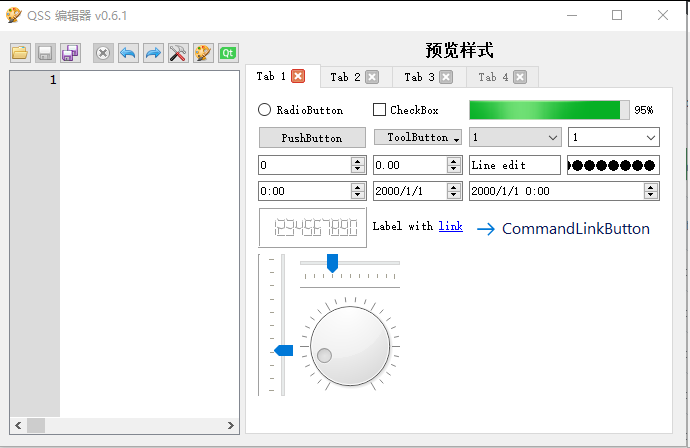
** QSS Editor : HappySeaFox / qsseditor :直接下载zip,并使用 Qt Creator编译之后,即可使用。
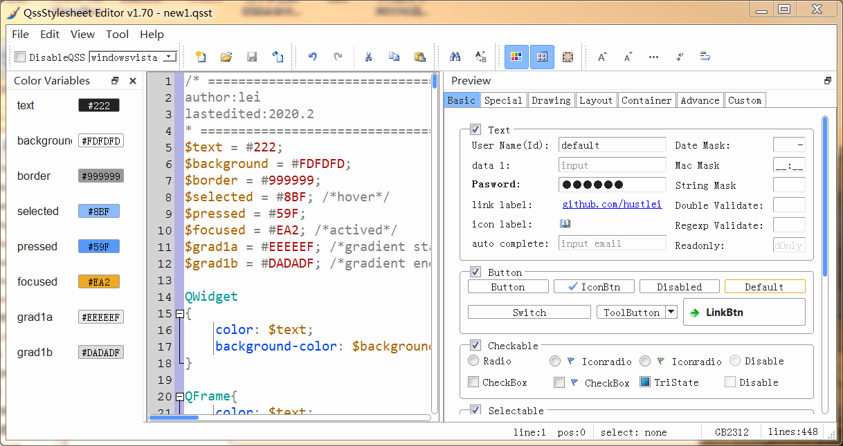
*** hustlei / QssStylesheetEditor https://github.com/hustlei/QssStylesheetEditor
QSS编辑器QssEditor之一:简介 https://blog.csdn.net/caoshangpa/article/details/127703838
说明:
1. 相比 QSS Editor,QssStylesheetEditor 似乎更全面一些?
2. 这些 Qss 编辑工具所给出的示例,应该会使可以考虑选用的样板吧?
在这些样板的基础上,进行修改,应该是一种好方法吧?
注意:同一个部件的设置,在 Qss编辑器中,被拆分成了几个代码块,可能是为了在编辑器设计中的某些方便吧?但有时也是太零散了?
=======================================
hustlei / QssStylesheetEditor
** QSS Editor
HappySeaFox / qsseditor https://github.com/HappySeaFox/qsseditor
A cross-platform tool to edit and preview Qt style sheets.
Requirements
Windows, Linux, macOS
Git to clone the repository
Qt5 with Qt Creator
Build tools: MSVC, MinGW, GCC, XCode etc.
Steps
Clone https://github.com/smoked-herring/qsseditor
Open QssEditor.pro in Qt Creator
Build QssEditor with a preferred or the default kit
QSS Editor 推荐:Nice and dark QSS example could be found here.
ColinDuquesnoy / QDarkStyleSheet https://github.com/ColinDuquesnoy/QDarkStyleSheet/tree/master/qdarkstyle
/* ---------------------------------------------------------------------------

    WARNING! File created programmatically. All changes made in this file will be lost!

    Created by the qtsass compiler v0.4.0

    The definitions are in the "qdarkstyle.qss._styles.scss" module

--------------------------------------------------------------------------- */
/* Light Style - QDarkStyleSheet ------------------------------------------ */
/*

See Qt documentation:

  - https://doc.qt.io/qt-5/stylesheet.html
  - https://doc.qt.io/qt-5/stylesheet-reference.html
  - https://doc.qt.io/qt-5/stylesheet-examples.html

--------------------------------------------------------------------------- */
/* Reset elements ------------------------------------------------------------

Resetting everything helps to unify styles across different operating systems

--------------------------------------------------------------------------- */
* {
  padding: 0px;
  margin: 0px;
  border: 0px;
  border-style: none;
  border-image: none;
  outline: 0;
}

/* specific reset for elements inside QToolBar */
QToolBar * {
  margin: 0px;
  padding: 0px;
}

/* QWidget ----------------------------------------------------------------

--------------------------------------------------------------------------- */
QWidget {
  background-color: #19232D;
  border: 0px solid #455364;
  padding: 0px;
  color: #DFE1E2;
  selection-background-color: #346792;
  selection-color: #DFE1E2;
}

QWidget:disabled {
  background-color: #19232D;
  color: #788D9C;
  selection-background-color: #26486B;
  selection-color: #788D9C;
}

QWidget::item:selected {
  background-color: #346792;
}

QWidget::item:hover:!selected {
  background-color: #1A72BB;
}

/* QMainWindow ------------------------------------------------------------

This adjusts the splitter in the dock widget, not qsplitter
https://doc.qt.io/qt-5/stylesheet-examples.html#customizing-qmainwindow

--------------------------------------------------------------------------- */
QMainWindow::separator {
  background-color: #455364;
  border: 0px solid #19232D;
  spacing: 0px;
  padding: 2px;
}

QMainWindow::separator:hover {
  background-color: #60798B;
  border: 0px solid #1A72BB;
}

QMainWindow::separator:horizontal {
  width: 5px;
  margin-top: 2px;
  margin-bottom: 2px;
  image: url(":/qss_icons/dark/rc/toolbar_separator_vertical.png");
}

QMainWindow::separator:vertical {
  height: 5px;
  margin-left: 2px;
  margin-right: 2px;
  image: url(":/qss_icons/dark/rc/toolbar_separator_horizontal.png");
}

/* QToolTip ---------------------------------------------------------------

https://doc.qt.io/qt-5/stylesheet-examples.html#customizing-qtooltip

--------------------------------------------------------------------------- */
QToolTip {
  background-color: #346792;
  color: #DFE1E2;
  /* If you remove the border property, background stops working on Windows */
  border: none;
  /* Remove padding, for fix combo box tooltip */
  padding: 0px;
  /* Remove opacity, fix #174 - may need to use RGBA */
}

/* QStatusBar -------------------------------------------------------------

https://doc.qt.io/qt-5/stylesheet-examples.html#customizing-qstatusbar

--------------------------------------------------------------------------- */
QStatusBar {
  border: 1px solid #455364;
  /* Fixes Spyder #9120, #9121 */
  background: #455364;
  /* Fixes #205, white vertical borders separating items */
}

QStatusBar::item {
  border: none;
}

QStatusBar QToolTip {
  background-color: #1A72BB;
  border: 1px solid #19232D;
  color: #19232D;
  /* Remove padding, for fix combo box tooltip */
  padding: 0px;
  /* Reducing transparency to read better */
  opacity: 230;
}

QStatusBar QLabel {
  /* Fixes Spyder #9120, #9121 */
  background: transparent;
}

/* QCheckBox --------------------------------------------------------------

https://doc.qt.io/qt-5/stylesheet-examples.html#customizing-qcheckbox

--------------------------------------------------------------------------- */
QCheckBox {
  background-color: #19232D;
  color: #DFE1E2;
  spacing: 4px;
  outline: none;
  padding-top: 4px;
  padding-bottom: 4px;
}

QCheckBox:focus {
  border: none;
}

QCheckBox QWidget:disabled {
  background-color: #19232D;
  color: #788D9C;
}

QCheckBox::indicator {
  margin-left: 2px;
  height: 14px;
  width: 14px;
}

QCheckBox::indicator:unchecked {
  image: url(":/qss_icons/dark/rc/checkbox_unchecked.png");
}

QCheckBox::indicator:unchecked:hover, QCheckBox::indicator:unchecked:focus, QCheckBox::indicator:unchecked:pressed {
  border: none;
  image: url(":/qss_icons/dark/rc/checkbox_unchecked_focus.png");
}

QCheckBox::indicator:unchecked:disabled {
  image: url(":/qss_icons/dark/rc/checkbox_unchecked_disabled.png");
}

QCheckBox::indicator:checked {
  image: url(":/qss_icons/dark/rc/checkbox_checked.png");
}

QCheckBox::indicator:checked:hover, QCheckBox::indicator:checked:focus, QCheckBox::indicator:checked:pressed {
  border: none;
  image: url(":/qss_icons/dark/rc/checkbox_checked_focus.png");
}

QCheckBox::indicator:checked:disabled {
  image: url(":/qss_icons/dark/rc/checkbox_checked_disabled.png");
}

QCheckBox::indicator:indeterminate {
  image: url(":/qss_icons/dark/rc/checkbox_indeterminate.png");
}

QCheckBox::indicator:indeterminate:disabled {
  image: url(":/qss_icons/dark/rc/checkbox_indeterminate_disabled.png");
}

QCheckBox::indicator:indeterminate:focus, QCheckBox::indicator:indeterminate:hover, QCheckBox::indicator:indeterminate:pressed {
  image: url(":/qss_icons/dark/rc/checkbox_indeterminate_focus.png");
}

/* QGroupBox --------------------------------------------------------------

https://doc.qt.io/qt-5/stylesheet-examples.html#customizing-qgroupbox

--------------------------------------------------------------------------- */
QGroupBox {
  font-weight: bold;
  border: 1px solid #455364;
  border-radius: 4px;
  padding: 2px;
  margin-top: 6px;
  margin-bottom: 4px;
}

QGroupBox::title {
  subcontrol-origin: margin;
  subcontrol-position: top left;
  left: 4px;
  padding-left: 2px;
  padding-right: 4px;
  padding-top: -4px;
}

QGroupBox::indicator {
  margin-left: 2px;
  margin-top: 2px;
  padding: 0;
  height: 14px;
  width: 14px;
}

QGroupBox::indicator:unchecked {
  border: none;
  image: url(":/qss_icons/dark/rc/checkbox_unchecked.png");
}

QGroupBox::indicator:unchecked:hover, QGroupBox::indicator:unchecked:focus, QGroupBox::indicator:unchecked:pressed {
  border: none;
  image: url(":/qss_icons/dark/rc/checkbox_unchecked_focus.png");
}

QGroupBox::indicator:unchecked:disabled {
  image: url(":/qss_icons/dark/rc/checkbox_unchecked_disabled.png");
}

QGroupBox::indicator:checked {
  border: none;
  image: url(":/qss_icons/dark/rc/checkbox_checked.png");
}

QGroupBox::indicator:checked:hover, QGroupBox::indicator:checked:focus, QGroupBox::indicator:checked:pressed {
  border: none;
  image: url(":/qss_icons/dark/rc/checkbox_checked_focus.png");
}

QGroupBox::indicator:checked:disabled {
  image: url(":/qss_icons/dark/rc/checkbox_checked_disabled.png");
}

/* QRadioButton -----------------------------------------------------------

https://doc.qt.io/qt-5/stylesheet-examples.html#customizing-qradiobutton

--------------------------------------------------------------------------- */
QRadioButton {
  background-color: #19232D;
  color: #DFE1E2;
  spacing: 4px;
  padding-top: 4px;
  padding-bottom: 4px;
  border: none;
  outline: none;
}

QRadioButton:focus {
  border: none;
}

QRadioButton:disabled {
  background-color: #19232D;
  color: #788D9C;
  border: none;
  outline: none;
}

QRadioButton QWidget {
  background-color: #19232D;
  color: #DFE1E2;
  spacing: 0px;
  padding: 0px;
  outline: none;
  border: none;
}

QRadioButton::indicator {
  border: none;
  outline: none;
  margin-left: 2px;
  height: 14px;
  width: 14px;
}

QRadioButton::indicator:unchecked {
  image: url(":/qss_icons/dark/rc/radio_unchecked.png");
}

QRadioButton::indicator:unchecked:hover, QRadioButton::indicator:unchecked:focus, QRadioButton::indicator:unchecked:pressed {
  border: none;
  outline: none;
  image: url(":/qss_icons/dark/rc/radio_unchecked_focus.png");
}

QRadioButton::indicator:unchecked:disabled {
  image: url(":/qss_icons/dark/rc/radio_unchecked_disabled.png");
}

QRadioButton::indicator:checked {
  border: none;
  outline: none;
  image: url(":/qss_icons/dark/rc/radio_checked.png");
}

QRadioButton::indicator:checked:hover, QRadioButton::indicator:checked:focus, QRadioButton::indicator:checked:pressed {
  border: none;
  outline: none;
  image: url(":/qss_icons/dark/rc/radio_checked_focus.png");
}

QRadioButton::indicator:checked:disabled {
  outline: none;
  image: url(":/qss_icons/dark/rc/radio_checked_disabled.png");
}

/* QMenuBar ---------------------------------------------------------------

https://doc.qt.io/qt-5/stylesheet-examples.html#customizing-qmenubar

--------------------------------------------------------------------------- */
QMenuBar {
  background-color: #455364;
  padding: 2px;
  border: 1px solid #19232D;
  color: #DFE1E2;
  selection-background-color: #1A72BB;
}

QMenuBar:focus {
  border: 1px solid #346792;
}

QMenuBar::item {
  background: transparent;
  padding: 4px;
}

QMenuBar::item:selected {
  padding: 4px;
  background: transparent;
  border: 0px solid #455364;
  background-color: #1A72BB;
}

QMenuBar::item:pressed {
  padding: 4px;
  border: 0px solid #455364;
  background-color: #1A72BB;
  color: #DFE1E2;
  margin-bottom: 0px;
  padding-bottom: 0px;
}

/* QMenu ------------------------------------------------------------------

https://doc.qt.io/qt-5/stylesheet-examples.html#customizing-qmenu

--------------------------------------------------------------------------- */
QMenu {
  border: 0px solid #455364;
  color: #DFE1E2;
  margin: 0px;
  background-color: #37414F;
  selection-background-color: #1A72BB;
}

QMenu::separator {
  height: 1px;
  background-color: #60798B;
  color: #DFE1E2;
}

QMenu::item {
  background-color: #37414F;
  padding: 4px 24px 4px 28px;
  /* Reserve space for selection border */
  border: 1px transparent #455364;
}

QMenu::item:selected {
  color: #DFE1E2;
  background-color: #1A72BB;
}

QMenu::item:pressed {
  background-color: #1A72BB;
}

QMenu::icon {
  padding-left: 10px;
  width: 14px;
  height: 14px;
}

QMenu::indicator {
  padding-left: 8px;
  width: 12px;
  height: 12px;
  /* non-exclusive indicator = check box style indicator (see QActionGroup::setExclusive) */
  /* exclusive indicator = radio button style indicator (see QActionGroup::setExclusive) */
}

QMenu::indicator:non-exclusive:unchecked {
  image: url(":/qss_icons/dark/rc/checkbox_unchecked.png");
}

QMenu::indicator:non-exclusive:unchecked:hover, QMenu::indicator:non-exclusive:unchecked:focus, QMenu::indicator:non-exclusive:unchecked:pressed {
  border: none;
  image: url(":/qss_icons/dark/rc/checkbox_unchecked_focus.png");
}

QMenu::indicator:non-exclusive:unchecked:disabled {
  image: url(":/qss_icons/dark/rc/checkbox_unchecked_disabled.png");
}

QMenu::indicator:non-exclusive:checked {
  image: url(":/qss_icons/dark/rc/checkbox_checked.png");
}

QMenu::indicator:non-exclusive:checked:hover, QMenu::indicator:non-exclusive:checked:focus, QMenu::indicator:non-exclusive:checked:pressed {
  border: none;
  image: url(":/qss_icons/dark/rc/checkbox_checked_focus.png");
}

QMenu::indicator:non-exclusive:checked:disabled {
  image: url(":/qss_icons/dark/rc/checkbox_checked_disabled.png");
}

QMenu::indicator:non-exclusive:indeterminate {
  image: url(":/qss_icons/dark/rc/checkbox_indeterminate.png");
}

QMenu::indicator:non-exclusive:indeterminate:disabled {
  image: url(":/qss_icons/dark/rc/checkbox_indeterminate_disabled.png");
}

QMenu::indicator:non-exclusive:indeterminate:focus, QMenu::indicator:non-exclusive:indeterminate:hover, QMenu::indicator:non-exclusive:indeterminate:pressed {
  image: url(":/qss_icons/dark/rc/checkbox_indeterminate_focus.png");
}

QMenu::indicator:exclusive:unchecked {
  image: url(":/qss_icons/dark/rc/radio_unchecked.png");
}

QMenu::indicator:exclusive:unchecked:hover, QMenu::indicator:exclusive:unchecked:focus, QMenu::indicator:exclusive:unchecked:pressed {
  border: none;
  outline: none;
  image: url(":/qss_icons/dark/rc/radio_unchecked_focus.png");
}

QMenu::indicator:exclusive:unchecked:disabled {
  image: url(":/qss_icons/dark/rc/radio_unchecked_disabled.png");
}

QMenu::indicator:exclusive:checked {
  border: none;
  outline: none;
  image: url(":/qss_icons/dark/rc/radio_checked.png");
}

QMenu::indicator:exclusive:checked:hover, QMenu::indicator:exclusive:checked:focus, QMenu::indicator:exclusive:checked:pressed {
  border: none;
  outline: none;
  image: url(":/qss_icons/dark/rc/radio_checked_focus.png");
}

QMenu::indicator:exclusive:checked:disabled {
  outline: none;
  image: url(":/qss_icons/dark/rc/radio_checked_disabled.png");
}

QMenu::right-arrow {
  margin: 5px;
  padding-left: 12px;
  image: url(":/qss_icons/dark/rc/arrow_right.png");
  height: 12px;
  width: 12px;
}

/* QAbstractItemView ------------------------------------------------------

https://doc.qt.io/qt-5/stylesheet-examples.html#customizing-qcombobox

--------------------------------------------------------------------------- */
QAbstractItemView {
  alternate-background-color: #19232D;
  color: #DFE1E2;
  border: 1px solid #455364;
  border-radius: 4px;
}

QAbstractItemView QLineEdit {
  padding: 2px;
}

/* QAbstractScrollArea ----------------------------------------------------

https://doc.qt.io/qt-5/stylesheet-examples.html#customizing-qabstractscrollarea

--------------------------------------------------------------------------- */
QAbstractScrollArea {
  background-color: #19232D;
  border: 1px solid #455364;
  border-radius: 4px;
  /* fix #159 */
  padding: 2px;
  /* remove min-height to fix #244 */
  color: #DFE1E2;
}

QAbstractScrollArea:disabled {
  color: #788D9C;
}

/* QScrollArea ------------------------------------------------------------

--------------------------------------------------------------------------- */
QScrollArea QWidget QWidget:disabled {
  background-color: #19232D;
}

/* QScrollBar -------------------------------------------------------------

https://doc.qt.io/qt-5/stylesheet-examples.html#customizing-qscrollbar

--------------------------------------------------------------------------- */
QScrollBar:horizontal {
  height: 16px;
  margin: 2px 16px 2px 16px;
  border: 1px solid #455364;
  border-radius: 4px;
  background-color: #19232D;
}

QScrollBar:vertical {
  background-color: #19232D;
  width: 16px;
  margin: 16px 2px 16px 2px;
  border: 1px solid #455364;
  border-radius: 4px;
}

QScrollBar::handle:horizontal {
  background-color: #60798B;
  border: 1px solid #455364;
  border-radius: 4px;
  min-width: 8px;
}

QScrollBar::handle:horizontal:hover {
  background-color: #346792;
  border: #346792;
  border-radius: 4px;
  min-width: 8px;
}

QScrollBar::handle:horizontal:focus {
  border: 1px solid #1A72BB;
}

QScrollBar::handle:vertical {
  background-color: #60798B;
  border: 1px solid #455364;
  min-height: 8px;
  border-radius: 4px;
}

QScrollBar::handle:vertical:hover {
  background-color: #346792;
  border: #346792;
  border-radius: 4px;
  min-height: 8px;
}

QScrollBar::handle:vertical:focus {
  border: 1px solid #1A72BB;
}

QScrollBar::add-line:horizontal {
  margin: 0px 0px 0px 0px;
  border-image: url(":/qss_icons/dark/rc/arrow_right_disabled.png");
  height: 12px;
  width: 12px;
  subcontrol-position: right;
  subcontrol-origin: margin;
}

QScrollBar::add-line:horizontal:hover, QScrollBar::add-line:horizontal:on {
  border-image: url(":/qss_icons/dark/rc/arrow_right.png");
  height: 12px;
  width: 12px;
  subcontrol-position: right;
  subcontrol-origin: margin;
}

QScrollBar::add-line:vertical {
  margin: 3px 0px 3px 0px;
  border-image: url(":/qss_icons/dark/rc/arrow_down_disabled.png");
  height: 12px;
  width: 12px;
  subcontrol-position: bottom;
  subcontrol-origin: margin;
}

QScrollBar::add-line:vertical:hover, QScrollBar::add-line:vertical:on {
  border-image: url(":/qss_icons/dark/rc/arrow_down.png");
  height: 12px;
  width: 12px;
  subcontrol-position: bottom;
  subcontrol-origin: margin;
}

QScrollBar::sub-line:horizontal {
  margin: 0px 3px 0px 3px;
  border-image: url(":/qss_icons/dark/rc/arrow_left_disabled.png");
  height: 12px;
  width: 12px;
  subcontrol-position: left;
  subcontrol-origin: margin;
}

QScrollBar::sub-line:horizontal:hover, QScrollBar::sub-line:horizontal:on {
  border-image: url(":/qss_icons/dark/rc/arrow_left.png");
  height: 12px;
  width: 12px;
  subcontrol-position: left;
  subcontrol-origin: margin;
}

QScrollBar::sub-line:vertical {
  margin: 3px 0px 3px 0px;
  border-image: url(":/qss_icons/dark/rc/arrow_up_disabled.png");
  height: 12px;
  width: 12px;
  subcontrol-position: top;
  subcontrol-origin: margin;
}

QScrollBar::sub-line:vertical:hover, QScrollBar::sub-line:vertical:on {
  border-image: url(":/qss_icons/dark/rc/arrow_up.png");
  height: 12px;
  width: 12px;
  subcontrol-position: top;
  subcontrol-origin: margin;
}

QScrollBar::up-arrow:horizontal, QScrollBar::down-arrow:horizontal {
  background: none;
}

QScrollBar::up-arrow:vertical, QScrollBar::down-arrow:vertical {
  background: none;
}

QScrollBar::add-page:horizontal, QScrollBar::sub-page:horizontal {
  background: none;
}

QScrollBar::add-page:vertical, QScrollBar::sub-page:vertical {
  background: none;
}

/* QTextEdit --------------------------------------------------------------

https://doc.qt.io/qt-5/stylesheet-examples.html#customizing-specific-widgets

--------------------------------------------------------------------------- */
QTextEdit {
  background-color: #19232D;
  color: #DFE1E2;
  border-radius: 4px;
  border: 1px solid #455364;
}

QTextEdit:focus {
  border: 1px solid #1A72BB;
}

QTextEdit:selected {
  background: #346792;
  color: #455364;
}

/* QPlainTextEdit ---------------------------------------------------------

--------------------------------------------------------------------------- */
QPlainTextEdit {
  background-color: #19232D;
  color: #DFE1E2;
  border-radius: 4px;
  border: 1px solid #455364;
}

QPlainTextEdit:focus {
  border: 1px solid #1A72BB;
}

QPlainTextEdit:selected {
  background: #346792;
  color: #455364;
}

/* QSizeGrip --------------------------------------------------------------

https://doc.qt.io/qt-5/stylesheet-examples.html#customizing-qsizegrip

--------------------------------------------------------------------------- */
QSizeGrip {
  background: transparent;
  width: 12px;
  height: 12px;
  image: url(":/qss_icons/dark/rc/window_grip.png");
}

/* QStackedWidget ---------------------------------------------------------

--------------------------------------------------------------------------- */
QStackedWidget {
  padding: 2px;
  border: 1px solid #455364;
  border: 1px solid #19232D;
}

/* QToolBar ---------------------------------------------------------------

https://doc.qt.io/qt-5/stylesheet-examples.html#customizing-qtoolbar

--------------------------------------------------------------------------- */
QToolBar {
  background-color: #455364;
  border-bottom: 1px solid #19232D;
  padding: 1px;
  font-weight: bold;
  spacing: 2px;
}

QToolBar:disabled {
  /* Fixes #272 */
  background-color: #455364;
}

QToolBar::handle:horizontal {
  width: 16px;
  image: url(":/qss_icons/dark/rc/toolbar_move_horizontal.png");
}

QToolBar::handle:vertical {
  height: 16px;
  image: url(":/qss_icons/dark/rc/toolbar_move_vertical.png");
}

QToolBar::separator:horizontal {
  width: 16px;
  image: url(":/qss_icons/dark/rc/toolbar_separator_horizontal.png");
}

QToolBar::separator:vertical {
  height: 16px;
  image: url(":/qss_icons/dark/rc/toolbar_separator_vertical.png");
}

QToolButton#qt_toolbar_ext_button {
  background: #455364;
  border: 0px;
  color: #DFE1E2;
  image: url(":/qss_icons/dark/rc/arrow_right.png");
}

/* QAbstractSpinBox -------------------------------------------------------

--------------------------------------------------------------------------- */
QAbstractSpinBox {
  background-color: #19232D;
  border: 1px solid #455364;
  color: #DFE1E2;
  /* This fixes 103, 111 */
  padding-top: 2px;
  /* This fixes 103, 111 */
  padding-bottom: 2px;
  padding-left: 4px;
  padding-right: 4px;
  border-radius: 4px;
  /* min-width: 5px; removed to fix 109 */
}

QAbstractSpinBox:up-button {
  background-color: transparent #19232D;
  subcontrol-origin: border;
  subcontrol-position: top right;
  border-left: 1px solid #455364;
  border-bottom: 1px solid #455364;
  border-top-left-radius: 0;
  border-bottom-left-radius: 0;
  margin: 1px;
  width: 12px;
  margin-bottom: -1px;
}

QAbstractSpinBox::up-arrow, QAbstractSpinBox::up-arrow:disabled, QAbstractSpinBox::up-arrow:off {
  image: url(":/qss_icons/dark/rc/arrow_up_disabled.png");
  height: 8px;
  width: 8px;
}

QAbstractSpinBox::up-arrow:hover {
  image: url(":/qss_icons/dark/rc/arrow_up.png");
}

QAbstractSpinBox:down-button {
  background-color: transparent #19232D;
  subcontrol-origin: border;
  subcontrol-position: bottom right;
  border-left: 1px solid #455364;
  border-top: 1px solid #455364;
  border-top-left-radius: 0;
  border-bottom-left-radius: 0;
  margin: 1px;
  width: 12px;
  margin-top: -1px;
}

QAbstractSpinBox::down-arrow, QAbstractSpinBox::down-arrow:disabled, QAbstractSpinBox::down-arrow:off {
  image: url(":/qss_icons/dark/rc/arrow_down_disabled.png");
  height: 8px;
  width: 8px;
}

QAbstractSpinBox::down-arrow:hover {
  image: url(":/qss_icons/dark/rc/arrow_down.png");
}

QAbstractSpinBox:hover {
  border: 1px solid #346792;
  color: #DFE1E2;
}

QAbstractSpinBox:focus {
  border: 1px solid #1A72BB;
}

QAbstractSpinBox:selected {
  background: #346792;
  color: #455364;
}

/* ------------------------------------------------------------------------ */
/* DISPLAYS --------------------------------------------------------------- */
/* ------------------------------------------------------------------------ */
/* QLabel -----------------------------------------------------------------

https://doc.qt.io/qt-5/stylesheet-examples.html#customizing-qframe

--------------------------------------------------------------------------- */
QLabel {
  background-color: #19232D;
  border: 0px solid #455364;
  padding: 2px;
  margin: 0px;
  color: #DFE1E2;
}

QLabel:disabled {
  background-color: #19232D;
  border: 0px solid #455364;
  color: #788D9C;
}

/* QTextBrowser -----------------------------------------------------------

https://doc.qt.io/qt-5/stylesheet-examples.html#customizing-qabstractscrollarea

--------------------------------------------------------------------------- */
QTextBrowser {
  background-color: #19232D;
  border: 1px solid #455364;
  color: #DFE1E2;
  border-radius: 4px;
}

QTextBrowser:disabled {
  background-color: #19232D;
  border: 1px solid #455364;
  color: #788D9C;
  border-radius: 4px;
}

QTextBrowser:hover, QTextBrowser:!hover, QTextBrowser:selected, QTextBrowser:pressed {
  border: 1px solid #455364;
}

/* QGraphicsView ----------------------------------------------------------

--------------------------------------------------------------------------- */
QGraphicsView {
  background-color: #19232D;
  border: 1px solid #455364;
  color: #DFE1E2;
  border-radius: 4px;
}

QGraphicsView:disabled {
  background-color: #19232D;
  border: 1px solid #455364;
  color: #788D9C;
  border-radius: 4px;
}

QGraphicsView:hover, QGraphicsView:!hover, QGraphicsView:selected, QGraphicsView:pressed {
  border: 1px solid #455364;
}

/* QCalendarWidget --------------------------------------------------------

--------------------------------------------------------------------------- */
QCalendarWidget {
  border: 1px solid #455364;
  border-radius: 4px;
}

QCalendarWidget:disabled {
  background-color: #19232D;
  color: #788D9C;
}

/* QLCDNumber -------------------------------------------------------------

--------------------------------------------------------------------------- */
QLCDNumber {
  background-color: #19232D;
  color: #DFE1E2;
}

QLCDNumber:disabled {
  background-color: #19232D;
  color: #788D9C;
}

/* QProgressBar -----------------------------------------------------------

https://doc.qt.io/qt-5/stylesheet-examples.html#customizing-qprogressbar

--------------------------------------------------------------------------- */
QProgressBar {
  background-color: #19232D;
  border: 1px solid #455364;
  color: #DFE1E2;
  border-radius: 4px;
  text-align: center;
}

QProgressBar:disabled {
  background-color: #19232D;
  border: 1px solid #455364;
  color: #788D9C;
  border-radius: 4px;
  text-align: center;
}

QProgressBar::chunk {
  background-color: #346792;
  color: #19232D;
  border-radius: 4px;
}

QProgressBar::chunk:disabled {
  background-color: #26486B;
  color: #788D9C;
  border-radius: 4px;
}

/* ------------------------------------------------------------------------ */
/* BUTTONS ---------------------------------------------------------------- */
/* ------------------------------------------------------------------------ */
/* QPushButton ------------------------------------------------------------

https://doc.qt.io/qt-5/stylesheet-examples.html#customizing-qpushbutton

--------------------------------------------------------------------------- */
QPushButton {
  background-color: #455364;
  color: #DFE1E2;
  border-radius: 4px;
  padding: 2px;
  outline: none;
  border: none;
}

QPushButton:disabled {
  background-color: #455364;
  color: #788D9C;
  border-radius: 4px;
  padding: 2px;
}

QPushButton:checked {
  background-color: #60798B;
  border-radius: 4px;
  padding: 2px;
  outline: none;
}

QPushButton:checked:disabled {
  background-color: #60798B;
  color: #788D9C;
  border-radius: 4px;
  padding: 2px;
  outline: none;
}

QPushButton:checked:selected {
  background: #60798B;
}

QPushButton:hover {
  background-color: #54687A;
  color: #DFE1E2;
}

QPushButton:pressed {
  background-color: #60798B;
}

QPushButton:selected {
  background: #60798B;
  color: #DFE1E2;
}

QPushButton::menu-indicator {
  subcontrol-origin: padding;
  subcontrol-position: bottom right;
  bottom: 4px;
}

QDialogButtonBox QPushButton {
  /* Issue #194 #248 - Special case of QPushButton inside dialogs, for better UI */
  min-width: 80px;
}

/* QToolButton ------------------------------------------------------------

https://doc.qt.io/qt-5/stylesheet-examples.html#customizing-qtoolbutton

--------------------------------------------------------------------------- */
QToolButton {
  background-color: #455364;
  color: #DFE1E2;
  border-radius: 4px;
  padding: 2px;
  outline: none;
  border: none;
  /* The subcontrols below are used only in the DelayedPopup mode */
  /* The subcontrols below are used only in the MenuButtonPopup mode */
  /* The subcontrol below is used only in the InstantPopup or DelayedPopup mode */
}

QToolButton:disabled {
  background-color: #455364;
  color: #788D9C;
  border-radius: 4px;
  padding: 2px;
}

QToolButton:checked {
  background-color: #60798B;
  border-radius: 4px;
  padding: 2px;
  outline: none;
}

QToolButton:checked:disabled {
  background-color: #60798B;
  color: #788D9C;
  border-radius: 4px;
  padding: 2px;
  outline: none;
}

QToolButton:checked:hover {
  background-color: #54687A;
  color: #DFE1E2;
}

QToolButton:checked:pressed {
  background-color: #60798B;
}

QToolButton:checked:selected {
  background: #60798B;
  color: #DFE1E2;
}

QToolButton:hover {
  background-color: #54687A;
  color: #DFE1E2;
}

QToolButton:pressed {
  background-color: #60798B;
}

QToolButton:selected {
  background: #60798B;
  color: #DFE1E2;
}

QToolButton[popupMode="0"] {
  /* Only for DelayedPopup */
  padding-right: 2px;
}

QToolButton[popupMode="1"] {
  /* Only for MenuButtonPopup */
  padding-right: 20px;
}

QToolButton[popupMode="1"]::menu-button {
  border: none;
}

QToolButton[popupMode="1"]::menu-button:hover {
  border: none;
  border-left: 1px solid #455364;
  border-radius: 0;
}

QToolButton[popupMode="2"] {
  /* Only for InstantPopup */
  padding-right: 2px;
}

QToolButton::menu-button {
  padding: 2px;
  border-radius: 4px;
  width: 12px;
  border: none;
  outline: none;
}

QToolButton::menu-button:hover {
  border: 1px solid #346792;
}

QToolButton::menu-button:checked:hover {
  border: 1px solid #346792;
}

QToolButton::menu-indicator {
  image: url(":/qss_icons/dark/rc/arrow_down.png");
  height: 8px;
  width: 8px;
  top: 0;
  /* Exclude a shift for better image */
  left: -2px;
  /* Shift it a bit */
}

QToolButton::menu-arrow {
  image: url(":/qss_icons/dark/rc/arrow_down.png");
  height: 8px;
  width: 8px;
}

QToolButton::menu-arrow:hover {
  image: url(":/qss_icons/dark/rc/arrow_down_focus.png");
}

/* QCommandLinkButton -----------------------------------------------------

--------------------------------------------------------------------------- */
QCommandLinkButton {
  background-color: transparent;
  border: 1px solid #455364;
  color: #DFE1E2;
  border-radius: 4px;
  padding: 0px;
  margin: 0px;
}

QCommandLinkButton:disabled {
  background-color: transparent;
  color: #788D9C;
}

/* ------------------------------------------------------------------------ */
/* INPUTS - NO FIELDS ----------------------------------------------------- */
/* ------------------------------------------------------------------------ */
/* QComboBox --------------------------------------------------------------

https://doc.qt.io/qt-5/stylesheet-examples.html#customizing-qcombobox

--------------------------------------------------------------------------- */
QComboBox {
  border: 1px solid #455364;
  border-radius: 4px;
  selection-background-color: #346792;
  padding-left: 4px;
  padding-right: 4px;
  /* padding-right = 36; 4 + 16*2 See scrollbar size */
  /* changed to 4px to fix #239 */
  /* Fixes #103, #111 */
  min-height: 1.5em;
  /* padding-top: 2px;     removed to fix #132 */
  /* padding-bottom: 2px;  removed to fix #132 */
  /* min-width: 75px;      removed to fix #109 */
  /* Needed to remove indicator - fix #132 */
}

QComboBox QAbstractItemView {
  border: 1px solid #455364;
  border-radius: 0;
  background-color: #19232D;
  selection-background-color: #346792;
}

QComboBox QAbstractItemView:hover {
  background-color: #19232D;
  color: #DFE1E2;
}

QComboBox QAbstractItemView:selected {
  background: #346792;
  color: #455364;
}

QComboBox QAbstractItemView:alternate {
  background: #19232D;
}

QComboBox:disabled {
  background-color: #19232D;
  color: #788D9C;
}

QComboBox:hover {
  border: 1px solid #346792;
}

QComboBox:focus {
  border: 1px solid #1A72BB;
}

QComboBox:on {
  selection-background-color: #346792;
}

QComboBox::indicator {
  border: none;
  border-radius: 0;
  background-color: transparent;
  selection-background-color: transparent;
  color: transparent;
  selection-color: transparent;
  /* Needed to remove indicator - fix #132 */
}

QComboBox::indicator:alternate {
  background: #19232D;
}

QComboBox::item {
  /* Remove to fix #282, #285 and MR #288*/
  /*&:checked {
            font-weight: bold;
        }

        &:selected {
            border: 0px solid transparent;
        }
        */
}

QComboBox::item:alternate {
  background: #19232D;
}

QComboBox::drop-down {
  subcontrol-origin: padding;
  subcontrol-position: top right;
  width: 12px;
  border-left: 1px solid #455364;
}

QComboBox::down-arrow {
  image: url(":/qss_icons/dark/rc/arrow_down_disabled.png");
  height: 8px;
  width: 8px;
}

QComboBox::down-arrow:on, QComboBox::down-arrow:hover, QComboBox::down-arrow:focus {
  image: url(":/qss_icons/dark/rc/arrow_down.png");
}

/* QSlider ----------------------------------------------------------------

https://doc.qt.io/qt-5/stylesheet-examples.html#customizing-qslider

--------------------------------------------------------------------------- */
QSlider:disabled {
  background: #19232D;
}

QSlider:focus {
  border: none;
}

QSlider::groove:horizontal {
  background: #455364;
  border: 1px solid #455364;
  height: 4px;
  margin: 0px;
  border-radius: 4px;
}

QSlider::groove:vertical {
  background: #455364;
  border: 1px solid #455364;
  width: 4px;
  margin: 0px;
  border-radius: 4px;
}

QSlider::add-page:vertical {
  background: #346792;
  border: 1px solid #455364;
  width: 4px;
  margin: 0px;
  border-radius: 4px;
}

QSlider::add-page:vertical :disabled {
  background: #26486B;
}

QSlider::sub-page:horizontal {
  background: #346792;
  border: 1px solid #455364;
  height: 4px;
  margin: 0px;
  border-radius: 4px;
}

QSlider::sub-page:horizontal:disabled {
  background: #26486B;
}

QSlider::handle:horizontal {
  background: #9DA9B5;
  border: 1px solid #455364;
  width: 8px;
  height: 8px;
  margin: -8px 0px;
  border-radius: 4px;
}

QSlider::handle:horizontal:hover {
  background: #346792;
  border: 1px solid #346792;
}

QSlider::handle:horizontal:focus {
  border: 1px solid #1A72BB;
}

QSlider::handle:vertical {
  background: #9DA9B5;
  border: 1px solid #455364;
  width: 8px;
  height: 8px;
  margin: 0 -8px;
  border-radius: 4px;
}

QSlider::handle:vertical:hover {
  background: #346792;
  border: 1px solid #346792;
}

QSlider::handle:vertical:focus {
  border: 1px solid #1A72BB;
}

/* QLineEdit --------------------------------------------------------------

https://doc.qt.io/qt-5/stylesheet-examples.html#customizing-qlineedit

--------------------------------------------------------------------------- */
QLineEdit {
  background-color: #19232D;
  padding-top: 2px;
  /* This QLineEdit fix  103, 111 */
  padding-bottom: 2px;
  /* This QLineEdit fix  103, 111 */
  padding-left: 4px;
  padding-right: 4px;
  border-style: solid;
  border: 1px solid #455364;
  border-radius: 4px;
  color: #DFE1E2;
}

QLineEdit:disabled {
  background-color: #19232D;
  color: #788D9C;
}

QLineEdit:hover {
  border: 1px solid #346792;
  color: #DFE1E2;
}

QLineEdit:focus {
  border: 1px solid #1A72BB;
}

QLineEdit:selected {
  background-color: #346792;
  color: #455364;
}

/* QTabWiget --------------------------------------------------------------

https://doc.qt.io/qt-5/stylesheet-examples.html#customizing-qtabwidget-and-qtabbar

--------------------------------------------------------------------------- */
QTabWidget {
  padding: 2px;
  selection-background-color: #455364;
}

QTabWidget QWidget {
  /* Fixes #189 */
  border-radius: 4px;
}

QTabWidget::pane {
  border: 1px solid #455364;
  border-radius: 4px;
  margin: 0px;
  /* Fixes double border inside pane with pyqt5 */
  padding: 0px;
}

QTabWidget::pane:selected {
  background-color: #455364;
  border: 1px solid #346792;
}

/* QTabBar ----------------------------------------------------------------

https://doc.qt.io/qt-5/stylesheet-examples.html#customizing-qtabwidget-and-qtabbar

--------------------------------------------------------------------------- */
QTabBar, QDockWidget QTabBar {
  qproperty-drawBase: 0;
  border-radius: 4px;
  margin: 0px;
  padding: 2px;
  border: 0;
  /* left: 5px; move to the right by 5px - removed for fix */
}

QTabBar::close-button, QDockWidget QTabBar::close-button {
  border: 0;
  margin: 0;
  padding: 4px;
  image: url(":/qss_icons/dark/rc/window_close.png");
}

QTabBar::close-button:hover, QDockWidget QTabBar::close-button:hover {
  image: url(":/qss_icons/dark/rc/window_close_focus.png");
}

QTabBar::close-button:pressed, QDockWidget QTabBar::close-button:pressed {
  image: url(":/qss_icons/dark/rc/window_close_pressed.png");
}

QTabBar::tab, QDockWidget QTabBar::tab {
  /* !selected and disabled ----------------------------------------- */
  /* selected ------------------------------------------------------- */
}

QTabBar::tab:top:selected:disabled, QDockWidget QTabBar::tab:top:selected:disabled {
  border-bottom: 3px solid #26486B;
  color: #788D9C;
  background-color: #455364;
}

QTabBar::tab:bottom:selected:disabled, QDockWidget QTabBar::tab:bottom:selected:disabled {
  border-top: 3px solid #26486B;
  color: #788D9C;
  background-color: #455364;
}

QTabBar::tab:left:selected:disabled, QDockWidget QTabBar::tab:left:selected:disabled {
  border-right: 3px solid #26486B;
  color: #788D9C;
  background-color: #455364;
}

QTabBar::tab:right:selected:disabled, QDockWidget QTabBar::tab:right:selected:disabled {
  border-left: 3px solid #26486B;
  color: #788D9C;
  background-color: #455364;
}

QTabBar::tab:top:!selected:disabled, QDockWidget QTabBar::tab:top:!selected:disabled {
  border-bottom: 3px solid #19232D;
  color: #788D9C;
  background-color: #19232D;
}

QTabBar::tab:bottom:!selected:disabled, QDockWidget QTabBar::tab:bottom:!selected:disabled {
  border-top: 3px solid #19232D;
  color: #788D9C;
  background-color: #19232D;
}

QTabBar::tab:left:!selected:disabled, QDockWidget QTabBar::tab:left:!selected:disabled {
  border-right: 3px solid #19232D;
  color: #788D9C;
  background-color: #19232D;
}

QTabBar::tab:right:!selected:disabled, QDockWidget QTabBar::tab:right:!selected:disabled {
  border-left: 3px solid #19232D;
  color: #788D9C;
  background-color: #19232D;
}

QTabBar::tab:top:!selected, QDockWidget QTabBar::tab:top:!selected {
  border-bottom: 2px solid #19232D;
  margin-top: 2px;
}

QTabBar::tab:bottom:!selected, QDockWidget QTabBar::tab:bottom:!selected {
  border-top: 2px solid #19232D;
  margin-bottom: 2px;
}

QTabBar::tab:left:!selected, QDockWidget QTabBar::tab:left:!selected {
  border-left: 2px solid #19232D;
  margin-right: 2px;
}

QTabBar::tab:right:!selected, QDockWidget QTabBar::tab:right:!selected {
  border-right: 2px solid #19232D;
  margin-left: 2px;
}

QTabBar::tab:top, QDockWidget QTabBar::tab:top {
  background-color: #455364;
  margin-left: 2px;
  padding-left: 4px;
  padding-right: 4px;
  padding-top: 2px;
  padding-bottom: 2px;
  min-width: 5px;
  border-bottom: 3px solid #455364;
  border-top-left-radius: 4px;
  border-top-right-radius: 4px;
}

QTabBar::tab:top:selected, QDockWidget QTabBar::tab:top:selected {
  background-color: #54687A;
  border-bottom: 3px solid #259AE9;
  border-top-left-radius: 4px;
  border-top-right-radius: 4px;
}

QTabBar::tab:top:!selected:hover, QDockWidget QTabBar::tab:top:!selected:hover {
  border: 1px solid #1A72BB;
  border-bottom: 3px solid #1A72BB;
  /* Fixes spyder-ide/spyder#9766 and #243 */
  padding-left: 3px;
  padding-right: 3px;
}

QTabBar::tab:bottom, QDockWidget QTabBar::tab:bottom {
  border-top: 3px solid #455364;
  background-color: #455364;
  margin-left: 2px;
  padding-left: 4px;
  padding-right: 4px;
  padding-top: 2px;
  padding-bottom: 2px;
  border-bottom-left-radius: 4px;
  border-bottom-right-radius: 4px;
  min-width: 5px;
}

QTabBar::tab:bottom:selected, QDockWidget QTabBar::tab:bottom:selected {
  background-color: #54687A;
  border-top: 3px solid #259AE9;
  border-bottom-left-radius: 4px;
  border-bottom-right-radius: 4px;
}

QTabBar::tab:bottom:!selected:hover, QDockWidget QTabBar::tab:bottom:!selected:hover {
  border: 1px solid #1A72BB;
  border-top: 3px solid #1A72BB;
  /* Fixes spyder-ide/spyder#9766 and #243 */
  padding-left: 3px;
  padding-right: 3px;
}

QTabBar::tab:left, QDockWidget QTabBar::tab:left {
  background-color: #455364;
  margin-top: 2px;
  padding-left: 2px;
  padding-right: 2px;
  padding-top: 4px;
  padding-bottom: 4px;
  border-top-left-radius: 4px;
  border-bottom-left-radius: 4px;
  min-height: 5px;
}

QTabBar::tab:left:selected, QDockWidget QTabBar::tab:left:selected {
  background-color: #54687A;
  border-right: 3px solid #259AE9;
}

QTabBar::tab:left:!selected:hover, QDockWidget QTabBar::tab:left:!selected:hover {
  border: 1px solid #1A72BB;
  border-right: 3px solid #1A72BB;
  /* Fixes different behavior #271 */
  margin-right: 0px;
  padding-right: -1px;
}

QTabBar::tab:right, QDockWidget QTabBar::tab:right {
  background-color: #455364;
  margin-top: 2px;
  padding-left: 2px;
  padding-right: 2px;
  padding-top: 4px;
  padding-bottom: 4px;
  border-top-right-radius: 4px;
  border-bottom-right-radius: 4px;
  min-height: 5px;
}

QTabBar::tab:right:selected, QDockWidget QTabBar::tab:right:selected {
  background-color: #54687A;
  border-left: 3px solid #259AE9;
}

QTabBar::tab:right:!selected:hover, QDockWidget QTabBar::tab:right:!selected:hover {
  border: 1px solid #1A72BB;
  border-left: 3px solid #1A72BB;
  /* Fixes different behavior #271 */
  margin-left: 0px;
  padding-left: 0px;
}

QTabBar QToolButton, QDockWidget QTabBar QToolButton {
  /* Fixes #136 */
  background-color: #455364;
  height: 12px;
  width: 12px;
}

QTabBar QToolButton:pressed, QDockWidget QTabBar QToolButton:pressed {
  background-color: #455364;
}

QTabBar QToolButton:pressed:hover, QDockWidget QTabBar QToolButton:pressed:hover {
  border: 1px solid #346792;
}

QTabBar QToolButton::left-arrow:enabled, QDockWidget QTabBar QToolButton::left-arrow:enabled {
  image: url(":/qss_icons/dark/rc/arrow_left.png");
}

QTabBar QToolButton::left-arrow:disabled, QDockWidget QTabBar QToolButton::left-arrow:disabled {
  image: url(":/qss_icons/dark/rc/arrow_left_disabled.png");
}

QTabBar QToolButton::right-arrow:enabled, QDockWidget QTabBar QToolButton::right-arrow:enabled {
  image: url(":/qss_icons/dark/rc/arrow_right.png");
}

QTabBar QToolButton::right-arrow:disabled, QDockWidget QTabBar QToolButton::right-arrow:disabled {
  image: url(":/qss_icons/dark/rc/arrow_right_disabled.png");
}

/* QDockWiget -------------------------------------------------------------

--------------------------------------------------------------------------- */
QDockWidget {
  outline: 1px solid #455364;
  background-color: #19232D;
  border: 1px solid #455364;
  border-radius: 4px;
  titlebar-close-icon: url(":/qss_icons/dark/rc/transparent.png");
  titlebar-normal-icon: url(":/qss_icons/dark/rc/transparent.png");
}

QDockWidget::title {
  /* Better size for title bar */
  padding: 3px;
  spacing: 4px;
  border: none;
  background-color: #455364;
}

QDockWidget::close-button {
  icon-size: 12px;
  border: none;
  background: transparent;
  background-image: transparent;
  border: 0;
  margin: 0;
  padding: 0;
  image: url(":/qss_icons/dark/rc/window_close.png");
}

QDockWidget::close-button:hover {
  image: url(":/qss_icons/dark/rc/window_close_focus.png");
}

QDockWidget::close-button:pressed {
  image: url(":/qss_icons/dark/rc/window_close_pressed.png");
}

QDockWidget::float-button {
  icon-size: 12px;
  border: none;
  background: transparent;
  background-image: transparent;
  border: 0;
  margin: 0;
  padding: 0;
  image: url(":/qss_icons/dark/rc/window_undock.png");
}

QDockWidget::float-button:hover {
  image: url(":/qss_icons/dark/rc/window_undock_focus.png");
}

QDockWidget::float-button:pressed {
  image: url(":/qss_icons/dark/rc/window_undock_pressed.png");
}

/* QTreeView QListView QTableView -----------------------------------------

https://doc.qt.io/qt-5/stylesheet-examples.html#customizing-qtreeview
https://doc.qt.io/qt-5/stylesheet-examples.html#customizing-qlistview
https://doc.qt.io/qt-5/stylesheet-examples.html#customizing-qtableview

--------------------------------------------------------------------------- */
QTreeView:branch:selected, QTreeView:branch:hover {
  background: url(":/qss_icons/dark/rc/transparent.png");
}

QTreeView:branch:has-siblings:!adjoins-item {
  border-image: url(":/qss_icons/dark/rc/branch_line.png") 0;
}

QTreeView:branch:has-siblings:adjoins-item {
  border-image: url(":/qss_icons/dark/rc/branch_more.png") 0;
}

QTreeView:branch:!has-children:!has-siblings:adjoins-item {
  border-image: url(":/qss_icons/dark/rc/branch_end.png") 0;
}

QTreeView:branch:has-children:!has-siblings:closed, QTreeView:branch:closed:has-children:has-siblings {
  border-image: none;
  image: url(":/qss_icons/dark/rc/branch_closed.png");
}

QTreeView:branch:open:has-children:!has-siblings, QTreeView:branch:open:has-children:has-siblings {
  border-image: none;
  image: url(":/qss_icons/dark/rc/branch_open.png");
}

QTreeView:branch:has-children:!has-siblings:closed:hover, QTreeView:branch:closed:has-children:has-siblings:hover {
  image: url(":/qss_icons/dark/rc/branch_closed_focus.png");
}

QTreeView:branch:open:has-children:!has-siblings:hover, QTreeView:branch:open:has-children:has-siblings:hover {
  image: url(":/qss_icons/dark/rc/branch_open_focus.png");
}

QTreeView::indicator:checked,
QListView::indicator:checked,
QTableView::indicator:checked,
QColumnView::indicator:checked {
  image: url(":/qss_icons/dark/rc/checkbox_checked.png");
}

QTreeView::indicator:checked:hover, QTreeView::indicator:checked:focus, QTreeView::indicator:checked:pressed,
QListView::indicator:checked:hover,
QListView::indicator:checked:focus,
QListView::indicator:checked:pressed,
QTableView::indicator:checked:hover,
QTableView::indicator:checked:focus,
QTableView::indicator:checked:pressed,
QColumnView::indicator:checked:hover,
QColumnView::indicator:checked:focus,
QColumnView::indicator:checked:pressed {
  image: url(":/qss_icons/dark/rc/checkbox_checked_focus.png");
}

QTreeView::indicator:unchecked,
QListView::indicator:unchecked,
QTableView::indicator:unchecked,
QColumnView::indicator:unchecked {
  image: url(":/qss_icons/dark/rc/checkbox_unchecked.png");
}

QTreeView::indicator:unchecked:hover, QTreeView::indicator:unchecked:focus, QTreeView::indicator:unchecked:pressed,
QListView::indicator:unchecked:hover,
QListView::indicator:unchecked:focus,
QListView::indicator:unchecked:pressed,
QTableView::indicator:unchecked:hover,
QTableView::indicator:unchecked:focus,
QTableView::indicator:unchecked:pressed,
QColumnView::indicator:unchecked:hover,
QColumnView::indicator:unchecked:focus,
QColumnView::indicator:unchecked:pressed {
  image: url(":/qss_icons/dark/rc/checkbox_unchecked_focus.png");
}

QTreeView::indicator:indeterminate,
QListView::indicator:indeterminate,
QTableView::indicator:indeterminate,
QColumnView::indicator:indeterminate {
  image: url(":/qss_icons/dark/rc/checkbox_indeterminate.png");
}

QTreeView::indicator:indeterminate:hover, QTreeView::indicator:indeterminate:focus, QTreeView::indicator:indeterminate:pressed,
QListView::indicator:indeterminate:hover,
QListView::indicator:indeterminate:focus,
QListView::indicator:indeterminate:pressed,
QTableView::indicator:indeterminate:hover,
QTableView::indicator:indeterminate:focus,
QTableView::indicator:indeterminate:pressed,
QColumnView::indicator:indeterminate:hover,
QColumnView::indicator:indeterminate:focus,
QColumnView::indicator:indeterminate:pressed {
  image: url(":/qss_icons/dark/rc/checkbox_indeterminate_focus.png");
}

QTreeView,
QListView,
QTableView,
QColumnView {
  background-color: #19232D;
  border: 1px solid #455364;
  color: #DFE1E2;
  gridline-color: #455364;
  border-radius: 4px;
}

QTreeView:disabled,
QListView:disabled,
QTableView:disabled,
QColumnView:disabled {
  background-color: #19232D;
  color: #788D9C;
}

QTreeView:selected,
QListView:selected,
QTableView:selected,
QColumnView:selected {
  background-color: #346792;
  color: #455364;
}

QTreeView:focus,
QListView:focus,
QTableView:focus,
QColumnView:focus {
  border: 1px solid #1A72BB;
}

QTreeView::item:pressed,
QListView::item:pressed,
QTableView::item:pressed,
QColumnView::item:pressed {
  background-color: #346792;
}

QTreeView::item:selected:active,
QListView::item:selected:active,
QTableView::item:selected:active,
QColumnView::item:selected:active {
  background-color: #346792;
}

QTreeView::item:selected:!active,
QListView::item:selected:!active,
QTableView::item:selected:!active,
QColumnView::item:selected:!active {
  color: #DFE1E2;
  background-color: #37414F;
}

QTreeView::item:!selected:hover,
QListView::item:!selected:hover,
QTableView::item:!selected:hover,
QColumnView::item:!selected:hover {
  outline: 0;
  color: #DFE1E2;
  background-color: #37414F;
}

QTableCornerButton::section {
  background-color: #19232D;
  border: 1px transparent #455364;
  border-radius: 0px;
}

/* QHeaderView ------------------------------------------------------------

https://doc.qt.io/qt-5/stylesheet-examples.html#customizing-qheaderview

--------------------------------------------------------------------------- */
QHeaderView {
  background-color: #455364;
  border: 0px transparent #455364;
  padding: 0;
  margin: 0;
  border-radius: 0;
}

QHeaderView:disabled {
  background-color: #455364;
  border: 1px transparent #455364;
}

QHeaderView::section {
  background-color: #455364;
  color: #DFE1E2;
  border-radius: 0;
  text-align: left;
  font-size: 13px;
}

QHeaderView::section::horizontal {
  padding-top: 0;
  padding-bottom: 0;
  padding-left: 4px;
  padding-right: 4px;
  border-left: 1px solid #19232D;
}

QHeaderView::section::horizontal::first, QHeaderView::section::horizontal::only-one {
  border-left: 1px solid #455364;
}

QHeaderView::section::horizontal:disabled {
  color: #788D9C;
}

QHeaderView::section::vertical {
  padding-top: 0;
  padding-bottom: 0;
  padding-left: 4px;
  padding-right: 4px;
  border-top: 1px solid #19232D;
}

QHeaderView::section::vertical::first, QHeaderView::section::vertical::only-one {
  border-top: 1px solid #455364;
}

QHeaderView::section::vertical:disabled {
  color: #788D9C;
}

QHeaderView::down-arrow {
  /* Those settings (border/width/height/background-color) solve bug */
  /* transparent arrow background and size */
  background-color: #455364;
  border: none;
  height: 12px;
  width: 12px;
  padding-left: 2px;
  padding-right: 2px;
  image: url(":/qss_icons/dark/rc/arrow_down.png");
}

QHeaderView::up-arrow {
  background-color: #455364;
  border: none;
  height: 12px;
  width: 12px;
  padding-left: 2px;
  padding-right: 2px;
  image: url(":/qss_icons/dark/rc/arrow_up.png");
}

/* QToolBox --------------------------------------------------------------

https://doc.qt.io/qt-5/stylesheet-examples.html#customizing-qtoolbox

--------------------------------------------------------------------------- */
QToolBox {
  padding: 0px;
  border: 0px;
  border: 1px solid #455364;
}

QToolBox:selected {
  padding: 0px;
  border: 2px solid #346792;
}

QToolBox::tab {
  background-color: #19232D;
  border: 1px solid #455364;
  color: #DFE1E2;
  border-top-left-radius: 4px;
  border-top-right-radius: 4px;
}

QToolBox::tab:disabled {
  color: #788D9C;
}

QToolBox::tab:selected {
  background-color: #60798B;
  border-bottom: 2px solid #346792;
}

QToolBox::tab:selected:disabled {
  background-color: #455364;
  border-bottom: 2px solid #26486B;
}

QToolBox::tab:!selected {
  background-color: #455364;
  border-bottom: 2px solid #455364;
}

QToolBox::tab:!selected:disabled {
  background-color: #19232D;
}

QToolBox::tab:hover {
  border-color: #1A72BB;
  border-bottom: 2px solid #1A72BB;
}

QToolBox QScrollArea {
  padding: 0px;
  border: 0px;
  background-color: #19232D;
}

/* QFrame -----------------------------------------------------------------

https://doc.qt.io/qt-5/stylesheet-examples.html#customizing-qframe
https://doc.qt.io/qt-5/qframe.html#-prop
https://doc.qt.io/qt-5/qframe.html#details
https://stackoverflow.com/questions/14581498/qt-stylesheet-for-hline-vline-color

--------------------------------------------------------------------------- */
/* (dot) .QFrame  fix #141, #126, #123 */
.QFrame {
  border-radius: 4px;
  border: 1px solid #455364;
  /* No frame */
  /* HLine */
  /* HLine */
}

.QFrame[frameShape="0"] {
  border-radius: 4px;
  border: 1px transparent #455364;
}

.QFrame[frameShape="4"] {
  max-height: 2px;
  border: none;
  background-color: #455364;
}

.QFrame[frameShape="5"] {
  max-width: 2px;
  border: none;
  background-color: #455364;
}

/* QSplitter --------------------------------------------------------------

https://doc.qt.io/qt-5/stylesheet-examples.html#customizing-qsplitter

--------------------------------------------------------------------------- */
QSplitter {
  background-color: #455364;
  spacing: 0px;
  padding: 0px;
  margin: 0px;
}

QSplitter::handle {
  background-color: #455364;
  border: 0px solid #19232D;
  spacing: 0px;
  padding: 1px;
  margin: 0px;
}

QSplitter::handle:hover {
  background-color: #9DA9B5;
}

QSplitter::handle:horizontal {
  width: 5px;
  image: url(":/qss_icons/dark/rc/line_vertical.png");
}

QSplitter::handle:vertical {
  height: 5px;
  image: url(":/qss_icons/dark/rc/line_horizontal.png");
}

/* QDateEdit, QDateTimeEdit -----------------------------------------------

--------------------------------------------------------------------------- */
QDateEdit, QDateTimeEdit {
  selection-background-color: #346792;
  border-style: solid;
  border: 1px solid #455364;
  border-radius: 4px;
  /* This fixes 103, 111 */
  padding-top: 2px;
  /* This fixes 103, 111 */
  padding-bottom: 2px;
  padding-left: 4px;
  padding-right: 4px;
  min-width: 10px;
}

QDateEdit:on, QDateTimeEdit:on {
  selection-background-color: #346792;
}

QDateEdit::drop-down, QDateTimeEdit::drop-down {
  subcontrol-origin: padding;
  subcontrol-position: top right;
  width: 12px;
  border-left: 1px solid #455364;
}

QDateEdit::down-arrow, QDateTimeEdit::down-arrow {
  image: url(":/qss_icons/dark/rc/arrow_down_disabled.png");
  height: 8px;
  width: 8px;
}

QDateEdit::down-arrow:on, QDateEdit::down-arrow:hover, QDateEdit::down-arrow:focus, QDateTimeEdit::down-arrow:on, QDateTimeEdit::down-arrow:hover, QDateTimeEdit::down-arrow:focus {
  image: url(":/qss_icons/dark/rc/arrow_down.png");
}

QDateEdit QAbstractItemView, QDateTimeEdit QAbstractItemView {
  background-color: #19232D;
  border-radius: 4px;
  border: 1px solid #455364;
  selection-background-color: #346792;
}

/* QAbstractView ----------------------------------------------------------

--------------------------------------------------------------------------- */
QAbstractView:hover {
  border: 1px solid #346792;
  color: #DFE1E2;
}

QAbstractView:selected {
  background: #346792;
  color: #455364;
}

/* PlotWidget -------------------------------------------------------------

--------------------------------------------------------------------------- */
PlotWidget {
  /* Fix cut labels in plots #134 */
  padding: 0px;
}
hustlei / QssStylesheetEditor 软件内部包含的示例
/* ================================================ *
author:lei
lastedited:2020.2
* ================================================ */
$text = #222;
$background = #FDFDFD;
$border = #999999;
$selected = #8BF; /*hover*/
$pressed = #59F;
$focused = #EA2; /*actived*/
$grad1a = #EEEEEF; /*gradient start*/
$grad1b = #DADADF; /*gradient end*/

QWidget
{
    color: $text;
    background-color: $background;
}

QFrame{
    color: $text;
    background-color: $background;/*不能设置为transparent*/
}
QMainWindow::separator{
    border: 1px solid $border;
    border-style: outset;
    width: 4px;
    height: 4px;
}
QMainWindow::separator:hover{
    background: $selected;
}
QSplitter::handle{
    border: 1px solid $border;
    border-style: outset;
    width: 4px;
    height: 4px;
}
QSplitter::handle:hover{/*splitter->handle(1)->setAttribute(Qt::WA_Hover, true);才生效*/
    border-color: $focused;
}
QSplitter::handle:pressed{
    border-color: $pressed;
}
QSizeGrip{
    background-color: none;
}

/* =============================================== */
/* Label                                           */
/* =============================================== */
QLabel {
    background: transparent;
    border: 1px solid transparent;
    padding: 1px;
}


/* A QLabel is a QFrame ... */
/* A QToolTip is a QLabel ... */
QToolTip {
    border: 1px solid $border;
    padding: 5px;
    border-radius: 3px;
    opacity:210;
}

/* =============================================== */
/* TextBox                                         */
/* =============================================== */
QLineEdit {
    background: $background;/*不建议设为透明,否则table编辑时会字显示*/
    selection-background-color: $selected;
    border: 1px solid $border;
    border-radius: 2px;
    border-style: inset;
    padding: 0 1px;
}

QLineEdit:hover{
    border-color: $selected;
}
QLineEdit:focus{
    border-color: $focused;
}
/*QLineEdit[readOnly="true"] { color: gray }*/
QLineEdit[echoMode="2"]{
    lineedit-password-character: 9679;/*字符的ascii码35 88等 */
}

QLineEdit:read-only {
    color: lightgray;
}

QLineEdit:disabled{
    color: lightgray;
    background: lightgray;
}

QTextEdit{
    selection-background-color:$selected;
    border: 1px solid $border;
    border-style: inset;
}
QTextEdit:hover{
    border-color: $selected;
}
QTextEdit:focus{
    border-color: $focused;
}
/* =============================================== */
/* Button                                          */
/* =============================================== */
QPushButton {
    border: 1px solid $border;
    border-radius: 2px;
    /*background-color: QLinearGradient( x1: 0, y1: 0, x2: 0, y2: 1,
        stop: 0 $grad1a, stop: 0.05 $grad1b,stop: 0.5 $grad1b,
        stop: 0.9 $grad1a, stop: 1 $grad1a);*/
    padding: 1px 4px;
    min-width: 50px;
    min-height: 16px;
}

QPushButton:hover{
    background-color: $selected;
    border-color: $pressed;
}

QPushButton:pressed
{
    border-width: 1px;
    background-color: $pressed;
    border-color: $border;
}

QPushButton:focus, QPushButton:default {
    border-color: $focused; /* make the default button prominent */
}


QToolButton,QToolButton:unchecked { /* ToolBar里的按钮和带下拉菜单的按钮 */
    border: 1px solid transparent;
    border-radius: 3px;
    background-color: transparent;
    margin: 1px;
}
QToolButton:checked{
    background-color: $selected;
    border-color: $pressed;
}
QToolButton:hover{
    background-color: $selected;
    border-color: $pressed;
}

QToolButton:pressed,QToolButton:checked:hover{
    background-color: $pressed;
    border-color: $focused;
}
QToolButton:checked:pressed{
    background-color: $selected;
}

/* only for MenuButtonPopup */
QToolButton[popupMode="1"]{
    padding-left: 1px;
    padding-right: 15px; /* make way for the popup button */
    border: 1px solid $border;
    min-height: 15px;
    /*background: qlineargradient(x1:0, y1:0 ,x2:0, y2:1
        stop: 0 $grad1a, stop: 0.05 $grad1b, stop: 0.5 $grad1b
        stop: 0.95 $grad1a stop: 1$grad1a)*/
}
QToolButton[popupMode="1"]:hover{
    background-color: $selected;
    border-color: $pressed;
}
QToolButton[popupMode="1"]:pressed{
    border-width: 1px;
    background-color: $pressed;
    border-color: $border;
}
QToolButton::menu-button {
    border: 1px solid $border;
    border-top-right-radius: 2px;
    border-bottom-right-radius: 2px;
    width: 16px;
}


/* =============================================== */
/* Slider ProgressBar                              */
/* =============================================== */
QProgressBar {
    border: 1px solid $border;
    border-radius: 4px;
    text-align: center;
}

QProgressBar::chunk {
    background-color: $focused;
    width: 4px;
    margin: 1px;
}

QSlider{
    border: 1px solid transparent;
}
QSlider::groove{
    border: 1px solid $border;
    background: $background;
}
QSlider::handle {/*设置中间的那个滑动的键*/
    border: 1px solid $border;
    background: $selected;
}
QSlider::groove:horizontal {
    height: 3px; /* the groove expands to the size of the slider by default. by giving it a height, it has a fixed size */
    left:5px; right: 5px;
}
QSlider::groove:vertical{
    width: 3px;
    top: 5px; bottom: 5px;
}
QSlider::handle:horizontal{
    width: 6px;
    margin: -7px; /* height */
}
QSlider::handle:vertical{
    height: 6px;
    margin: -7px; /* height */
}
QSlider::add-page{/*还没有滑上去的地方*/
    border: 1px solid $border;
    background:$grad1a;
}
QSlider::sub-page{/*已经划过的从地方*/
    background: $focused;
}

/* =============================================== */
/* ScrollBar                                       */
/* =============================================== */
QScrollBar{
    background-color: $background;
    border: 1px solid $border;
    border-radius: 5px;
    padding: 1px;
    height: 10px;
    width: 10px;
}
QScrollBar:hover{
    border-color:$selected;
}
QScrollBar::handle{
    border-radius: 3px;
    background: $pressed;
    min-width: 16px;
    min-height: 16px;
}
QScrollBar::handle:hover {
    background: $focused;
}
QScrollBar::add-line, QScrollBar::sub-line,
QScrollBar::add-page, QScrollBar::sub-page {
    width: 0px;
    background: transparent;
}
QScrollArea{
    border: none;
}
/*QScrollArea  QAbstractSlider{
    border-radius: 0px;
}*/
/* =============================================== */
/* DockWidget                                       */
/* =============================================== */
QDockWidget, QDockWidget > QWidget/*not work*/
{
    border-color: $border;/*qt bug*/
    background: transparent;
}
QDockWidget::title {
    border-bottom: 1px solid $border;
    border-style: inset;
    text-align: left; /* align the text to the left */
    padding: 6px;
}

/* =============================================== */
/* GroupBox                                        */
/* =============================================== */
QGroupBox {
    background-color: $background;
    border: 1px solid $border;
    border-radius: 4px;
    margin-top: 0.5em;
}
QGroupBox::title {
    subcontrol-origin: margin;
    subcontrol-position: top left;
    left: 1em;
	top: 0.1em;
    background-color: $background;
}
/* =============================================== */
/* ToolBox                                         */
/* =============================================== */
QToolBox{
    border: 1px solid $border;
}
QToolBox::tab {
    background: $grad1a;
    border: 1px solid $border;
    border-radius: 1px;
}
QToolBox::tab:hover {
    background-color: $selected;
    border-color: transparent;
}
QToolBox::tab:pressed {
    background-color: $pressed;
    border-color: transparent;
}
QToolBox::tab:selected {
    font-weight: bold;
    border-color: $selected;
}

/* =============================================== */
/* TabWidget                                       */
/* =============================================== */
QTabWidget{
    margin-top:10px;
}
QTabWidget::pane{
    border: 1px solid $border;
}
QTabWidget::tab-bar {
    left: 0px;
}
QTabBar::tab {
    background: $background;
    border: 1px solid $border;
    padding: 3px 5px;
}
QTabBar::tab:hover {
    background: $selected;
    border-color: transparent;
}
QTabBar::tab:selected {
    background: $selected;
    border-color: $pressed;
}
QTabBar::tab:pressed {
    background: $pressed;
    border-color: transparent;
}
QTabBar::tab:focus {
    border-color: $focused;
}
QTabBar::tab:top{
    margin-top: 3px;
    border-bottom: transparent;
    margin-right: 1px;
}
QTabBar::tab:bottom{
    margin-bottom: 3px;
    border-top: transparent;
    margin-right: 1px;
}
QTabBar::tab:left{
    border-right: transparent;
    margin-bottom: 1px;
}
QTabBar::tab:right{
    border-left: transparent;
    margin-bottom: 1px;
}

/* =============================================== */
/* QHeaderView for list table                      */
/* =============================================== */
QHeaderView {
	border: none;
	margin: 0px;
	padding: 0px;
}
QHeaderView::section, QTableCornerButton::section {/*设置表头属性*//*左上角*/
	background-color: $grad1a;
	padding: 0 3px;
	border-right: 1px solid $border;
	border-bottom: 1px solid $border;
	border-radius: 0px;
}
QHeaderView::section:hover, QTableCornerButton::section:hover{
    background-color: $selected;
}
QHeaderView::section:pressed{
    background-color: $pressed;
}
QHeaderView::section:checked {
    background-color: $focused;
}

/* =============================================== */
/* QTableWidget                                    */
/* =============================================== */
QTableWidget, QTableView
{
    gridline-color: $border;    /*表格中的网格线条颜色*/
    background: $background;
    /*设置交替颜色,需要在函数属性中设置:tableWidget->setAlternatingRowColors(true)*/
    alternate-background-color: $grad1a;
    /*selection-color:$background;    鼠标选中时前景色:文字颜色*/
    selection-background-color:$selected;   /*鼠标选中时背景色*/
    border:1px solid $border;  /*边框线的宽度、颜色*/
    /*border:none;    去除边界线*/
    /*border-radius:5px;*/
    /*padding:10px 10px;*/  /*表格与边框的间距*/
}
QTableView::item, QTabWidget::item{
    background: transparent;
	outline-style: none;
	border: none;
}

QTableView::item:hover {
	background: $selected;
    border: 1px solid $focused;
}

QTableView::item:selected {
	background: $selected;
	color: $grad1a;
}

QTableView::item:selected:active {
	background: $pressed;
	color: $grad1a;
}

QTableWidget QComboBox{
    margin: 2px;
    border: none;
}
:https://github.com/HappySeaFox/qsseditor


 扫一扫
扫一扫


 669
669

 被折叠的 条评论
为什么被折叠?
被折叠的 条评论
为什么被折叠?
 到【灌水乐园】发言


