


Bootstrap自带了很多JQuery插件,给用户做前端开发提供了很大的方便。对于每一个插件,有2种引用方式:一是单独引用,即使用Bootstrap的单独*.js文件,这种方式需要注意的是一些插件和CSS组件可能依赖其他插件,所以单独引用的时候,需要弄清楚这种包含关系一并引用;二是直接引用完整的bootstrap.js或者压缩版的bootstrap.min.js,需要注意的是不能同时引用这2个文件。
Bootstrap自带了很多基本的插件,包括模态对话框、标签切换、Tooltip提示工具等。首先来总结下模态对话框的使用。
0x01基本样式
模态框(Modal)是覆盖在父窗体上的子窗体。通常,目的是显示来自一个单独的源的内容,可以在不离开父窗体的情况下有一些互动。子窗体可提供信息、交互等。Bootstrap Modals(模态框)是使用定制的JQuery插件创建的。它可以用来创建模态窗口丰富用户体验,或者为用户添加实用功能。
下面是一个基本样式:
<!DOCTYPE html>
<html lang="zh-cn">
<head>
<meta charset="UTF-8">
<meta name="viewport" content="width=device-width, initial-scale=1">
<link href="../../css/bootstrap.min.css" rel="stylesheet">
<script src="http://cdn.bootcss.com/jquery/1.11.1/jquery.min.js"></script>
<script src="../../js/bootstrap.min.js"></script>
<title>模态对话框</title>
</head>
<body>
<div class="container">
<div class="page-header">
<h1>模态对话框基本</h1>
</div>
<button type="button" id="Open" class="btn btn-primary btn-lg btn-mymodal" data-toggle="modal"
data-target="#myModal">
打开模态框
</button>
<div class="modal fade" id="myModal" aria-labelledby="myModalLabel" aria-hidden="true">
<div class="modal-dialog">
<div class="modal-content">
<div class="modal-header">
<button type="button" class="close" data-dismiss="modal" aria-hidden="true">×</button>
<h4 class="modal-title" id="myModalLabel">标题</h4>
</div>
<div class="modal-body">内容内容内容内容</div>
<div class="modal-footer">
<button type="button" class="btn btn-default" data-dismiss="modal">关闭</button>
<button type="button" class="btn btn-primary">提交</button>
</div>
</div>
</div>
</div>
</div>
</body>
</html>效果如下:
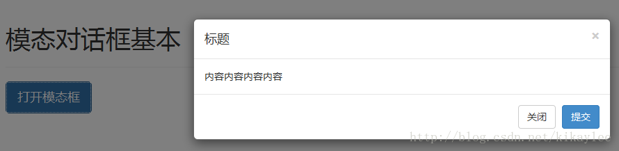
几点说明:
(1)使用模态窗口,需要有某种触发器,可以使用按钮或链接。这里我们使用的是按钮。
(2)data-target="#myModal" 是想要在页面上加载的模态框的目标。
(3)在模态框中需要注意两点:一是.modal,用来把 <div> 的内容识别为模态框;二是 .fade class。当模态框被切换时,它会引起内容淡入淡出。
(4)<div class="modal-header">,modal-header 是为模态窗口的头部定义样式的类。
(5)class="close",close 是一个 CSS class,用于为模态窗口的关闭按钮设置样式。
(6)data-dismiss="modal",是一个自定义的 HTML5 data 属性。在这里它被用于关闭模态窗口。
(7)class="modal-body",是 Bootstrap CSS 的一个 CSS class,用于为模态窗口的主体设置样式。
(8)class="modal-footer",是 Bootstrap CSS 的一个 CSS class,用于为模态窗口的底部设置样式。
(9)data-toggle="modal",HTML5 自定义的 data 属性 data-toggle 用于打开模态窗口。
0x02 JS方式加载
除了上面通过属性方式加载外,还可以通过JS方式加载模态对话框,下面是一个用户登录界面的简单实现:
<!DOCTYPE html>
<html lang="zh-cn">
<head>
<meta charset="UTF-8">
<meta name="viewport" content="width=device-width, initial-scale=1">
<link href="../../css/bootstrap.min.css" rel="stylesheet">
<script src="http://cdn.bootcss.com/jquery/1.11.1/jquery.min.js"></script>
<script src="../../js/bootstrap.min.js"></script>
<style>
.col-center-block{
float: none;
display: block;
margin-left: auto;
margin-right: auto;
}
</style>
<title>js加载例子</title>
</head>
<body>
<div class="container">
<div class="page-header">
<h1>js加载模态对话框</h1>
</div>
<div>
<button type="button" class="btn btn-lg btn-primary btn-myModal" data-toggle="modal">弹出对话框</button>
<div id="myModal" class="modal fade">
<div class="modal-dialog" style="width: 20%">
<div class="modal-content">
<div class="modal-header">
<button type="button" class="close" data-dismiss="modal" aria-hidden="true">×</button>
<h4 class="modal-title">用户登录</h4>
</div>
<div class="modal-body">
<div>
<form>
<div class="form-group">
<label class="control-label" for="UserName">用户名</label>
<input type="text" class="form-control" id="UserName" placeholder="用户名">
</div>
<div class="form-group">
<label class="control-label" for="Password">密码</label>
<input type="password" class="form-control" id="Password" placeholder="密码">
</div>
<div class="form-group">
<label>
<input type="checkbox"> 下次自动登录
</label>
<a href="#" class="pull-right">忘记密码</a>
</div>
<div class="form-group">
<button type="submit" class="btn btn-primary form-control">登录</button>
</div>
</form>
</div>
</div>
</div>
</div>
</div>
</div>
</div>
<script>
$(function () {
$(".btn-myModal").click(function () {
$("#myModal").modal({
keyboard:true,
// remote:"../Alerts.html"
})
})
$("#myModal").on("hidden.bs.modal",function () {
// alert('test');
})
})
</script>
</body>
</html>效果如下:
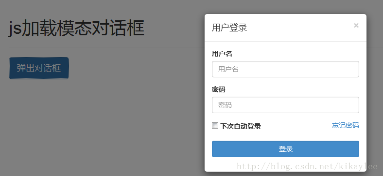
上面的例子包含了JS加载modal的过程,也包括了设置模态对话框宽度、响应事件等内容。modal方法结合一些参数来实现特殊效果:
(1)把内容作为模态框激活。接受一个可选的选项对象:
$("#myModal").modal({
keyboard:true,
})
(2)状态切换
$("#myModal").modal('toggle')  //手动打开模态框。
$("#myModal").modal('hide')   //手动隐藏模态框。
0x03 事件
Bootstrap模态对话框还定义了事件,通过“钩子”的方式调用:
(1)show.bs.modal
在调用 show 方法后触发:
$('#myModal').on('show.bs.modal', function () {
  // 执行一些动作...
})
(2)shown.bs.modal
当模态框对用户可见时触发(将等待 CSS 过渡效果完成):
$('#myModal').on('shown.bs.modal', function () {
  // 执行一些动作...
})
(3)hide.bs.modal
当调用 hide 实例方法时触发:
$('#myModal').on('hide.bs.modal', function () {
  // 执行一些动作...
})
(4)hidden.bs.modal
当模态框完全对用户隐藏时触发:
$('#myModal').on('hidden.bs.modal', function () {
  // 执行一些动作...
})
上面用户登录的例子中事件部分代码:
$("#myModal").on("hidden.bs.modal",function () {
      alert('test');
  })
当模态框完全对用户隐藏时,就会调用执行这段JS代码。


 2万+
2万+

 被折叠的 条评论
为什么被折叠?
被折叠的 条评论
为什么被折叠?
 到【灌水乐园】发言


