


转自:http://www.androidchina.net/4203.html#rd?sukey=014c68f407f2d3e13756cff06b9baa28584128bb29f69add6d8f77c0bf439c9df6b75d47891d253e316fda1c5d523794
Android中提供了各种类型的Drawable,也可以用XML定义各种Drawable。本文重点讲述如何用XML中的shape节点定义GradientDrawable。
用XML定义的drawable文件放在res/drawable目录下。
用XML文件定义GradientDrawable的语法如下所示:
|
1
2
3
4
5
6
7
8
9
10
11
12
13
14
15
16
17
18
19
20
21
22
23
24
25
26
27
28
29
30
31
32
33
34
35
36
|
<?
xml
version
=
"1.0"
encoding
=
"utf-8"
?>
<
shape
android:shape=["rectangle" | "oval" | "line" | "ring"] >
<
corners
android:radius
=
"integer"
android:topLeftRadius
=
"integer"
android:topRightRadius
=
"integer"
android:bottomLeftRadius
=
"integer"
android:bottomRightRadius
=
"integer"
/>
<
gradient
android:angle
=
"integer"
android:centerX
=
"integer"
android:centerY
=
"integer"
android:centerColor
=
"integer"
android:endColor
=
"color"
android:gradientRadius
=
"integer"
android:startColor
=
"color"
android:type=["linear" | "radial" | "sweep"]
android:useLevel=["true" | "false"] />
<
padding
android:left
=
"integer"
android:top
=
"integer"
android:right
=
"integer"
android:bottom
=
"integer"
/>
<
size
android:width
=
"integer"
android:height
=
"integer"
/>
<
solid
android:color
=
"color"
/>
<
stroke
android:width
=
"integer"
android:color
=
"color"
android:dashWidth
=
"integer"
android:dashGap
=
"integer"
/>
</
shape
>
|
该文件以<shape>为根结点,其shape属性可取四种值:rectangle、oval、line或ring。以上语法格式中虽然列出了很多属性,但是并不是对于所有类型的shape都支持这些属性。下面分别对这四种shape进行讲解。
rectangle
在res/drawable下面用XML文件定义了一个名为rectangle的GradientDrawable,其对应的shape值为rectangle,表明我们定义的drawable的形状是矩形。在layout文件中定义了一个TextView,其使用了上述drawable,如下所示:
|
1
2
3
4
|
<
TextView
android:text
=
"@string/hello_world"
android:layout_width
=
"200dp"
android:layout_height
=
"100dp"
android:background
=
"@drawable/rectangle"
/>
|
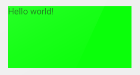
- solidrectangle.xml定义如下所示:
12345
<?xmlversion="1.0"encoding="utf-8"?>android:shape="rectangle"><solidandroid:color="#00ff00"/></shape>在上面的XML文件中,我们将shape属性设置为
rectangle,我们将<solid>节点的color属性设置为绿色,<solid>属性是用来设置面的填充色的,效果如下所示:
- corners
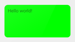
<corners>节点用于设置drawable四个拐角的半径,对应的XML文件如下所示:123456<?xmlversion="1.0"encoding="utf-8"?>android:shape="rectangle"><solidandroid:color="#00ff00"/><cornersandroid:radius="20dp"/></shape>效果如下所示:
只有当
shape属性值为rectangle时,<corners>节点才会有用。<corners>节点的radius属性同时定义了四个角的半径,如果想让这四个角的半径不一样,可以分别设置topLeftRadius、topRightRadius、bottomLeftRadius和bottomRightRadius属性,不过在设置这四个属性之前应先设置radius属性作为默认值,且默认值要大于1,无法正常使用其他四个属性。 - padding
<padding>节点用于设置drawable的padding,可以分别设置left、right、top、bottom四个属性,其作用与直接对TextView设置的四个paddingLeft、paddingRight、paddingTop、paddingBottom属性等价。XML文件如下所示:12345678910<?xmlversion="1.0"encoding="utf-8"?>android:shape="rectangle"><solidandroid:color="#00ff00"/><cornersandroid:radius="20dp"/><paddingandroid:left="10dp"android:right="10dp"android:top="10dp"android:bottom="10dp"/></shape>效果如下所示:
- size
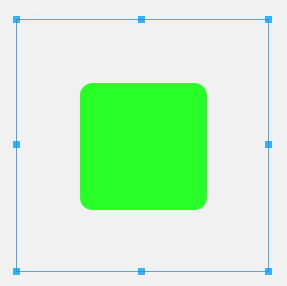
可以用<size>节点的width和height属性设置drawable的尺寸。默认情况下,用<shape>定义的drawable会自动缩放到包含drawable的View尺寸范围。比如我们有如下的ImageView的src设置了<shape>定义的drawable,当我们设置了其scaleType值为center时,<shape>中定义的size尺寸就会限制drawable缩放。定义的ImageView如下所示:123456<ImageViewandroid:layout_width="200dp"android:layout_height="200dp"android:src="@drawable/rectangle"android:scaleType="center"/>对应的drawable定义如下所示:
12345678<?xmlversion="1.0"encoding="utf-8"?>android:shape="rectangle"><solidandroid:color="#00ff00"/><cornersandroid:radius="20dp"/><sizeandroid:width="100dp"android:height="100dp"/></shape>效果如下所示:
- stroke
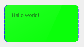
可以用<stroke>节点设置drawable的轮廓线,通过width属性设置轮廓线的宽度,通过color属性设置轮廓线的颜色。默认情况下,<stroke>定义的是实线,除此之外,还可以设置dashWidth和dashGap属性,如果设置了这两个属性,那么就是虚线。其中,dashWidth定义了每个虚线段的长度,dashGap定义了两个虚线段之间的距离。对应的XML文件如下所示:1234567891011121314<?xmlversion="1.0"encoding="utf-8"?>android:shape="rectangle"><solidandroid:color="#00ff00"/><cornersandroid:radius="20dp"/><paddingandroid:left="20dp"android:top="20dp"android:right="20dp"android:bottom="20dp"/><strokeandroid:width="1dp"android:color="#0000ff"android:dashWidth="8dp"android:dashGap="2dp"/></shape>效果如下所示:
- gradient
上面我们说到,通过<solid>可以设置drawable的颜色,但是只是一种纯色,如果想让drawable产生渐变效果,可以使用<gradient>节点创建渐变色效果。<gradient>节点具有以下属性:type、startColor、centerColor、endColor、angle、centerX、centerY、gradientRadius。其中type有三种取值:linear、radial和sweep,默认值是linear。当type取不同的值时,<gradient>并不是支持全部属性,下面详细说明。- linear
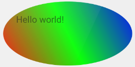
当<gradient>的type值为linear时,表示颜色是线性渐变的,此时支持startColor、centerColor、endColor、angle这四个属性,其他属性不支持。我们可以通过设置startColor和endColor指定渐变的起始颜色以及终止颜色,XML如下所示:123456789101112<?xmlversion="1.0"encoding="utf-8"?>android:shape="rectangle"><cornersandroid:radius="20dp"/><paddingandroid:left="20dp"android:top="20dp"android:right="20dp"android:bottom="20dp"/><gradientandroid:type="linear"android:startColor="#ff0000"android:endColor="#0000ff"/></shape>我们将startColor设置为红色,endColor设置为蓝色,效果如下所示:
我们还可以设置centerColor属性,指定中间色,XML如下所示:
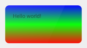
12345678910111213<?xmlversion="1.0"encoding="utf-8"?>android:shape="rectangle"><cornersandroid:radius="20dp"/><paddingandroid:left="20dp"android:top="20dp"android:right="20dp"android:bottom="20dp"/><gradientandroid:type="linear"android:startColor="#ff0000"android:centerColor="#00ff00"android:endColor="#0000ff"/></shape>我们将中间色设置为绿色,效果如下所示:
默认情况下,渐变是从左向右进行的,如果想调整渐变的方向可以设置
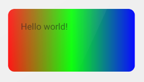
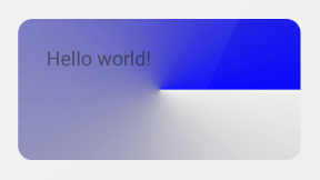
angle属性,angle的默认值为0,对应着自左向右渐变,angle的单位是角度,angle的值必须是45的倍数,否则不会有渐变效果。我们可以更改angle值,XML如下所示:1234567891011121314<?xmlversion="1.0"encoding="utf-8"?>android:shape="rectangle"><cornersandroid:radius="20dp"/><paddingandroid:left="20dp"android:top="20dp"android:right="20dp"android:bottom="20dp"/><gradientandroid:type="linear"android:startColor="#ff0000"android:centerColor="#00ff00"android:endColor="#0000ff"android:angle="90"/></shape>我们将angle设置为90度,那么渐变方向就变成了从下上,效果如下所示:
- radial
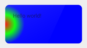
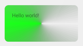
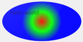
当<gradient>的type值为radial时,表示颜色从某点向周围辐射渐变,此时支持除angle之外的其他所有属性。我们必须通过设置gradientRadius属性以指定渐变的辐射半径,通过startColor指定起始颜色,XML如下所示:123456789101112<?xmlversion="1.0"encoding="utf-8"?>android:shape="rectangle"><cornersandroid:radius="20dp"/><paddingandroid:left="20dp"android:top="20dp"android:right="20dp"android:bottom="20dp"/><gradientandroid:type="radial"android:gradientRadius="50dp"android:startColor="#ff0000"/></shape>我们将startColor设置为红色,效果如下所示:
由上图我们可以发现,startColor(红色)从中心沿着圆的半径逐渐变淡。
在设置了startColor的基础上,我们还可以设置centerColor,XML如下所示:
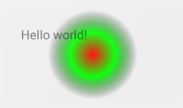
12345678910111213<?xmlversion="1.0"encoding="utf-8"?>android:shape="rectangle"><cornersandroid:radius="20dp"/><paddingandroid:left="20dp"android:top="20dp"android:right="20dp"android:bottom="20dp"/><gradientandroid:type="radial"android:gradientRadius="50dp"android:startColor="#ff0000"android:centerColor="#00ff00"/></shape>效果如下图所示:
由上图可以看出,startColor(红色)从中心沿着圆的半径逐渐渐变到centerColor(绿色)。
除了设置startColor、centerColor,还可以设置endColor,XML如下所示:
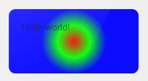
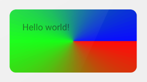
1234567891011121314<?xmlversion="1.0"encoding="utf-8"?>android:shape="rectangle"><cornersandroid:radius="20dp"/><paddingandroid:left="20dp"android:top="20dp"android:right="20dp"android:bottom="20dp"/><gradientandroid:type="radial"android:gradientRadius="50dp"android:startColor="#ff0000"android:centerColor="#00ff00"android:endColor="#0000ff"/></shape>我们将centerColor设置为绿色,效果如下所示:
由上图可以看出,startColor(红色)从中心沿着圆的半径逐渐渐变到centerColor(绿色),在指定的半径之外颜色用endColor(蓝色)填充。其实,startColor、centerColor、endColor这三个属性可以任意组合,大家可以自己尝试一下各种组合的效果。
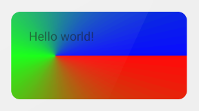
默认圆心的位置处于drawable的中心,我们可以通过centerX和centerY属性改变渐变圆心的位置,centerX和centerY的取值范围都是0到1,这两个属性的默认值都是0.5,drawable的左上角的centerX和centerY的值都是0,右下角的centerX和centerY的值都是1。我们改变centerX和centerY的值,XML如下所示:
12345678910111213141516<?xmlversion="1.0"encoding="utf-8"?>android:shape="rectangle"><cornersandroid:radius="20dp"/><paddingandroid:left="20dp"android:top="20dp"android:right="20dp"android:bottom="20dp"/><gradientandroid:type="radial"android:gradientRadius="50dp"android:startColor="#ff0000"android:centerColor="#00ff00"android:endColor="#0000ff"android:centerX="0"android:centerY="0.5"/></shape>效果如下所示:
- sweep
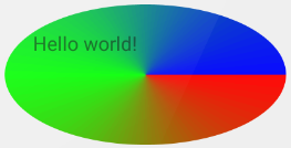
当<gradient>的type值为sweep时,表示颜色是围绕中心点360度顺时针旋转的,起点就是3点钟位置。
我们可以只设置startColor,XML文件如下所示:1234567891011<?xmlversion="1.0"encoding="utf-8"?>android:shape="rectangle"><cornersandroid:radius="20dp"/><paddingandroid:left="20dp"android:top="20dp"android:right="20dp"android:bottom="20dp"/><gradientandroid:type="sweep"android:startColor="#ff0000"/></shape>我们将startColor设置为红色,效果如下所示:
我们也可以只设置endColor,XML文件如下所示:
1234567891011<?xmlversion="1.0"encoding="utf-8"?>android:shape="rectangle"><cornersandroid:radius="20dp"/><paddingandroid:left="20dp"android:top="20dp"android:right="20dp"android:bottom="20dp"/><gradientandroid:type="sweep"android:endColor="#0000ff"/></shape>将endColor设置为蓝色,效果如下所示:
我们也可以只设置centerColor的值,XML文件如下所示:
1234567891011<?xmlversion="1.0"encoding="utf-8"?>android:shape="rectangle"><cornersandroid:radius="20dp"/><paddingandroid:left="20dp"android:top="20dp"android:right="20dp"android:bottom="20dp"/><gradientandroid:type="sweep"android:centerColor="#00ff00"/></shape>将centerColor设置为绿色,效果如下所示:
我们也可以同时设置startColor、centerColor、endColor的值,XML文件如下所示:
12345678910111213<?xmlversion="1.0"encoding="utf-8"?>android:shape="rectangle"><cornersandroid:radius="20dp"/><paddingandroid:left="20dp"android:top="20dp"android:right="20dp"android:bottom="20dp"/><gradientandroid:type="sweep"android:startColor="#ff0000"android:centerColor="#00ff00"android:endColor="#0000ff"/></shape>将startColor、centerColor、endColor分别设置为红、绿、蓝,效果如下所示:
centerX和centerY的默认值都是0.5,表示中心点的默认位置就是drawable的中心,我们也可以更改centerX和centerY的值,从而更新中心点的位置,XML文件如下所示:
123456789101112131415<?xmlversion="1.0"encoding="utf-8"?>android:shape="rectangle"><cornersandroid:radius="20dp"/><paddingandroid:left="20dp"android:top="20dp"android:right="20dp"android:bottom="20dp"/><gradientandroid:type="sweep"android:startColor="#ff0000"android:centerColor="#00ff00"android:endColor="#0000ff"android:centerX="0.25"android:centerY="0.5"/></shape>我们将centerX的值设置为0.25,效果如下所示:
- linear
oval
在res/drawable下面用XML文件定义了一个名为oval的GradientDrawable,其对应的shape值为oval,表示drawable的形状是椭圆,并将该drawable作为TextView的background。oval和rectangle的主要区别就是drawable的形状不同,大部分的节点属性的作用是相同的。
- solid
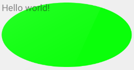
如同rectangle,我们可以通过solid指定drawable的颜色,XML如下所示:12345<?xmlversion="1.0"encoding="utf-8"?>android:shape="oval"><solidandroid:color="#00ff00"/></shape>效果如下所示:
- corners
当shape为oval时,不支持<corners>节点。 - padding
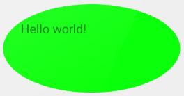
oval同样支持<padding>节点,将四个padding值设置为20dp,效果如下所示:
- size
oval不支持<size>节点。 - stroke
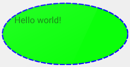
同rectangle一样,我们也可以为oval设定<stroke>,效果如下所示:
- gradient
oval同样支持<gradient>节点实现渐变效果,type属性也是支持linear、radial、sweep三个属性。<gradient>节点实现的渐变效果桶rectangle的渐变效果基本一样。- linear
当type为linear时,实现线性渐变效果,我们将startColor、centerColor、endColor分别设置为红、绿、蓝,并设置angle为45度,效果如下所示:
- radial
当type为radial时,实现放射渐变效果,我们将startColor、centerColor、endColor分别设置为红、绿、蓝,效果如下所示:
- sweep
当type为sweep时,表示颜色是围绕中心点360度顺时针旋转的,起点就是3点钟位置。我们将startColor、centerColor、endColor分别设置为红、绿、蓝,效果如下所示:
<gradient>节点中的多个参数组合的效果可以参见上述rectangle中的说明。
- linear
line
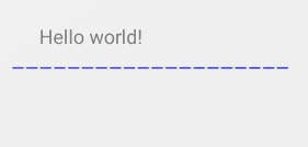
在res/drawable下面用XML文件定义了一个名为line的GradientDrawable,其对应的shape值为line,并将该drawable作为TextView的background。当shape为line时,表示drawable的形状是线,该线会分割drawable。line只支持<stroke>和<padding>两个节点,不支持其他的节点。
XML文件如下所示:
|
1
2
3
4
5
6
7
8
9
10
11
12
|
<?
xml
version
=
"1.0"
encoding
=
"utf-8"
?>
android:shape
=
"line"
>
<
stroke
android:color
=
"#0000ff"
android:width
=
"1dp"
android:dashWidth
=
"8dp"
android:dashGap
=
"2dp"
/>
<
padding
android:left
=
"20dp"
android:right
=
"20dp"
android:top
=
"20dp"
android:bottom
=
"20dp"
/>
</
shape
>
|
效果如下所示:
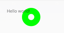
ring
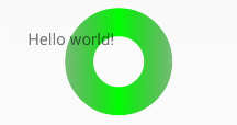
在res/drawable下面用XML文件定义了一个名为ring的GradientDrawable,其对应的shape值为ring,表示drawable的形状是圆环,并将该drawable作为TextView的background。所谓圆环就是大圆套小圆。当shape为ring时,shape有额外的四个属性可用:innerRadius、thickness、innerRadiusRatio、thicknessRatio。
需要特别注意的是,在API<=19的真机上使用shape为ring的drawable时,Android有个bug,会不显示drawable,解决办法是将shape设置useLevel属性为true。
我们通过innerRadius指定小圆的半径,通过thickness指定大圆和小圆之间的宽度。XML如下所示:
|
1
2
3
4
5
6
7
8
9
10
11
12
|
<?
xml
version
=
"1.0"
encoding
=
"utf-8"
?>
android:shape
=
"ring"
android:innerRadius
=
"10dp"
android:thickness
=
"20dp"
android:useLevel
=
"false"
>
<
solid
android:color
=
"#00ff00"
/>
<
padding
android:left
=
"20dp"
android:right
=
"20dp"
android:top
=
"20dp"
android:bottom
=
"20dp"
/>
</
shape
>
|
效果如下所示:
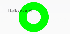
我们还可以通过innerRadiusRatio指定小圆的半径,innerRadiusRatio的值是float类型,如果其值是9,表示小圆的半径等于TextView宽度的1/9。同样,也可以通过thicknessRatio指定大圆和小圆之间的宽度,其值类型也是float,如果值为8,则表示大小圆之间的宽度等于TextView的1/8。XML文件如下所示:
|
1
2
3
4
5
6
7
8
9
10
11
12
|
<?
xml
version
=
"1.0"
encoding
=
"utf-8"
?>
android:shape
=
"ring"
android:innerRadiusRatio
=
"9"
android:thicknessRatio
=
"8"
android:useLevel
=
"false"
>
<
solid
android:color
=
"#00ff00"
/>
<
padding
android:left
=
"20dp"
android:right
=
"20dp"
android:top
=
"20dp"
android:bottom
=
"20dp"
/>
</
shape
>
|
效果如下所示:
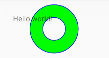
如果给ring设置了<stroke>,那么大小圆都会使用该设置的轮廓线,效果如下所示:
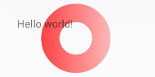
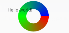
ring同样支持<gradient>实现渐变效果,默认type为linear,只将startColor设置为红色,效果如下所示:
type为linear时,只将centerColor设置为绿色,效果如下所示:
type为linear时,只将endColor设置为蓝色,效果如下所示:

type为linear时,<gradient>也支持angle参数。大家可以自己尝试多种颜色的组合效果。
当<gradient>的type值设置为gradial时,需要指定gradientRadius属性,否则会报错。gradial并不能像上面那样实现辐射渐变效果,gradial的ring只是用startColor填充圆环的颜色,实现的效果与指定<solid>节点中的color属性相同,此处就不贴图了。
当type为sweep时,表示颜色是围绕中心点360度顺时针旋转的,起点就是3点钟位置。我们将startColor、centerColor、endColor分别设置为红、绿、蓝,效果如下所示:
希望本文对大家用Shape定义GradientDrawable有所帮助!


 扫一扫
扫一扫
 651
651

 被折叠的 条评论
为什么被折叠?
被折叠的 条评论
为什么被折叠?
 到【灌水乐园】发言


