


1. 先看下效果图:

这个需要用到1个开源的 库,这个后面也会说下的。

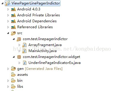
工程目录:
这个是每个标签卡中间 没想间隔线的那个效果,想要间隔线效果的话 在这个开源包的demo里面 tabs 里面有。但是下面的指示器 就不是随动的了。是按照选中标签卡后才会直接变化的,就不放效果图了。
1. MainActivity.java
public class MainActivity extends FragmentActivity {

	private ViewPagerFrameAdapter adapter;        //适配器(标题和内容)
	private ViewPager mPager;

	private TabPageIndicator         tabbPageIndicator;         //
	private UnderlinePageIndicatorEx underlinePageIndicator;

	private  int COUNT = 0;
	private List<String>   titles = new ArrayList<String>(); //标题


	@Override
	protected void onCreate(Bundle bundle) {
		     super.onCreate(bundle);
			 requestWindowFeature(Window.FEATURE_NO_TITLE);
			 setContentView(R.layout.activity_main);

			 //标题,这里自己造的假数据
			 for (int j = 0; j < 3 ; j++){
	               titles.add( "第"+ j +"标签卡");
			  }

	         mPager = (ViewPager)findViewById(R.id.pager);
             adapter = new ViewPagerFrameAdapter(getSupportFragmentManager(),titles);
    		 mPager.setAdapter(adapter);

    		 //得到指示器
			 tabbPageIndicator = (TabPageIndicator) findViewById(R.id.tab_indicator);
			 tabbPageIndicator.setViewPager(mPager);
		     //下标
			 underlinePageIndicator = (UnderlinePageIndicatorEx)findViewById(R.id.underline_indicator);
			 underlinePageIndicator.setViewPager(mPager);
			 underlinePageIndicator.setFades(false);
		     //设置指示器
		     tabbPageIndicator.setOnPageChangeListener(underlinePageIndicator);
	}

    //adapter 没啥好说的 跟前面的一样
	private class ViewPagerFrameAdapter extends FragmentStatePagerAdapter{

		private List<String> title; //页面标题头部数据

		public ViewPagerFrameAdapter(FragmentManager fm, List<String> title) {
			super(fm);
			this.title = title;
		}

		//根据position 返回 fragment
		@Override
		public Fragment getItem(int position) {
			return ArrayFragment.newInstance(position);
		}
        //size
		@Override
		public int getCount() {
		     return title.size();
		}

		//顶部的title
		@Override
		public CharSequence getPageTitle(int position) {
			if (titles != null){
				return titles.get(position).toString();
			}
			return super.getPageTitle(position);
		}
	}

}
UnderlinePageIndicatorEx.java
//继承这个然后重写
public class UnderlinePageIndicatorEx extends UnderlinePageIndicator{

	    public UnderlinePageIndicatorEx(Context context) {
		   super(context, null);
	    }

	    public UnderlinePageIndicatorEx(Context context, AttributeSet attrs) {
	    	super(context, attrs, R.attr.vpiUnderlinePageIndicatorStyle);
	    }

	    public UnderlinePageIndicatorEx(Context context, AttributeSet attrs, int defStyle) {
	        super(context, attrs, defStyle);
	    }

	    //自身的 ViewPage传递过去
	    @Override
	    public void setViewPager(ViewPager viewPager) {
	    	if (mViewPager == viewPager){
	            return;
	        }

//	        if (mViewPager != null) {
//	            mViewPager.setOnPageChangeListener(null);
//	        }

	        if (viewPager.getAdapter() == null) {
	            throw new IllegalStateException(" pager 没有 加入 adapter");
	        }

	        mViewPager = viewPager;
//	        mViewPager.setOnPageChangeListener(this);
	        invalidate();

	        post(new Runnable(){
	            @Override public void run() {
	                if (mFades) {
	                    post(mFadeRunnable);
	                }
	            }
	        });
	    }

}
ArrayFragment.java
public class ArrayFragment extends Fragment{

	private int position;

	public ArrayFragment(int position){
		this.position = position;
	}

	 // 返回   viwePager 下面滑动的页面
	public static ArrayFragment newInstance(int position){
		return new ArrayFragment(position);
	}

	@Override
	public void onCreate(Bundle savedInstanceState) {
		super.onCreate(savedInstanceState);
	}

	@Override
	public void onDestroy() {
		super.onDestroy();
	}

	// 根据position 返回不同的view
	@Override
	public View onCreateView(LayoutInflater inflater, ViewGroup container,
			Bundle savedInstanceState) {

		View view = inflater.inflate(R.layout.layoutaa, null);
		return view;
	}
}
好了接下来是 布局xml了。
<LinearLayout
        xmlns:android="http://schemas.android.com/apk/res/android"
        android:layout_width="fill_parent"
        android:layout_height="fill_parent"
        android:orientation="vertical"
      >

   <!--  标题      和      标题下面的  指示器  -->
     <LinearLayout
        android:layout_width="fill_parent"
        android:layout_height="35dp"
        android:orientation="vertical"
        android:background="@drawable/main_header_background">

		        <com.viewpagerindicator.TabPageIndicator
			        android:id="@+id/tab_indicator"
			        android:layout_height="wrap_content"
			        android:layout_width="fill_parent"/>

		        <com.test.linepagerindictor.widget.UnderlinePageIndicatorEx
			        android:id="@+id/underline_indicator"
			        android:layout_height="3dip"
			        android:layout_width="fill_parent"
			        android:layout_alignParentBottom="true"/>

       </LinearLayout>

       <android.support.v4.view.ViewPager
        android:id="@+id/pager"
        android:layout_width="fill_parent"
        android:layout_height="fill_parent"/>

</LinearLayout>
接下来设置 滑动指示器的style
  <!-- 总 style  直接引用  这个   由  tab style  和    Indicator style 组成 -->
    <style name="StyledAllIndicators" parent="@android:style/Theme.Light">
        <item name="vpiTabPageIndicatorStyle">@style/CustomTabPageIndicator</item>
        <item name="vpiUnderlinePageIndicatorStyle">@style/CustomUnderlinePageIndicator</item>
    </style>

    <!-- tab的 style -->
    <style name="CustomTabPageIndicator" parent="Widget.TabPageIndicator">
        <item name="android:background">#00000000</item>
        <item name="android:textAppearance">@style/CustomTabPageIndicator_text</item>
        <item name="android:textColor">@color/selector_tab</item>
        <item name="android:textSize">20sp</item>

        <!-- 分割线,可有可无的 -->
        <item name="android:divider">@drawable/custom_tab_indicator_divider</item>
        <item name="android:dividerPadding">10dip</item>
        <item name="android:showDividers">middle</item>

        <item name="android:paddingTop">4dp</item>
        <item name="android:paddingLeft">8dp</item>
        <item name="android:paddingBottom">4dp</item>
        <item name="android:paddingRight">8dp</item>

        <item name="android:fadingEdge">horizontal</item>
        <item name="android:fadingEdgeLength">8dp</item>
    </style>

    <style name="CustomTabPageIndicator_text" parent="android:TextAppearance.Medium">
        <item name="android:typeface">monospace</item>
    </style>


    <!--  下标的指示器的颜色 -->
    <style name="CustomUnderlinePageIndicator">
        <item name="selectedColor">#EB5548</item>
        <item name="android:background">#00000000</item>
        <item name="fadeLength">1000</item>
        <item name="fadeDelay">1000</item>
    </style>
<?xml version="1.0" encoding="utf-8"?>

<selector xmlns:android="http://schemas.android.com/apk/res/android">
    <item android:state_selected="true" android:color="#91D228" />
    <item android:state_focused="true" android:color="#91D228" />
    <item android:color="#dddddd" />
</selector>
好了 ,基本就这些了 fragment的的那个xml 自己随意画吧, 那个开源库随后上传。
2.


这个下面的指示器是根据滑动时手势滑动的,并且相应的标签卡件也有相应的分割线
这个是用到了开源的 PagerSlidingTab 的样式。 其实就是自定义了 horizontalScrollView ,但是因为鉴于一些效果稍微的不同,就需要改些相应的东西。比如控制指示器的长度不填充。
/**
 *	滑动指示器pstsindicatorcolor颜色
 *	在视图的底部的全宽度的线pstsunderlinecolor颜色
 *	选项卡之间的分隔pstsdividercolor颜色
 *	滑动指示器pstsindicatorheightheight
 *	在视图的底部的全宽度的线pstsunderlineheight高度
 *	pstsdividerpadding顶部和底部填充的分频器
 *	pststabpaddingleftright左、右填充每个选项卡
 *	pstsscrolloffset卷轴被选择的标签的偏移
 *	pststabbackground背景绘制的每个标签,应该是一个statelistdrawable
 *	pstsshouldexpand如果设置为TRUE,每个标签都给予同样的重量,默认为false
 *	pststextallcaps如果为真,所有选项卡标题都是大写,默认为true
 *  indicatorleftrightpadsize
 */
public class PagerSlidingTabStrip extends HorizontalScrollView {

	public interface IconTabProvider {
		public int getPageIconResId(int position);
	}

	// @formatter:off
	private static final int[] ATTRS = new int[] {
		android.R.attr.textSize,
		android.R.attr.textColor
    };
	// @formatter:on

	private LinearLayout.LayoutParams defaultTabLayoutParams;
	private LinearLayout.LayoutParams expandedTabLayoutParams;

	private final PageListener pageListener = new PageListener();
	public OnPageChangeListener delegatePageListener;

	private LinearLayout tabsContainer;
	private ViewPager pager;

	private int tabCount;

	private int currentPosition = 0;
	private int selectedPosition = 0;
	private float currentPositionOffset = 0f;

	private Paint rectPaint;
	private Paint dividerPaint;

	private int indicatorColor = 0xFF666666; //滑动标签颜色
	private int underlineColor = 0x1A000000;//底部虚线颜色
	private int dividerColor = 0x1A000000;

	private boolean shouldExpand = false;
	private boolean textAllCaps = true;

	private int scrollOffset = 52;
	private int indicatorHeight = 8;  //底部滑动标签高度
	private int indicatorleftrightpadsize = 20;  //底部滑动标签左右减少宽度(默认30)


	private int underlineHeight = 2;  //底部虚线

	private int dividerPadding = 12;
	private int tabPadding = 24;
	private int dividerWidth = 1;

	private int tabTextSize = 12;
	private int tabTextColor = 0xFF666666;  //这个是标签卡上文字的颜色
	private int selectedTabTextColor = 0xFF666666;//选中标签卡上文字的颜色
	private Typeface tabTypeface = null;
	private int tabTypefaceStyle = Typeface.NORMAL;

	private int lastScrollX = 0;

	private int tabBackgroundResId = R.drawable.background_tab;

	private Locale locale;

	public PagerSlidingTabStrip(Context context) {
		this(context, null);
	}

	public PagerSlidingTabStrip(Context context, AttributeSet attrs) {
		this(context, attrs, 0);
	}

	public PagerSlidingTabStrip(Context context, AttributeSet attrs, int defStyle) {
		super(context, attrs, defStyle);

		setFillViewport(true);
		setWillNotDraw(false);

		tabsContainer = new LinearLayout(context);
		tabsContainer.setOrientation(LinearLayout.HORIZONTAL);
		tabsContainer.setLayoutParams(new LayoutParams(LayoutParams.MATCH_PARENT, LayoutParams.MATCH_PARENT));
		addView(tabsContainer);

		DisplayMetrics dm = getResources().getDisplayMetrics();

		scrollOffset = (int) TypedValue.applyDimension(TypedValue.COMPLEX_UNIT_DIP, scrollOffset, dm);
		indicatorHeight = (int) TypedValue.applyDimension(TypedValue.COMPLEX_UNIT_DIP, indicatorHeight, dm);
		underlineHeight = (int) TypedValue.applyDimension(TypedValue.COMPLEX_UNIT_DIP, underlineHeight, dm);
		dividerPadding = (int) TypedValue.applyDimension(TypedValue.COMPLEX_UNIT_DIP, dividerPadding, dm);
		tabPadding = (int) TypedValue.applyDimension(TypedValue.COMPLEX_UNIT_DIP, tabPadding, dm);
		dividerWidth = (int) TypedValue.applyDimension(TypedValue.COMPLEX_UNIT_DIP, dividerWidth, dm);
		tabTextSize = (int) TypedValue.applyDimension(TypedValue.COMPLEX_UNIT_SP, tabTextSize, dm);
		indicatorleftrightpadsize = (int) TypedValue.applyDimension(TypedValue.COMPLEX_UNIT_SP, indicatorleftrightpadsize, dm);


		// get system attrs (android:textSize and android:textColor)

		TypedArray a = context.obtainStyledAttributes(attrs, ATTRS);

		tabTextSize = a.getDimensionPixelSize(0, tabTextSize);
		tabTextColor = a.getColor(1, tabTextColor);

		a.recycle();

		// get custom attrs

		a = context.obtainStyledAttributes(attrs, R.styleable.PagerSlidingTabStrip);

		indicatorColor = a.getColor(R.styleable.PagerSlidingTabStrip_pstsIndicatorColor, indicatorColor);

		//tab文字选中时的颜色,默认和滑动指示器的颜色一致
		selectedTabTextColor=a.getColor(R.styleable.PagerSlidingTabStrip_selectedTabTextColor, indicatorColor);

		underlineColor = a.getColor(R.styleable.PagerSlidingTabStrip_pstsUnderlineColor, underlineColor);
		dividerColor = a.getColor(R.styleable.PagerSlidingTabStrip_pstsDividerColor, dividerColor);
		indicatorHeight = a.getDimensionPixelSize(R.styleable.PagerSlidingTabStrip_pstsIndicatorHeight, indicatorHeight);
		underlineHeight = a.getDimensionPixelSize(R.styleable.PagerSlidingTabStrip_pstsUnderlineHeight, underlineHeight);
		dividerPadding = a.getDimensionPixelSize(R.styleable.PagerSlidingTabStrip_pstsDividerPadding, dividerPadding);
		tabPadding = a.getDimensionPixelSize(R.styleable.PagerSlidingTabStrip_pstsTabPaddingLeftRight, tabPadding);
		tabBackgroundResId = a.getResourceId(R.styleable.PagerSlidingTabStrip_pstsTabBackground, tabBackgroundResId);
		shouldExpand = a.getBoolean(R.styleable.PagerSlidingTabStrip_pstsShouldExpand, shouldExpand);
		scrollOffset = a.getDimensionPixelSize(R.styleable.PagerSlidingTabStrip_pstsScrollOffset, scrollOffset);
		textAllCaps = a.getBoolean(R.styleable.PagerSlidingTabStrip_pstsTextAllCaps, textAllCaps);
		indicatorleftrightpadsize = a.getDimensionPixelSize(R.styleable.PagerSlidingTabStrip_indicatorleftrightpad, indicatorleftrightpadsize);

		a.recycle();

		rectPaint = new Paint();
		rectPaint.setAntiAlias(true);
		rectPaint.setStyle(Style.FILL);

		dividerPaint = new Paint();
		dividerPaint.setAntiAlias(true);
		dividerPaint.setStrokeWidth(dividerWidth);

		defaultTabLayoutParams = new LinearLayout.LayoutParams(LayoutParams.WRAP_CONTENT, LayoutParams.MATCH_PARENT);
		expandedTabLayoutParams = new LinearLayout.LayoutParams(0, LayoutParams.MATCH_PARENT, 1.0f);

		if (locale == null) {
			locale = getResources().getConfiguration().locale;
		}
	}

	public void setViewPager(ViewPager pager) {
		this.pager = pager;

		if (pager.getAdapter() == null) {
			throw new IllegalStateException("ViewPager does not have adapter instance.");
		}

		pager.setOnPageChangeListener(pageListener);

		notifyDataSetChanged();
	}

	public void setOnPageChangeListener(OnPageChangeListener listener) {
		this.delegatePageListener = listener;
	}

	public void notifyDataSetChanged() {

		tabsContainer.removeAllViews();

		tabCount = pager.getAdapter().getCount();

		for (int i = 0; i < tabCount; i++) {

			if (pager.getAdapter() instanceof IconTabProvider) {
				addIconTab(i, ((IconTabProvider) pager.getAdapter()).getPageIconResId(i));
			} else {
				addTextTab(i, pager.getAdapter().getPageTitle(i).toString());
			}

		}

		updateTabStyles();

		getViewTreeObserver().addOnGlobalLayoutListener(new OnGlobalLayoutListener() {

			@Override
			public void onGlobalLayout() {
				getViewTreeObserver().removeGlobalOnLayoutListener(this);
				currentPosition = pager.getCurrentItem();
				scrollToChild(currentPosition, 0);
			}
		});

	}

	private void addTextTab(final int position, String title) {

		TextView tab = new TextView(getContext());
		tab.setText(title);
		tab.setGravity(Gravity.CENTER);
		tab.setSingleLine();
		addTab(position, tab);
	}

	private void addIconTab(final int position, int resId) {

		ImageButton tab = new ImageButton(getContext());
		tab.setImageResource(resId);

		addTab(position, tab);

	}

	private void addTab(final int position, View tab) {
		tab.setFocusable(true);
		tab.setOnClickListener(new OnClickListener() {
			@Override
			public void onClick(View v) {
				pager.setCurrentItem(position);
			}
		});

		tab.setPadding(tabPadding, 0, tabPadding, 0);
		tabsContainer.addView(tab, position, shouldExpand ? expandedTabLayoutParams : defaultTabLayoutParams);
	}

	private void updateTabStyles() {

		for (int i = 0; i < tabCount; i++) {

			View v = tabsContainer.getChildAt(i);

			v.setBackgroundResource(tabBackgroundResId);

			if (v instanceof TextView) {

				TextView tab = (TextView) v;
				tab.setTextSize(TypedValue.COMPLEX_UNIT_PX, tabTextSize);
				tab.setTypeface(tabTypeface, tabTypefaceStyle);
				tab.setTextColor(tabTextColor);

				// setAllCaps() is only available from API 14, so the upper case is made manually if we are on a
				// pre-ICS-build
				if (textAllCaps) {
					if (Build.VERSION.SDK_INT >= Build.VERSION_CODES.ICE_CREAM_SANDWICH) {
						tab.setAllCaps(true);
					} else {
						tab.setText(tab.getText().toString().toUpperCase(locale));
					}
				}
				if (i == selectedPosition) {
					tab.setTextColor(selectedTabTextColor);
				}
			}
		}

	}

	private void scrollToChild(int position, int offset) {

		if (tabCount == 0) {
			return;
		}

		int newScrollX = tabsContainer.getChildAt(position).getLeft() + offset;

		if (position > 0 || offset > 0) {
			newScrollX -= scrollOffset;
		}

		if (newScrollX != lastScrollX) {
			lastScrollX = newScrollX;
			scrollTo(newScrollX, 0);
		}

	}

	@Override
	protected void onDraw(Canvas canvas) {
		super.onDraw(canvas);

		if (isInEditMode() || tabCount == 0) {
			return;
		}

		final int height = getHeight();

		// draw underline
		rectPaint.setColor(underlineColor);
		canvas.drawRect(0, height - underlineHeight, tabsContainer.getWidth(), height, rectPaint);

		// draw indicator line
		rectPaint.setColor(indicatorColor);

		// default: line below current tab
		View currentTab = tabsContainer.getChildAt(currentPosition);
		float lineLeft = currentTab.getLeft();
		float lineRight = currentTab.getRight();

		// if there is an offset, start interpolating left and right coordinates between current and next tab
		if (currentPositionOffset > 0f && currentPosition < tabCount - 1) {

			View nextTab = tabsContainer.getChildAt(currentPosition + 1);
			final float nextTabLeft = nextTab.getLeft();
			final float nextTabRight = nextTab.getRight();

			lineLeft = (currentPositionOffset * nextTabLeft + (1f - currentPositionOffset) * lineLeft);
			lineRight = (currentPositionOffset * nextTabRight + (1f - currentPositionOffset) * lineRight);
		}

		canvas.drawRect(lineLeft + indicatorleftrightpadsize, height - indicatorHeight, lineRight - indicatorleftrightpadsize, height, rectPaint);

		// draw divider

		dividerPaint.setColor(dividerColor);
		for (int i = 0; i < tabCount - 1; i++) {
			View tab = tabsContainer.getChildAt(i);
			canvas.drawLine(tab.getRight(), dividerPadding, tab.getRight(), height - dividerPadding, dividerPaint);
		}
	}

	private class PageListener implements OnPageChangeListener {

		@Override
		public void onPageScrolled(int position, float positionOffset, int positionOffsetPixels) {
			currentPosition = position;
			currentPositionOffset = positionOffset;

			scrollToChild(position, (int) (positionOffset * tabsContainer.getChildAt(position).getWidth()));

			invalidate();

			if (delegatePageListener != null) {
				delegatePageListener.onPageScrolled(position, positionOffset, positionOffsetPixels);
			}
		}

		@Override
		public void onPageScrollStateChanged(int state) {
			if (state == ViewPager.SCROLL_STATE_IDLE) {
				scrollToChild(pager.getCurrentItem(), 0);
			}

			if (delegatePageListener != null) {
				delegatePageListener.onPageScrollStateChanged(state);
			}
		}

		@Override
		public void onPageSelected(int position) {
			selectedPosition = position;
			updateTabStyles();
			if (delegatePageListener != null) {
				delegatePageListener.onPageSelected(position);
			}
		}

	}

	public void setIndicatorColor(int indicatorColor) {
		this.indicatorColor = indicatorColor;

		invalidate();
	}

	public void setIndicatorColorResource(int resId) {
		this.indicatorColor = getResources().getColor(resId);

		invalidate();
	}

	public int getIndicatorColor() {
		return this.indicatorColor;
	}

	public void setIndicatorHeight(int indicatorLineHeightPx) {
		this.indicatorHeight = indicatorLineHeightPx;
		invalidate();
	}

	public int getIndicatorHeight() {
		return indicatorHeight;
	}

	public void setUnderlineColor(int underlineColor) {
		this.underlineColor = underlineColor;
		invalidate();
	}

	public void setUnderlineColorResource(int resId) {
		this.underlineColor = getResources().getColor(resId);
		invalidate();
	}

	public int getUnderlineColor() {
		return underlineColor;
	}

	public void setDividerColor(int dividerColor) {
		this.dividerColor = dividerColor;
		invalidate();
	}

	public void setDividerColorResource(int resId) {
		this.dividerColor = getResources().getColor(resId);
		invalidate();
	}

	public int getDividerColor() {
		return dividerColor;
	}

	public void setUnderlineHeight(int underlineHeightPx) {
		this.underlineHeight = underlineHeightPx;
		invalidate();
	}

	public int getUnderlineHeight() {
		return underlineHeight;
	}

	public void setDividerPadding(int dividerPaddingPx) {
		this.dividerPadding = dividerPaddingPx;
		invalidate();
	}

	public int getDividerPadding() {
		return dividerPadding;
	}

	public void setScrollOffset(int scrollOffsetPx) {
		this.scrollOffset = scrollOffsetPx;
		invalidate();
	}

	public int getScrollOffset() {
		return scrollOffset;
	}

	public void setShouldExpand(boolean shouldExpand) {
		this.shouldExpand = shouldExpand;
		notifyDataSetChanged();
	}

	public boolean getShouldExpand() {
		return shouldExpand;
	}

	public boolean isTextAllCaps() {
		return textAllCaps;
	}

	public void setAllCaps(boolean textAllCaps) {
		this.textAllCaps = textAllCaps;
	}

	public void setTextSize(int textSizePx) {
		this.tabTextSize = textSizePx;
		updateTabStyles();
	}

	public int getTextSize() {
		return tabTextSize;
	}

	public void setTextColor(int textColor) {
		this.tabTextColor = textColor;
		updateTabStyles();
	}

	public void setTextColorResource(int resId) {
		this.tabTextColor = getResources().getColor(resId);
		updateTabStyles();
	}

	public int getTextColor() {
		return tabTextColor;
	}

	public void setSelectedTextColor(int textColor) {
		this.selectedTabTextColor = textColor;
		updateTabStyles();
	}

	public void setSelectedTextColorResource(int resId) {
		this.selectedTabTextColor = getResources().getColor(resId);
		updateTabStyles();
	}

	public int getSelectedTextColor() {
		return selectedTabTextColor;
	}

	public void setTypeface(Typeface typeface, int style) {
		this.tabTypeface = typeface;
		this.tabTypefaceStyle = style;
		updateTabStyles();
	}

	public void setTabBackground(int resId) {
		this.tabBackgroundResId = resId;
		updateTabStyles();
	}

	public int getTabBackground() {
		return tabBackgroundResId;
	}

	public void setTabPaddingLeftRight(int paddingPx) {
		this.tabPadding = paddingPx;
		updateTabStyles();
	}

	public int getTabPaddingLeftRight() {
		return tabPadding;
	}

	@Override
	public void onRestoreInstanceState(Parcelable state) {
		SavedState savedState = (SavedState) state;
		super.onRestoreInstanceState(savedState.getSuperState());
		currentPosition = savedState.currentPosition;
		requestLayout();
	}

	@Override
	public Parcelable onSaveInstanceState() {
		Parcelable superState = super.onSaveInstanceState();
		SavedState savedState = new SavedState(superState);
		savedState.currentPosition = currentPosition;
		return savedState;
	}

	static class SavedState extends BaseSavedState {
		int currentPosition;

		public SavedState(Parcelable superState) {
			super(superState);
		}

		private SavedState(Parcel in) {
			super(in);
			currentPosition = in.readInt();
		}

		@Override
		public void writeToParcel(Parcel dest, int flags) {
			super.writeToParcel(dest, flags);
			dest.writeInt(currentPosition);
		}

		public static final Parcelable.Creator<SavedState> CREATOR = new Parcelable.Creator<SavedState>() {
			@Override
			public SavedState createFromParcel(Parcel in) {
				return new SavedState(in);
			}

			@Override
			public SavedState[] newArray(int size) {
				return new SavedState[size];
			}
		};
	}

}<?xml version="1.0" encoding="utf-8"?>
<resources>
<declare-styleable name="PagerSlidingTabStrip">
<attr name="pstsIndicatorColor" format="color" />
<attr name="pstsUnderlineColor" format="color" />
<attr name="pstsDividerColor" format="color" />
<attr name="pstsIndicatorHeight" format="dimension" />
<attr name="pstsUnderlineHeight" format="dimension" />
<attr name="pstsDividerPadding" format="dimension" />
<attr name="pstsTabPaddingLeftRight" format="dimension" />
<attr name="pstsScrollOffset" format="dimension" />
<attr name="pstsTabBackground" format="reference" />
<attr name="pstsShouldExpand" format="boolean" />
<attr name="pstsTextAllCaps" format="boolean" />
<attr name="selectedTabTextColor" format="color" />
<attr name="indicatorleftrightpad" format="dimension" />
</declare-styleable>
</resources>
标签卡点击时的切换 xml
<?xml version="1.0" encoding="utf-8"?>
<selector xmlns:android="http://schemas.android.com/apk/res/android" android:exitFadeDuration="@android:integer/config_shortAnimTime">
    <item android:state_pressed="true" android:drawable="@android:color/transparent" />
    <item android:state_focused="true" android:drawable="@android:color/transparent"/>
    <item android:drawable="@android:color/transparent"/>
</selector>
布局文件xml
<RelativeLayout xmlns:android="http://schemas.android.com/apk/res/android"
    xmlns:tools="http://schemas.android.com/tools"
    android:layout_width="match_parent"
    android:layout_height="match_parent"
    xmlns:pst="http://schemas.android.com/apk/res/com.astuetz">

    <com.astuetz.PagerSlidingTabStrip
        android:id="@+id/tabs"
        android:layout_width="match_parent"
        android:layout_height="40dp"
        android:background="@android:color/white"
        pst:pstsShouldExpand="true"
        pst:pstsUnderlineHeight="0dp"
        pst:pstsIndicatorHeight="2dp"
        pst:pstsIndicatorColor="@android:color/holo_blue_light"
       	pst:selectedTabTextColor="@android:color/holo_blue_light"
        pst:pstsDividerColor="@android:color/transparent"
	    pst:pstsTabBackground="@drawable/background_tab"
	    pst:indicatorleftrightpad="15dip"
         />

    <android.support.v4.view.ViewPager
        android:id="@+id/pager"
        android:layout_width="match_parent"
        android:layout_height="wrap_content"
        android:layout_below="@+id/tabs" />

</RelativeLayout>
调用时界面代码
public class MainActivity extends FragmentActivity {
	PagerSlidingTabStrip tabs;
	ViewPager pager;

	String[] titles = { "第0个标签卡", "第1个标签卡", "第2个标签卡" };
	@Override
	protected void onCreate(Bundle savedInstanceState) {
		super.onCreate(savedInstanceState);
		initView();
	}

	private void initView(){
		setContentView(R.layout.activity_main);
		pager = (ViewPager) findViewById(R.id.pager);
		tabs = (PagerSlidingTabStrip) findViewById(R.id.tabs);
		pager.setAdapter(new MyAdapter(getSupportFragmentManager(),titles));
		tabs.setViewPager(pager);
	}


	public class MyAdapter extends FragmentPagerAdapter{
		String[] _titles;
		public MyAdapter(FragmentManager fm,String[] titles) {
			super(fm);
			_titles=titles;
		}

		@Override
		public CharSequence getPageTitle(int position) {
			return _titles[position];
		}

		@Override
		public int getCount() {
			return _titles.length;
		}

		@Override
		public Fragment getItem(int position) {

			return  null;
		}
	}
}


 705
705

 被折叠的 条评论
为什么被折叠?
被折叠的 条评论
为什么被折叠?
 到【灌水乐园】发言


