


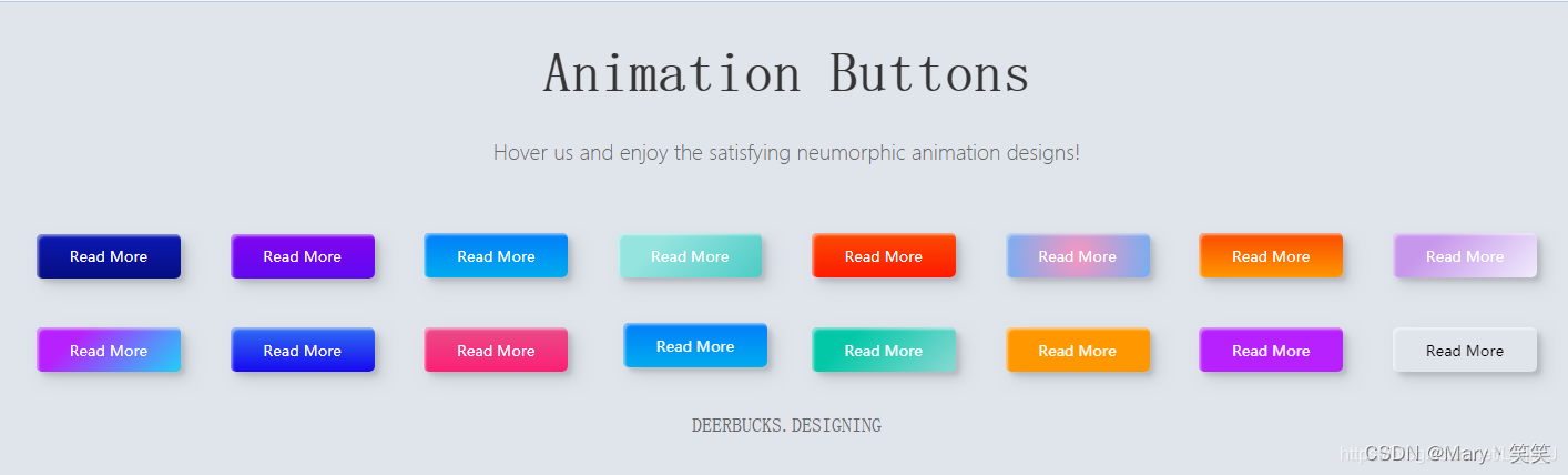
展示效果
[注意:]并不是单纯的效果,而是有动画的
代码段
<!DOCTYPE html>
<html>
	<head>
		<meta charset="UTF-8">
		<title></title>
	</head>
	<body>

		<h1>Animation Buttons</h1>
		<p>Hover us and enjoy the satisfying neumorphic animation designs!</p>
		<div class="frame">
		  <button class="custom-btn btn-1">Read More</button>
		  <button class="custom-btn btn-2">Read More</button>
		  <button class="custom-btn btn-3"><span>Read More</span></button>
		  <button class="custom-btn btn-4"><span>Read More</span></button>
		  <button class="custom-btn btn-5"><span>Read More</span></button>
		  <button class="custom-btn btn-6"><span>Read More</span></button>
		  <button class="custom-btn btn-7"><span>Read More</span></button>
		  <button class="custom-btn btn-8"><span>Read More</span></button>
		  <button class="custom-btn btn-9">Read More</button>
		  <button class="custom-btn btn-10">Read More</button>
		  <button class="custom-btn btn-11">Read More<div class="dot"></div></button>
		  <button class="custom-btn btn-12"><span>Click!</span><span>Read More</span></button>
		  <button class="custom-btn btn-13">Read More</button>
		  <button class="custom-btn btn-14">Read More</button>
		  <button class="custom-btn btn-15">Read More</button>
		  <button class="custom-btn btn-16">Read More</button>
		  <p style="font-family: Andale Mono, monospace;">
		    DEERBUCKS.DESIGNING</p>
		</div>

	</body>
</html>
<style>

	body {
	  background: #e0e5ec;
	}
	h1 {
	  position: relative;
	  text-align: center;
	  color: #353535;
	  font-size: 50px;
	  font-family: "Cormorant Garamond", serif;
	}

	p {
	  font-family: 'Lato', sans-serif;
	  font-weight: 300;
	  text-align: center;
	  font-size: 18px;
	  color: #676767;
	}
	.frame {
	  width: 90%;
	  margin: 40px auto;
	  text-align: center;
	}
	button {
	  margin: 20px;
	}
	.custom-btn {
	  width: 130px;
	  height: 40px;
	  color: #fff;
	  border-radius: 5px;
	  padding: 10px 25px;
	  font-family: 'Lato', sans-serif;
	  font-weight: 500;
	  background: transparent;
	  cursor: pointer;
	  transition: all 0.3s ease;
	  position: relative;
	  display: inline-block;
	   box-shadow:inset 2px 2px 2px 0px rgba(255,255,255,.5),
	   7px 7px 20px 0px rgba(0,0,0,.1),
	   4px 4px 5px 0px rgba(0,0,0,.1);
	  outline: none;
	}

	/* 1 */
	.btn-1 {
	  background: rgb(6,14,131);
	  background: linear-gradient(0deg, rgba(6,14,131,1) 0%, rgba(12,25,180,1) 100%);
	  border: none;
	}
	.btn-1:hover {
	   background: rgb(0,3,255);
	background: linear-gradient(0deg, rgba(0,3,255,1) 0%, rgba(2,126,251,1) 100%);
	}

	/* 2 */
	.btn-2 {
	  background: rgb(96,9,240);
	  background: linear-gradient(0deg, rgba(96,9,240,1) 0%, rgba(129,5,240,1) 100%);
	  border: none;

	}
	.btn-2:before {
	  height: 0%;
	  width: 2px;
	}
	.btn-2:hover {
	  box-shadow:  4px 4px 6px 0 rgba(255,255,255,.5),
	              -4px -4px 6px 0 rgba(116, 125, 136, .5),
	    inset -4px -4px 6px 0 rgba(255,255,255,.2),
	    inset 4px 4px 6px 0 rgba(0, 0, 0, .4);
	}


	/* 3 */
	.btn-3 {
	  background: rgb(0,172,238);
	background: linear-gradient(0deg, rgba(0,172,238,1) 0%, rgba(2,126,251,1) 100%);
	  width: 130px;
	  height: 40px;
	  line-height: 42px;
	  padding: 0;
	  border: none;

	}
	.btn-3 span {
	  position: relative;
	  display: block;
	  width: 100%;
	  height: 100%;
	}
	.btn-3:before,
	.btn-3:after {
	  position: absolute;
	  content: "";
	  right: 0;
	  top: 0;
	   background: rgba(2,126,251,1);
	  transition: all 0.3s ease;
	}
	.btn-3:before {
	  height: 0%;
	  width: 2px;
	}
	.btn-3:after {
	  width: 0%;
	  height: 2px;
	}
	.btn-3:hover{
	   background: transparent;
	  box-shadow: none;
	}
	.btn-3:hover:before {
	  height: 100%;
	}
	.btn-3:hover:after {
	  width: 100%;
	}
	.btn-3 span:hover{
	   color: rgba(2,126,251,1);
	}
	.btn-3 span:before,
	.btn-3 span:after {
	  position: absolute;
	  content: "";
	  left: 0;
	  bottom: 0;
	   background: rgba(2,126,251,1);
	  transition: all 0.3s ease;
	}
	.btn-3 span:before {
	  width: 2px;
	  height: 0%;
	}
	.btn-3 span:after {
	  width: 0%;
	  height: 2px;
	}
	.btn-3 span:hover:before {
	  height: 100%;
	}
	.btn-3 span:hover:after {
	  width: 100%;
	}

	/* 4 */
	.btn-4 {
	  background-color: #4dccc6;
	background-image: linear-gradient(315deg, #4dccc6 0%, #96e4df 74%);
	  line-height: 42px;
	  padding: 0;
	  border: none;
	}
	.btn-4:hover{
	  background-color: #89d8d3;
	background-image: linear-gradient(315deg, #89d8d3 0%, #03c8a8 74%);
	}
	.btn-4 span {
	  position: relative;
	  display: block;
	  width: 100%;
	  height: 100%;
	}
	.btn-4:before,
	.btn-4:after {
	  position: absolute;
	  content: "";
	  right: 0;
	  top: 0;
	   box-shadow:  4px 4px 6px 0 rgba(255,255,255,.9),
	              -4px -4px 6px 0 rgba(116, 125, 136, .2),
	    inset -4px -4px 6px 0 rgba(255,255,255,.9),
	    inset 4px 4px 6px 0 rgba(116, 125, 136, .3);
	  transition: all 0.3s ease;
	}
	.btn-4:before {
	  height: 0%;
	  width: .1px;
	}
	.btn-4:after {
	  width: 0%;
	  height: .1px;
	}
	.btn-4:hover:before {
	  height: 100%;
	}
	.btn-4:hover:after {
	  width: 100%;
	}
	.btn-4 span:before,
	.btn-4 span:after {
	  position: absolute;
	  content: "";
	  left: 0;
	  bottom: 0;
	  box-shadow:  4px 4px 6px 0 rgba(255,255,255,.9),
	              -4px -4px 6px 0 rgba(116, 125, 136, .2),
	    inset -4px -4px 6px 0 rgba(255,255,255,.9),
	    inset 4px 4px 6px 0 rgba(116, 125, 136, .3);
	  transition: all 0.3s ease;
	}
	.btn-4 span:before {
	  width: .1px;
	  height: 0%;
	}
	.btn-4 span:after {
	  width: 0%;
	  height: .1px;
	}
	.btn-4 span:hover:before {
	  height: 100%;
	}
	.btn-4 span:hover:after {
	  width: 100%;
	}

	/* 5 */
	.btn-5 {
	  width: 130px;
	  height: 40px;
	  line-height: 42px;
	  padding: 0;
	  border: none;
	  background: rgb(255,27,0);
	background: linear-gradient(0deg, rgba(255,27,0,1) 0%, rgba(251,75,2,1) 100%);
	}
	.btn-5:hover {
	  color: #f0094a;
	  background: transparent;
	   box-shadow:none;
	}
	.btn-5:before,
	.btn-5:after{
	  content:'';
	  position:absolute;
	  top:0;
	  right:0;
	  height:2px;
	  width:0;
	  background: #f0094a;
	  box-shadow:
	   -1px -1px 5px 0px #fff,
	   7px 7px 20px 0px #0003,
	   4px 4px 5px 0px #0002;
	  transition:400ms ease all;
	}
	.btn-5:after{
	  right:inherit;
	  top:inherit;
	  left:0;
	  bottom:0;
	}
	.btn-5:hover:before,
	.btn-5:hover:after{
	  width:100%;
	  transition:800ms ease all;
	}


	/* 6 */
	.btn-6 {
	  background: rgb(247,150,192);
	background: radial-gradient(circle, rgba(247,150,192,1) 0%, rgba(118,174,241,1) 100%);
	  line-height: 42px;
	  padding: 0;
	  border: none;
	}
	.btn-6 span {
	  position: relative;
	  display: block;
	  width: 100%;
	  height: 100%;
	}
	.btn-6:before,
	.btn-6:after {
	  position: absolute;
	  content: "";
	  height: 0%;
	  width: 1px;
	 box-shadow:
	   -1px -1px 20px 0px rgba(255,255,255,1),
	   -4px -4px 5px 0px rgba(255,255,255,1),
	   7px 7px 20px 0px rgba(0,0,0,.4),
	   4px 4px 5px 0px rgba(0,0,0,.3);
	}
	.btn-6:before {
	  right: 0;
	  top: 0;
	  transition: all 500ms ease;
	}
	.btn-6:after {
	  left: 0;
	  bottom: 0;
	  transition: all 500ms ease;
	}
	.btn-6:hover{
	  background: transparent;
	  color: #76aef1;
	  box-shadow: none;
	}
	.btn-6:hover:before {
	  transition: all 500ms ease;
	  height: 100%;
	}
	.btn-6:hover:after {
	  transition: all 500ms ease;
	  height: 100%;
	}
	.btn-6 span:before,
	.btn-6 span:after {
	  position: absolute;
	  content: "";
	  box-shadow:
	   -1px -1px 20px 0px rgba(255,255,255,1),
	   -4px -4px 5px 0px rgba(255,255,255,1),
	   7px 7px 20px 0px rgba(0,0,0,.4),
	   4px 4px 5px 0px rgba(0,0,0,.3);
	}
	.btn-6 span:before {
	  left: 0;
	  top: 0;
	  width: 0%;
	  height: .5px;
	  transition: all 500ms ease;
	}
	.btn-6 span:after {
	  right: 0;
	  bottom: 0;
	  width: 0%;
	  height: .5px;
	  transition: all 500ms ease;
	}
	.btn-6 span:hover:before {
	  width: 100%;
	}
	.btn-6 span:hover:after {
	  width: 100%;
	}

	/* 7 */
	.btn-7 {
	background: linear-gradient(0deg, rgba(255,151,0,1) 0%, rgba(251,75,2,1) 100%);
	  line-height: 42px;
	  padding: 0;
	  border: none;
	}
	.btn-7 span {
	  position: relative;
	  display: block;
	  width: 100%;
	  height: 100%;
	}
	.btn-7:before,
	.btn-7:after {
	  position: absolute;
	  content: "";
	  right: 0;
	  bottom: 0;
	  background: rgba(251,75,2,1);
	  box-shadow:
	   -7px -7px 20px 0px rgba(255,255,255,.9),
	   -4px -4px 5px 0px rgba(255,255,255,.9),
	   7px 7px 20px 0px rgba(0,0,0,.2),
	   4px 4px 5px 0px rgba(0,0,0,.3);
	  transition: all 0.3s ease;
	}
	.btn-7:before{
	   height: 0%;
	   width: 2px;
	}
	.btn-7:after {
	  width: 0%;
	  height: 2px;
	}
	.btn-7:hover{
	  color: rgba(251,75,2,1);
	  background: transparent;
	}
	.btn-7:hover:before {
	  height: 100%;
	}
	.btn-7:hover:after {
	  width: 100%;
	}
	.btn-7 span:before,
	.btn-7 span:after {
	  position: absolute;
	  content: "";
	  left: 0;
	  top: 0;
	  background: rgba(251,75,2,1);
	  box-shadow:
	   -7px -7px 20px 0px rgba(255,255,255,.9),
	   -4px -4px 5px 0px rgba(255,255,255,.9),
	   7px 7px 20px 0px rgba(0,0,0,.2),
	   4px 4px 5px 0px rgba(0,0,0,.3);
	  transition: all 0.3s ease;
	}
	.btn-7 span:before {
	  width: 2px;
	  height: 0%;
	}
	.btn-7 span:after {
	  height: 2px;
	  width: 0%;
	}
	.btn-7 span:hover:before {
	  height: 100%;
	}
	.btn-7 span:hover:after {
	  width: 100%;
	}

	/* 8 */
	.btn-8 {
	  background-color: #f0ecfc;
	background-image: linear-gradient(315deg, #f0ecfc 0%, #c797eb 74%);
	  line-height: 42px;
	  padding: 0;
	  border: none;
	}
	.btn-8 span {
	  position: relative;
	  display: block;
	  width: 100%;
	  height: 100%;
	}
	.btn-8:before,
	.btn-8:after {
	  position: absolute;
	  content: "";
	  right: 0;
	  bottom: 0;
	  background: #c797eb;
	  /*box-shadow:  4px 4px 6px 0 rgba(255,255,255,.5),
	              -4px -4px 6px 0 rgba(116, 125, 136, .2),
	    inset -4px -4px 6px 0 rgba(255,255,255,.5),
	    inset 4px 4px 6px 0 rgba(116, 125, 136, .3);*/
	  transition: all 0.3s ease;
	}
	.btn-8:before{
	   height: 0%;
	   width: 2px;
	}
	.btn-8:after {
	  width: 0%;
	  height: 2px;
	}
	.btn-8:hover:before {
	  height: 100%;
	}
	.btn-8:hover:after {
	  width: 100%;
	}
	.btn-8:hover{
	  background: transparent;
	}
	.btn-8 span:hover{
	  color: #c797eb;
	}
	.btn-8 span:before,
	.btn-8 span:after {
	  position: absolute;
	  content: "";
	  left: 0;
	  top: 0;
	  background: #c797eb;
	  /*box-shadow:  4px 4px 6px 0 rgba(255,255,255,.5),
	              -4px -4px 6px 0 rgba(116, 125, 136, .2),
	    inset -4px -4px 6px 0 rgba(255,255,255,.5),
	    inset 4px 4px 6px 0 rgba(116, 125, 136, .3);*/
	  transition: all 0.3s ease;
	}
	.btn-8 span:before {
	  width: 2px;
	  height: 0%;
	}
	.btn-8 span:after {
	  height: 2px;
	  width: 0%;
	}
	.btn-8 span:hover:before {
	  height: 100%;
	}
	.btn-8 span:hover:after {
	  width: 100%;
	}


	/* 9 */
	.btn-9 {
	  border: none;
	  transition: all 0.3s ease;
	  overflow: hidden;
	}
	.btn-9:after {
	  position: absolute;
	  content: " ";
	  z-index: -1;
	  top: 0;
	  left: 0;
	  width: 100%;
	  height: 100%;
	   background-color: #1fd1f9;
	background-image: linear-gradient(315deg, #1fd1f9 0%, #b621fe 74%);
	  transition: all 0.3s ease;
	}
	.btn-9:hover {
	  background: transparent;
	  box-shadow:  4px 4px 6px 0 rgba(255,255,255,.5),
	              -4px -4px 6px 0 rgba(116, 125, 136, .2),
	    inset -4px -4px 6px 0 rgba(255,255,255,.5),
	    inset 4px 4px 6px 0 rgba(116, 125, 136, .3);
	  color: #fff;
	}
	.btn-9:hover:after {
	  -webkit-transform: scale(2) rotate(180deg);
	  transform: scale(2) rotate(180deg);
	  box-shadow:  4px 4px 6px 0 rgba(255,255,255,.5),
	              -4px -4px 6px 0 rgba(116, 125, 136, .2),
	    inset -4px -4px 6px 0 rgba(255,255,255,.5),
	    inset 4px 4px 6px 0 rgba(116, 125, 136, .3);
	}

	/* 10 */
	.btn-10 {
	  background: rgb(22,9,240);
	background: linear-gradient(0deg, rgba(22,9,240,1) 0%, rgba(49,110,244,1) 100%);
	  color: #fff;
	  border: none;
	  transition: all 0.3s ease;
	  overflow: hidden;
	}
	.btn-10:after {
	  position: absolute;
	  content: " ";
	  top: 0;
	  left: 0;
	  z-index: -1;
	  width: 100%;
	  height: 100%;
	  transition: all 0.3s ease;
	  -webkit-transform: scale(.1);
	  transform: scale(.1);
	}
	.btn-10:hover {
	  color: #fff;
	  border: none;
	  background: transparent;
	}
	.btn-10:hover:after {
	  background: rgb(0,3,255);
	background: linear-gradient(0deg, rgba(2,126,251,1) 0%,  rgba(0,3,255,1)100%);
	  -webkit-transform: scale(1);
	  transform: scale(1);
	}

	/* 11 */
	.btn-11 {
	  border: none;
	  background: rgb(251,33,117);
	    background: linear-gradient(0deg, rgba(251,33,117,1) 0%, rgba(234,76,137,1) 100%);
	    color: #fff;
	    overflow: hidden;
	}
	.btn-11:hover {
	    text-decoration: none;
	    color: #fff;
	}
	.btn-11:before {
	    position: absolute;
	    content: '';
	    display: inline-block;
	    top: -180px;
	    left: 0;
	    width: 30px;
	    height: 100%;
	    background-color: #fff;
	    animation: shiny-btn1 3s ease-in-out infinite;
	}
	.btn-11:hover{
	  opacity: .7;
	}
	.btn-11:active{
	  box-shadow:  4px 4px 6px 0 rgba(255,255,255,.3),
	              -4px -4px 6px 0 rgba(116, 125, 136, .2),
	    inset -4px -4px 6px 0 rgba(255,255,255,.2),
	    inset 4px 4px 6px 0 rgba(0, 0, 0, .2);
	}


	@-webkit-keyframes shiny-btn1 {
	    0% { -webkit-transform: scale(0) rotate(45deg); opacity: 0; }
	    80% { -webkit-transform: scale(0) rotate(45deg); opacity: 0.5; }
	    81% { -webkit-transform: scale(4) rotate(45deg); opacity: 1; }
	    100% { -webkit-transform: scale(50) rotate(45deg); opacity: 0; }
	}


	/* 12 */
	.btn-12{
	  position: relative;
	  right: 20px;
	  bottom: 20px;
	  border:none;
	  box-shadow: none;
	  width: 130px;
	  height: 40px;
	  line-height: 42px;
	  -webkit-perspective: 230px;
	  perspective: 230px;
	}
	.btn-12 span {
	  background: rgb(0,172,238);
	background: linear-gradient(0deg, rgba(0,172,238,1) 0%, rgba(2,126,251,1) 100%);
	  display: block;
	  position: absolute;
	  width: 130px;
	  height: 40px;
	  box-shadow:inset 2px 2px 2px 0px rgba(255,255,255,.5),
	   7px 7px 20px 0px rgba(0,0,0,.1),
	   4px 4px 5px 0px rgba(0,0,0,.1);
	  border-radius: 5px;
	  margin:0;
	  text-align: center;
	  -webkit-box-sizing: border-box;
	  -moz-box-sizing: border-box;
	  box-sizing: border-box;
	  -webkit-transition: all .3s;
	  transition: all .3s;
	}
	.btn-12 span:nth-child(1) {
	  box-shadow:
	   -7px -7px 20px 0px #fff9,
	   -4px -4px 5px 0px #fff9,
	   7px 7px 20px 0px #0002,
	   4px 4px 5px 0px #0001;
	  -webkit-transform: rotateX(90deg);
	  -moz-transform: rotateX(90deg);
	  transform: rotateX(90deg);
	  -webkit-transform-origin: 50% 50% -20px;
	  -moz-transform-origin: 50% 50% -20px;
	  transform-origin: 50% 50% -20px;
	}
	.btn-12 span:nth-child(2) {
	  -webkit-transform: rotateX(0deg);
	  -moz-transform: rotateX(0deg);
	  transform: rotateX(0deg);
	  -webkit-transform-origin: 50% 50% -20px;
	  -moz-transform-origin: 50% 50% -20px;
	  transform-origin: 50% 50% -20px;
	}
	.btn-12:hover span:nth-child(1) {
	  box-shadow:inset 2px 2px 2px 0px rgba(255,255,255,.5),
	   7px 7px 20px 0px rgba(0,0,0,.1),
	   4px 4px 5px 0px rgba(0,0,0,.1);
	  -webkit-transform: rotateX(0deg);
	  -moz-transform: rotateX(0deg);
	  transform: rotateX(0deg);
	}
	.btn-12:hover span:nth-child(2) {
	  box-shadow:inset 2px 2px 2px 0px rgba(255,255,255,.5),
	   7px 7px 20px 0px rgba(0,0,0,.1),
	   4px 4px 5px 0px rgba(0,0,0,.1);
	 color: transparent;
	  -webkit-transform: rotateX(-90deg);
	  -moz-transform: rotateX(-90deg);
	  transform: rotateX(-90deg);
	}


	/* 13 */
	.btn-13 {
	  background-color: #89d8d3;
	background-image: linear-gradient(315deg, #89d8d3 0%, #03c8a8 74%);
	  border: none;
	  z-index: 1;
	}
	.btn-13:after {
	  position: absolute;
	  content: "";
	  width: 100%;
	  height: 0;
	  bottom: 0;
	  left: 0;
	  z-index: -1;
	  border-radius: 5px;
	   background-color: #4dccc6;
	background-image: linear-gradient(315deg, #4dccc6 0%, #96e4df 74%);
	  box-shadow:
	   -7px -7px 20px 0px #fff9,
	   -4px -4px 5px 0px #fff9,
	   7px 7px 20px 0px #0002,
	   4px 4px 5px 0px #0001;
	  transition: all 0.3s ease;
	}
	.btn-13:hover {
	  color: #fff;
	}
	.btn-13:hover:after {
	  top: 0;
	  height: 100%;
	}
	.btn-13:active {
	  top: 2px;
	}


	/* 14 */
	.btn-14 {
	  background: rgb(255,151,0);
	  border: none;
	  z-index: 1;
	}
	.btn-14:after {
	  position: absolute;
	  content: "";
	  width: 100%;
	  height: 0;
	  top: 0;
	  left: 0;
	  z-index: -1;
	  border-radius: 5px;
	  background-color: #eaf818;
	  background-image: linear-gradient(315deg, #eaf818 0%, #f6fc9c 74%);
	   box-shadow:inset 2px 2px 2px 0px rgba(255,255,255,.5);
	   7px 7px 20px 0px rgba(0,0,0,.1),
	   4px 4px 5px 0px rgba(0,0,0,.1);
	  transition: all 0.3s ease;
	}
	.btn-14:hover {
	  color: #000;
	}
	.btn-14:hover:after {
	  top: auto;
	  bottom: 0;
	  height: 100%;
	}
	.btn-14:active {
	  top: 2px;
	}

	/* 15 */
	.btn-15 {
	  background: #b621fe;
	  border: none;
	  z-index: 1;
	}
	.btn-15:after {
	  position: absolute;
	  content: "";
	  width: 0;
	  height: 100%;
	  top: 0;
	  right: 0;
	  z-index: -1;
	  background-color: #663dff;
	  border-radius: 5px;
	   box-shadow:inset 2px 2px 2px 0px rgba(255,255,255,.5),
	   7px 7px 20px 0px rgba(0,0,0,.1),
	   4px 4px 5px 0px rgba(0,0,0,.1);
	  transition: all 0.3s ease;
	}
	.btn-15:hover {
	  color: #fff;
	}
	.btn-15:hover:after {
	  left: 0;
	  width: 100%;
	}
	.btn-15:active {
	  top: 2px;
	}


	/* 16 */
	.btn-16 {
	  border: none;
	  color: #000;
	}
	.btn-16:after {
	  position: absolute;
	  content: "";
	  width: 0;
	  height: 100%;
	  top: 0;
	  left: 0;
	  direction: rtl;
	  z-index: -1;
	  box-shadow:
	   -7px -7px 20px 0px #fff9,
	   -4px -4px 5px 0px #fff9,
	   7px 7px 20px 0px #0002,
	   4px 4px 5px 0px #0001;
	  transition: all 0.3s ease;
	}
	.btn-16:hover {
	  color: #000;
	}
	.btn-16:hover:after {
	  left: auto;
	  right: 0;
	  width: 100%;
	}
	.btn-16:active {
	  top: 2px;
	}

</style>


 2412
2412


 被折叠的 条评论
为什么被折叠?
被折叠的 条评论
为什么被折叠?
 到【灌水乐园】发言


