Vue 基于 ant-design-vue 封装 TabBar
目录
BaseTabBarItem
<template>
  <a-badge
    v-if="true"
    :class="[
      isCenter
        ? 'base-tabbar-center-item-badge-wrap'
        : 'base-tabbar-item-badge-wrap',
      'animate__animated',
      isActive ? 'animate__zoomIn' : ''
    ]"
    :style="{
      '--animate-duration': '.35s',
      'animation-fill-mode': 'forwards'
    }"
    :color="badge.color"
    :count="badge.count"
    :overflow-count="badge.overflowCount"
    :dot="badge.dot"
    @click="clickTabBar"
  >
    <div
      :class="[
        isCenter ? 'base-tabbar-center-item-wrap' : 'base-tabbar-item-wrap',
        isActive
          ? 'base-tabbar-item-wrap-active'
          : 'base-tabbar-item-wrap-unactive'
      ]"
    >
      <div
        class="base-tabbar-item-icon"
        :style="
          isCenter
            ? {
                'background-color': activeColor,
                'border-radius':
                  !item.centerShape || item.centerShape == 'circle'
                    ? '50%'
                    : '15%'
              }
            : {}
        "
      >
        <slot name="icon"
          ><icon
            :icon="item.icon"
            :color="isActive && !isCenter ? activeColor : color"
          ></icon
        ></slot>
      </div>
      <div
        :class="[
          'base-tabbar-item-text',
          'animate__animated',
          !isActive && showTextOnActive
            ? 'animate__zoomOut base-tabbar-item-text-unactive'
            : ''
        ]"
      >
        <slot name="text"
          ><span
            v-text="item.text"
            :style="{ color: isActive ? activeColor : color }"
          ></span
        ></slot>
      </div>
    </div>
  </a-badge>
</template>

<script>
function isString(string) {
  return typeof string === "string";
}

function pushRoute(route) {
  // Vue刷新页面的三种方式
  // https://blog.csdn.net/weixin_43885417/article/details/91310674
  if (!route) {
    return;
  }
  let currentRoutePath = router.currentRoute.path;
  if (
    route && router.currentRoute && isString(route)
      ? currentRoutePath == route
      : currentRoutePath == route.path
  ) {
    return;
  }
  router.push(route);
}

export default {
  name: "BaseTabBarItem",
  data() {
    return {};
  },
  props: {
    // 中间是否隐藏 是则不是中间的样式
    centerVisible: {
      type: [Boolean],
      default: true,
      required: false
    },
    // 激活时才显示文字
    showTextOnActive: {
      type: [Boolean],
      default: false,
      required: false
    },
    color: {
      type: [String],
      default: "",
      required: false
    },
    activeColor: {
      type: [String],
      default: "",
      required: false
    },
    itemKey: {
      type: [String, Number],
      default: "",
      required: false
    },
    activeItemKey: {
      type: [String, Number],
      default: "",
      required: false
    },
    item: {
      type: [Object],
      default() {
        //   index: 1,
        //   icon: "Antd_home",
        //   text: "首页",
        //   route: { path: "/pvtnote/home" },
        //   badge: JSON.stringify({ count: 0 }),
        //   isCenter: true,
        //   // circle square
        //   centerShape: "circle"
        return {};
      },
      required: false
    }
  },
  computed: {
    badge() {
      let badge = this.item.badge;
      return badge
        ? isString(badge)
          ? JSON.parse(badge)
          : badge
        : { count: 0 };
    },
    isActive() {
      let activeItemKey = this.activeItemKey;
      return activeItemKey && activeItemKey == this.itemKey;
    },
    isCenter() {
      return this.item.isCenter && this.centerVisible;
    }
  },
  methods: {
    pushRoute,
    clickTabBar() {
      this.$emit("click", this.itemKey);
      this.$emit("change", this.itemKey);
      let route = this.item.route;
      if (route) {
        this.pushRoute(this.item.route);
      }
    }
  }
};
</script>

<style>
.base-tabbar-item-badge-wrap {
  cursor: pointer;
  width: 3.3rem;
  padding: 0 0 0.1rem;
}
.base-tabbar-item-badge-wrap sup,
.base-tabbar-center-item-badge-wrap sup {
  animation: none;
  position: absolute;
}

/* ant-design-vue 修改 badge 样式 避免徽章在底部导航栏突出显示 */
.base-tabbar-item-badge-wrap .ant-badge-count,
.base-tabbar-item-badge-wrap .ant-badge-dot,
.base-tabbar-item-badge-wrap .ant-badge .ant-scroll-number-custom-component {
  transform: translate(30%, 10%);
}

.base-tabbar-item-wrap,
.base-tabbar-center-item-wrap {
  display: flex;
  flex-direction: column;
  align-items: center;
  justify-content: space-around;
}

.base-tabbar-center-item-wrap .icon,
.base-tabbar-item-wrap .icon {
  margin: 0.3rem 0;
}

.base-tabbar-center-item-wrap .icon,
.base-tabbar-center-item-wrap .icon svg {
  width: 1.2rem;
  height: 1.2rem;
}

.base-tabbar-item-wrap .icon,
.base-tabbar-item-wrap .icon svg {
  width: 1.1rem;
  height: 1.1rem;
}

.base-tabbar-center-item-wrap .base-tabbar-item-text,
.base-tabbar-item-wrap .base-tabbar-item-text {
  font-size: 0.5rem;
  color: black;
}

.base-tabbar-center-item-wrap .base-tabbar-item-text {
  font-size: 0.75rem;
  margin-top: 0.45rem;
}

.base-tabbar-center-item-wrap .base-tabbar-item-text-unactive,
.base-tabbar-item-wrap .base-tabbar-item-text-unactive {
  display: none;
}

/* Center */
.base-tabbar-center-item-badge-wrap {
  cursor: pointer;
  width: 3.5rem;
  position: relative;
  top: -1.3rem;
}

.base-tabbar-center-item-wrap .base-tabbar-item-icon {
  display: flex;
  justify-content: center;
  align-items: center;
  width: 3.7rem;
  height: 3.7rem;
  /* border-radius: 20%; */
  border: 0.5rem solid #ffffff;
  box-shadow: 0 0 0.35rem 0 #e2e1e1;
  box-shadow: 0 0 6px rgba(180, 160, 120, 0.8);
}
</style>
BaseTabBar
<template>
  <div class="base-tabbar-wrap" :style="{ bottom }">
    <slot name="baseTabBarItem">
      <base-tab-bar-item
        v-for="(baseTabBar, index) in baseTabBars"
        :item="baseTabBar"
        :key="index"
        :item-key="index"
        :active-item-key="realActiveItemKey"
        :centerVisible="centerVisible"
        @click="clickTabBar"
        @change="changeTabBar(index)"
        v-bind="$props"
      ></base-tab-bar-item>
    </slot>
  </div>
</template>

<script>
import BaseTabBarItem from "./BaseTabBarItem";

export default {
  name: "BaseTabBar",
  components: { BaseTabBarItem },
  data() {
    return {
      inActiveItemKey: ""
    };
  },
  props: {
    centerVisible: {
      type: [Boolean],
      default: true,
      required: false
    },
    visible: {
      type: [Boolean],
      default: true,
      required: false
    },
    showTextOnActive: {
      type: [Boolean],
      default: false,
      required: false
    },
    color: {
      type: [String],
      default: "",
      required: false
    },
    activeColor: {
      type: [String],
      default: "",
      required: false
    },
    activeItemKey: {
      type: [String, Number],
      default: "",
      required: false
    },
    baseTabBars: {
      type: [Array],
      default: function() {
        return [
          {
            icon: "Antd_home",
            text: "首页",
            route: {},
            badge: JSON.stringify({
              color: "red",
              count: 12,
              overflowCount: 99,
              dot: false
            })
          }
        ];
      },
      required: false
    }
  },
  computed: {
    realActiveItemKey() {
      let activeItemKey = this.activeItemKey;
      let isNotNull = activeItemKey | (activeItemKey == 0);
      return isNotNull ? activeItemKey : this.inActiveItemKey;
    },
    bottom() {
      return this.visible ? 0 : "-7.25%";
    }
  },
  methods: {
    changeTabBar(key) {
      this.inActiveItemKey = key;
      this.$emit("change", key);
    },
    clickTabBar() {
      this.$emit("click");
    }
  },
  mounted() {
    let activeItemKey = this.activeItemKey;
    let isNotNull = activeItemKey | (activeItemKey == 0);
    return isNotNull ? activeItemKey : this.inActiveItemKey;
  }
};
</script>

<style>
.base-tabbar-wrap {
  height: 7.25%;
  max-height: 7.25%;
  display: flex;
  flex-direction: row;
  justify-content: space-around;
  align-items: center;
  background-color: white;
  position: fixed;
  width: 100%;
  bottom: 0;
  transition: bottom 0.25s;
}
</style>
API
BaseTabBarItem
| 参数 | 说明 | 类型 | 默认值 |
|---|
| centerVisible | 是否中间隐藏 是则不是中间的样式 用于底部工具栏出现时隐藏中间样式 | Boolean | false |
| showTextOnActive | 是否激活时才显示文字 | Boolean | false |
| color | 文字颜色 | String | |
| activeColor | 激活时文字颜色 | String | |
| itemKey | 项键 | String,Number | |
| activeItemKey | 激活项键 用于激活时显示 | String,Number | |
| icon | 图标组件 - 图标组件需要自己实现 | Slot | |
| text | 文字 | Slot | |
| item | 项 | Object | |
事件
| 事件名称 | 说明 | 类型 | 默认值 |
|---|
| click | 点击回调 | function(itemKey){} | |
| change | 改变回调 | function(itemKey){} | |
Item
| 参数 | 说明 | 类型 | 默认值 |
|---|
| icon | 图标 - 这里是自己实现的图标组件所需参数 | String | |
| text | 文字 | String | |
| route | 路由 | Object,String | |
| badge | 徽章 | Object,String | |
| isCenter | 是否中间样式 | Boolean | |
| centerShape | 中间形状 | String | circle,square |
BaseTabBar
| 参数 | 说明 | 类型 | 默认值 |
|---|
| centerVisible | 是否中间隐藏 是则不是中间的样式 用于底部工具栏出现时隐藏中间样式 | Boolean | true |
| showTextOnActive | 是否激活时才显示文字 | Boolean | false |
| visible | 是否隐藏 是则不显示 | Boolean | true |
| color | 文字颜色 | String | |
| activeColor | 激活时文字颜色 | String | |
| activeItemKey | 激活项键 用于激活时显示 | String,Number | |
| baseTabBars | tab项数组 | Array | |
事件
| 事件名称 | 说明 | 类型 | 默认值 |
|---|
| click | 点击回调 | function(){} | |
| change | 改变回调 | function(itemKey){} | |
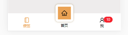
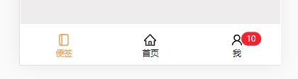
示例


 1650
1650

 被折叠的 条评论
为什么被折叠?
被折叠的 条评论
为什么被折叠?
 到【灌水乐园】发言


