


CSS技巧
1. css初始化
不同浏览器对有些标签的默认值是不同的,为了消除不同的浏览器对 HTML 文本呈现的差异,兼容浏览器需要对 css 初始化
- 使用 github 上超火的 css 初始化库 Normalize.css 使浏览器呈现所有 HTML 元素更加一致,并且符合现代 web 标准。
- Normalize.css 只作用于需要规范化的样式
- cdn 引入
<link href="https://cdn.bootcdn.net/ajax/libs/normalize/8.0.1/normalize.css" rel="stylesheet"> - 文件下载地址
https://necolas.github.io/normalize.css/8.0.1/normalize.css
- cdn 引入

2. 字体图标
常见字体图标库:iconfont 阿里巴巴矢量图标库、font awesome v4/v5、iconmoon、

使用步骤如下:
第一步:打开 iconfont 阿里巴巴矢量图标库,选择自己想要的图标加入项目然后本地下载文件
第二步:解压下载的 .zip 文件,打开 demo_index.html 文件
第三步:引入文件到自己的项目中,有三种引入方式 Unicode 引入、Font class 引入、Symbol 引入
2-1 Font class 引入 (常用)
font-class 是 Unicode 使用方式的一种变种,主要是解决 Unicode 书写不直观,语意不明确的问题
与 Unicode 使用方式相比,具有如下特点:
- 相比于 Unicode 语意明确,书写更直观。可以很容易分辨这个 icon 是什么
- 因为使用 class 来定义图标,所以当要替换图标时,只需要修改 class 里面的 Unicode 引用
使用步骤如下:
第一步:引入项目下面生成的 fontclass 代码:
<link rel="stylesheet" href="./iconfont.css">
第二步:挑选相应图标并获取类名,应用于页面:
<span class="iconfont icon-meh-filling"></span>
" iconfont" 是你项目下的 font-family。可以通过编辑项目查看,默认是 “iconfont”
2-2 Unicode 引入
Unicode 是字体在网页端最原始的应用方式,特点是:
- 支持按字体的方式去动态调整图标大小,颜色等等
- 默认情况下不支持多色,直接添加多色图标会自动去色
注意:新版 iconfont 支持两种方式引用多色图标:SVG symbol 引用方式和彩色字体图标模式。(使用彩色字体图标需要在「编辑项目」中开启「彩色」选项后并重新生成。)
Unicode 使用步骤如下:
第一步:拷贝项目下面生成的 @font-face
@font-face {
  font-family: 'iconfont';
  src: url('iconfont.woff2?t=1638446867490') format('woff2'),
       url('iconfont.woff?t=1638446867490') format('woff'),
       url('iconfont.ttf?t=1638446867490') format('truetype');
}
第二步:定义使用 iconfont 的样式
.iconfont {
  font-family: "iconfont" !important;
  font-size: 16px;
  font-style: normal;
  -webkit-font-smoothing: antialiased;
  -moz-osx-font-smoothing: grayscale;
}
第三步:挑选相应图标并获取字体编码,应用于页面
<span class="iconfont"></span>
“iconfont” 是你项目下的 font-family。可以通过编辑项目查看,默认是 “iconfont”
2-3 Symbol 引入
这是一种全新的使用方式,应该说这才是未来的主流,也是平台目前推荐的用法。相关介绍可以参考这篇文章 这种用法其实是做了一个 SVG 的集合,与另外两种相比具有如下特点:
- 支持多色图标了,不再受单色限制。
- 通过一些技巧,支持像字体那样,通过
font-size,color来调整样式。 - 兼容性较差,支持 IE9+,及现代浏览器。
- 浏览器渲染 SVG 的性能一般,还不如 png。
使用步骤如下:
第一步:引入项目下面生成的 symbol 代码:
<script src="./iconfont.js"></script>
第二步:加入通用 CSS 代码(引入一次就行):
<style>
.icon {
  width: 1em;
  height: 1em;
  vertical-align: -0.15em;
  fill: currentColor;
  overflow: hidden;
}
</style>
第三步:挑选相应图标并获取类名,应用于页面:
<svg class="icon" aria-hidden="true">
  <use xlink:href="#icon-meh-filling"></use>
</svg>
3. 字体引用
字体引入是通过 @font-face 属性来指定一个用于显示文本的自定义字体
3-1 属性介绍
/* 语法 */
@font-face {
      font-family: <YourDefineFontName>;
      src: <url> [<format>],[<source> [<format>]];
      [font-weight: <weight>];
      [font-style: <style>];
}
/* 带中括号的属性为非必须选项 */
-
font-family:为载入的字体取名字
-
src:
-
**url:**加载字体,可以是相对路径,可以是绝对路径,也可以是网络地址
-
**format:**定义的字体的格式,用来帮助浏览器识别。主要取值为:
truetype(.ttf)、opentype(.otf)、truetype-aat、embedded-opentype(.eot)、svg(.svg)、woff(.woff)
-
-
font-weight:定义加粗样式
-
font-style:定义字体样式
/* format对应字体格式 以及 常见兼容性写法 */
@font-face {
  font-family: 'MyName';
  src: url('../fonts/xxx.eot');
  src: url('../fonts/xxx.eot?#iefix') format('embedded-opentype'),
       url('../fonts/xxx.woff') format('woff'),
       url('../fonts/xxx.ttf') format('truetype'),
       url('../fonts/xxx.svg#defineName') format('svg');
  font-weight: normal;
  font-style: normal;
}
#iefix有何作用?
IE9 之前的版本没有按照标准解析字体声明,当 src 属性包含多个 url 时,它无法正确的解析而返回 404 错误,而其他浏览器会自动采用自己适用的 url。因此把仅
IE9 之前支持的 EOT 格式放在第一位,然后在 url 后加上 ?,这样 IE9 之前的版本会把问号之后的内容当作 url 的参数。至于 #iefix 的作用,一是起到了注释的作
用,二是可以将 url 参数变为锚点,减少发送给服务器的字符
为何有两个src?
绝大多数情况下,第一个 src 是可以去掉的,除非需要支持 IE9 下的兼容模式。在 IE9 中可以使用 IE7 和 IE8 的模式渲染页面,微软修改了在兼容模式下的 CSS 解
析器,导致使用 ? 的方案失效。由于 CSS 解释器是从下往上解析的,所以在上面添加一个不带问号的 src 属性便可以解决此问题
3-2 兼容性
IE6-8 仅支持 embedded-opentype(.eot)
firefox3.5 支持truetype(.ttf)、opentype(.otf)
firefox3.6 支持truetype(.ttf)和opentype(.otf)、WOFF(.woff)
**chrome **支持truetype(.ttf)、opentype(.otf)、WOFF(.woff)、svg(.svg)
**safari **支持truetype(.ttf)、opentype(.otf)、WOFF(.woff)、svg(.svg)
opera 支持truetype(.ttf)、opentype(.otf)、WOFF(.woff)、svg(.svg)
3-3 格式介绍
目前最主要的几种网络字体(web font)格式包括WOFF,SVG,EOT,OTF/TTF
WOFF
WOFF是Web Open Font Format几个词的首字母简写。这种字体格式专门用于网上,由Mozilla联合其它几大组织共同开发。WOFF字体通常比其它字体加载的要
快些,因为使用了OpenType (OTF)和TrueType (TTF)字体里的存储结构和压缩算法。这种字体格式还可以加入元信息和授权信息。这种字体格式有君临天下的趋
势,因为所有的现代浏览器都开始支持这种字体格式。
SVG / SVGZ
Scalable Vector Graphics (Font). SVG是一种用矢量图格式改进的字体格式,体积上比矢量图更小,适合在手机设备上使用。
EOT
Embedded Open Type。这是微软创造的字体格式。这种格式只在IE6-IE8里使用。
OTF / TTF
OpenType Font 和 TrueType Font。部分的因为这种格式容易被复制(非法的),这才催生了WOFF字体格式。然而,OpenType有很多独特的地方,受到很多设计
者的喜爱
| String | Font Format | Common extensions |
|---|---|---|
| woff | WOFF 1.0(Web Open Font Format) | .woff |
| woff2 | WOFF 2.0(Web Open Font Format) | .woff2 |
| truetype | TrueType | .ttf |
| opentype | OpenType | .ttf、.otf |
| embedded-opentype | Embedded OpenType | .eot |
| svg | SVG Font | .svg、.svgz |
4. title 图标
设置网页图标是通过在 <head> 标签中添加 <link> 标签设置 link 标签属性
在网页标题左侧显示:<link rel="icon" href="图标地址" type="image/x-icon">
在收藏夹显示图标:<link rel="shortcut icon" href="图标地址" type="image/x-icon">
<head>
    <link rel="icon" href="图标地址" type="image/x-icon">
    <link rel="shortcut icon" href="图标地址" type="image/x-icon">
</head>
-
rel 属性值表示
<link>项的链接方式与包含它的文档之间的关系 -
type 属性可以指定不同的文件类型(MIME 类型)
-
sizes 属性表示图标大小
-
media 属性内部进行查询,这种资源将只在满足媒体条件的情况下才被加载进来
<link rel="icon" type="image/png" sizes="114×114" media="screen and (max-width: 600px)">
图片格式转换网站链接:Convert image format Online - Image Converter Online - 100% free (jinaconvert.com)
| 缩写 | 文件格式 | MIME 类型 | 文件拓展名 | 浏览器兼容性 |
|---|---|---|---|---|
| APNG | Animated Portable Network Graphics 动态便携式网络图像 | image/apng | .apng | Chrome, Edge, Firefox, Opera, Safari |
| AVIF | AV1 Image File Format AV1 图像文件格式 | image/avif | .avif | Chrome, Opera, Firefox (feature flag) |
| BMP | Bitmap file 位图文件 | image/bmp | .bmp | Chrome, Edge, Firefox, Internet Explorer, Opera, Safari |
| GIF | Graphics Interchange Format 图像互换格式 | image/gif | .gif | Chrome, Edge, Firefox, Internet Explorer, Opera, Safari |
| ICO | Microsoft Icon 微软图标 | image/x-icon | .ico, .cur | Chrome, Edge, Firefox, Internet Explorer, Opera, Safari |
| JPEG | Joint Photographic Expert Group image 联合影像专家小组图像 | image/jpeg | .jpg, .jpeg, .jfif, .pjpeg, .pjp | Chrome, Edge, Firefox, Internet Explorer, Opera, Safari |
| PNG | Portable Network Graphics 便携式网络图像 | image/png | .png | Chrome, Edge, Firefox, Internet Explorer, Opera, Safari |
| SVG | Scalable Vector Graphics 可缩放矢量图形 | image/svg+xml | .svg | Chrome, Edge, Firefox, Internet Explorer, Opera, Safari |
| TIFF | Tagged Image File Format 标签图像文件格式 | image/tiff | .tif, .tiff | Safari |
| WebP | Web Picture format 万维网图像格式 | image/webp | .webp | Chrome, Edge, Firefox, Opera, Safari |
5. css 居中详解
5-1 水平居中
利用 text-align: center 可以实现块级元素内部的内联元素水平居中(内联元素 line,内联块 inline-block,内联表格 inline-table,inline-flex 元素)
.box {
	text-align: center;
}
/* 利用 text-align: center 可以实现块级元素内部的内联元素水平居中 */
.content-box {
	display: inline-block;
	width: 100px;
	height: 100px;
	background-color: #ff7b00;
}

<div class="box">
    <div class="content-box"></div>
</div>
通过固定宽度块级元素的 margin-left 和 margin-right 设成 auto,就可以使块级元素水平居中
.block-box {
	width: 100px;
	height: 100px;
	background-color: #9900ff;
	margin: 0 auto;
    /* 对固定宽度的块级元素,通过设置元素左右外边距为auto,即可实现元素水平居中 */
}

<div class="block-box"></div>
(不需要设置元素宽高)利用弹性布局,实现水平居中,其中 justify-content 用于设置弹性盒子元素在主轴方向上的对齐方式
.flex-box {
	display: flex;
	justify-content: center;
    /* 需要对水平对齐元素父元素设置 */
    /* 利用弹性布局 使用 justify-conten 属性在主轴方向上的对齐方式 */
}
.flex-box .content-box {
	width: 100px;
	height: 100px;
	background-color: #9dff00;
}

<div class="flex-box">
    <div class="content-box"></div>
</div>
(不需要设置元素宽高)通过 position,left/right 和 transform 属性水平居中
.position-box {
	width: 100px;
	height: 100px;
	background-color: #ee5f66;
	position: relative;
	left: 50%;
	transform: translate(-50%, 0);
    /* 给元素设置定位relative 给定left/right一半值,通过transform属性偏移元素自身一半的宽度 */
}

<div class="position-box"></div>
**Tips:**在标准文档流中,水平方向不会出现左右外边距重叠现象,所以在使用 position 定位时可以使用 relative/absolute
(需要设置元素宽高)使用 position 以及负值的 margin-left 水平居中
.burden-box .content-box {
	position: absolute;
	left: 50%;
	width: 100px;
	height: 100px;
	background-color: #5fe4ee;
	margin-left: -50px;
    /* 负值的margin-left */
}

<div class="burden-box">
    <div class="content-box"></div>
</div>
(不需要设置元素宽高)使用 position 以及left:0;,right:0, margin:0 auto 水平居中
.auto-box .content-box {
	position: absolute;
	left: 0;
	right: 0;
	width: 100px;
	height: 100px;
	background-color: #eeec5f;
	margin: 0 auto;
    /* 使用绝对定位方式, 以及left:0; right:0; margin:0 auto; */
}

<div class="auto-box">
    <div class="content-box"></div>
</div>
5-2 垂直居中
通过设置内联元素的高度 height 和行高 line-height 相等,从而使元素垂直居中(使元素垂直居中使用 vertical-align: middle)
这种方法比较适合文字的居中,其核心是设置行高(line-height)等于包裹他的盒子的高,或者不设高度只设行高,这种适合文字居中且高度固定的场景
.box {
    /* 适用于文本垂直场景 使元素垂直居中使用 vertical-align: middle */
	display: inline-block;
	width: 100px;
	height: 100px;
	background-color: #ff7b00;
	vertical-align: middle;
}

<div class="container">
    文本
    <div class="box"></div>
</div>
行内块级元素, 使用 display: inline-block, vertical-align: middle 加上伪元素辅助实现
.container.before::before {
	content: "";
	display: inline-block;
	width: 0;
	height: 100%;
	vertical-align: middle;
}
/* 在父元素中设置一个行内的伪元素,让行内的子元素与这个伪元素垂直对齐 */
.pseudo-box {
	display: inline-block;
	width: 100px;
	height: 100px;
	background-color: #66ff00;
	vertical-align: middle;
}

<div class="container before">
    <div class="pseudo-box"></div>
</div>
通过 vertical-align 属性, 而 vertical-align 只有在父层为 td 或者 th 时, 才会生效, 对于其他块级元素, 例如 div、p 等, 默认情况是不支持的. 为了使用vertical-align, 我们需要设置父元素 display:table, 子元素 display:table-cell,vertical-align:middle
在表单元格中,这个属性会设置单元格框中的单元格内容的对齐方式
.container.table {
	width: 100%;
	display: table;
}
/* 设置为table布局 然后设置为单元格 通过vertical-align属性设置单元格对齐方式 */
.table-box {
	display: table-cell;
	vertical-align: middle;
}
.last-box {
	width: 100px;
	height: 100px;
	background-color: #0059ff;
}

<div class="container table">
    <div class="table-box">
        <div class="last-box"></div>
    </div>
</div>
(不需要设置元素宽高)利用弹性布局,实现垂直居中,其中 align-items: center 用于设置弹性盒子元素在竖轴方向上的对齐方式
.flex-box {
	display: flex;
	align-items: center;
	height: 200px;
	background-color: #f5f5f5;
	margin-bottom: 20px;
    /* 需要对垂直对齐元素父元素设置 */
    /* 利用弹性布局 使用 align-items 属性在竖轴方向上的对齐方式 */
}

.flex-box .content-box {
	width: 100px;
	height: 100px;
	background-color: #9900ff;
}

<div class="flex-box">
    <div class="content-box"></div>
</div>
**Tips:**在标准文档流中,竖直方向会出现上下外边距重叠现象,所以在使用 position 定位时必须使用 absolute 触发BFC
(不需要设置元素宽高)通过 position,top/bottom 和 transform 属性垂直居中
.position {
    position: relative;
}
.position-box .content-box {
	width: 100px;
	height: 100px;
	background-color: #ee5f66;
	position: absolute;
	top: 50%;
	transform: translate(0, -50%);
    /* 给元素设置定位 给定top/bottom一半值,通过transform属性偏移元素自身一半的宽度 */
}

<div class="position-box container">
    <div class="content-box"></div>
</div>
(需要设置元素宽高)使用 position 以及负值的 margin-top 垂直居中
.burden-box {
    position: relative;
}
.burden-box .content-box {
	position: absolute;
	top: 50%;
	width: 100px;
	height: 100px;
	background-color: #5fe4ee;
	margin-top: -50px;
    /* 负值的margin-top */
}

<div class="burden-box container">
    <div class="content-box"></div>
</div>
(不需要设置元素宽高)使用 position 以及top:0;,bottom:0, margin:auto 0 垂直居中
.auto-box {
   position: relative;
}
.auto-box .content-box {
	position: absolute;
	top: 0;
	bottom: 0;
	width: 100px;
	height: 100px;
	background-color: #eeec5f;
	margin: auto 0;
    /* 使用绝对定位方式, 以及top:0; bottom:0; margin:0 auto; */
}

<div class="auto-box container">
    <div class="content-box"></div>
</div>
5-3 水平垂直居中
text-align + line-height + vertical-align(行内元素/行内块元素|父元素需要设置高度,子元素可以不设置高度)
.container {
	background-color: #f5f5f5;
	text-align: center;
	height: 200px;
	line-height: 200px;
	margin-bottom: 20px;
}

.container .box {
	display: inline-block;
	width: 100px;
	height: 100px;
	background-color: #008cff;
	vertical-align: middle;
}

<div class="container">
	<div class="box"></div>
</div>
position + margin-top/margin-bottom (块级元素/行内元素/行内块元素|子元素需要设置高度)
.position-box {
	position: relative;
	background-color: #f5f5f5;
	text-align: center;
	height: 200px;
	margin-bottom: 20px;
}

.margin-box {
	position: absolute;
	left: 50%;
	top: 50%;
	margin-top: -50px;
	margin-left: -50px;
	width: 100px;
	height: 100px;
	background-color: #008cff;
}

<div class="position-box">
	<div class="margin-box"></div>
</div>
position + transform (块级元素/行内元素/行内块元素)
.position-box {
	position: relative;
	background-color: #f5f5f5;
	text-align: center;
	height: 200px;
	margin-bottom: 20px;
}
.transform-box {
	position: absolute;
	left: 50%;
	top: 50%;
	transform: translate(-50%, -50%);
	width: 100px;
	height: 100px;
	background-color: #008cff;
}


<div class="position-box">
	<div class="transform-box"></div>
</div>
display: table + display: table-cell + text-align + vertical-center (行内元素/行内块元素)
.table-box {
	display: table;
	width: 100%;
	background-color: #f5f5f5;
	margin-bottom: 20px;
	height: 200px;
}

.table-box .cell-box {
	display: table-cell;
	vertical-align: middle;
	text-align: center;
}

.table-box .cell-box .box {
	display: inline-block;
	width: 100px;
	height: 100px;
	background-color: #008cff;
}

<div class="table-box">
	<div class="cell-box">
		<div class="box"></div>
	</div>
</div>
伪元素 + text-align + vertical-center (行内元素/行内块元素|父元素需要设置高度)
.false-box {
	background-color: #f5f5f5;
	margin-bottom: 20px;
	height: 200px;
	text-align: center;
}

.false-box::before {
	display: inline-block;
	content: "";
	height: 100%;
	width: 0;
	vertical-align: middle;
}

.false-box .box {
	display: inline-block;
	width: 100px;
	height: 100px;
	background-color: #008cff;
	vertical-align: middle;
}

<div class="false-box">
	<div class="box"></div>
</div>
position + top/right/bottom/left: 0 + margin (块级元素/行内元素/行内块元素|子元素需要设置高度)
.auto-box {
	position: relative;
	background-color: #f5f5f5;
	margin-bottom: 20px;
	height: 200px;
}

.auto-box .box {
	position: absolute;
	left: 0;
	top: 0;
	bottom: 0;
	right: 0;
	width: 100px;
	height: 100px;
	background-color: #008cff;
	margin: auto;
}

<div class="auto-box">
	<div class="box"></div>
</div>
flex + align-items + justify-content (块级元素/行内元素/行内块元素)
.flex-box {
	display: flex;
	align-items: center;
	justify-content: center;
	height: 200px;
	background-color: #f5f5f5;
	margin-bottom: 20px;
}

.flex-box .box {
	width: 100px;
	height: 100px;
	background-color: #008cff;
}

<div class="flex-box">
	<div class="box"></div>
</div>
grid + justify-items + align-items (块级元素/行内元素/行内块元素)
.grid-box {
	display: grid;
	height: 200px;
	background-color: #f5f5f5;
	grid-template-columns: repeat(1, 1fr);
	justify-items: center;
	align-items: center;
}

.grid-box .box {
	width: 100px;
	height: 100px;
	background-color: #008cff;
}

<div class="grid-box">
	<div class="box"></div>
</div>
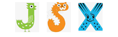
6. 精灵图
CSS Sprites叫 CSS精灵或者雪碧图,是一种网页图片应用处理方式
**精灵图技术产生的目的:**很多大型网页在首次加载的时候都需要加载很多的小图片,而考虑到在同一时间,服务器拥堵的情况下,为了解决这一问题,采用了精灵
图这一技术来缓解加载时间过长从而影响用户体验的这个问题
**精灵图技术的本质:**所谓精灵图就是把很多的小图片合并到一张较大的图片里,所以在首次加载页面的时候,就不用加载过多的小图片,只需要加载出来将小图片
合并起来的那一张大图片也就是精灵图即可,这样在一定程度上减少了页面的加载速度,也一定程度上缓解了服务器的压力
通过 background-position 属性来实现,起始坐标点是(0,0),第一个值是水平位置,第二个值是垂直位置,可以为负数
x 轴右边是正数,左边是负数,y 轴同理
div {
	display: inline-block;
	margin-right: 20px;
	background: url("http://pic.616pic.com/ys_bnew_img/00/40/48/YEilzWHDbk.jpg") no-repeat;
	width: 80px;
	height: 100px;
}

.j {
	background-position: -345px -180px;
}

.s {
	background-position: -272px -424px;
}

.x {
	background-position: -293px -543px;
}
7. css三角形
css三角形原理:
1、通过只设置一个边框为有色,其余边框为透明色
2、三角形大小受非同向的两边框宽度影响
  .div {
    width: 0;
    height: 0;
    /* 上下边框宽度是 40px */
    border-top: 40px solid yellow;
    border-bottom: 40px solid blue;
    /* 左右边框宽度是 60px */
    border-left: 40px solid green;
    border-right: 40px solid red;
  }
- 左右边框的宽度相等时,就是等边的三角形
- 左右边框宽度不相等时,就不是等边的三角形
- 左右边框某个宽度 0 时,就是直角三角形

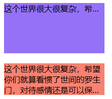
8. 文本溢出省略号
单行文本溢出
.hidden {
  overflow: hidden; /* 文字长度超出限定宽度,则隐藏超出的内容 */
  white-space: nowrap; /* 设置文字在一行显示,不能换行 */
  text-overflow: ellipsis; /* 规定当文本溢出时,显示省略符号来代表被修剪的文本 */
}
多行文本溢出
**Tips:**多行文本溢出不能设置元素高度,否则展示有问题的显示
line-clamp 属性只在 webkit 内核的浏览器中支持
.hidden {
  -webkit-line-clamp: 2; /* 用来限制在一个块元素显示的文本的行数,2 表示最多显示 2 行。为了实现该效果,它需要组合其他的 WebKit 属性 */
  display: -webkit-box; /* 和 1 结合使用,将对象作为弹性伸缩盒子模型显示 */
  -webkit-box-orient: vertical;/* 和 1 结合使用 ,设置或检索伸缩盒对象的子元素的排列方式 */
  overflow: hidden; /* 文本溢出限定的宽度就隐藏内容 */
  text-overflow: ellipsis; /* 多行文本的情况下,用省略号 “…” 隐藏溢出范围的文本 */
}
9. 鼠标样式
cursor 属性设置光标的类型(如果有),在鼠标指针悬停在元素上时显示相应样式
-
cursor 属性为零个或多个 cursor 值,它们之间用逗号分隔,最后必填一个关键字值。
-
每个 url 指向一个图像文件。浏览器将尝试加载指定的第一个图像,如果无法加载则返回下一个图像,如果无法加载图像或未指定图像,则使用关键字值代表的指针类型。
-
每个 url 后面都可选跟一对空格分隔的数字
xy表示偏移。它们用来设置指针的热点(即自定义图标的实际点击位置),位置相对于图标的左上角 -
最后提供一个关键字值作为备用
/* 关键字值 */
cursor: pointer;
cursor: auto;

/* 使用URL,并提供一个关键字值作为备用 */
cursor: url(hand.cur), pointer;

/* URL和xy的坐标偏移值,最后提供一个关键字值作为备用 */
cursor:  url(cursor1.png) 4 12, auto;
cursor:  url(cursor2.png) 2 2, pointer;

/* 全局属性 */
cursor: inherit;
cursor: initial;
cursor: unset;
| 值 | 描述 |
|---|---|
| url | 需使用的自定义光标的 URL。注释:请在此列表的末端始终定义一种普通的光标,以防没有由 URL 定义的可用光标 |
| default | 默认光标(通常是一个箭头) |
| auto | 默认。浏览器设置的光标。 |
| crosshair | 光标呈现为十字线 |
| pointer | 光标呈现为指示链接的指针(一只手) |
| move | 此光标指示某对象可被移动 |
| e-resize | 此光标指示矩形框的边缘可被向右(东)移动 |
| ne-resize | 此光标指示矩形框的边缘可被向上及向右移动(北/东) |
| nw-resize | 此光标指示矩形框的边缘可被向上及向左移动(北/西) |
| n-resize | 此光标指示矩形框的边缘可被向上(北)移动 |
| se-resize | 此光标指示矩形框的边缘可被向下及向右移动(南/东) |
| sw-resize | 此光标指示矩形框的边缘可被向下及向左移动(南/西) |
| s-resize | 此光标指示矩形框的边缘可被向下移动(南) |
| w-resize | 此光标指示矩形框的边缘可被向左移动(西) |
| text | 此光标指示文本 |
| wait | 此光标指示程序正忙(通常是一只表或沙漏) |
| help | 此光标指示可用的帮助(通常是一个问号或一个气球) |
10. 用户调整元素尺寸
**Tips:**如果一个 block 元素的 overflow 属性被设置成了
visible,那么resize属性对该元素无效
resize 属性规定可以由用户调整元素的大小
如果希望此属性生效,需要设置元素的 overflow 属性,值可以是 auto、hidden 或 scroll
resize: none|both|horizontal|vertical;
- none:用户无法调整元素的尺寸
- both:用户可调整元素的高度和宽度
- horizontal:用户可调整元素的宽度
- vertical:用户可调整元素的高度
禁止文本域拖拽
textarea {
    resize: none;
}
11. 图片底部空白
一个line box,如果里面没有 inline 内联元素,或者overflow 不是 visible,则该元素的基线就是其margin 底边缘,否则其基线就是元素里面最后一行内联元素的基线
line box中图片默认和文本基线对齐,如果使用基线对齐,该行内若有文字,文字的底线与基线之间有距离,此时文字就会顶起来一段距离
解决方法:
1、使用其它 vertical-align 值:将 vertical-align 属性变为 bottom,表示对底边齐父元素下行高边框
2、让 vertical-align 失效:将 img 标签设置为 display:block,vertical-align 只能改变行内或行内块元素
3、直接修改 line-height 值:空隙高度,实际上是文字计算后的行高值和字体内容区域(content-area)下边缘的距离,只要行高足够小,实际文字占据的高度小于字体内容区域(content-area),就不会出现空白空隙了


 扫一扫
扫一扫


 被折叠的 条评论
为什么被折叠?
被折叠的 条评论
为什么被折叠?
 到【灌水乐园】发言


