


效果如下图所示
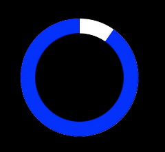
思路
左右两个div拼成一个圆,设置overflow:hidden
使用伪元素构建真正旋转的半圆
左边的半圆,以右边中点为tranform旋转中心顺时针旋转
右边的半圆,以左边中点为tranform旋转中心顺时针旋转
<div class="loading">
  <div class="left"></div>
  <div class="right"></div>
  <div class="progress"></div>
</div>
body {
  background: #000;
}
.loading {
  margin: 100px auto;
  width: 160px;
  height: 160px;
  position: relative;
}

.loading .progress {
  position: absolute;
  width: 120px;
  height: 120px;
  background-color: #000;
  border-radius: 50%;
  left: 20px;
  top: 20px;
  line-height: 120px;
  text-align: center;
}
.left,
.right {
  width: 80px;
  height: 160px;
  overflow: hidden;
  position: relative;
  float: left;
  background-color: #fff;
}
.left {
  border-radius: 80px 0 0 80px;
}
.right {
  border-radius: 0 80px 80px 0;
}

.left:after,
.right:after {
  content: "";
  position: absolute;
  display: block;
  width: 80px;
  height: 160px;
  border-radius: 80px 0 0 80px;
  background-color: blue;
  animation-duration: 6s;
  animation-iteration-count: infinite;
  animation-timing-function: linear;
}
.right:after {
  content: "";
  position: absolute;
  display: block;
  border-radius: 0 80px 80px 0;
}
.left:after {
  transform-origin: right center;
  animation-name: spin-left;
}

.right:after {
  transform-origin: left center;
  animation-name: spin-right;
}

@keyframes spin-right {
  0 {
    transform: rotate(0deg);
  }
  50% {
    transform: rotate(180deg);
  }
  100% {
    transform: rotate(180deg);
  }
}

@keyframes spin-left {
  0 {
    transform: rotate(0deg);
  }
  50% {
    transform: rotate(0deg);
  }
  100% {
    transform: rotate(180deg);
  }
}
一点心得
一开始实现动画效果的时候使用的是animation-delay让左半边延时动画,但是把动画改成infinite之后,只有第一次动画有延时,所以在keyframes里控制动画的延时时间。


 888
888


 被折叠的 条评论
为什么被折叠?
被折叠的 条评论
为什么被折叠?
 到【灌水乐园】发言


