


我是c站的一个小博主,近期我会每天分享前端知识包括(原生的web语句,以及vue2和vue3,微信小程序的写法及知识点)本篇文章收录于html特效专栏中,如果想每天在我这学到一些东西,请关注我并订阅专栏,每天都分享前端知识哦~
欢迎关注b站:小淼前端
有更多的前端特效,及视频讲解+源代码可领取哦~
目录
欢迎关注b站:小淼前端
有更多的前端特效,及视频讲解+源代码可领取哦~
欢迎关注b站:小淼前端
有更多的前端特效,及视频讲解+源代码可领取哦~
前端的特效视觉:
层次结构的表现
动态效果,如缩放,覆盖,滑出网页或单个视觉元素,可帮助用户理解网页信息架构。通常是通过转场和菜单来展开网页。
表现层级关系
为了展现层与层的关系,是抽屉,是打开,还是平级切换等等。让用户知道这个界面和上一个、下一个的关系。
清晰明确
动效可以清晰地表明各种数据块中间的逻辑结构,即使在数据高度饱和的情况下也能使一切从观感上有组织性。
添加了图层
在网站制作过程中加上特效,每个元素都在用户滚动页面或者是鼠标经过的地方有动态效果,就像在平面层上多出了一个动态层,这样看起来更加有层次感。
我想借此专栏发布的内容帮助那些正在入坑前端的家人们,同时作为我以后复习的笔记,希望我们可以互相帮助,共同加油!!!
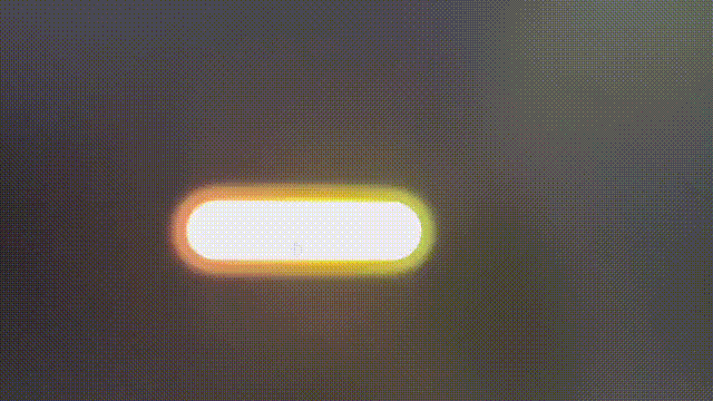
1.伸缩版搜索框

代码:
<!DOCTYPE html>
<html>

<head>
    <meta http-equiv="content-type" content="text/html; charset=utf-8">
    <meta name="viewport" content="width=device-width,initial-scale=1,maximum-scale=1,user-scalable=no">

    <title>伸缩版搜索框</title>
    <link href="https://cdn.bootcdn.net/ajax/libs/font-awesome/4.7.0/css/font-awesome.min.css" rel="stylesheet">
    <style>
        body{
    /* 初始化 取消内外边距 */
    margin: 0;
    padding: 0;
    /* 100%窗口高度 */
    height: 100vh;
    /* 渐变背景 */
    background: linear-gradient(200deg,#e3eeff,#f3e7e9);
}
.search-box{
    /* 绝对定位 水平垂直居中 */
    position: absolute;
    top: 50%;
    left: 50%;
    transform: translate(-50%,-50%);
    background-color: #2f3640;
    height: 40px;
    padding: 10px;
    border-radius: 40px;
}
.search-txt{
    border:none;
    background: none;
    outline: none;
    float: left;
    padding: 0;
    color: #fff;
    font-size: 16px;
    line-height: 40px;
    width: 0;
    /* 动画过渡 */
    transition: 0.4s;
}
.search-btn{
    color: #e84118;
    float: right;
    width: 40px;
    height: 40px;
    border-radius: 50%;
    background-color: #2f3640;
    /* 弹性布局 水平垂直居中 */
    display: flex;
    justify-content: center;
    align-items: center;
    cursor: pointer;
    /* 动画过渡 */
    transition: 0.4s;
}
.search-box:hover .search-txt{
    width: 200px;
    padding: 0 6px;
}
.search-box:hover .search-btn{
    background-color: #fff;
}
    </style>
</head>

<body>
    <div class="search-box">
        <input type="text" class="search-txt" placeholder="想搜啥?" />
        <a class="search-btn">
            <i class="fa fa-search" aria-hidden="true"></i>
        </a>
    </div>
</body>

</html>
2.流光版button按钮效果
代码:
<!DOCTYPE html>
<html>

<head>
    <meta http-equiv="content-type" content="text/html; charset=utf-8">
    <meta name="viewport" content="width=device-width,initial-scale=1,maximum-scale=1,user-scalable=no">

    <title>流光button按钮</title>
    <style>
        *{
    /* 初始化 取消页面的内外边距 */
    margin: 0;
    padding: 0;
}
body{
    /* 弹性布局 让页面元素水平、垂直居中 */
    display: flex;
    justify-content: center;
    align-items: center;
    /* 设置body高度为100%窗口高度 */
    height: 100vh;
    background: #000;
}
a{
    /* 相对定位 */
    position: relative;
    width: 400px;
    height: 100px;
    line-height: 100px;
    text-align: center;
    text-decoration: none;
    text-transform: uppercase;
    font-size: 24px;
    color: #fff;
    /* 渐变背景 */
    background: linear-gradient(to right,#03a9f4,#f441a5,#ffeb3b,#09a8f4);
    /* 背景渐变色大小 */
    background-size: 400%;
    /* 圆角 */
    border-radius: 50px;
    z-index: 1;
}
/* 发光效果 */
a::before{
    content: "";
    position: absolute;
    top: -5px;
    left: -5px;
    bottom: -5px;
    right: -5px;
    /* 渐变背景 */
    background: linear-gradient(to right,#03a9f4,#f441a5,#ffeb3b,#09a8f4);
    /* 背景渐变色大小 */
    background-size: 400%;
    /* 圆角 */
    border-radius: 50px;
    /* 位于按钮之下 */
    z-index: -1;
    /* 设置模糊度 显示发光效果 */
    filter: blur(20px);
}
/* 鼠标移入执行动画 */
a:hover{
    /* 动画:名称 时间 infinite是无限次播放 */
    animation: streamer 8s infinite;
}
a:hover::before{
    animation: streamer 8s infinite;
}
/* 接下来定义动画 */
@keyframes streamer{
    100%{
        /* 背景位置 */
        background-position: -400% 0;
    }
}
    </style>
</head>

<body>
    <a href="#">button</a>
</body>

</html>
3.鼠标悬停边框流光button效果

代码:
<!DOCTYPE html>
<html>

<head>
    <meta http-equiv="content-type" content="text/html; charset=utf-8">
    <meta name="viewport" content="width=device-width,initial-scale=1,maximum-scale=1,user-scalable=no">

    <title>鼠标悬停流光button效果</title>
    <style>
        *{
    /* 初始化 取消页面元素的内外边距 */
    margin: 0;
    padding: 0;
}
.container{
    /* 弹性布局 水平、垂直居中 */
    display: flex;
    justify-content: center;
    align-items: center;
    /* 让子元素垂直排列 */
    flex-direction: column;
    /* 100%窗口宽度、高度 */
    width: 100vw;
    height: 100vh;
    /* 背景径向渐变 */
    background: radial-gradient(circle at center,#555,#000);
}
.container a{
    /* 相对定位 */
    position: relative;
    /* 将a元素转为块级元素,不然无法设置宽和高 */
    display: block;
    width: 140px;
    height: 60px;
    line-height: 60px;
    text-align: center;
    margin: 40px;
    color: plum;
    text-decoration: none;
    font-size: 20px;
    /* 这里加个动画过渡 */
    transition: all 0.3s ease-in-out;
    /* 我们来改变各个a元素的颜色【划重点】 */
    /* 大家看到效果了吧,是不是很神奇 */
    /* hue-rotate是颜色滤镜,可以加不同的度数来改变颜色,这里我们用了calc自动计算函数,以及var函数来调用我们给每一个a元素设置的不同的自定义属性1~5,然后分别乘以60度,就能够分别得到不同的颜色 */
    filter: hue-rotate(calc(var(--i)*60deg));
}
.container a::before,
.container a::after{
    /* 将两个伪元素的相同样式写在一起 */
    content: "";
    position: absolute;
    width: 20px;
    height: 20px;
    border: 2px solid plum;
    /* 这里也加一个动画过渡 */
    /* 最后的0.3s是延迟时间 */
    transition: all 0.3s ease-in-out 0.3s;
}
.container a::before{
    top: 0;
    left: 0;
    /* 删除左边元素的右、下边框 */
    border-right: 0;
    border-bottom: 0;
}
.container a::after{
    right: 0;
    bottom: 0;
    /* 删除右边元素的左、上边框 */
    border-top: 0;
    border-left: 0;
}
.container a:hover{
    background-color: plum;
    color: #000;
    /* 添加发光效果和倒影 */
    box-shadow: 0 0 50px plum;
    /* below是下倒影 1px是倒影和元素相隔的距离 最后是个渐变颜色 */
    -webkit-box-reflect: below 1px linear-gradient(transparent,rgba(0,0,0,0.3));
    /* 这里我们为以上属性设置一下延迟时间 */
    transition-delay: 0.4s;
}
.container a:hover::before,
.container a:hover::after{
    width: 138px;
    height: 58px;
    /* 这里不需要延迟 */
    transition-delay: 0s;
}
    </style>
</head>

<body>
    <div class="container">
        <!-- 接下来的有点神奇了哈,划重点哦 -->
        <!-- 这里的--i是一个自定义属性 -->
        <a href="#" style="--i:1">点赞</a>
        <a href="#" style="--i:2">关注</a>
        <a href="#" style="--i:3">评论</a>
        <a href="#" style="--i:4">收藏</a>
        <a href="#" style="--i:5">分享</a>
    </div>
</body>

</html>
4.简约版input效果

代码:
<!DOCTYPE html>
<html lang="en">
<head>
    <meta charset="UTF-8">
    <meta http-equiv="X-UA-Compatible" content="IE=edge">
    <meta name="viewport" content="width=device-width, initial-scale=1.0">
    <title>Document</title>
    <style>
        *{
    margin: 0;
    padding: 0;
    outline: none;
    /* 这个属性是告诉浏览器:你想要设置的边框和内边距的值是包含在总宽高内的 */
    box-sizing: border-box;
}
body{
    /* 弹性布局 水平垂直居中 */
    display: flex;
    justify-content: center;
    align-items: center;
    /* 设置body最小高度为100%窗口高度 */
    min-height: 100vh;
    /* 渐变背景 */
    background: linear-gradient(200deg,#0c3483,#a2b6df);
}
.wrapper{
    width: 450px;
    background-color: #fff;
    /* 内边距(上下左右) */
    padding: 40px;
    /* 盒子阴影 */
    box-shadow: 0px 0px 10px rgba(0,0,0,0.1);
    /* 圆角 */
    border-radius: 8px;
}
.wrapper .input-data{
    /* 相对定位 */
    position:relative;
    width: 100%;
    height: 40px;
}
.wrapper .input-data input{
    width: 100%;
    height: 100%;
    border:none;
    font-size: 17px;
    border-bottom: 2px solid #c0c0c0;
}
/* 输入框获得焦点时 */
.wrapper .input-data input:focus ~ label,
/* 输入框的值为合法时 */
.wrapper .input-data input:valid ~ label{
    /* label上移,同时改变字号、字体颜色 */
    transform: translateY(-25px);
    font-size: 15px;
    color: #2c6fdb;
}
.wrapper .input-data label{
    /* 绝对定位 */
    position: absolute;
    bottom: 10px;
    left: 0px;
    color: #808080;
    /* 这个属性可以使点击label穿透到输入框 */
    pointer-events: none;
    /* 现在动画有点生硬,在这里需要给动画加个过渡 */
    transition: all 0.3s ease;
}
.wrapper .input-data .underline{
    position: absolute;
    bottom: 0px;
    height: 2px;
    width: 100%;
    background-color: #2c6fdb;
    /* 沿X轴缩小 */
    transform: scaleX(0);
    /* 这里同样给动画加个过渡 */
    transition: all 0.3s ease;
}
.wrapper .input-data input:focus ~ .underline,
.wrapper .input-data input:valid ~ .underline{
    /* 沿X轴放大 */
    transform: scaleX(1);
}
    </style>
</head>
<body>
    <div class="wrapper">
        <div class="input-data">
            <input type="text" required>
            <div class="underline"></div>
            <label>您的姓名</label>
        </div>
    </div>
</body>
</html>
5.logo彩色流光闪过

代码:
<!DOCTYPE html>
<html>

<head>
    <meta http-equiv="content-type" content="text/html; charset=utf-8">
    <meta name="viewport" content="width=device-width,initial-scale=1,maximum-scale=1,user-scalable=no">

    <title>好玩的聚光灯效果</title>
    <style>
        *{
    /* 初始化 取消页面元素内外边距 */
    margin: 0;
    padding: 0;
}
body{
    background-color: #222;
    /* 弹性布局 水平、垂直居中 */
    display: flex;
    justify-content: center;
    align-items: center;
    /* 100%窗口高度 */
    height: 100vh;
}
h1{
    color: #333;
    /* 转大写 */
    text-transform: uppercase;
    font-size: 112px;
    /* 相对定位 */
    position: relative;
}
h1::after{
    content: "lqj_本人@csdn";
    /* 颜色为透明 */
    color: transparent;
    position: absolute;
    top: 0;
    left: 0;
    background: linear-gradient(to right,#ff69b3,#fe0000,#ffa401,#ffff01,#008102,#40e1d2,#410098,#9400d4);
    /* 以文字的范围来裁剪背景图片 */
    background-clip: text;
    -webkit-background-clip: text;
    /* 将元素裁剪为一个圆形(100px表示圆的直径,0% 50%表示圆心的位置) */
    clip-path: circle(100px at 0% 50%);
    /* 执行动画(动画 时长 infinite表示无限次播放) */
    animation: light 5s infinite;
}

/* 定义动画 改变圆心的位置 */
@keyframes light{
    0%{
        clip-path: circle(100px at 0% 50%);
    }
    50%{
        clip-path: circle(100px at 100% 50%);
    }
    100%{
        clip-path: circle(100px at 0% 50%);
    }
}
    </style>
</head>

<body>
    <h1>lqj_本人@csdn</h1>
</body>

</html>


 679
679


 被折叠的 条评论
为什么被折叠?
被折叠的 条评论
为什么被折叠?
 到【灌水乐园】发言


