


主要由html、css构成,加上监听鼠标进出的方向的js组成简单好看的翻页相册(用到了jQuery自行下载)
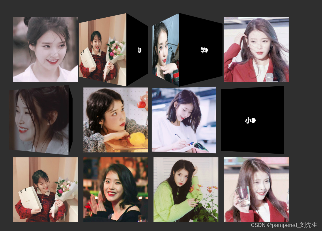
效果

html部分
<!DOCTYPE html>
<html>
	<head>
		<meta charset="utf-8">
		<title></title>
		<link rel="stylesheet" type="text/css" href="css/style.css" />
	</head>
	<body>
		<div class="wrapper">
			<ul>
				<li>
					<div class="picBox">
						<div class="show">
							<img height="180px" width="180px" src="img/pic1.png">
						</div>
						<div class="hide">
							<h3>
								努❥
							</h3>
						</div>
					</div>
				</li>
				<li>
					<div class="picBox">
						<div class="show">
							<img height="180px" width="180px" src="img/pic2-1.png">
						</div>
						<div class="hide">
							<h3>
								力❥
							</h3>
						</div>
					</div>
				</li>
				<li>
					<div class="picBox">
						<div class="show">
							<img height="180px" width="180px" src="img/pic2-2.png">
						</div>
						<div class="hide">
							<h3>
								学❥
							</h3>
						</div>
					</div>
				</li>
				<li>
					<div class="picBox">
						<div class="show">
							<img height="180px" width="180px" src="img/pic2-3.png">
						</div>
						<div class="hide">
							<h3>
								习❥
							</h3>
						</div>
					</div>
				</li>
				<li>
					<div class="picBox">
						<div class="show">
							<img height="180px" width="180px" src="img/pic2-4.png">
						</div>
						<div class="hide">
							<h3>
								挣❥
							</h3>
						</div>
					</div>
				</li>
				<li>
					<div class="picBox">
						<div class="show">
							<img height="180px" width="180px" src="img/pic2.png">
						</div>
						<div class="hide">
							<h3>
								钱❥
							</h3>
						</div>
					</div>
				</li>
				<li>
					<div class="picBox">
						<div class="show">
							<img height="180px" width="180px" src="img/pic3-1.png">
						</div>
						<div class="hide">
							<h3>
								给❥
							</h3>
						</div>
					</div>
				</li>
				<li>
					<div class="picBox">
						<div class="show">
							<img height="180px" width="180px" src="img/pic3-2.png">
						</div>
						<div class="hide">
							<h3>
								小❥
							</h3>
						</div>
					</div>
				</li>
				<li>
					<div class="picBox">
						<div class="show">
							<img height="180px" width="180px" src="img/pic3-3.png">
						</div>
						<div class="hide">
							<h3>
								娇❥
							</h3>
						</div>
					</div>
				</li>
				<li>
					<div class="picBox">
						<div class="show">
							<img height="180px" width="180px" src="img/pic3-4.png">
						</div>
						<div class="hide">
							<h3>
								妻❥
							</h3>
						</div>
					</div>
				</li>
				<li>
					<div class="picBox">
						<div class="show">
							<img height="180px" width="180px" src="img/pic3.png">
						</div>
						<div class="hide">
							<h3>
								花❥
							</h3>
						</div>
					</div>
				</li>
				<li>
					<div class="picBox">
						<div class="show">
							<img height="180px" width="180px" src="img/pic4.png">
						</div>
						<div class="hide">
							<h3>
								!❥
							</h3>
						</div>
					</div>
				</li>
			</ul>
		</div>

		<script src="js/jquery.min.js"></script>
		<script src="js/demo.js"></script>
	</body>
</html>
css部分
*{
	margin: 0;
	padding: 0;
}
body{
	background-color: #2F2F2F;
}
.wrapper{
	max-width: 900px;
	margin: 80px auto;
}
.wrapper li{
	position: relative;
	width: 180px;
	height: 180px;
	list-style: none;
	margin: 5px;
	display: inline-block;
	perspective: 300px;
}
.picBox{
	position: absolute;
	top: 0;
	right: 0;
	bottom: 0;
	left: 0;
	transform-style: preserve-3d;
	transform-origin: 50% 50% -90px;
	animation: 200ms ease-out 0ms 1 normal forwards;//时间 过度类型 延迟 循环次数 是否反向循环 动画的状态
}
.show,
.hide{
	position: absolute;
	top: 0;
	right: 0;
	bottom: 0;
	left: 0;
}
.hide{
	color: #fff;
	background-color: #000;
	text-align: center;
	line-height: 180px;
	transform: translate3d(0,0,-1px);//3d空间内移动一个元素的位置
}
.in-top .hide,
.out-top .hide
 {
    transform-origin: 0% 100%;
    transform: translate3d(0, -100%, 0) rotate3d(1,0,0,90deg);
}
.in-top .picBox{
    animation-name: in-top;
    animation-play-state: running;
}
.out-top .picBox{
    animation-name: out-top;
    animation-play-state: running;
}
@keyframes in-top {
    from  {transform: rotate3d(0,0,0,0deg)}
    to    {transform: rotate3d(-1,0,0,90deg)}
}

@keyframes out-top {
    from {transform: rotate3d(-1,0,0,90deg)}
    to   {transform: rotate3d(0,0,0,0deg)}
}
.in-right .hide,
.out-right .hide {
          transform-origin: 0% 0%;
          transform: translate3d(100%, 0, 0) rotate3d(0,1,0,90deg);
}
.in-right .picBox{
    animation-name: in-right;
    animation-play-state: running;
}
.out-right .picBox{
    animation-name: out-right;
    animation-play-state: running;
}
@keyframes in-right {
    from  {transform: rotate3d(0,0,0,0deg)}
    to    {transform: rotate3d(0,-1,0,90deg)}
}

@keyframes out-right {
    from  {transform: rotate3d(0,-1,0,90deg)}
    to    {transform: rotate3d(0,0,0,0deg)}
}

.in-bottom .hide,
.out-bottom .hide {
          transform-origin: 0% 0%;
          transform: translate3d(0, 100%, 0) rotate3d(-1,0,0,90deg);
}
.in-bottom .picBox{
    animation-name: in-bottom;
    animation-play-state: running;
}
.out-bottom .picBox{
    animation-name: out-bottom;
    animation-play-state: running;
}
@keyframes in-bottom {
    from  {transform: rotate3d(0,0,0,0deg)}
    to    {transform: rotate3d(1,0,0,90deg)}
}
@keyframes out-bottom {
    from  {transform: rotate3d(1,0,0,90deg)}
    to    {transform: rotate3d(0,0,0,0deg)}
}
.in-left .hide,
.out-left .hide {
          transform-origin: 100% 0;
          transform: translate3d(-100%,0,0) rotate3d(0,-1,0,90deg);
}
@keyframes in-left {
    from  {transform: rotate3d(0,0,0,0deg)}
    to    {transform: rotate3d(0,1,0,90deg)}
}
@keyframes out-left {
    from  {transform: rotate3d(0,1,0,90deg)}
    to    {transform: rotate3d(0,0,0,0deg)}
}
.in-left .picBox{
          animation-name: in-left;
          animation-play-state: running;
}
.out-left .picBox{
          animation-name: out-left;
          animation-play-state: running;
}
js部分
function Index(node) {
    this.node = node;
    this.init();
};
Index.prototype.init = function () {
    var self = this;
    this.nodes = [];
    Array.prototype.slice.call(self.node, 0).forEach(function (item, index) {
        self.nodes.push(self.update(item));
        self.bindEvents(item, index);
    });
};
Index.prototype.update = function (item) {
    return {
        w: item.offsetWidth,
        h: item.offsetHeight,
        l: item.offsetLeft,
        t: item.offsetTop
    }
};
Index.prototype.bindEvents = function (item, index) {
    var self = this;
    $(item).on('mouseenter', function (e) {
        self.addClass(e, item, 'in', index);
        return false;

    })
    $(item).on('mouseleave', function (e) {
        self.addClass(e, item, 'out', index);
        return false;
    })
};
Index.prototype.addClass = function (e, item, state, index) {
    var direction = this.getDirection(e, index);
    var class_suffix = '';
    switch (direction) {
        case 0:
            class_suffix = '-top';
            break;
        case 1:
            class_suffix = '-right';
            break;
        case 2:
            class_suffix = '-bottom';
            break;
        case 3:
            class_suffix = '-left';
            break;
    }
    item.className = '';
    item.classList.add(state + class_suffix);
};
Index.prototype.getDirection = function (e, index) {
    var w = this.nodes[index].w,
        h = this.nodes[index].h,
        x = e.pageX - this.nodes[index].l - w / 2 ,
        y = e.pageY - this.nodes[index].t - h / 2 ;
        // 取到x,y两点坐标
        d=(Math.round(((Math.atan2(y, x) * (180 / Math.PI)) + 180) / 90)+3) % 4;


    return d;//d的数值用于判断方向上下左右。
};
new Index($('li'));
注:有需要,csdn联系发代码图片


 2978
2978


 被折叠的 条评论
为什么被折叠?
被折叠的 条评论
为什么被折叠?
 到【灌水乐园】发言


