


 本文详细介绍了CSS中的伪类和伪元素,包括它们的应用场景、状态伪类如:link、:hover、:active和:visited,以及伪元素的选择器和使用方法。还涵盖了CSS布局中的浮动、定位、文档流和不同类型的布局示例,如两栏和多栏布局的实现与调试技巧。
CSS伪类与伪元素
1.伪类和伪元素的用途
伪类:可以用于
设置鼠标悬停在元素上时的样式;为已访问和未访问链接设置不同的样式;设置元素获得焦点时的样式
伪元素:可以用于
设置元素的首字母、首行的样式;在元素的内容之前或之后插入内容
2.伪类
- 状态伪类:基于元素当前状态进行选择的(主要预习)
- 结构性伪类:css3新增选择器
:link 应用于未被访问过的链接;
:hover 应用于鼠标悬停到的元素;
:active 应用于被激活的元素;
:visited 应用于被访问过的链接,与:link互斥。
:focus 应用于拥有键盘输入焦点的元素。
上网寻找到代码的实例
<!DOCTYPE html>
<html>
<head>
<style>
/* 未访问的链接 */
a:link {
color: red;
}
/* 已访问的链接 */
a:visited {
color: green;
}
/* 鼠标悬停链接 */
a:hover {
color: hotpink;
}
/* 已选择的链接*/
a:active {
color: blue;
}
</style>
</head>
<body>
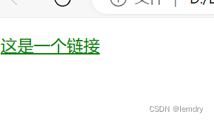
<p><a href="">这是一个链接</a></p>
</body>
</html>注意:
这几个伪类同时出现在一个元素的操作上,顺序不能改变,否则很大程度上会产生紊乱,造成效果失效!
a:hover 必须在 CSS 定义中的 a:link 和 a:visited 之后,才能生效。(意思是必须先写a:link 和 a:visited再写 :hover)
a:active 必须在 CSS 定义中的 a:hover 之后才能生效。(意思是必须先写a:hover再写 :active)
另外伪类名称对大小写并不敏感
3.伪元素
| 选择器 | 例子 | 例子描述 |
| ::after | a::after | 在每个 <p> 元素之后插入内容 |
| ::before | a::before | 在每个 <p> 元素之前插入内容 |
| ::first-letter | a::first-letter | 选择每个 <p> 元素的首字母 |
| ::first-line | a::first-line | 选择每个 <p> 元素的首行 |
| ::selection | p::selection | 选择用户选择的元素部分 |
注意:伪元素用两个冒号,伪类用一个冒号
-
<style>
	p::first-line {
  color: #ff0000;
  font-size:16px;
</style>
<body>
	<h1>中华人民共和国万岁</h1>
	<p>wansui</p>
</body>
</html>
测试结果:中华人民共和国的字体颜色为红色
找的代码总是在DW实现不了,学姐学长有什么办法吗?
关系选择器
类型:
- 后代选择器
- 子代选择器
- 相邻兄弟选择器
- 通用兄弟选择器
1.后代选择器
A B{}
.ul li{
color:red;
}
2.子代选择器
A>B{}
.ul>li{
color:red;
}
3.相邻兄弟选择器
A+B{}
.one+p{
color: red;
}
4、通用兄弟选择器
A~B{}
.one~p {
            color: coral;
        }
CSS布局
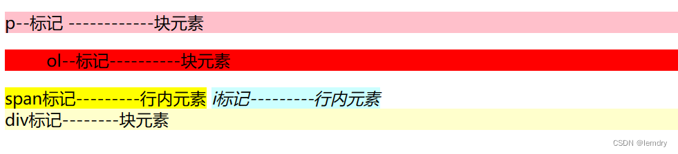
<span>为最典型的行内元素;<div>标记是最典型的块元素
块元素和行元素的转换:
display对类型进行转换
(1)inline:此元素将显示为行内元素(行内元素默认的display属性值)。
(2)block:此元素将显示为块元素(块元素默认的display属性值)。
(3)inline- block: 此元素将显示为行内块元素,可以对其设置宽度、高度和对齐等属性,但是该元素不会独占一行。(4)none:此元素将被隐藏,不显示,也不占用页面空囘,相当于垓元素不存在。
上面的代码若加入display:inline就会变成

CSS有三种基本定位机制:普通文档流、浮动、定位。
普通文档流中元素的位置由元素在HTML中的位置决定。
通过使用定位属性(position)可以选择4种不同类型的定位,这会影响元索的显示位置:定位属性的取值可以是static (静态定位)、relative (相对定位)、absolute (绝对定位)、fixed(固定定位)。
1.普通文档流
下面的例子主要为静态定位
<!DOCTYPE html>
<html>
<head>
	<meta charset="utf-8">
	<meta name="viewport" content="width=device-width, initial-scale=1">
	<title></title>
	<style type="text/css">
		P{
			border: solid 5px blue;
			text-align: right; /* 右对齐 */
			width: 110px;
			height: 20px;
		}
	</style>
</head>
<body>
<p>hello world</p>
<p>hello world</p>
<p>hello world</p>
</body>
</html>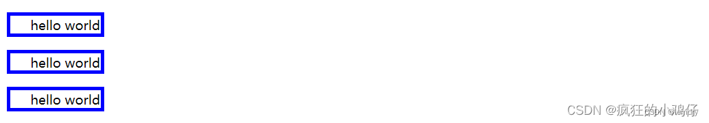
2.浮动
盒模型
HTML文档中的每个元素都被描绘成矩形盒子,这些矩形盒子通过一个模型来描述其占用的空间,这个模型称为盒子模型。
盒子模型用四个边界描述:margin (外边距), border (边框),padding (内边距),content (内容区域)
外边距
用margin属性定义。
margin的默认值是0。外边距没有继承性,也就是说给父元素设置的margin值并不会自动传递到子元素中。
margin该属性可以有1- 4个值,表示的含义
(1) margin: 20px; //表示4个方向的外边距都是20px
(2) margin: 20px 5px; //表示上下外边距是20px,左右外边距是5px
(3) margin: 10px 5px 15px; //表示上外边距是10px,左右外边距是5px,下外边距是15px
(4) margin: 10px 5px 15px 20px; //表示上外边距是10px,右外边距是5px,下外边距/是15px,右外边距是20px
四个外边距的顺序从上开始,按照顺时针方向设置。也能使用margin-top、margin-right、 margin-bottom和margin-left四个属性对上外边距、右外边距、下外边距和左外边距分别设置。
margin外边距合并有以下原则:(1)块级元素的垂直相邻外边距会合并,且其垂直相邻外边距合并之后的值为上元素的下
外边距和下元素的上外边距的较大值。
(2)行内元素实际上不占上下外边距,行内元素的左右外边距不会合并。
(3)浮动元素的外边距不会合并。
内边框
内边距指盒子模型的边框与显示内容之间的距离,使用paddig属性定义。
例如:设置h1元素的各边都有10像素的内边距
h1 {padding: 10px;}
例如:按照上、右、下、左的顺序分别设置各边的内边距,各边均可以使用不同的单位或百分比值。h1 {padding: 5px 6px 7px 8px;}
同样也可以通过padding-top、padding -right、padding-bottom、 padding-left四个单独的属性,分别设置上、右、下、左内边距。
元素的边框( border )是围绕元素内容和内边距的一条或多条线。CSS中使用border属性设置元素边框的样式、宽度和颜色。格式如下:
border:宽度 样式 颜色;
比较感兴趣的布局
两栏布局
<!DOCTYPE html>
<html>
<head>
	<meta charset="utf-8">
	<meta name="viewport" content="width=device-width, initial-scale=1">
	<title></title>
	<style type="text/css">
		*{
			margin: 0;
			padding: 0;
		}
		.content{
			width: 410px;
			height: 200px;
		}
		.left{
			background-color: yellow;
			float: left;
			height: 100%;
			width: 100px;


		}
		.right{
			background-color: red;
			width: 300px;
			height: 100%;
			float: left;
			margin-left: 10px;
		}
		.content::after{
			content: '';
			display: block;  //display属性设置为快属性
			visibility: hidden;  //可见性为隐藏
			clear: both;     //清楚块两侧的浮动
		}
	</style>
</head>
<body>
	<div class="content">
		<div class="left">左</div>
		<div class="right">右</div>
	</div>
</body>
</html> 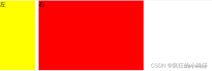
多栏布局
<!DOCTYPE html>
<html>
<head>
	<meta charset="utf-8">
	<meta name="viewport" content="width=device-width, initial-scale=1">
	<title>

	</title>
	<style type="text/css">
		.header,.footer{
			width: 500px;
			height: 100px;
			background: pink;
		}
		.main{
			width: 500px;
			height: 300px;

		}
		.left,.right{
			width: 100px;
			height: 300px;
		}
		.content-top,.content-bot{
			width: 300px;
			height: 150px;
		}
		.left{
			background: #c9e143;
			float: left;
		}
		.content-top{
			background: #ff0000;

		}
		.content-bot{
			background: #ffa500;

		}
		.right{
			float: right;
			background: black;
			}
			.content{
				float: left;
			}
	</style>
</head>
<body>
	<div class="header"></div>
	<div class="main">
		<div class="left"></div>
		<div class="content">
			<div class="content-top"></div>
			<div class="content-bot"></div>
		</div>
		<div class="right"></div>
	</div>
	<div class="footer"></div>
</body>
</html>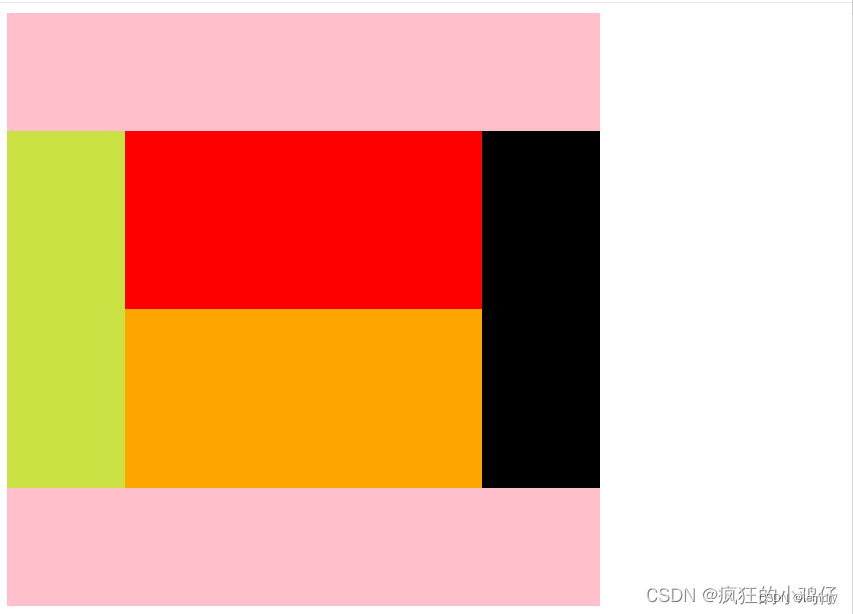


 152
152


 被折叠的 条评论
为什么被折叠?
被折叠的 条评论
为什么被折叠?
 到【灌水乐园】发言


