


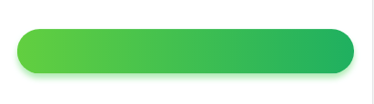
例如下面绿色的按钮渐变加阴影
直接贴代码:大家可以根据自己的需求做调整:
width: 100%;
height: 50px;
background: -webkit-linear-gradient(left, #62cf40 , #1fb060); /* Safari 5.1 - 6.0 */
background: -o-linear-gradient(right, #62cf40, #1fb060); /* Opera 11.1 - 12.0 */
background: -moz-linear-gradient(right, #62cf40, #1fb060); /* Firefox 3.6 - 15 */
background: linear-gradient(to right, #62cf40 , #1fb060); /* 标准的语法(必须放在最后) */
border-radius: 67px;
-webkit-box-shadow:0px 5px 10px rgba(0, 192, 14, 0.3);
-moz-box-shadow: 0px 5px 10px rgba(0, 192, 14, 0.3);
box-shadow: 0px 5px 10px rgba(0, 192, 14,0.3);
详解:
1、 background-image: linear-gradient(direction, color-stop1, color-stop2, ...);
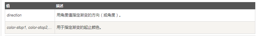
2、box-shadow: h-shadow v-shadow blur spread color inset;
·····


 扫一扫
扫一扫


 被折叠的 条评论
为什么被折叠?
被折叠的 条评论
为什么被折叠?
 到【灌水乐园】发言


