


大家好,我是宝哥。
今天讲50个前端实战项目之08:表单输入框波纹。
源码下载地址
https://github.com/bradtraversy/50projects50days/tree/master/form-input-wave
前端实战项目系列正在更新:08/50
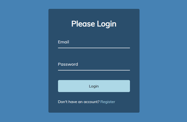
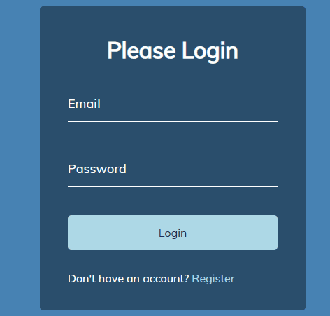
项目介绍
本项目演示了一个带有文字波纹效果的表单输入框。用户在输入框中输入文字时,相应的字母标签会产生波纹涟漪的动画效果。
效果预览
在线预览(文末点击原文链接可直达):
https://qdkfweb.cn/50projects50days/form-wave/
核心代码
HTML
使用了标准的表单结构,并在每个 .form-control 元素中嵌套了一个包含文本内容的 <label> 标签。
<!DOCTYPE html>
<html lang="en">
  <head>
    <meta charset="UTF-8" />
    <meta name="viewport" content="width=device-width, initial-scale=1.0" />
    <link rel="stylesheet" href="style.css" />
    <title>Form Input Wave</title>
  </head>
  <body>
    <div class="container">
      <h1>Please Login</h1>
      <form>
        <div class="form-control">
          <input type="text" required>
          <label>Email</label>
          <!-- <label>
            <span style="transition-delay: 0ms">E</span>
              <span style="transition-delay: 50ms">m</span>
              <span style="transition-delay: 100ms">a</span>
              <span style="transition-delay: 150ms">i</span>
              <span style="transition-delay: 200ms">l</span>
        </label> -->
        </div>

        <div class="form-control">
          <input type="password" required>
          <label>Password</label>
        </div>

        <button class="btn">Login</button>

        <p class="text">Don't have an account? <a href="#">Register</a> </p>
      </form>
    </div>
    <script src="script.js"></script>
  </body>
</html>
CSS
CSS 样式定义了表单的整体样式、按钮样式以及输入框聚焦/有效的样式。
关键在于为
<label>标签内的文本设置了额外的样式。首先将文本内容拆分成一个个的字母
<span>元素。然后利用
transition属性控制这些字母元素的transform( translateY ) 和颜色,使其在输入框获得焦点或值有效时依次位移并变色,呈现波纹效果。
@import url('https://fonts.googleapis.com/css?family=Muli&display=swap');

* {
  box-sizing: border-box;
}

body {
  background-color: steelblue;
  color: #fff;
  font-family: 'Muli', sans-serif;
  display: flex;
  flex-direction: column;
  align-items: center;
  justify-content: center;
  height: 100vh;
  overflow: hidden;
  margin: 0;
}

.container {
  background-color: rgba(0, 0, 0, 0.4);
  padding: 20px 40px;
  border-radius: 5px;
}

.container h1 {
  text-align: center;
  margin-bottom: 30px;
}

.container a {
  text-decoration: none;
  color: lightblue;
}

.btn {
  cursor: pointer;
  display: inline-block;
  width: 100%;
  background: lightblue;
  padding: 15px;
  font-family: inherit;
  font-size: 16px;
  border: 0;
  border-radius: 5px;
}

.btn:focus {
  outline: 0;
}

.btn:active {
  transform: scale(0.98);
}

.text {
  margin-top: 30px;
}

.form-control {
  position: relative;
  margin: 20px 0 40px;
  width: 300px;
}

.form-control input {
  background-color: transparent;
  border: 0;
  border-bottom: 2px #fff solid;
  display: block;
  width: 100%;
  padding: 15px 0;
  font-size: 18px;
  color: #fff;
}

.form-control input:focus,
.form-control input:valid {
  outline: 0;
  border-bottom-color: lightblue;
}

.form-control label {
  position: absolute;
  top: 15px;
  left: 0;
}

.form-control label span {
  display: inline-block;
  font-size: 18px;
  min-width: 5px;
  transition: 0.3s cubic-bezier(0.68, -0.55, 0.265, 1.55);
}

.form-control input:focus + label span,
.form-control input:valid + label span {
  color: lightblue;
  transform: translateY(-30px);
}
JavaScript
获取所有的
.form-control label元素的 DOM 节点列表。遍历这些标签,并利用 JavaScript 字符串操作方法将文本内容拆分成一个个的字母。
然后为每个字母创建一个单独的
<span>元素,并设置相应的样式 (包含延迟时间)。最后,将这些字母
<span>元素的组合重新赋值回标签的innerHTML属性,完成替换。
const labels = document.querySelectorAll('.form-control label')

labels.forEach(label => {
    label.innerHTML = label.innerText
        .split('')
        .map((letter, idx) => `<span style="transition-delay:${idx * 50}ms">${letter}</span>`)
        .join('')
})
总结
该项目利用 CSS 的 transition 属性控制文本的移动和颜色的变化,从而实现波纹效果。JavaScript 代码则负责将标签的文本内容拆分成一个个字母的 span 元素,并设置每个字母的延迟时间,使它们依次位移并变色,营造波浪扩散的视觉效果。
动图全过程展示:
在线预览(点底部原文链接可直达):https://qdkfweb.cn/50projects50days/form-wave/
最后
如果你觉得宝哥今天的尝试对你有帮助,就给我点个赞,关注一波。分享出去,也许你的转发能给别人带来一点启发。
以后我也会多尝试共读其它项目,如果看到喜欢的项目也可以留言告诉我,今天的教程你学会了吗?学会了,就在评论区刷一个,学会了。
欢迎长按图片加好友,宝哥会第一时间和你分享前端行业趋势,面试资源,学习途径等等。

添加好友备注【加群】拉你进技术交流群
公众号:前端开发博客专注前端开发技术,分享前端开发资源和WEB前沿资讯,如果喜欢我的分享,给 宝哥 点一个赞或者分享都是对我的支持
关注公众号后,在首页:
回复「小抄」,领取Vue、JavaScript 和 WebComponent 小抄 PDF
回复「Vue脑图」获取 Vue 相关脑图
回复「思维图」获取 JavaScript 相关思维图
回复「简历」获取简历制作建议
回复「简历模板」获取精选的简历模板
回复「电子书」下载我整理的大量前端资源,含面试、Vue实战项目、CSS和JavaScript电子书等。
回复「知识点」下载高清JavaScript知识点图谱
回复「读书」下载成长的相关电子书


 2148
2148

 被折叠的 条评论
为什么被折叠?
被折叠的 条评论
为什么被折叠?
 到【灌水乐园】发言


