


之前我们学习了使用grid来设置图表的边距(https://blog.csdn.net/lilycheng1986/article/details/119570518),
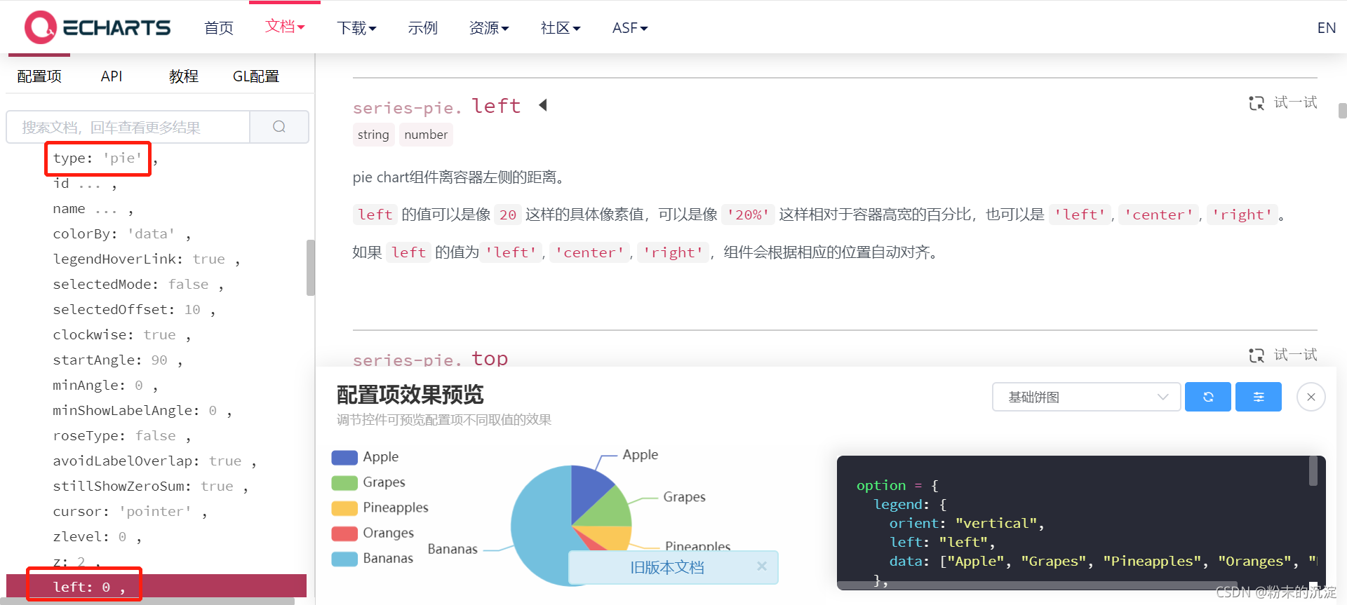
但是我发现grid是相当于把legend和pie当一个整体来移动了,如果想要调整legend和pie之间的距离,可以分别给它俩设置left、right这些配置项,平时要多看看echart的配置文档。
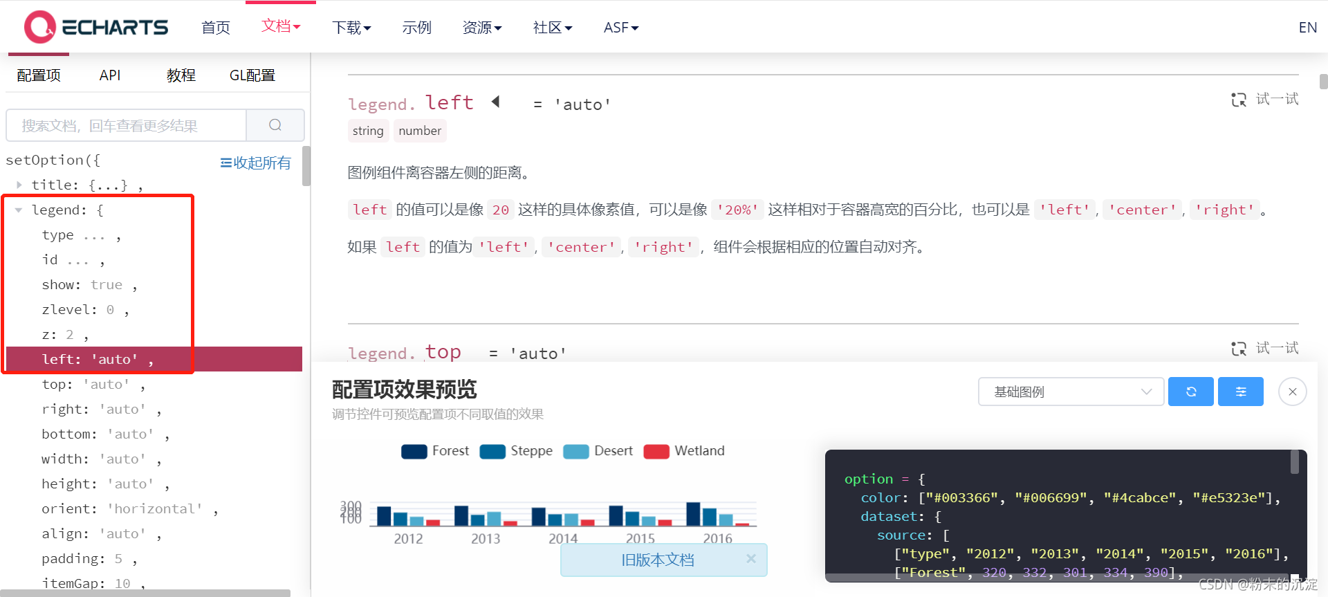
legend: {
            orient: 'vertical',
            left: 0,
            bottom: 'center',
            icon: "circle",
            textStyle: {
              color: "#ffffff",
              fontSize:16
            },
series: [{
name: '危化企业占比情况',
type: 'pie',
radius: ['40%', '70%'],
avoidLabelOverlap: false,
left: 200,
label: {
show: true,
position: 'outside',
color: '#0e94ea'
},
labelLine: {
normal: {
lineStyle: {
color: '#0e94ea'
},
smooth: 0.2
}
},
data: data
}]效果图


 被折叠的 条评论
为什么被折叠?
被折叠的 条评论
为什么被折叠?
 到【灌水乐园】发言


