


在网上看到一个进度条效果图,非常美观,如下:

进行效果分解:
1,渐变色,看起来颜色变化并不复杂,使用LinearGradient应该可以实现。
2,圆头,无非是画两个圆,外圆使用渐变色的颜色,内圆固定为白色。
3,灰底,还没有走到的进度部分为灰色。
4,进度值,使用文本来显示;
5,弧形的头部,考虑使用直线进行连接,或者使用曲线,例如贝塞尔曲线;
我首先初步实现了进度条的模样,发现样子有了,却不太美观。
反思了一下,我只是个写代码的,对于哪种比例比较美观,是没有清晰的认识的,所以,还是参考原图吧。
然后就进行了精细的测量:
将图像放大4倍,进行测量,然后获取到各部分的比例关系,具体过程就不细说了,说一下测量结果(按比例的):
视图总长300,其中前面留空5,进度长258,然后再留空5,显示文本占26,后面留空6;
高度分为4个:
外圆:10
字高:9
内圆:6
线粗:5
考虑上下各留空10,则视图的高度为30。
考虑到视图整体的效果,可以由用户来设置长度值与高度值,按比例取最小值来进行绘图。
首先计算出一个单位的实际像素数,各部分按比例来显示即可。
还有一个弧形的头部,是怎么实现的呢?
在放大之后,能看出来图形比较简单,看不出有弧度,那么,使用一小段直线连接就可以了。
估算这小段直线:线粗为2,呈30度角,长为8-10即可,连接直线与弧顶,起点在弧顶之左下方。
注意:在进度的起点时,不能画出。避免出现一个很突兀的小尾巴。在2%进度之后,才开始画。
在文字的绘制过程中,遇到一个小问题,就是文字不居中,略微偏下,上网查了下,原因是这样的:我们绘制文本时,使用的这个函数:canvas.drawText(“30%”, x, y, paint);
其中的参数 y 是指字符串baseline的的位置,不是文本的中心。通过计算可以调整为居中,如下:
        //计算坐标使文字居中
        FontMetrics fontMetrics = mPaint.getFontMetrics();
        float  fontHeight = fontMetrics.bottom - fontMetrics.top;
        float baseY =  height/2 + fontHeight/2 - fontMetrics.bottom;
按比例来绘制之后,就确实是原来那个修长优雅的感觉了。
实际运行后,发现字体偏小,不太适合竖屏观看,调大了些。
另外对于参数,做了如下几个自定义属性:
前景色:开始颜色,结束颜色;
进度条未走到时的默认颜色,
字体颜色。
属性xml如下:
<?xml version="1.0" encoding="utf-8"?>
<resources>

    <attr name="startColor" format="color" />
    <attr name="endColor" format="color" />
    <attr name="backgroundColor" format="color" />
    <attr name="textColor" format="color" />

    <declare-styleable name="GoodProgressView">
        <attr name="startColor" />
        <attr name="endColor" />
        <attr name="backgroundColor" />
        <attr name="textColor" />
    </declare-styleable>

</resources>
自定义View文件:
package com.customview.view;

import android.content.Context;
import android.content.res.TypedArray;
import android.graphics.Canvas;
import android.graphics.Color;
import android.graphics.LinearGradient;
import android.graphics.Paint;
import android.graphics.Shader;
import android.graphics.Paint.Cap;
import android.graphics.Paint.FontMetrics;
import android.graphics.Paint.Style;
import android.util.AttributeSet;
import android.util.Log;
import android.view.View;
import com.customview.R;

public class GoodProgressView extends View
{
    private int[] mColors = { Color.RED, Color.MAGENTA};//进度条颜色(渐变色的2个点)
    private int backgroundColor = Color.GRAY;//进度条默认颜色
    private int textColor = Color.GRAY;//文本颜色

    private Paint mPaint;//画笔
    private int progressValue=0;//进度值
//  private RectF rect;//绘制范围

    public GoodProgressView(Context context, AttributeSet attrs)
    {
        this(context, attrs, 0);
    }

    public GoodProgressView(Context context)
    {
        this(context, null);
    }

    // 获得我自定义的样式属性
    public GoodProgressView(Context context, AttributeSet attrs, int defStyle)
    {
        super(context, attrs, defStyle);

        // 获得我们所定义的自定义样式属性
        TypedArray a = context.getTheme().obtainStyledAttributes(attrs, R.styleable.GoodProgressView, defStyle, 0);
        int n = a.getIndexCount();
        for (int i = 0; i < n; i++)
        {
            int attr = a.getIndex(i);
            switch (attr)
            {
            case R.styleable.GoodProgressView_startColor:
                // 渐变色之起始颜色,默认设置为红色
                mColors[0] = a.getColor(attr, Color.RED);
                break;
            case R.styleable.GoodProgressView_endColor:
                // 渐变色之结束颜色,默认设置为品红
                mColors[1] = a.getColor(attr, Color.MAGENTA);
                break;
            case R.styleable.GoodProgressView_backgroundColor:
                // 进度条默认颜色,默认设置为灰色
                backgroundColor = a.getColor(attr, Color.GRAY);
                break;
            case R.styleable.GoodProgressView_textColor:
                // 文字颜色,默认设置为灰色
                textColor = a.getColor(attr, Color.GRAY);
                break;
            }
        }
        a.recycle();

        mPaint = new Paint();
        progressValue=0;
    }

    public void setProgressValue(int progressValue){

        if(progressValue>100){
            progressValue = 100;
        }
        this.progressValue = progressValue;
        Log.i("customView","log: progressValue="+progressValue);
    }

    public void setColors(int[] colors){
        mColors = colors;
    }

    @Override
    protected void onMeasure(int widthMeasureSpec, int heightMeasureSpec)
    {

        int width = 0;
        int height = 0;
        /**
         * 设置宽度
         */
        int specMode = MeasureSpec.getMode(widthMeasureSpec);
        int specSize = MeasureSpec.getSize(widthMeasureSpec);
        switch (specMode)
        {
        case MeasureSpec.EXACTLY:// 明确指定了
            width = specSize;
            break;
        case MeasureSpec.AT_MOST:// 一般为WARP_CONTENT
            width = getPaddingLeft() + getPaddingRight() ;
            break;
        }

        /**
         * 设置高度
         */
        specMode = MeasureSpec.getMode(heightMeasureSpec);
        specSize = MeasureSpec.getSize(heightMeasureSpec);
        switch (specMode)
        {
        case MeasureSpec.EXACTLY:// 明确指定了
            height = specSize;
            break;
        case MeasureSpec.AT_MOST:// 一般为WARP_CONTENT
            height = width/10;
            break;
        }

        Log.i("customView","log: w="+width+" h="+height);
        setMeasuredDimension(width, height);

    }

    @Override
    protected void onDraw(Canvas canvas) {
        super.onDraw(canvas);

        int mWidth = getMeasuredWidth();
        int mHeight = getMeasuredHeight();

        //按比例计算进度条各部分的值
        float unit = Math.min(((float)mWidth)/300, ((float)mHeight)/30);
        float lineWidth = 5*unit;//线粗
        float innerCircleDiameter = 6*unit;//内圆直径
        float outerCircleDiameter = 10*unit;//外圆直径
        float wordHeight = 12*unit;//字高//9*unit
//      float wordWidth = 26*unit;//字长
        float offsetLength = 5*unit;//留空
//      float width = 300*unit;//绘画区域的长度
        float height = 30*unit;//绘画区域的高度
        float progressWidth = 258*unit;//绘画区域的长度

        mPaint.setAntiAlias(true);
        mPaint.setStrokeWidth((float) lineWidth );
        mPaint.setStyle(Style.STROKE);
        mPaint.setStrokeCap(Cap.ROUND);

        mPaint.setColor(Color.TRANSPARENT);

        float offsetHeight=height/2;
        float offsetWidth=offsetLength;

        float section = ((float)progressValue) / 100;
        if(section>1)
            section=1;

        int count = mColors.length;
        int[] colors = new int[count];
        System.arraycopy(mColors, 0, colors, 0, count);

        //底部灰色背景,指示进度条总长度
        mPaint.setShader(null);
        mPaint.setColor(backgroundColor);
        canvas.drawLine(offsetWidth+section * progressWidth, offsetHeight, offsetWidth+progressWidth, offsetHeight, mPaint);

        //设置渐变色区域
        LinearGradient shader = new LinearGradient(0, 0, offsetWidth*2+progressWidth , 0, colors, null,
                Shader.TileMode.CLAMP);
        mPaint.setShader(shader);

        //画出渐变色进度条
        canvas.drawLine(offsetWidth, offsetHeight, offsetWidth+section*progressWidth, offsetHeight, mPaint);

        //渐变色外圆
        mPaint.setStrokeWidth(1);
        mPaint.setStyle(Paint.Style.FILL);
        canvas.drawCircle(offsetWidth+section * progressWidth, offsetHeight, outerCircleDiameter/2, mPaint);

        //绘制两条斜线,使外圆到进度条的连接更自然
        if(section*100>1.8){

            mPaint.setStrokeWidth(2*unit);
            canvas.drawLine(offsetWidth+section * progressWidth-6*unit, offsetHeight-(float)1.5*unit,
                    offsetWidth+section * progressWidth-1*unit,offsetHeight-(float)3.8*unit, mPaint);

            canvas.drawLine(offsetWidth+section * progressWidth-6*unit, offsetHeight+(float)1.5*unit,
                    offsetWidth+section * progressWidth-1*unit,offsetHeight+(float)3.8*unit, mPaint);
        }

        //白色内圆
        mPaint.setShader(null);
        mPaint.setColor(Color.WHITE);
        canvas.drawCircle(offsetWidth+section * progressWidth, offsetHeight, innerCircleDiameter/2, mPaint);//白色内圆


        //绘制文字--百分比
        mPaint.setStrokeWidth(2*unit);
        mPaint.setColor(textColor);
        mPaint.setTextSize(wordHeight);
        //计算坐标使文字居中
        FontMetrics fontMetrics = mPaint.getFontMetrics();
        float  fontHeight = fontMetrics.bottom - fontMetrics.top;
        float baseY =  height/2 + fontHeight/2 - fontMetrics.bottom;
        canvas.drawText(""+progressValue+"%", progressWidth+2*offsetWidth, baseY, mPaint);//略微偏下,baseline

    }

}
主xml:
放了两个进度条,一个使用默认值,一个设置了进度条默认颜色与字体颜色:
<RelativeLayout xmlns:android="http://schemas.android.com/apk/res/android"
    xmlns:tools="http://schemas.android.com/tools"
    xmlns:custom="http://schemas.android.com/apk/res/com.customview"
    android:layout_width="match_parent"
    android:layout_height="match_parent" >

    <com.customview.view.GoodProgressView
        android:id="@+id/good_progress_view1"
        android:layout_width="match_parent"
        android:layout_height="wrap_content"
        android:padding="10dp"
        />

    <com.customview.view.GoodProgressView
        android:id="@+id/good_progress_view2"
        android:layout_width="match_parent"
        android:layout_height="wrap_content"
        android:layout_centerInParent="true"
        custom:backgroundColor="#ffcccccc"
        custom:textColor="#ff000000"
        android:padding="10dp"
        />

</RelativeLayout>
Activity文件:
一个使用默认渐变色效果,一个的渐变色使用随机颜色,这样每次运行效果不同,比较有趣一些,另外我们也可以从随机效果中找到比较好的颜色组合。进度的变化,是使用了一个定时器来推进。
package com.customview;

import android.os.Bundle;
import android.os.Handler;
import android.os.Message;
import android.util.Log;
import android.view.WindowManager;
import java.util.Random;
import java.util.Timer;
import java.util.TimerTask;
import com.customview.view.GoodProgressView;
import android.app.Activity;
import android.graphics.Color;

public class MainActivity extends Activity
{

    GoodProgressView good_progress_view1;
    GoodProgressView good_progress_view2;

    int progressValue=0;

    @Override
    protected void onCreate(Bundle savedInstanceState)
    {
        super.onCreate(savedInstanceState);
        this.getWindow().setFlags(WindowManager.LayoutParams.FLAG_FULLSCREEN,WindowManager.LayoutParams.FLAG_FULLSCREEN);//去掉信息栏

        setContentView(R.layout.activity_main);
        good_progress_view1 = (GoodProgressView)findViewById(R.id.good_progress_view1);
        good_progress_view2 = (GoodProgressView)findViewById(R.id.good_progress_view2);

        //第一个进度条使用默认进度颜色,第二个指定颜色(随机生成)
        good_progress_view2.setColors(randomColors());

        timer.schedule(task, 1000, 1000); // 1s后执行task,经过1s再次执行
    }

    Handler handler = new Handler() {
        public void handleMessage(Message msg) {
            if (msg.what == 1) {
                Log.i("log","handler : progressValue="+progressValue);

                //通知view,进度值有变化
                good_progress_view1.setProgressValue(progressValue*2);
                good_progress_view1.postInvalidate();

                good_progress_view2.setProgressValue(progressValue);
                good_progress_view2.postInvalidate();

                progressValue+=1;
                if(progressValue>100){
                    timer.cancel();
                }
            }
            super.handleMessage(msg);
        };
    };

    private int[] randomColors() {
        int[] colors=new int[2];

        Random random = new Random();
        int r,g,b;
        for(int i=0;i<2;i++){
            r=random.nextInt(256);
            g=random.nextInt(256);
            b=random.nextInt(256);
            colors[i]=Color.argb(255, r, g, b);
            Log.i("customView","log: colors["+i+"]="+Integer.toHexString(colors[i]));
        }

        return colors;
    }

    Timer timer = new Timer();
    TimerTask task = new TimerTask() {

        @Override
        public void run() {
            // 需要做的事:发送消息
            Message message = new Message();
            message.what = 1;
            handler.sendMessage(message);
        }
    };

}
最终效果如下:
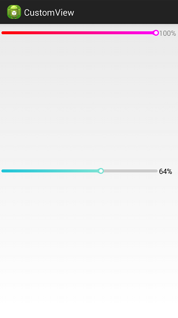
竖屏时:
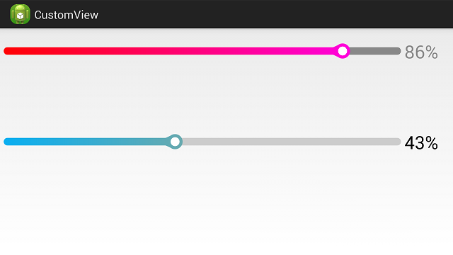
横屏时:


 扫一扫
扫一扫
 277
277

 被折叠的 条评论
为什么被折叠?
被折叠的 条评论
为什么被折叠?
 到【灌水乐园】发言


