从父现象:父亲怂了,儿子再牛逼也没用。
* {
margin: 0;
padding: 0;
}
.shayi {
width: 200px;
height: 200px;
background-color: blue;
position: relative;
z-index: 10;
}
.tianliang {
width: 200px;
height: 200px;
background-color: orange;
position: relative;
z-index: 9;
}
.anji {
width: 60px;
height: 60px;
background-color: green;
position: absolute;
top: 300px;
left: 450px;
z-index: 454;
}
.liangzai {
width: 60px;
height: 60px;
background-color: pink;
position: absolute;
top: 130px;
left: 490px;
z-index: 45454;
}
<div class="shayi">沙溢
<p class="anji">安吉</p>
</div>
<div class="tianliang">田亮
<p class="liangzai">亮仔</p>
</div>
总结:
1:margin的塌陷现象:标准文档流中,竖直方向的margin不会重叠,以较大的为准
2:当两个盒子浮动后,margin就会叠加(面试题)
3:标准文档流,盒子居中:margin:0 auto
4:定位:
1:相对定位:标准文档流,老家留坑,形影分离,参考点是本身 positon:relative
2:绝对定位:position:absolute
A:脱标,如果是top
B:参考点是页面左上角 如果是bottom,首屏的左下角
C:以盒子为参考点,盒子必须定位
子绝父相?
父亲需要占位子,所以是相对定位,儿子需要到处飘,压盖现象,所以需要绝对定位
D:定位的儿子会无视父亲的padding
3:固定定位 position:fixed,固定在页面的某个位置
用途:返回顶部按钮,顶部导航栏
4:z-index
A:值大的压住小的
B:值没有单位
C:只有定位的元素才可以设置z-index
D:从父现象,父亲的值如果小,儿子再大也没用
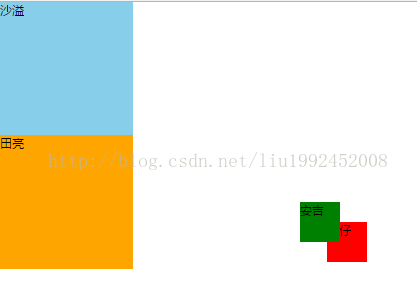
<!DOCTYPE html>
<html lang="en">

<head>
    <meta charset="UTF-8">
    <title>Document</title>
    <style>
        * {
            margin: 0;
            padding: 0;
        }

        .shayi {
            width: 200px;
            height: 200px;
            background: skyblue;
            position: relative;
            z-index: 10;
        }

        .tianliang {
            width: 200px;
            height: 200px;
            background: orange;
            position: relative;
            z-index: 9;
        }

        .anji {
            width: 60px;
            height: 60px;
            background: green;
            position: absolute;
            top: 300px;
            left: 450px;
            z-index: 200;
        }

        .liangzai {
            width: 60px;
            height: 60px;
            background: red;
            position: absolute;
            top: 130px;
            left: 490px;
            z-index: 900;
        }
    </style>
</head>

<body>
    <div class="shayi">沙溢
        <p class="anji">安吉</p>
    </div>
    <div class="tianliang">田亮
        <p class="liangzai">亮仔</p>
    </div>
</body>

</html>


 1万+
1万+


 被折叠的 条评论
为什么被折叠?
被折叠的 条评论
为什么被折叠?
 到【灌水乐园】发言


