


CSS3选择器
本文为本人CSS3学习笔记,文中所介绍内容以及源代码均出自:
图解css3核心技术与案例实战
W3CPlus
强烈推荐!!!
要使某个样式应用于特定的HTML元素,首先需要找到该元素。在CSS中,执行这一过程任务的表现规则称为CSS选择器,它为获取目标元素之后施加样式提供了极大的灵活性。
CSS3选择器在常规选择器的基础上新增了属性选择器、伪类选择器和过滤选择器,可以帮助在开发中减少对HTML类名或者ID名的依赖,以及对HTML元素的结构依赖,使编写代码更加简单轻松。
一、基本选择器
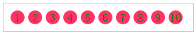
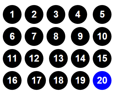
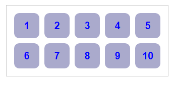
基本选择器是CSS中使用最频繁、最基础的选择器,通过基本选择器可以确定HTML树形结构中大多数的DOM元素节点。
<!DOCTYPE html>
<html>
<head>
    <meta charset="utf-8">
    <title>基本选择器</title>
<style type="text/css" media="screen">
*{
    margin:0;
    padding: 0;
}
.clearfix:after,.clearfix:before{
display: table;
content: "";
}
.clearfix:after{
    clear: both;
    overflow: hidden;
}
.demo{
    width: 250px;
    border: 1px solid #ccc;
    padding: 10px;
    margin:20px auto;
}
li{
    list-style: none outside none;
    float: left;
    height: 20px;
    line-height: 20px;
    width: 20px;
    border-radius: 10px;
    text-align: center;
    background: #f36;
    color: green;
    margin-right: 5px;
}
</style>
</head>
<body>
<ul class="clearfix demo">
    <li class="first" id="first">1</li>
    <li class="active">2</li>
    <li class="important item">3</li>
    <li class="important">4</li>
    <li class="item">5</li>
    <li>6</li>
    <li>7</li>
    <li>8</li>
    <li>9</li>
    <li class="last" id="last">10</li>
</ul>
</body>
</html>
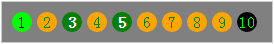
上面代码使用了基本选择器,页面的初步效果为
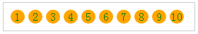
1.通配选择器
.demo *{
    background: orange;
}
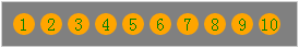
2.元素选择器
ul{
    background: gray;
}
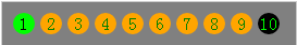
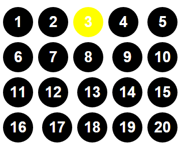
3.ID选择器
#first{
    background: lime;
    color: #000;
}
#last{
    background: #000;
    color: lime;
}
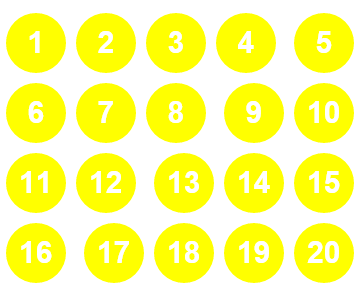
4.类选择器
.item{
    background: green;
    color: #fff;
    font-weight: bold;
}
二、层次选择器
层次选择器通过HTML的DOM元素间的层次关系获取元素,其主要的层次关系包括后代、父子、相邻兄弟和通用兄弟几种关系,通过七中某类关系可以方便快捷的选定需要的元素。
<!DOCTYPE html>
<html>
<head>
    <meta charset="utf-8">
    <title>使用CSS3层次选择器</title>
<style type="text/css" media="screen">
*{
    margin: 0;
    padding: 0;
}
body{
    width: 300px;
    margin: 0 auto;
}
div{
    margin: 5px;
    padding: 5px;
    border: 1px solid #ccc;
}
</style>
</head>
<body>
<div class="active">1</div>
<div>2</div>
<div>3</div>
<div>4
    <div>5</div>
    <div>6</div>
</div>
<div>7
    <div>8
        <div>9
            <div>10</div>
        </div>
    </div>
</div>
</body>
</html>
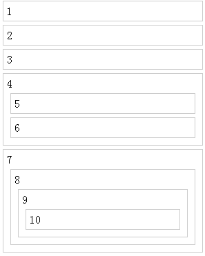
1.后代选择器
div div{
    background: orange;
}
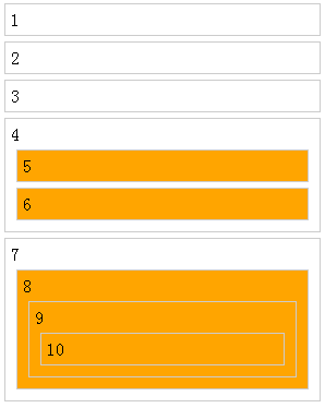
2.子选择器
body > div{
    background: green;
}
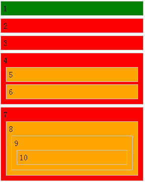
3.相邻兄弟选择器
.active + div{
    background: lime;
}
4.通用兄弟选择器
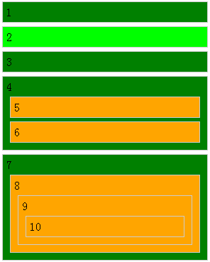
通用兄弟选择器是CSS3新增加的,用于选择某元素后面的所有兄弟元素。
.active ~ div{
    background: red;
}
三、动态伪类选择器
动态伪类并不存在于HTML中,只有当用户与网站交互的时候才能体现出来。动态伪类包含两种,第一种是在链接中常看到的锚点伪类,另一种为用户行为伪类。分别为:E:link,E:visited,E:active,E:hover,E:focus.
<!DOCTYPE html>
<html>
<head>
    <meta charset="utf-8">
    <title>使用动态伪类选择器美化按钮</title>
<style type="text/css" media="screen">
.download-info{
 text-align: center;
}
/*默认状态下的按钮效果*/
.btn{
    background-color: #0074cc;
    *background-color: #0055cc;
    /*CSS3渐变制作背景图片*/
    background-image: -ms-linear-gradient(top,#0088cc,#0055cc);
    background-image: -webkit-gradient(linear,0,0,0 100%,from(#0088cc),to(#0055cc));
    background-image: -webkit-linear-gradient(top,#0088cc,#0055cc);
    background-image: -o-linear-gradient(top,#0088cc,#0055cc);
    background-image: -moz-linear-gradient(top,#0088cc,#0055cc);
    background-image: linear-gradient(top,#0088cc,#0055cc);
    background-repeat: repeat-x;
    display: inline-block;
    *display: inline;
    border: 1px solid #ccc;
    *border: 0;
    border-color: #ccc;
    /*CSS3的色彩模块*/
    border-color: rgba(0,0,0,0.1) rgba(0,0,0,0.1) rgba(0,0,0,0.25);
    border-radius: 6px;
    color: #fff;
    cursor: pointer;
    font-size: 20px;
    font-weight: normal;
    filter:progid:dximagetransform.microsoft.gradient(startColorstr='#0088cc',endColorstr='#0055cc',GradientType=0);
    filter:progid:dximagetransform.microsoft.gradient(enabled=false);
    padding: 14px 24px;
    text-align: center;
    /*CSS3文字阴影特性*/
    text-shadow:0 -1px 0 rgba(0,0,0,0.25);
    text-decoration: none;
    vertical-align: middle;
    *zoom:1;
}
/*悬浮状态下的按钮效果*/
.btn:hover{
    background-position: 0 -15px;
    background-color: #0055cc;
    *background-color: #004ab3;
    color: #fff;
    text-decoration: none;
    text-shadow:0 -1px 0 rgba(0,0,0,0.25);
    /*CSS3动画效果*/
    -webkit-transition:background-position 0.1s linear;
    -moz-transition:background-position 0.1s linear;
    -ms-transition:background-position 0.1s linear;
    -o-transition:background-position 0.1s linear;
    transition:background-position 0.1s linear;
}
/*点击时按钮效果*/
.btn:active{
    background-color: #0055cc;
    *background-color: #004ab3;
    background-color: #004099 \9;
    background-image: none;
    outline: 0;
    /*CSS3盒子阴影特性*/
    box-shadow: inset 0 2px 4px rgba(0,0,0,0.15),0 1px 2px rgba(0,0,0,0.05);
    color: rgba(255,255,255,0.75);
}
/*获得焦点按钮效果*/
.btn:focus{
    outline: thin dotted #333;
    outline: 5px auto -webkit-focus-ring-color;
    outline-offset:-2px;
}
</style>
</head>
<body>
<div class="download-info">
    <a href="#" class="btn">View project on GitHub</a>
</div>
</body>
</html>
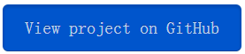
默认状态:

悬浮状态:
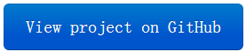
点击状态:
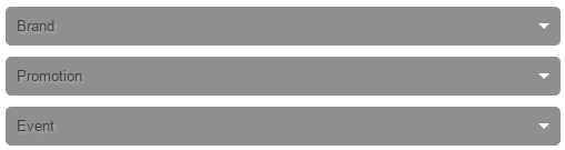
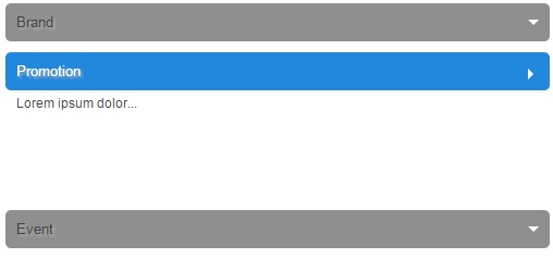
四、目标伪类选择器
目标伪类选择器” :target”用来匹配文档的URI中某个标识符的目标元素。具体来说。URI中的标识符通常会包含一个#号,后面带有一个标识符名称,例如”#contact”,”:target”就是用来匹配ID为”contact”的元素的。
使用纯CSS实现垂直手风琴效果。
<!DOCTYPE html>
<html>
<head>
    <meta charset="utf-8">
    <title>垂直手风琴</title>
<style type="text/css" media="screen">
.accordionMenu{
    background:#fff;
    color: #424242;
    font:12px Arial,Verdana,sans-serif;
    margin: 0 auto;
    padding: 10px;
    width: 500px;
}
.accordionMenu h2{
    margin:5px 0;
    padding: 0;
    position: relative;
}
.accordionMenu h2:before{/*制作向下三角效果*/
    border: 5px solid #fff;
    border-color: #fff transparent transparent;
    content: "";
    height: 0;
    position: absolute;
    right: 10px;
    top: 15px;
    width: 0;
}
.accordionMenu h2 a{/*制作手风琴标题栏效果*/
    background:#8f8f8f;
    background: linear-gradient(top,#cecece,#8f8f8f);
    border-radius: 5px;
    color: #424242;
    display: block;
    font-size: 13px;
    font-weight: normal;
    margin: 0;
    padding: 10px 10px;
    text-shadow:2px 2px 2px #aeaeae;
    text-decoration: none;
}
.accordionMenu :target h2 a,/*目标标题的效果*/
.accordionMenu h2 a:focus,
.accordionMenu h2 a:hover,
.accordionMenu h2 a:active{
    background: #2288dd;
    background: linear-gradient(top,#6bb2ff,#2288dd);
    color: #fff;
}
.accordionMenu p{/*标题栏对应的内容*/
    margin: 0;
    height: 0;/*默认栏目内容高度0,达到隐藏效果*/
    overflow: hidden;
    padding: 0 10px;
    transition:height 0.5s ease-in;
}
/*这部分是显示内容的关键代码*/
.accordionMenu :target p{/*展开时对应目标内容*/
    height: 100px;
    overflow: auto;
}
.accordionMenu :target h2:before{/*展开时标题三角效果*/
    border-color: transparent transparent transparent #fff;
}
</style>
</head>
<body>
    <div class="accordionMenu">
        <div class="menuSection" id="brand">
            <h2><a href="#brand">Brand</a></h2>
            <p>Lorem ipsum dolor...</p>
        </div>
        <div class="menuSection" id="promotion">
            <h2><a href="#promotion">Promotion</a></h2>
            <p>Lorem ipsum dolor...</p>
        </div>
        <div class="menuSection" id="event">
            <h2><a href="#event">Event</a></h2>
            <p>Lorem ipsum dolor...</p>
        </div>
    </div>
</body>
</html>
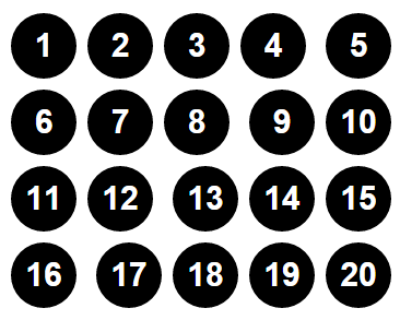
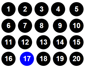
五、结构伪类选择器
<!DOCTYPE html>
<html>
<head>
    <meta charset="utf-8">
    <title>CSS3结构伪类选择器的使用</title>
<style type="text/css" media="screen">
*{
    margin: 0;
    padding: 0;
}
ul{
    margin: 50px auto;
    width: 400px;
    list-style: none outside none;
}
li{
    display: inline-block;
    margin: 5px;
    padding: 5px;
    width: 50px;
    height: 50px;
    font:bold 30px/50px arial;
    background: #000;
    color: #fff;
    border-radius: 50px;
    text-align: center;
}
</style>
</head>
<body>
<ul>
    <li>1</li><li>2</li><li>3</li><li>4</li>
    <li>5</li><li>6</li><li>7</li><li>8</li>
    <li>9</li><li>10</li><li>11</li><li>12</li>
    <li>13</li><li>14</li><li>15</li><li>16</li>
    <li>17</li><li>18</li><li>19</li><li>20</li>
</ul>
</body>
</html>
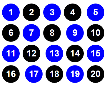
页面初始效果
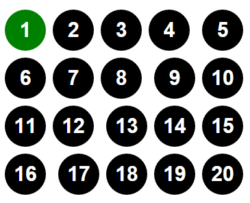
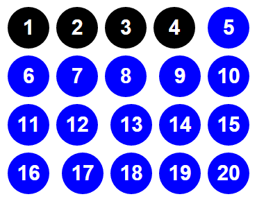
1.:first-child的使用
ul > li:first-child{
    background-color: green;
}
2.:last-child的使用
ul > li:last-child{
    background-color: blue;
}
3.:nth-child的使用
ul > li:nth-child(3){
    background-color: yellow;
}
ul > li:nth-child(n){
    background-color: yellow;
}
ul > li:nth-child(2n){
    background-color: yellow;
}
ul > li:nth-child(2n+1){
    background-color: yellow;
}
ul > li:nth-child(n+5){
    background-color: blue;
}
ul > li:nth-child(-n+5){
    background-color: blue;
}
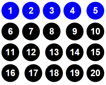
ul > li:nth-child(4n+1){
    background-color: blue;
}
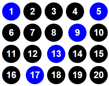
4.:nth-last-child的使用
:nth-last-child和:nth-child相似,只是:nth-last-child从某父元素的最后一个子元素开始计算来选择特定的元素。
ul > li:nth-last-child(4){
    background-color: blue;
}
5.:nth-of-type的使用
:nth-of-type和:nth-child类似,不同的是它只计算父元素中指定的某种类型的子元素。当某个元素中的子元素不单单是同一种类型的子元素时使用:nth-of-type选择器来定位于父元素中某种类型的子元素是非常有用和方便的。
6.:nth-last-of-type的使用
:nth-last-of-type和:nth-of-type一样,用来选择父元素中指定的某种子元素类型,但它的起始方向是从最后一个子元素开始的。
7.:first-of-type和:last-of-type的使用
:first-of-type和:last-of-type这两个选择器类似于:first-child和:last-child,不同之处就是指定了元素的类型。换句话说,:first-of-type是用来定位一个父元素下的某个类型的第一个子元素。而:last-of-type用来定位一个父元素下的某个类型的最后一个子元素。
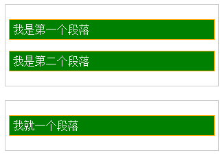
8.:only-child的使用
:only-child表示一个元素是它父元素的唯一子元素。换句话说,匹配元素的父元素中仅有一个子元素。
<!DOCTYPE html>
<html>
<head>
    <meta charset="utf-8">
    <title>:only-child的使用</title>
<style type="text/css" media="screen">
.post{
    width: 300px;
    margin: 20px auto;
    padding: 5px;
    border:1px solid #ccc;
}
p{
    background: green;
    color: #fff;
    border: 1px solid orange;
    padding: 5px;
}
</style>
</head>
<body>
<div class="post">
    <p>我是第一个段落</p>
    <p>我是第二个段落</p>
</div>
<div class="post">
    <p>我就一个段落</p>
</div>
</body>
</html>
页面初始效果:
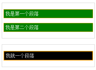
.post > p:only-child{
    border-width: 2px;
    background-color: #000;
}
9.:only-of-type的使用
:only-of-type用来选择一个元素是它的父元素的唯一一个相同类型的子元素。换一种说法,:only-of-type表示一个元素有很多个子元素,而其中只有一个子元素是唯一的,使用:only-of-type就可以选中这个唯一类型的子元素。
10.:empty的使用
:empty用来选择任何内容的元素,这里“没有任何内容”指的是一点内容都么有,哪怕是一个空格。
六、伪元素
伪元素可用于定位文档中包含的文本,但无法在文档树中定位。CSS3中对伪元素进行了一定的调整,在以前的基础上增加一个冒号,相应的变成了::first-letter,::first-line,::before,::after,另外还增加了一个::selection。
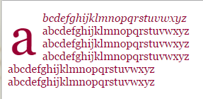
1.::first-line和::first-letter的使用
<!DOCTYPE html>
<html>
<head>
    <meta charset="utf-8">
    <title>CSS3伪元素</title>
<style type="text/css" media="screen">
p{
    color: #903;
    font: 16px/18px Georgia;
}
p::first-line{
    font-style: italic;
}
p::first-letter{
    float: left;
    padding: 4px 8px 0 3px;
    font: 75px/60px Georgia;
}
</style>
</head>
<body>
<p>
    abcdefghijklmnopqrstuvwxyz<br>
    abcdefghijklmnopqrstuvwxyz<br>
    abcdefghijklmnopqrstuvwxyz<br>
    abcdefghijklmnopqrstuvwxyz<br>
    abcdefghijklmnopqrstuvwxyz<br>
    abcdefghijklmnopqrstuvwxyz<br>
</p>
</body>
</html>
七、属性选择器
属性选择器的格式为以下几种:E[attr], E[attr=val], E[attr|=val], E[attr~=val], E[attr*=val], E[attr^=val], E[attr$=val].
<!DOCTYPE html>
<html lang="en-US">
<head>
    <meta charset="utf-8">
    <title>CSS3属性选择器的使用</title>
<style type="text/css">
.demo{
    width: 300px;
    border:1px solid #ccc;
    padding: 10px;
    overflow: hidden;
    margin: 20px auto;
}
.demo a{
    float: left;
    display: block;
    width: 50px;
    height: 50px;
    border-radius: 10px;
    text-align: center;
    background-color: #aac;
    color: blue;
    font: bold 20px/50px Arial;
    margin-right: 5px;
    text-decoration: none;
    margin:5px;
}
</style>
</head>
<body>
<div class="demo">
    <a href="http://www.w3cplus.com" target="_blank" class="links item first" id="first" title="w3cplus">1</a>
    <a href="" class="links active item" title="test website" target="_blank" lang="zh">2</a>
    <a href="sites/file/test.html" class="links item" title="this is a link" lang="zh-cn">3</a>
    <a href="sites/file/test.png" class="links item" target="_blank" lang="zh-tw">4</a>
    <a href="sites/file/image.jpg" class="links item" title="zh-cn">5</a>
    <a href="mailto:w3cplus@hotmail" class="links item" title="website link" lang="zh">6</a>
    <a href="/a.pdf" class="links item" title="open the website" lang="cn">7</a>
    <a href="/abc.pdf" class="links item" title="close the website" lang="en-zh">8</a>
    <a href="abcdef.doc" class="links item" title="http://www.sina.com">9</a>
    <a href="abd.doc" class="links item last" id="last">10</a>
</div>
</body>
</html>
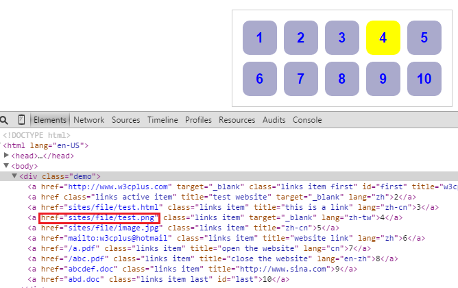
页面初始效果
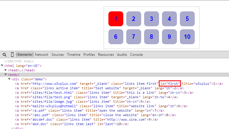
1.E[attr]
a[id]{
    background-color: yellow;
}
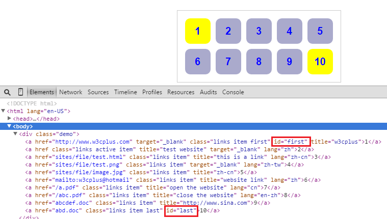
a[id][title]{
    background-color: red;
}
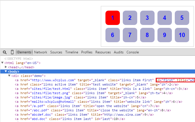
2.E[attr=val]
a[id=first]{
    background-color: red;
}
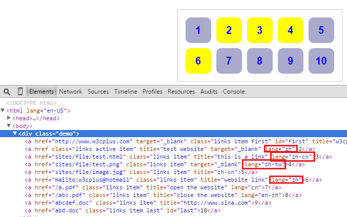
3.E[attr|=val]
a[lang|=zh]{
    background-color: yellow;
}
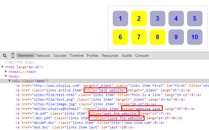
4.E[attr~=val]
a[title~=website]{
    background-color: yellow;
}
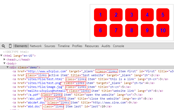
5.E[attr*=val]
a[class*=links]{
    background-color: red;
}
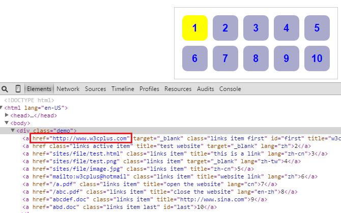
6.E[attr^=val]
a[href^=http]{
    background-color: yellow;
}
7.E[attr$=val]
a[href$=png]{
    background-color:yellow;
}


 210
210


 被折叠的 条评论
为什么被折叠?
被折叠的 条评论
为什么被折叠?
 到【灌水乐园】发言


