


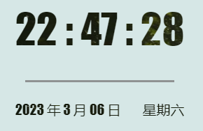
先上效果图
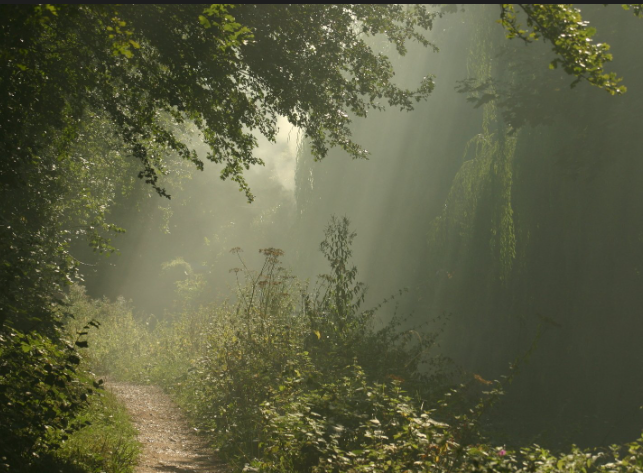
用于填充文字的图片是这个
实现方式
主要用到的是CSS属性:background-clip: text
这个属性搭配background-image或者background-color时,会把背景图或者背景颜色转变为文字的填充色,从而可以实现一些酷炫的文字效果
同样的你也可以设置渐变色 lineargradient(to buttom, skyblue, blue),来填充文字,同样也非常酷炫
支持问题
目前只有Chrome支持,所以想要使用就必须加上-webkit-background-clip: text;
核心代码
注意一定要有color: transparent,不然渲染不上
  #yourSelector{
    color: transparent;
    /*-webkit-background-clip不能省略*/
    background-clip: text;
    -webkit-background-clip: text;

    /*想用渐变色填充文字也可以: lineargradient(to buttom, color1, color2),个人觉得向下渐变要好看些*/
    background-image: url("填充图片的路径");
  }
完整代码
<template>
	<div>
      <div id="dateBox">
        <span id="timeNow">{{timeNow}}</span><br/>
        <p id="line"></p>
        <span id="dateNow">{{dateNow}}</span><br/>
        <span id="weekNow">{{weekNow}}</span>
      </div>
	</div>
</template>

<style>
  #dateBox{
    display: flex;
    justify-content: center;
    position: absolute;
    right: 25%;
    width: 25%;
    height: 100%;
    font-family: Impact, Haettenschweiler, 'Arial Narrow Bold', sans-serif;
    font-weight: 400;
  }
  #dateBox span{
    color: transparent;
    background-clip: text;
    -webkit-background-clip: text;
    background-image: url("~@/components/assets/images/fontBG.jpg");
  }

  #location{
    position: absolute;
    right: 0;
    width: 25%;
    height: 100%;
  }
  #timeNow{
    position: absolute;
    font-size: 6em;
    top: 15%;
  }
  #line{
    display: block;
    position: absolute;
    top: 70%;
    width: 61.8%;
    margin: 0 auto;
    height: 1%;
    background-color: rgba(128, 128, 128, 0.822);
  }

  #dateNow{
    position: absolute;
    top: 82%;
    left: 15% !important;
  }
  #weekNow{
    position: absolute;
    top: 82%;
    right: 15% !important;
  }
</style>


 扫一扫
扫一扫


 1319
1319

 被折叠的 条评论
为什么被折叠?
被折叠的 条评论
为什么被折叠?
 到【灌水乐园】发言


