


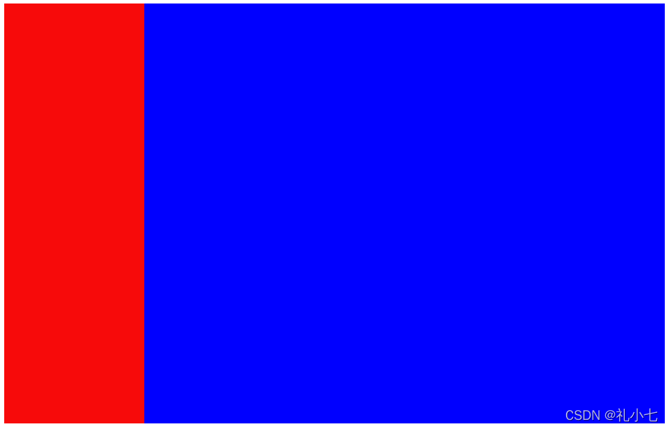
1.左侧固定,右侧自适应
<style>
    .left {
        width: 200px;
        height: 600px;
        background-color: rgb(247, 10, 10);
        float: left;
    }
    .right {
        height: 600px;
        margin-left: 200px;
       background-color: blue;
    }

</style>

<body>
   <div class="box">
       <div class="left"></div>
       <div class="right"></div>
   </div>

</body>
2.浮动+BFC
<style>
    .left {
        width: 200px;
        height: 600px;
        background-color: rgb(247, 10, 10);
        float: left;
    }
    .right {
        height: 600px;
       /* 触发BFC */
       overflow: hidden;
       background-color: blue;
    }
</style>
 <body>
   <div class="box">
       <div class="left"></div>
       <div class="right"></div>
   </div>
</body>
3. 定位 子绝父相
<style>
    .box {
        position: relative;
    }

    .left {
        position: absolute;
        left: 0;
        width: 200px;
        height: 600px;
        background-color: rgb(247, 10, 10);
        float: left;
    }

    .right {
        height: 600px;
        margin-left: 200px;
        background-color: blue;
    }
</style>

<body>
    <div class="box">
        <div class="left"></div>
        <div class="right"></div>
    </div>
</body>
4.定位 -子绝父相 不使用 margin
左侧右侧都使用定位
<style>
    .box {
        position: relative;
    }

    .left {
        position: absolute;
        left: 0;
        width: 200px;
        height: 600px;
        background-color: rgb(247, 10, 10);
        float: left;
    }

    .right {
        position: absolute;
        height: 600px;
        left: 200px;
        right: 0;
        background-color: blue;
    }
</style>

<body>
    <div class="box">
        <div class="left"></div>
        <div class="right"></div>
    </div>
</body>
5.flex布局
<style>
    .box {
        /* 将所以元素排成一排 */
        display: flex;
    }

    .left {
        width: 200px;
        height: 600px;
        background-color: rgb(247, 10, 10);
        float: left;
    }

    .right {
        /* 将flex设置为1,右盒子会将剩余空间填满 */
        flex: 1;
        height: 600px;
        background-color: blue;
    }
</style>

<body>
    <div class="box">
        <div class="left"></div>
        <div class="right"></div>
    </div>
</body>
样式


 扫一扫
扫一扫


 被折叠的 条评论
为什么被折叠?
被折叠的 条评论
为什么被折叠?
 到【灌水乐园】发言


