


零、文章目录
CSS入门七、CSS3新特性
1、CSS3 的现状
- 新增的CSS3特性有兼容性问题,ie9+才支持
- 移动端支持优于 PC 端
- 不断改进中
- 应用相对广泛
2、CSS3 新增选择器
- CSS3 给我们新增了选择器,可以更加便捷,更加自由的选择目标元素。
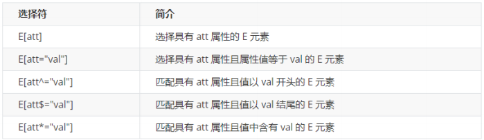
- 属性选择器
- 结构伪类选择器
- 伪元素选择器
(1)属性选择器
属性选择器可以根据元素特定属性来选择元素。注意:类选择器、属性选择器、伪类选择器,权重为 10。
案例如下:
<!DOCTYPE html>
<html lang="en">
<head>
<meta charset="UTF-8">
<meta name="viewport" content="width=device-width, initial-scale=1.0">
<meta http-equiv="X-UA-Compatible" content="ie=edge">
<title>CSS3新增属性选择器</title>
<style>
/* 必须是input 但是同时具有 value这个属性 选择这个元素 [] */
/* input[value] {
color:pink;
} */
/* 只选择 type =text 文本框的input 选取出来 */
input[type=text] {
color: pink;
}
/* 选择首先是div 然后 具有class属性 并且属性值必须是icon开头的这些元素 */
div[class^=icon] {
color: red;
}
section[class$=data] {
color: blue;
}
div.icon1 {
color: skyblue;
}
/* 类选择器和属性选择器 伪类选择器 权重都是 10 */
</style>
</head>
<body>
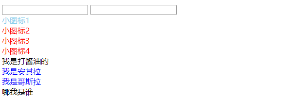
<!-- 1. 利用属性选择器就可以不用借助于类或者id选择器 -->
<!-- <input type="text" value="请输入用户名">
<input type="text"> -->
<!-- 2. 属性选择器还可以选择属性=值的某些元素 重点务必掌握的 -->
<input type="text" name="" id="">
<input type="password" name="" id="">
<!-- 3. 属性选择器可以选择属性值开头的某些元素 -->
<div class="icon1">小图标1</div>
<div class="icon2">小图标2</div>
<div class="icon3">小图标3</div>
<div class="icon4">小图标4</div>
<div>我是打酱油的</div>
<!-- 4. 属性选择器可以选择属性值结尾的某些元素 -->
<section class="icon1-data">我是安其拉</section>
<section class="icon2-data">我是哥斯拉</section>
<section class="icon3-ico">哪我是谁</section>
</body>
</html>
(2)结构伪类选择器
- 结构伪类选择器主要根据
文档结构来选择器元素。 - 常用于根据父级选择器里面的子元素。
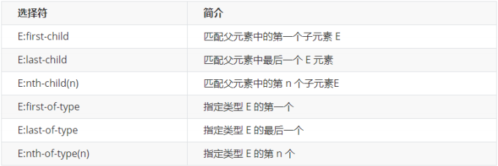
-
nth-child(n)选择某个父元素的一个或多个特定的子元素(重点)-
n 可以是数字,关键字和公式。
-
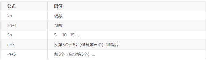
n 如果是数字,就是选择第 n 个子元素, 里面数字从1开始。
-
n 可以是关键字:even 偶数,odd 奇数。
-
n 可以是公式:常见的公式如下 ( 如果n是公式,则从0开始计算,但是第 0 个元素或者超出了元素的个数会被忽略 )。
-
nth-child和nth-of-type区别nth-child:对父元素里面所有孩子排序选择(序号是固定的) 先找到第n个孩子,然后看看是否和E匹配。nth-of-type:对父元素里面指定子元素进行排序选择。 先去匹配E ,然后再根据E 找第n个孩子。
案例如下:
<!DOCTYPE html>
<html lang="en">
<head>
<meta charset="UTF-8">
<meta name="viewport" content="width=device-width, initial-scale=1.0">
<meta http-equiv="X-UA-Compatible" content="ie=edge">
<title>CSS3新增结构伪类选择器</title>
<style>
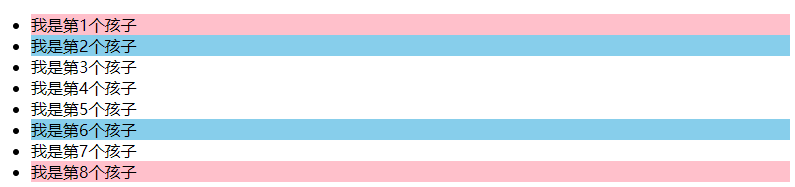
/* 1. 选择ul里面的第一个孩子 小li */
ul li:first-child {
background-color: pink;
}
/* 2. 选择ul里面的最后一个孩子 小li */
ul li:last-child {
background-color: pink;
}
/* 3. 选择ul里面的第2个孩子 小li */
ul li:nth-child(2) {
background-color: skyblue;
}
ul li:nth-child(6) {
background-color: skyblue;
}
</style>
</head>
<body>
<ul>
<li>我是第1个孩子</li>
<li>我是第2个孩子</li>
<li>我是第3个孩子</li>
<li>我是第4个孩子</li>
<li>我是第5个孩子</li>
<li>我是第6个孩子</li>
<li>我是第7个孩子</li>
<li>我是第8个孩子</li>
</ul>
</body>
</html>
nth-child案例如下:
<!DOCTYPE html>
<html lang="en">
<head>
<meta charset="UTF-8">
<meta name="viewport" content="width=device-width, initial-scale=1.0">
<meta http-equiv="X-UA-Compatible" content="ie=edge">
<title>CSS3新增结构伪类选择器-nth-child</title>
<style>
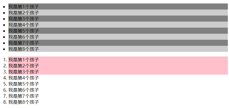
/* 1.把所有的偶数 even的孩子选出来 */
ul li:nth-child(even) {
background-color: #ccc;
}
/* 2.把所有的奇数 odd的孩子选出来 */
ul li:nth-child(odd) {
background-color: gray;
}
/* 3.nth-child(n) 从0开始 每次加1 往后面计算 这里面必须是n 不能是其他的字母 选择了所有的孩子*/
/* ol li:nth-child(n) {
background-color: pink;
} */
/* 4.nth-child(2n)母选择了所有的偶数孩子 等价于 even*/
/* ol li:nth-child(2n) {
background-color: pink;
}
ol li:nth-child(2n+1) {
background-color: skyblue;
} */
/* ol li:nth-child(n+3) {
background-color: pink;
} */
ol li:nth-child(-n+3) {
background-color: pink;
}
</style>
</head>
<body>
<ul>
<li>我是第1个孩子</li>
<li>我是第2个孩子</li>
<li>我是第3个孩子</li>
<li>我是第4个孩子</li>
<li>我是第5个孩子</li>
<li>我是第6个孩子</li>
<li>我是第7个孩子</li>
<li>我是第8个孩子</li>
</ul>
<ol>
<li>我是第1个孩子</li>
<li>我是第2个孩子</li>
<li>我是第3个孩子</li>
<li>我是第4个孩子</li>
<li>我是第5个孩子</li>
<li>我是第6个孩子</li>
<li>我是第7个孩子</li>
<li>我是第8个孩子</li>
</ol>
</body>
</html>
nth-type-of案例如下:
<!DOCTYPE html>
<html lang="en">
<head>
<meta charset="UTF-8">
<meta name="viewport" content="width=device-width, initial-scale=1.0">
<meta http-equiv="X-UA-Compatible" content="ie=edge">
<title>CSS3新增选择器nth-type-of</title>
<style>
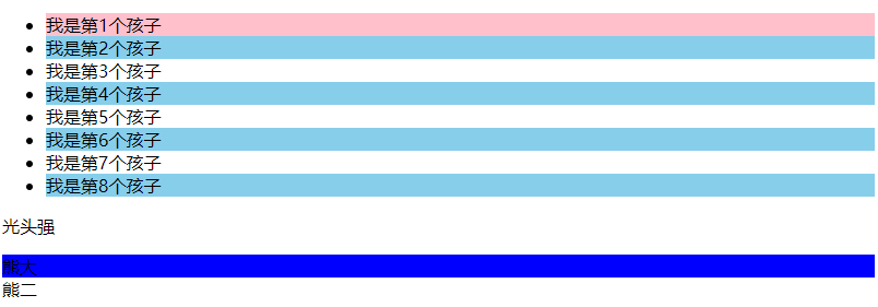
ul li:first-of-type {
background-color: pink;
}
ul li:last-of-type {
background-color: pink;
}
ul li:nth-of-type(even) {
background-color: skyblue;
}
/* nth-child 会把所有的孩子都排列序号 */
/* 执行的时候首先看 :nth-child(1) 之后回去看 前面 div */
section div:nth-child(1) {
background-color: red;
}
/* nth-of-type 会把指定元素的孩子排列序号 */
/* 执行的时候首先看 div指定的元素 之后回去看 :nth-of-type(1) 第几个孩子 */
section div:nth-of-type(1) {
background-color: blue;
}
</style>
</head>
<body>
<ul>
<li>我是第1个孩子</li>
<li>我是第2个孩子</li>
<li>我是第3个孩子</li>
<li>我是第4个孩子</li>
<li>我是第5个孩子</li>
<li>我是第6个孩子</li>
<li>我是第7个孩子</li>
<li>我是第8个孩子</li>
</ul>
<!-- 区别 -->
<section>
<p>光头强</p>
<div>熊大</div>
<div>熊二</div>
</section>
</body>
</html>
(3)伪元素选择器(重点)
- 伪元素选择器可以帮助我们利用CSS创建新标签元素,而不需要HTML标签,从而简化HTML结构。
before和after创建一个元素,但是属于行内元素,新创建的这个元素在文档树中是找不到的,所以我们称为伪元素。- before 和 after 必须有
content 属性。 - before 在父元素内容的前面创建元素,after 在父元素内容的后面插入元素。
伪元素选择器和标签选择器一样,权重为 1。
element::before {}
案例如下:
<!DOCTYPE html>
<html lang="en">
<head>
<meta charset="UTF-8">
<meta name="viewport" content="width=device-width, initial-scale=1.0">
<meta http-equiv="X-UA-Compatible" content="ie=edge">
<title>伪元素选择器before和after</title>
<style>
div {
width: 200px;
height: 200px;
background-color: pink;
}
/* div::before 权重是2 */
div::before {
/* 这个content是必须要写的 */
/* display: inline-block; */
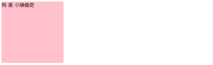
content: '我';
/* width: 30px;
height: 40px;
background-color: purple; */
}
div::after {
content: '小猪佩奇';
}
</style>
</head>
<body>
<div>
是
</div>
</body>
</html>
字体图标案例如下:
<!DOCTYPE html>
<html lang="en">
<head>
<meta charset="UTF-8">
<meta name="viewport" content="width=device-width, initial-scale=1.0">
<meta http-equiv="X-UA-Compatible" content="ie=edge">
<title>伪元素选择器使用场景-字体图标</title>
<style>
@font-face {
font-family: 'icomoon';
src: url('fonts/icomoon.eot?1lv3na');
src: url('fonts/icomoon.eot?1lv3na#iefix') format('embedded-opentype'), url('fonts/icomoon.ttf?1lv3na') format('truetype'), url('fonts/icomoon.woff?1lv3na') format('woff'), url('fonts/icomoon.svg?1lv3na#icomoon') format('svg');
font-weight: normal;
font-style: normal;
font-display: block;
}
div {
position: relative;
width: 200px;
height: 35px;
border: 1px solid red;
}
div::after {
position: absolute;
top: 10px;
right: 10px;
font-family: 'icomoon';
/* content: ''; */
content: '\e91e';
color: red;
font-size: 18px;
}
</style>
</head>
<body>
<div></div>
</body>
</html>

仿土豆网显示隐藏遮罩案例如下:
<!DOCTYPE html>
<html lang="en">

<head>
    <meta charset="UTF-8">
    <meta name="viewport" content="width=device-width, initial-scale=1.0">
    <meta http-equiv="X-UA-Compatible" content="ie=edge">
    <title>伪元素选择器使用场景2-仿土豆网显示隐藏遮罩案例</title>
    <style>
        .tudou {
            position: relative;
            width: 444px;
            height: 320px;
            background-color: pink;
            margin: 30px auto;
        }

        .tudou img {
            width: 100%;
            height: 100%;
        }

        .tudou::before {
            content: '';
            /* 隐藏遮罩层 */
            display: none;
            position: absolute;
            top: 0;
            left: 0;
            width: 100%;
            height: 100%;
            background: rgba(0, 0, 0, .4) url(images/arr2.png) no-repeat center;
        }
        /* 当我们鼠标经过了 土豆这个盒子,就让里面before遮罩层显示出来 */

        .tudou:hover::before {
            /* 而是显示元素 */
            display: block;
        }
    </style>
</head>

<body>
    <div class="tudou">
        <img src="images/tudou.jpg" alt="">
    </div>
</body>

</html>

3、CSS3 美化页面元素
(1)文字阴影
text-shadow属性在CSS2.0中出现,但迟迟未被各大浏览器所支持,因此在CSS2.1中被废弃,如今在CSS3中得到了各大浏览器的支持!
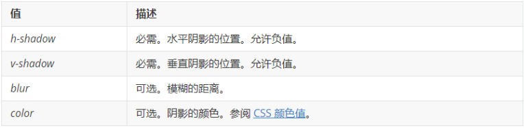
text-shadow: h-shadow v-shadow blur color;
案例如下:
<!DOCTYPE html>
<html lang="en">
<head>
<meta charset="UTF-8">
<meta name="viewport" content="width=device-width, initial-scale=1.0">
<meta http-equiv="X-UA-Compatible" content="ie=edge">
<title>文字阴影</title>
<style>
div {
font-size: 50px;
color: orangered;
font-weight: 700;
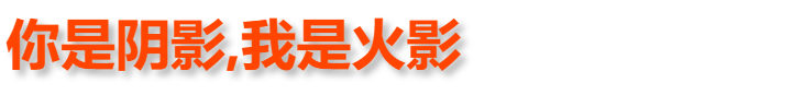
text-shadow: 5px 5px 6px rgba(0, 0, 0, .3);
}
</style>
</head>
<body>
<div>
你是阴影,我是火影
</div>
</body>
</html>
(2)图片变模糊
filter属性将模糊或颜色偏移等图形效果应用于元素。
filter: 函数(); 例如: filter: blur(5px); blur模糊处理 数值越大越模糊
案例如下:
<!DOCTYPE html>
<html lang="en">
<head>
<meta charset="UTF-8">
<meta name="viewport" content="width=device-width, initial-scale=1.0">
<meta http-equiv="X-UA-Compatible" content="ie=edge">
<title>图片模糊处理filter</title>
<style>
img {
/* blur是一个函数 小括号里面数值越大,图片越模糊 注意数值要加px单位 */
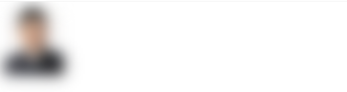
filter: blur(15px);
}
img:hover {
filter: blur(0);
}
</style>
</head>
<body>
<img src="images/ldh.jpg" alt="">
</body>
</html>
移上去就清晰显示
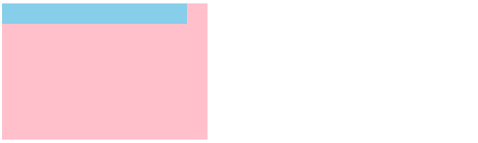
(3)计算盒子宽度
calc()让你在声明CSS属性值时执行一些计算。- 括号里面可以使用 + - * / 来进行计算。
width: calc(100% - 80px);
案例如下:
<!DOCTYPE html>
<html lang="en">
<head>
    <meta charset="UTF-8">
    <meta name="viewport" content="width=device-width, initial-scale=1.0">
    <meta http-equiv="X-UA-Compatible" content="ie=edge">
    <title>CSS3属性calc函数</title>
    <style>
        .father {
            width: 300px;
            height: 200px;
            background-color: pink;
        }
        .son {
            /* width: 150px; */
            /* width: calc(150px + 30px); */
            width: calc(100% - 30px);
            height: 30px;
            background-color: skyblue;
        }
    </style>
</head>
<body>
    <!-- 需求我们的子盒子宽度永远比父盒子小30像素 -->
    <div class="father">
        <div class="son"></div>
    </div>
</body>
</html>
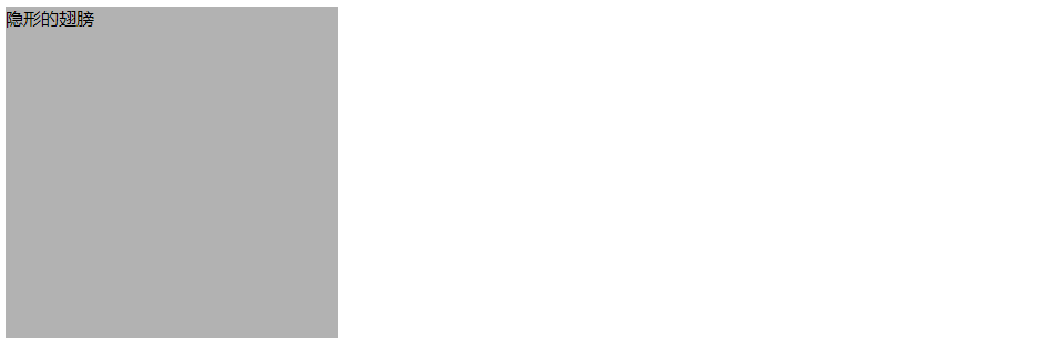
(4)背景色半透明
background: rgba(0, 0, 0, 0.3);
- 最后一个参数是 alpha 透明度,取值范围在 0~1之间。
- 我们习惯把 0.3 的 0 省略掉,写为
background: rgba(0, 0, 0, .3); - 注意:背景半透明是指盒子背景半透明,盒子里面的内容不受影响。
案例如下:
<!DOCTYPE html>
<html lang="en">

<head>
    <meta charset="UTF-8">
    <meta name="viewport" content="width=device-width, initial-scale=1.0">
    <meta http-equiv="X-UA-Compatible" content="ie=edge">
    <title>背景色透明写法</title>
    <style>
        div {
            width: 300px;
            height: 300px;
            /* background-color: black; */
            /* background: rgba(0, 0, 0, 0.3); */
            background: rgba(0, 0, 0, .3);
        }
    </style>
</head>

<body>
    <div>隐形的翅膀</div>
</body>

</html>
4、CSS3 盒子模型
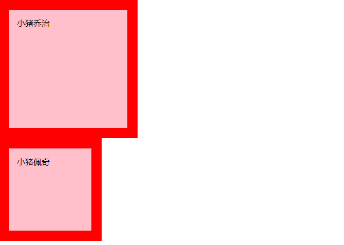
(1)盒子模型
box-sizing用来指定盒模型。- 可以分成两种情况:
box-sizing: content-box盒子大小为 width + padding + border。box-sizing: border-box盒子大小为 width,padding和border就不会撑大盒子了(前提padding和border不会超过width宽度)。
案例如下:
<!DOCTYPE html>
<html lang="en">
<head>
    <meta charset="UTF-8">
    <meta name="viewport" content="width=device-width, initial-scale=1.0">
    <meta http-equiv="X-UA-Compatible" content="ie=edge">
    <title>CSS3盒子模型</title>
    <style>
        * {
            margin: 0;
            padding: 0;
            box-sizing: border-box;
        }
        div {
            width: 200px;
            height: 200px;
            background-color: pink;
            border: 20px solid red;
            padding: 15px;
            box-sizing: content-box;
        }
        p {
            width: 200px;
            height: 200px;
            background-color: pink;
            border: 20px solid red;
            padding: 15px;
            /* css3 盒子模型  盒子最终的大小就是 width  200 的大小 */
            box-sizing: border-box;
        }
    </style>
</head>
<body>
    <div>
        小猪乔治
    </div>
    <p>
        小猪佩奇
    </p>
</body>
</html>
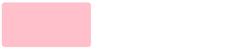
(2)圆角边框
border-radius属性用于设置元素的外边框圆角。
border-radius:length;
length可以为数值或百分比的形式,百分比是相对宽度的比值,是圆角对应的圆的半径,按照这个半径画一个圆作为圆角的弧。- 该属性是一个简写属性,可以跟四个值,分别代表左上角、右上角、右下角、左下角,分开写:
border-top-left-radius、border-top-right-radius、border-bottom-right-radius 和border-bottom-left-radius 兼容性 ie9+ 浏览器支持, 但是不会影响页面布局,可以放心使用。
案例如下:
<!DOCTYPE html>
<html lang="en">

<head>
    <meta charset="UTF-8">
    <meta name="viewport" content="width=device-width, initial-scale=1.0">
    <meta http-equiv="X-UA-Compatible" content="ie=edge">
    <title>圆角边框</title>
    <style>
        div {
            width: 300px;
            height: 150px;
            background-color: pink;
            border-radius: 10px;
        }
    </style>
</head>

<body>
    <div></div>
</body>

</html>
常用写法案例如下:
<!DOCTYPE html>
<html lang="en">
<head>
<meta charset="UTF-8">
<meta name="viewport" content="width=device-width, initial-scale=1.0">
<meta http-equiv="X-UA-Compatible" content="ie=edge">
<title>圆角边框常用写法</title>
<style>
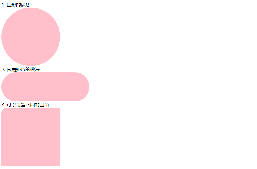
.yuanxing {
width: 200px;
height: 200px;
background-color: pink;
/* border-radius: 100px; */
/* 50% 就是宽度和高度的一半 等价于 100px */
border-radius: 50%;
}
.juxing {
width: 300px;
height: 100px;
background-color: pink;
/* 圆角矩形设置为高度的一半 */
border-radius: 50px;
}
.radius {
width: 200px;
height: 200px;
/* border-radius: 10px 20px 30px 40px; */
/* border-radius: 10px 40px; */
border-top-left-radius: 20px;
background-color: pink;
}
</style>
</head>
<body>
1. 圆形的做法:
<div class="yuanxing"></div>
2. 圆角矩形的做法:
<div class="juxing"></div>
3. 可以设置不同的圆角:
<div class="radius"></div>
</body>
</html>
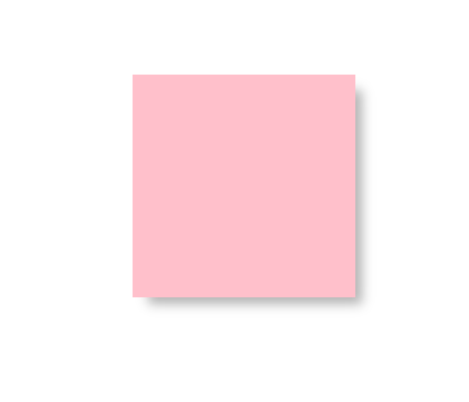
(3)盒子阴影
box-shadow属性为盒子添加阴影。- 默认的是外阴影(outset), 但是不可以写这个单词,否则造成阴影无效。
盒子阴影不占用空间,不会影响其他盒子排列。
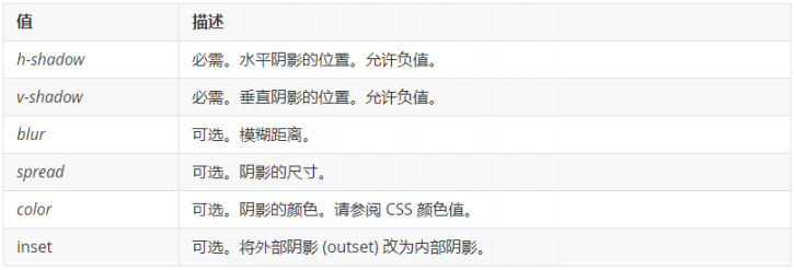
box-shadow: h-shadow v-shadow blur spread color inset;
案例如下:
<!DOCTYPE html>
<html lang="en">

<head>
    <meta charset="UTF-8">
    <meta name="viewport" content="width=device-width, initial-scale=1.0">
    <meta http-equiv="X-UA-Compatible" content="ie=edge">
    <title>盒子阴影</title>
    <style>
        div {
            width: 200px;
            height: 200px;
            background-color: pink;
            margin: 100px auto;
            /* box-shadow: 10px 10px; */
        }
        /* 原先盒子没有影子,当我们鼠标经过盒子就添加阴影效果 */
        div:hover {
            box-shadow: 10px 10px 10px -4px rgba(0, 0, 0, .3);
        }
    </style>
</head>

<body>
    <div></div>
</body>

</html>
5、浏览器私有前缀
- 浏览器私有前缀是为了
兼容老版本浏览器的写法,比较新版本的浏览器无须添加。
(1)私有前缀
- -moz-:代表 firefox 浏览器私有属性
- -ms-:代表 ie 浏览器私有属性
- -webkit-:代表 safari、chrome 私有属性
- -o-:代表 Opera 私有属性
(2)提倡的写法
-moz-border-radius: 10px;
-webkit-border-radius: 10px;
-o-border-radius: 10px;
border-radius: 10px;


 7709
7709


 被折叠的 条评论
为什么被折叠?
被折叠的 条评论
为什么被折叠?
 到【灌水乐园】发言


