<!DOCTYPE html>
<html lang="zh-cn">
<head>
<meta charset="UTF-8">
<title>Title</title>
<meta name="Author" content="">
<meta http-equiv="X-UA-Compatible" content="IE=Edge">
<style>
*{margin:0;padding:0;}
body {
background-color: #999;
}
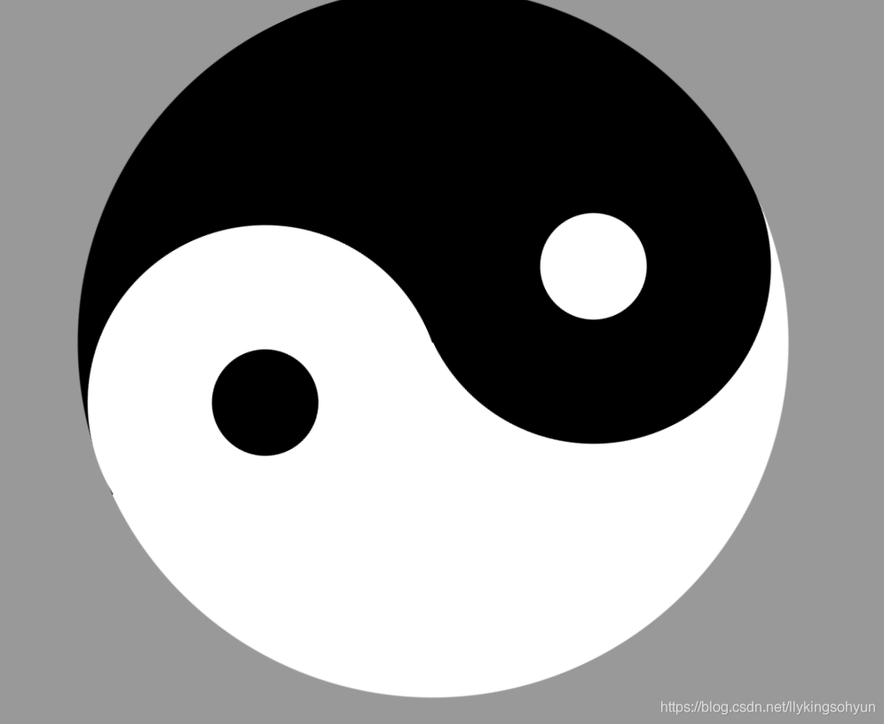
.box {
position: relative;
margin: 0 auto;
width: 0;
height: 400px;
border-left: 200px solid #fff;
border-right: 200px solid #000;
border-radius: 50%;
animation: move 10s linear infinite;
}
.box:before {
position: absolute;
content: '';
top: 0;
left: -90px;
width: 60px;
height: 60px;
border: 70px solid #fff;
border-radius: 50%;
background-color: #000;
}
.box::after {
position: absolute;
content: '';
width: 60px;
height: 60px;
border-radius: 50%;
border: 70px solid #000;
margin: 200px 0 0 -100px;
background-color: #ffffff;
}
@keyframes move {
0% {
transform: rotate(0deg);
}
100% {
transform: rotate(360deg);
}
}
</style>
</head>
<body>
<div class="box"></div>
</body>
</html>


 扫一扫
扫一扫


 2490
2490

 被折叠的 条评论
为什么被折叠?
被折叠的 条评论
为什么被折叠?
 到【灌水乐园】发言


