


radial-gradient()
语法:
<radial-gradient> = radial-gradient([ [ <shape> || <size> ] [ at <position> ]? , | at <position>, ]?<color-stop>[ , <color-stop> ]+)
<position> = [ <length>① | <percentage>① | left | center① | right ]? [ <length>② | <percentage>② | top | center② | bottom ]?
<shape> = circle | ellipse
<size> = <extent-keyword> | [ <circle-size> || <ellipse-size> ]
<extent-keyword> = closest-side | closest-corner | farthest-side | farthest-corner
<circle-size> = <length>
<ellipse-size> = [ <length> | <percentage> ]{2}
<shape-size> = <length> | <percentage>
<color-stop> = <color> [ <length> | <percentage> ]?
取值:
<position> 确定圆心的位置。如果提供2个参数,第一个表示横坐标,第二个表示纵坐标;如果只提供一个,第二值默认为50%,即center
<percentage>①:
用百分比指定径向渐变圆心的横坐标值。可以为负值。
<length>①:
用长度值指定径向渐变圆心的横坐标值。可以为负值。
left:
设置左边为径向渐变圆心的横坐标值。
center①:
设置中间为径向渐变圆心的横坐标值。
right:
设置右边为径向渐变圆心的横坐标值。
<percentage>②:
用百分比指定径向渐变圆心的纵坐标值。可以为负值。
<length>②:
用长度值指定径向渐变圆心的纵坐标值。可以为负值。
top:
设置顶部为径向渐变圆心的纵坐标值。
center②:
设置中间为径向渐变圆心的纵坐标值。
bottom:
设置底部为径向渐变圆心的纵坐标值。
<shape> 确定圆的类型
circle:
指定圆形的径向渐变
ellipse:
指定椭圆形的径向渐变。
<extent-keyword> circle | ellipse 都接受该值作为 size
closest-side:
指定径向渐变的半径长度为从圆心到离圆心最近的边
closest-corner:
指定径向渐变的半径长度为从圆心到离圆心最近的角
farthest-side:
指定径向渐变的半径长度为从圆心到离圆心最远的边
farthest-corner:
指定径向渐变的半径长度为从圆心到离圆心最远的角
<circle-size> circle 接受该值作为 size
<length>:
用长度值指定正圆径向渐变的半径长度。不允许负值。
<ellipse-size> ellipse 接受该值作为 size
<length>:
用长度值指定椭圆径向渐变的横向或纵向半径长度。不允许负值。
<percentage>:
用百分比指定椭圆径向渐变的横向或纵向半径长度。不允许负值。
<color-stop> 用于指定渐变的起止颜色:
<color>:
指定颜色。
<length>:
用长度值指定起止色位置。不允许负值
<percentage>:
用百分比指定起止色位置。不允许负值
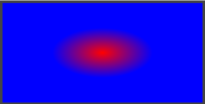
.demo-1{
background: radial-gradient(red,blue);
}
<div class="demo demo-1"></div>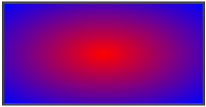
.demo-2{
        background: radial-gradient(circle,red,blue);
    }
<div class="demo demo-2"></div>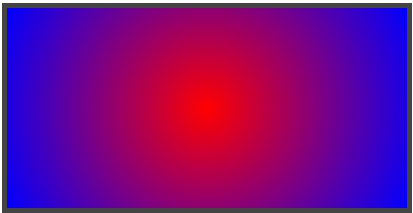
.demo-3{
        background: radial-gradient(circle 100px,red,blue);
    }
<div class="demo demo-3"></div>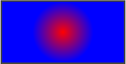
.demo-4{
        background: radial-gradient(closest-side,red,blue);
    }
<div class="demo demo-4"></div>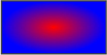
.demo-5{
background: radial-gradient(100px 50px,red,blue);
}
.demo-6{
        background: radial-gradient(100px 50px at 0 0,red,blue);
    }
<div class="demo demo-6"></div>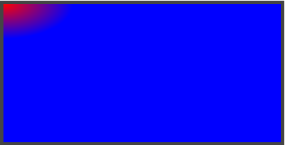
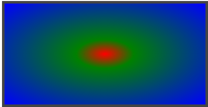
.demo-7{
background: radial-gradient(red,green 20%,blue);
}
附代码:
背景
.demo-1{
background: radial-gradient(red,blue);
}
.demo-2{
background: radial-gradient(circle,red,blue);
}
.demo-3{
background: radial-gradient(circle 100px,red,blue);
}
.demo-4{
background: radial-gradient(closest-side,red,blue);
}
.demo-5{
background: radial-gradient(100px 50px,red,blue);
}
.demo-6{
background: radial-gradient(100px 50px at 0 0,red,blue);
}
.demo-7{
background: radial-gradient(red,green 20%,blue);
}
--------------------------------------------------------------------------

linear-gradient()
-----------------
语法:
= linear-gradient([ [ | to ] ,]? [, ]+)
= [left | right] || [top | bottom]
= [ | ]?
取值:
下述值用来表示渐变的方向,可以使用角度或者关键字来设置:
:
用角度值指定渐变的方向(或角度)。
to left:
设置渐变为从右到左。相当于: 270deg
to right:
设置渐变从左到右。相当于: 90deg
to top:
设置渐变从下到上。相当于: 0deg
to bottom:
设置渐变从上到下。相当于: 180deg。这是默认值,等同于留空不写。
用于指定渐变的起止颜色:
:
指定颜色。
:
用长度值指定起止色位置。不允许负值
:
用百分比指定起止色位置。
```
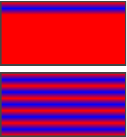
.demo-1{
background: linear-gradient(red,blue 20px,red 40px);
}
.demo-2{
background: repeating-linear-gradient(red,blue 20px,red 40px);
}
radial-gradient()
语法:
<radial-gradient> = radial-gradient([ [ <shape> || <size> ] [ at <position> ]? , | at <position>, ]?<color-stop>[ , <color-stop> ]+)
<position> = [ <length>① | <percentage>① | left | center① | right ]? [ <length>② | <percentage>② | top | center② | bottom ]?
<shape> = circle | ellipse
<size> = <extent-keyword> | [ <circle-size> || <ellipse-size> ]
<extent-keyword> = closest-side | closest-corner | farthest-side | farthest-corner
<circle-size> = <length>
<ellipse-size> = [ <length> | <percentage> ]{2}
<shape-size> = <length> | <percentage>
<color-stop> = <color> [ <length> | <percentage> ]?
取值:
<position> 确定圆心的位置。如果提供2个参数,第一个表示横坐标,第二个表示纵坐标;如果只提供一个,第二值默认为50%,即center
<percentage>①:
用百分比指定径向渐变圆心的横坐标值。可以为负值。
<length>①:
用长度值指定径向渐变圆心的横坐标值。可以为负值。
left:
设置左边为径向渐变圆心的横坐标值。
center①:
设置中间为径向渐变圆心的横坐标值。
right:
设置右边为径向渐变圆心的横坐标值。
<percentage>②:
用百分比指定径向渐变圆心的纵坐标值。可以为负值。
<length>②:
用长度值指定径向渐变圆心的纵坐标值。可以为负值。
top:
设置顶部为径向渐变圆心的纵坐标值。
center②:
设置中间为径向渐变圆心的纵坐标值。
bottom:
设置底部为径向渐变圆心的纵坐标值。
<shape> 确定圆的类型
circle:
指定圆形的径向渐变
ellipse:
指定椭圆形的径向渐变。
<extent-keyword> circle | ellipse 都接受该值作为 size
closest-side:
指定径向渐变的半径长度为从圆心到离圆心最近的边
closest-corner:
指定径向渐变的半径长度为从圆心到离圆心最近的角
farthest-side:
指定径向渐变的半径长度为从圆心到离圆心最远的边
farthest-corner:
指定径向渐变的半径长度为从圆心到离圆心最远的角
<circle-size> circle 接受该值作为 size
<length>:
用长度值指定正圆径向渐变的半径长度。不允许负值。
<ellipse-size> ellipse 接受该值作为 size
<length>:
用长度值指定椭圆径向渐变的横向或纵向半径长度。不允许负值。
<percentage>:
用百分比指定椭圆径向渐变的横向或纵向半径长度。不允许负值。
<color-stop> 用于指定渐变的起止颜色:
<color>:
指定颜色。
<length>:
用长度值指定起止色位置。不允许负值
<percentage>:
用百分比指定起止色位置。不允许负值
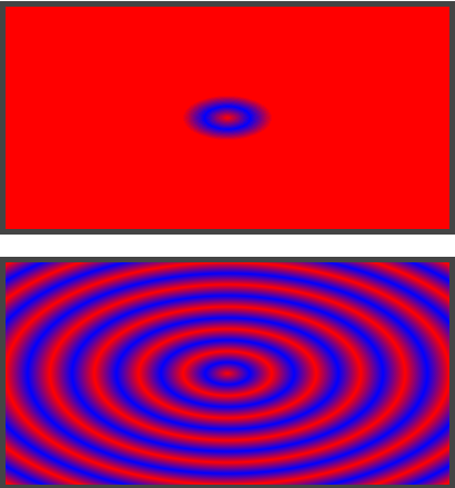
.demo-3{
background: radial-gradient(red,blue 20px,red 40px);
}
.demo-4{
background: repeating-radial-gradient(red,blue 20px,red 40px);
}
background
语法:
background:[ <bg-layer>, ]* <final-bg-layer>
<bg-layer> = <bg-image> || <position> [ / <bg-size> ]? || <repeat-style> || <attachment> || <box> || <box>
<final-bg-layer> = <bg-image> || <position> [ / <bg-size> ]? || <repeat-style> || <attachment> || <box> || <box> || <' background-color '>
默认值:看每个独立属性
适用于:所有元素
继承性:无
动画性:看每个独立属性
计算值:看每个独立属性
取值:
<' background-image '>:
指定对象的背景图像。可以是真实图片路径或使用渐变创建的“背景图像”
<' background-position '>:
指定对象的背景图像位置。
<' background-size '>:
指定对象的背景图像的尺寸大小。
<' background-repeat '>:
指定对象的背景图像如何铺排填充。
<' background-attachment '>:
指定对象的背景图像是随对象内容滚动还是固定的。
<' background-origin '>:
指定对象的背景图像显示的原点。
<' background-clip '>:
指定对象的背景图像向外裁剪的区域。
<' background-color '>:
指定对象的背景颜色。
.demo{
width:555px;height:123px;
background-image: url(red.png);
}
.demo-1{
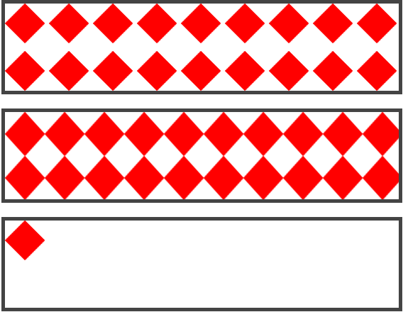
background-repeat: repeat-x ;
}
.demo-2{
background-repeat: repeat-y ;
}
.demo-3{
background-repeat: space ;
}
.demo-4{
background-repeat: round ;
}
.demo-5{
background-repeat: no-repeat ;
}
<div class="demo demo-1"></div>
<div class="demo demo-2"></div>
<div class="demo demo-3"></div>
<div class="demo demo-4"></div>
<div class="demo demo-5"></div>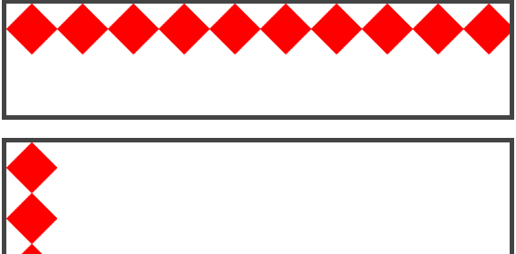
background-position
语法:
background-position:<position> [ , <position> ]*
<position> = [ left | center | right | top | bottom | <percentage> | <length> ] | [ left | center | right | <percentage> | <length> ] [ top | center | bottom | <percentage> | <length> ] | [ center | [ left | right ] [ <percentage> | <length> ]? ] && [ center | [ top | bottom ] [ <percentage> | <length> ]? ]
默认值:0% 0%,效果等同于left top
适用于:所有元素
继承性:无
动画性:是
计算值:指定值
取值:
<percentage>:
用百分比指定背景图像填充的位置。可以为负值。
<length>:
用长度值指定背景图像填充的位置。可以为负值。
center:
背景图像横向和纵向居中。
left:
背景图像在横向上填充从左边开始。
right:
背景图像在横向上填充从右边开始。
top:
背景图像在纵向上填充从顶部开始。
bottom:
背景图像在纵向上填充从底部开始。
.demo{
background-image: url(red.png);
background-repeat: no-repeat;
}
.demo-1{
background-position: 10px 20px ;
}
.demo-2{
background-position: 10px ;
}
.demo-3{
background-position: 50% 20% ;
}
.demo-4{
background-position: 50% 50% ;
}
.demo-5{
background-position: center ;
}
<div class="demo demo-1"></div>
<div class="demo demo-2"></div>
<div class="demo demo-3"></div>
<div class="demo demo-4"></div>
<div class="demo demo-5"></div>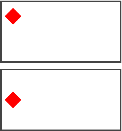
background-attachment
语法:
background-attachment:<attachment> [ , <attachment> ]*
<attachment> = fixed | scroll | local
默认值:scroll
适用于:所有元素
继承性:无
动画性:否
计算值:指定值
取值:
fixed:
背景图像相对于窗体固定。
scroll:
背景图像相对于元素固定,也就是说当元素内容滚动时背景图像不会跟着滚动,因为背景图像总是要跟着元素本身。但会随元素的祖先元素或窗体一起滚动。
local:
背景图像相对于元素内容固定,也就是说当元素随元素滚动时背景图像也会跟着滚动,因为背景图像总是要跟着内容。(CSS3)
说明:
设置或检索背景图像是随对象内容滚动还是固定的。必须先指定 <' background-image '> 属性。
对应的脚本特性为backgroundAttachment。
.demo{
        overflow: auto;
        background-image: url(red.png);
        background-repeat: repeat;
    }
    .demo-1{
        background-attachment: scroll;/*背景随滚动条滚动*/
    }
    .demo-2{
        background-attachment: local;/*背景不随滚动条滚动*/
    }
    .demo-3{
        background-attachment: fixed;/*网易云课堂说很少用*/
    }
<div class="demo demo-1">
    <p>demo demo demo demo demo demo demo demo demo demo demo demo demo demo demo demo demo demo demo demo demo demo demo demo demo demo demo demo demo demo demo demo demo demo demo demo demo demo demo demo demo demo demo</p>
</div>
<div class="demo demo-2">
    <p>demo demo demo demo demo demo demo demo demo demo demo demo demo demo demo demo demo demo demo demo demo demo demo demo demo demo demo demo demo demo demo demo demo demo demo demo demo demo demo demo demo demo demo</p>
</div>
<div class="demo demo-3">
    <p>demo demo demo demo demo demo demo demo demo demo demo demo demo demo demo demo demo demo demo demo demo demo demo demo demo demo demo demo demo demo demo demo demo demo demo demo demo demo demo demo demo demo demo</p>
</div>


 2249
2249


 被折叠的 条评论
为什么被折叠?
被折叠的 条评论
为什么被折叠?
 到【灌水乐园】发言


