


原文地址:http://blog.csdn.net/lovelyelfpop/article/details/51142261
ExtJS一直以来都有一个布局叫Column Layout,也就是列布局。从ExtJS4开始,新增了HBox布局,中文意思是水平方向盒子布局。
区别一
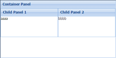
首先是Column Layout
Ext.create('Ext.panel.Panel', {
    renderTo: Ext.getBody(),
    width: 400,
    height: 200,
    title: 'Container Panel',
    layout: 'column',
    items: [
        {
            xtype: 'panel',
            title: 'Child Panel 1',
            height: 100,
            columnWidth: 0.5
        },
        {
            xtype: 'panel',
            title: 'Child Panel 2',
            height: 100,
            columnWidth: 0.5
        }
    ]
});

然后是HBox
Ext.create('Ext.panel.Panel', {
    renderTo: Ext.getBody(),
    width: 400,
    height: 200,
    title: 'Container Panel',
    layout: 'hbox',
    items: [
        {
            xtype: 'panel',
            title: 'Child Panel 1',
            height: 100,
            flex: 1
        },
        {
            xtype: 'panel',
            title: 'Child Panel 2',
            height: 100,
            flex: 1
        }
    ]
});
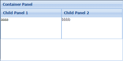
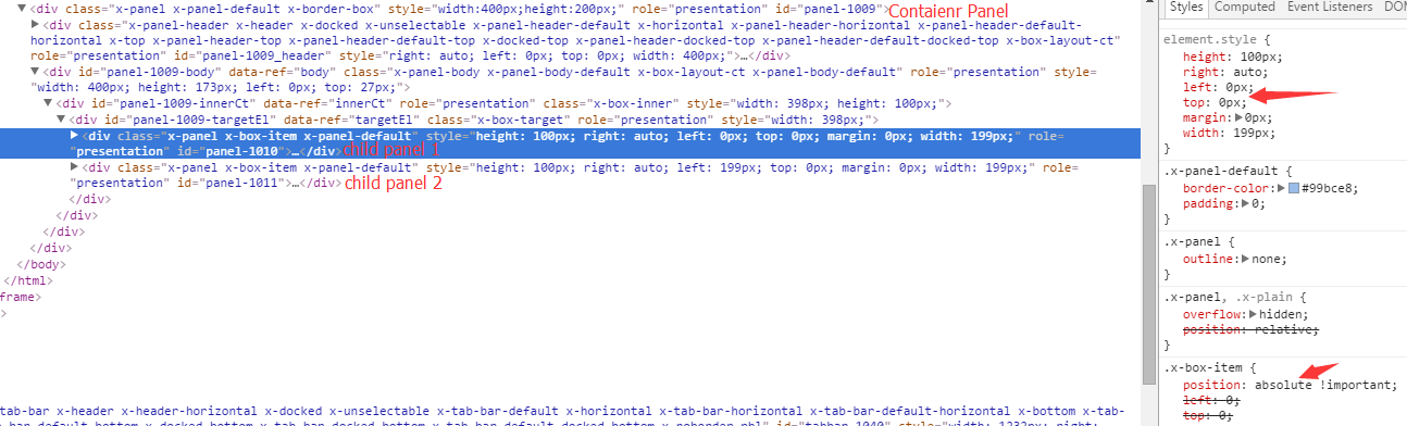
从界面效果上来看,Column布局和HBox布局没什么差别。从生成的DOM结构和css样式上可以看到,Column布局用的是 float: left向左浮动,而HBox则是 position: absolute 绝对定位。
区别二
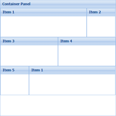
我们来实现这样一个界面:一个父panel分成三行,每一行放2个子panel
首先是Column Layout
Ext.create('Ext.panel.Panel', {
    renderTo: Ext.getBody(),
    width: 400,
    height: 400,
    title: 'Container Panel',
    layout: { type: 'column' },
    items: [{
        title: 'Item 1',
        height: 100,
        columnWidth: .75
    },{
        title: 'Item 2',
        height: 100,
        columnWidth: .25
    },{
        title: 'Item 3',
        height: 100,
        columnWidth: .5
    },{
        title: 'Item 4',
        height: 100,
        columnWidth: .5
    },{
        title: 'Item 5',
        height: 100,
        columnWidth: .25
    },{
        title: 'Item 1',
        height: 100,
        columnWidth: .75
    }]
});
然后是HBox Layout
Ext.create('Ext.panel.Panel', {
    renderTo: Ext.getBody(),
    width: 400,
    height: 400,
    title: 'Container Panel',
    layout: { type: 'anchor' },
    items: [{
        anchor: '0',
        layout: 'hbox',
        items: [{
            title: 'Item 1',
            height: 100,
            flex: 3
        },{
            title: 'Item 2',
            height: 100,
            flex: 1
        }]
    },{
        anchor: '0',
        layout: 'hbox',
        items: [{
            title: 'Item 3',
            height: 100,
            flex: 1
        },{
            title: 'Item 4',
            height: 100,
            flex: 1
        }]
    },{
        anchor: '0',
        layout: 'hbox',
        items: [{
            title: 'Item 5',
            height: 100,
            flex: 1
        },{
            title: 'Item 6',
            height: 100,
            flex: 3
        }]
    }]
});
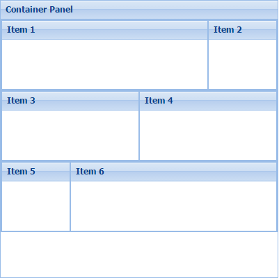
可以看到,Column Layout因为是 float: left 浮动的机制,所以会自动换行;而HBox Layout需要借助其它比如Anchor 布局、行布局或者垂直方向盒子布局才能达到分行的效果。以至于HBox可能会比Column布局需要更多地嵌套
区别三
Ext.application({
    name: 'Fiddle',

    launch: function() {
        Ext.create('Ext.Panel', {
            width: 500,
            defaults: {
                border: true
            },
            title: "HBoxLayout Panel",
            layout: {
                type: 'hbox',
                align: 'middle'
            },
            renderTo: document.body,
            items: [{
                xtype: 'panel',
                title: 'Inner Panel One',
                flex: 2,
                height: 50
            }, {
                xtype: 'panel',
                title: 'Inner Panel Two',
                flex: 1,
                height: 150
            }, {
                xtype: 'panel',
                title: 'Inner Panel Three',
                flex: 1,
                height: 250
            }]
        });
        Ext.create('Ext.panel.Panel', {
            title: 'Column Layout Panel',
            width: 500,
            margin: '50 0 0 0',
            layout: 'column',
            defaults: {
                border: true
            },
            items: [{
                title: 'Inner Panel One',
                columnWidth: 0.50,
                height: 200
            }, {
                title: 'Inner Panel Two',
                columnWidth: 0.25,
                height: 50
            }, {
                title: 'Inner Panel Three',
                columnWidth: 0.25,
                height: 400
            }],
            renderTo: Ext.getBody()
        });

    }
});
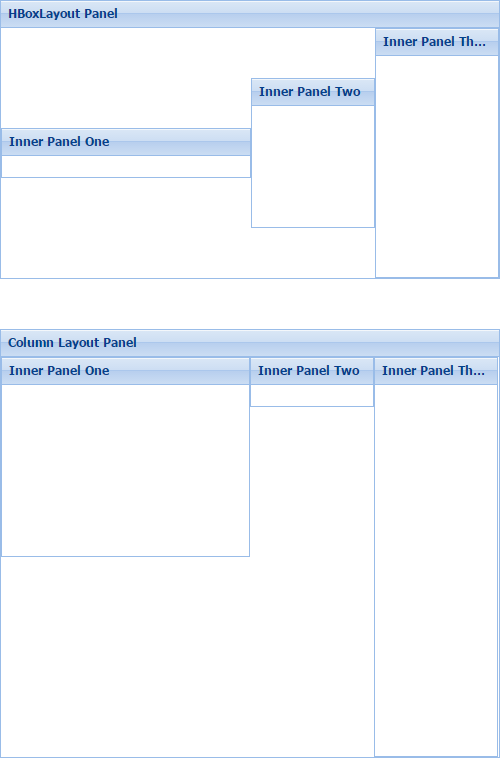
可以看出来,HBox可以让子控件居中,而Column布局则不方便实现。
与Column Layout和HBox Layout相对的,还有叫Row Layout(行布局)和VBox Layout(垂直方向盒子布局)布局。机制和区别同上面类似。
附:
Sencha touch或者 Ext JS6 Modern 中的HBox和VBox,实现的机制并不是绝对定位,而是利用的CSS3的弹性盒子flexbox布局。
Ext JS6 Classic 中的HBox和VBox,在界面发生改变(比如窗口大小变化等)的时候,需要重新计算子控件的绝对位置;而CSS3的flexbox则不需要,是自动的,这样在移动端的性能相对较好。
欢迎加入Sencha Touch + Phonegap交流群
1群:194182999 (满)
2群:419834979
共同学习交流(博主QQ:479858761)


 181
181


 被折叠的 条评论
为什么被折叠?
被折叠的 条评论
为什么被折叠?
 到【灌水乐园】发言


