


目录😋
背景介绍
厨房里新到一批蔬菜,被凌乱地堆放在一起,现在我们给蔬菜分下类,把相同的蔬菜放到同一个菜板上,拿给厨师烹饪美味佳肴吧。
准备步骤
开始答题前,需要先打开本题的项目代码文件夹,目录结构如下:
├── css
│   └── style.css
├── images
└── index.html
其中:
css/style.css是需要补充代码的样式文件。images是图片文件夹。index.html是主页面。注意:打开环境后发现缺少项目代码,请手动键入下述命令进行下载:
cd /home/project
wget https://labfile.oss.aliyuncs.com/courses/9788/02.zip && unzip 02.zip && rm 02.zip
在浏览器中预览
index.html页面,显示如下所示:
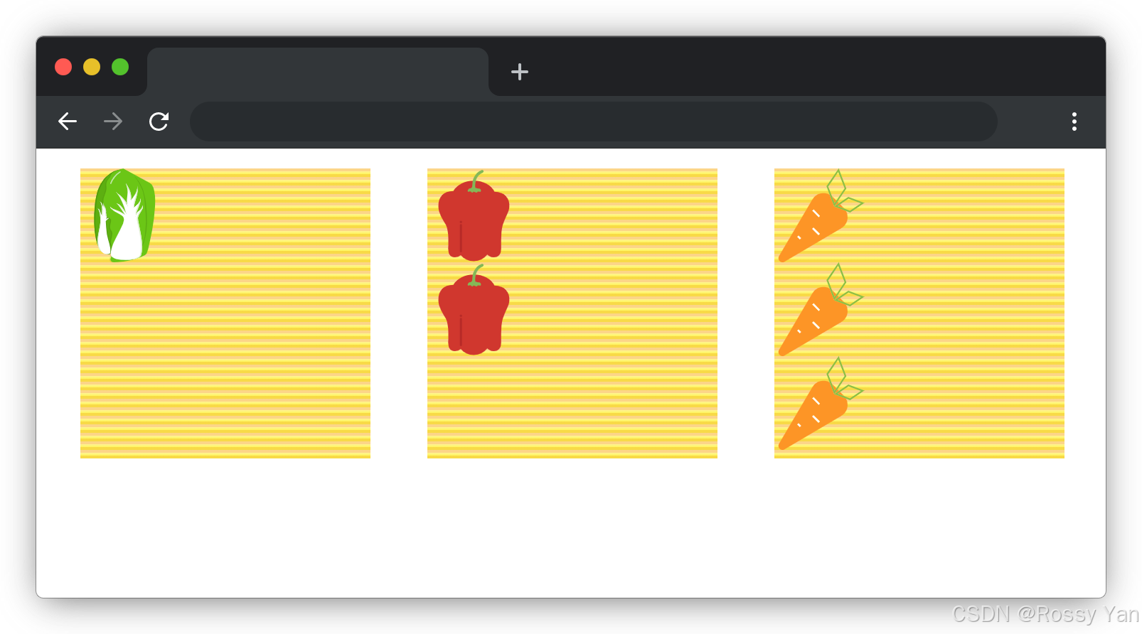
目标效果
完成
css/style.css中的 TODO 部分。所有元素的大小都已给出,无需修改,完成后效果如下(图中灰色线条为布局参考线无需实现):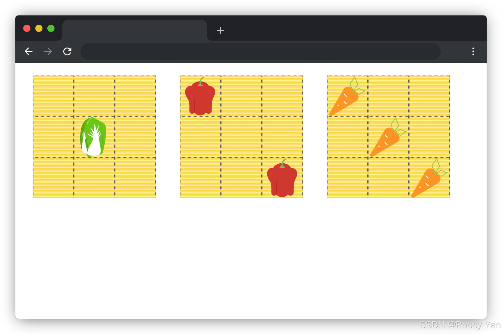
要求规定
- 请勿修改页面中所有给出元素的大小,以免造成无法判题通过。
- 请严格按照考试步骤操作,切勿修改考试默认提供项目中的文件名称、文件夹路径、class 名、id 名、图片名等,以免造成无法判题通过。
判分标准
- 本题完全实现题目目标得满分,否则得 0 分。
通关代码✔️
方法一:flex布局
.container {
  display: flex;
  justify-content: center;
  flex-wrap: wrap;
  width: 960px;
  margin: 0 auto;
}

.item {
  display: block;
  width: 66px;
  height: 66px;
}

.item img {
  width: 100%;
  height: auto;
}

[class$="box"] {
  width: 204px;
  height: 204px;
  margin: 20px;
  background-image: linear-gradient(
    rgb(252, 213, 136) 33.3%,
    #fff493 0,
    #fdf45d 66.6%,
    #f8da47 0
  );
  background-size: 6px 6px;
}

/* TODO:待补充代码 */
.box{
  display: flex;
}
#box1{
  flex-direction: row;
  justify-content: center;
  align-items: center;
}
#box2{
  justify-content: space-between;
}
#box2 .item:nth-child(2){
  align-self: end;
}
#box3{
  justify-content: space-between;
}
#box3 .item:nth-child(2){
  align-self: center;
}
#box3 .item:nth-child(3){
  align-self: end;
}
方法二:grid布局
.container {
  display: flex;
  justify-content: center;
  flex-wrap: wrap;
  width: 960px;
  margin: 0 auto;
}

.item {
  display: block;
  width: 66px;
  height: 66px;
}

.item img {
  width: 100%;
  height: auto;
}

[class$="box"] {
  width: 204px;
  height: 204px;
  margin: 20px;
  background-image: linear-gradient(
    rgb(252, 213, 136) 33.3%,
    #fff493 0,
    #fdf45d 66.6%,
    #f8da47 0
  );
  background-size: 6px 6px;
}

/* TODO:待补充代码 */
.box{
  display: grid;
  grid-template:repeat(3,1fr)/repeat(3,1fr);
}
#box1 .item{
  grid-area:2/2;
}
#box2 .item:nth-child(2){
  grid-area: 3/3;
}
#box3 .item:nth-child(2){
  grid-area:2/2;
}
#box3 .item:nth-child(3){
  grid-area:3/3;
}
代码解析📑
一、HTML 部分
<!DOCTYPE html>
<html lang="en">
  <head>
    <meta charset="UTF-8" />
    <meta http-equiv="X-UA-Compatible" content="IE=edge" />
    <meta name="viewport" content="width=device-width, initial-scale=1.0" />
    <title>新鲜的蔬菜</title>
    <link rel="stylesheet" href="./css/style.css" />
  </head>

  <body>
    <div class="container">
      <div class="box" id="box1">
        <span class="item">
          <img src="./images/cabbage.svg" alt="" />
        </span>
      </div>
      <div class="box" id="box2">
        <span class="item">
          <img src="./images/chili.svg" alt="" />
        </span>
        <span class="item">
          <img src="./images/chili.svg" alt="" />
        </span>
      </div>
      <div class="box" id="box3">
        <span class="item">
          <img src="./images/carrot.svg" alt="" />
        </span>
        <span class="item">
          <img src="./images/carrot.svg" alt="" />
        </span>
        <span class="item">
          <img src="./images/carrot.svg" alt="" />
        </span>
      </div>
    </div>
  </body>
</html>
1. 文档声明与头部信息:
<!DOCTYPE html>:声明文档类型为 HTML5。<html lang="en">:设置文档语言为英语。<head>标签内包含了字符编码、浏览器兼容性、视口设置、页面标题以及外部 CSS 文件的链接。2. 主体内容:
<body>标签内有一个<div class="container">,它作为整个页面的容器。- 容器内包含三个
<div class="box">元素,分别具有不同的id(box1、box2、box3),每个box元素代表一个展示区域。- 每个
box元素内包含若干个<span class="item">元素,每个item元素中又包含一个<img>标签,用于显示蔬菜图标。
二、CSS 部分
方法一:flex布局
.container {
  display: flex;
  justify-content: center;
  flex-wrap: wrap;
  width: 960px;
  margin: 0 auto;
}

.item {
  display: block;
  width: 66px;
  height: 66px;
}

.item img {
  width: 100%;
  height: auto;
}

[class$="box"] {
  width: 204px;
  height: 204px;
  margin: 20px;
  background-image: linear-gradient(
    rgb(252, 213, 136) 33.3%,
    #fff493 0,
    #fdf45d 66.6%,
    #f8da47 0
  );
  background-size: 6px 6px;
}

/* TODO:待补充代码 */
.box{
  display: flex;
}
#box1{
  flex-direction: row;
  justify-content: center;
  align-items: center;
}
#box2{
  justify-content: space-between;
}
#box2 .item:nth-child(2){
  align-self: end;
}
#box3{
  justify-content: space-between;
}
#box3 .item:nth-child(2){
  align-self: center;
}
#box3 .item:nth-child(3){
  align-self: end;
}
.container样式:
display: flex;:将.container元素设置为弹性容器,其子元素将按照弹性布局排列。justify-content: center;:使子元素在水平方向上居中对齐。flex-wrap: wrap;:当子元素超出容器宽度时,允许换行显示。width: 960px;:设置容器的宽度为 960 像素。margin: 0 auto;:使容器在页面中水平居中。.item样式:
display: block;:将.item元素设置为块级元素。width: 66px;和height: 66px;:设置.item元素的宽度和高度为 66 像素。.item img样式:
width: 100%;:使图片宽度占满.item元素的宽度。height: auto;:保持图片的原始宽高比。[class$="box"]样式:
- 选择所有类名以
"box"结尾的元素。- 设置宽度和高度为 204 像素,并添加 20 像素的外边距。
- 使用线性渐变设置背景图像,并设置背景图像的大小为 6x6 像素。
.box样式:
display: flex;:将.box元素设置为弹性容器。#box1样式:
flex-direction: row;:设置子元素在水平方向上排列。justify-content: center;和align-items: center;:使子元素在水平和垂直方向上都居中对齐。#box2样式:
justify-content: space-between;:使子元素在水平方向上均匀分布,两端对齐。#box2 .item:nth-child(2):选择#box2中的第二个.item元素,align-self: end;使其在垂直方向上靠底部对齐。#box3样式:
justify-content: space-between;:使子元素在水平方向上均匀分布,两端对齐。#box3 .item:nth-child(2):选择#box3中的第二个.item元素,align-self: center;使其在垂直方向上居中对齐。#box3 .item:nth-child(3):选择#box3中的第三个.item元素,align-self: end;使其在垂直方向上靠底部对齐。方法二:flex布局
.container {
  display: flex;
  justify-content: center;
  flex-wrap: wrap;
  width: 960px;
  margin: 0 auto;
}

.item {
  display: block;
  width: 66px;
  height: 66px;
}

.item img {
  width: 100%;
  height: auto;
}

[class$="box"] {
  width: 204px;
  height: 204px;
  margin: 20px;
  background-image: linear-gradient(
    rgb(252, 213, 136) 33.3%,
    #fff493 0,
    #fdf45d 66.6%,
    #f8da47 0
  );
  background-size: 6px 6px;
}

/* TODO:待补充代码 */
.box{
  display: grid;
  grid-template:repeat(3,1fr)/repeat(3,1fr);
}
#box1 .item{
  grid-area:2/2;
}
#box2 .item:nth-child(2){
  grid-area: 3/3;
}
#box3 .item:nth-child(2){
  grid-area:2/2;
}
#box3 .item:nth-child(3){
  grid-area:3/3;
}
.container、.item、.item img和[class$="box"]样式:与第一段代码中的对应样式相同。.box样式:
display: grid;:将.box元素设置为网格容器。grid-template:repeat(3,1fr)/repeat(3,1fr);:将网格容器划分为 3 行 3 列,每行和每列的大小都相等,使用1fr表示等分剩余空间。#box1 .item样式:
grid-area:2/2;:将#box1中的.item元素放置在网格的第 2 行第 2 列。#box2 .item:nth-child(2)样式:
grid-area: 3/3;:将#box2中的第二个.item元素放置在网格的第 3 行第 3 列。#box3 .item:nth-child(2)样式:
grid-area:2/2;:将#box3中的第二个.item元素放置在网格的第 2 行第 2 列。#box3 .item:nth-child(3)样式:
grid-area:3/3;:将#box3中的第三个.item元素放置在网格的第 3 行第 3 列。
三、工作流程▶️
1. HTML 结构搭建:
- 浏览器首先解析 HTML 文件,构建 DOM 树。在这个过程中,会识别出
<div class="container">作为整体容器,以及内部的三个<div class="box">元素和它们包含的<span class="item">及<img>元素。2. CSS 样式应用(方法一:flex布局):
- 浏览器加载外部 CSS 文件(如果有的话),并根据选择器匹配规则将样式应用到对应的元素上。
.container元素被设置为弹性容器,子元素按照弹性布局排列,水平居中且允许换行。.item元素被设置为块级元素,具有固定的宽度和高度,图片自适应宽度。- 类名以
"box"结尾的元素应用了特定的宽度、高度、外边距和背景渐变样式。- 每个
box元素内部的子元素根据不同的id选择器设置的弹性布局属性进行排列,如居中对齐、两端对齐、垂直方向的不同对齐方式等。3. CSS 样式应用(方法二:grid布局):
- 同样,浏览器根据选择器匹配规则应用样式。
.container、.item、.item img和[class$="box"]的样式与第一段相同。.box元素被设置为网格容器,划分为 3 行 3 列的网格。- 各个
box元素内的特定.item元素根据grid-area属性被放置在网格的指定位置。
测试结果👍


 扫一扫
扫一扫


 被折叠的 条评论
为什么被折叠?
被折叠的 条评论
为什么被折叠?
 到【灌水乐园】发言


