


本文继续前面的内容,App.vue采用了flex布局
垂直居中还是有点难度的。
但是习惯使用flex布局后,又能简单的实现。
页面只有一个元素
<template>
    <view class="center">
        <view style="background-color: blue">居中文字</view>
    </view>
</template>
<style>
    .center {
        flex: auto;
        display: flex;
        flex-direction: column;
        justify-content: center;
        align-items: center;
        background-color: red;
    }
</style>
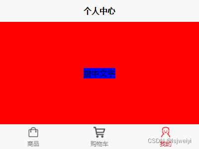
这里首先呢,居中是基于父元素的宽高下居中,所以,父元素得有一定的宽高,flex布局下,宽度默认是最大,但高度由子元素决定。
所以flex: auto;让父元素占满剩余空间。然后父元素是flex+行布局display: flex; flex-direction: column;。最后便是水平居中+垂直居中align-items: center; background-color: red;。底色是为了更明显看到父子元素所占的空间。
这里只有一行文字,多行文字的效果:
也是没问题的。
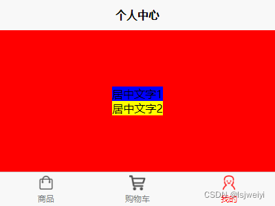
多个元素
<template>
    <view class="center">
        <view style="background-color: blue">居中文字1</view>
        <view style="background-color: yellow">居中文字2</view>
    </view>
    <view style="flex: none; bottom: 0px; height: 50px">我固定在底部</view>
</template>
<style>
    .center {
        flex: auto;
        display: flex;
        flex-direction: column;
        justify-content: center;
        align-items: center;
        background-color: red;
    }
</style>
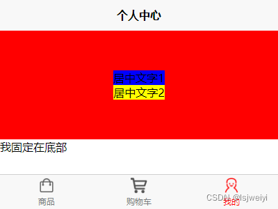
可以看到,一样是会自动居中的,问题不大。
flex布局是比较灵活的。用好该布局可以解决大多数场景,也让css代码更简单。


 扫一扫
扫一扫


 421
421

 被折叠的 条评论
为什么被折叠?
被折叠的 条评论
为什么被折叠?
 到【灌水乐园】发言


