


 超级会员免费看
概述
线性布局(LinearLayout)是开发中最常用的布局,通过线性容器 Row 和 Column 构建。线性布局是其他布局的基础,其子元素在线性方向上(水平方向和垂直方向)依次排列。线性布局的排列方向由所选容器组件决定,Column 容器内子元素按照垂直方向排列,Row 容器内子元素按照水平方向排列。根据不同的排列方向,开发者可选择使用 Row 或 Column 容器创建线性布局。
我开发的 Demo 展示

以下代码均经过我 demo 的实战验证,确保代码和效果对应
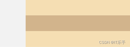
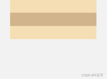
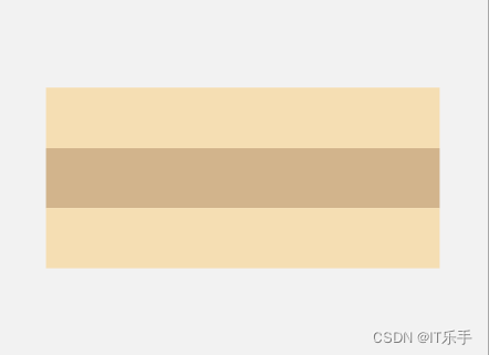
布局子元素在排列方向上的间距
1、Column 容器内排列方向上的间距
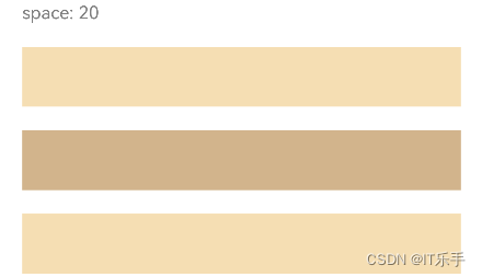
对应代码
Column({ space: 20 }) {
    Text('space: 20')
    .fontSize(15)
    .fontColor(Color.Gray)
    .width('90%')
    Row()
    .width('90%')
    .height(50)
    .backgroundColor(0xF5DEB3)
    Row()
    .width('90%')
    .height(50)
    .backgroundColor(0xD2B48C)
    Row()
    .width('90%')
    .height(50)
    .backgroundColor(0xF5DEB3)
}.width('100%')
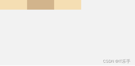
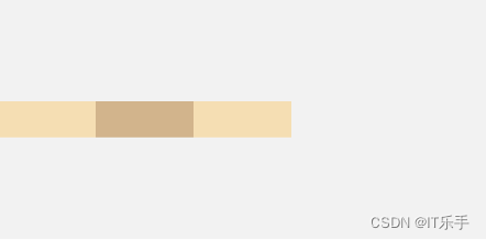
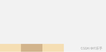
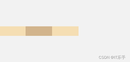
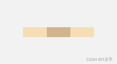
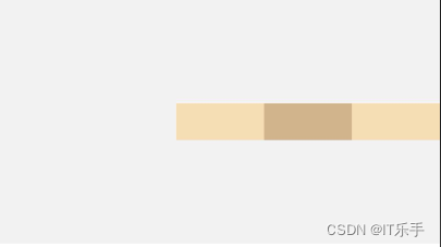
2、Row 容器内排列方向上的间距
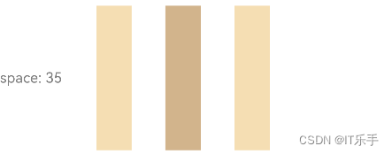
对应代码
Row({ space: 35 }) {
    Text('space: 35')
      .fontSize(15)
      .fontColor(Color.Gray)
    Row()
      .width('10%')
      .height(150)
      .backgroundColor(0xF5DEB3)
    Row()
      .width('10%')
      .height(150)
      .backgroundColor(0xD2B48C)
    Row()
      .width('10%')
      .height(150)
      .backgroundColor(0xF5DEB3)
}.width('90%')
布局子元素在交叉轴上的对齐方式
1、Column 容器内子元素在水平方向上的排列
HorizontalAlign.Start:子元素在水平方向左对齐
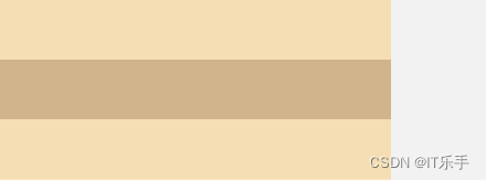
对应代码
Column({}) {
    Column() {}
    .width('80%')
    .height(50)
    .backgroundColor(0xF5DEB3)

    Column() {}
    .width('80%')
    .height(50)
    .backgroundColor(0xD2B48C)

    Column() {}
    .width('80%')
    .height(50)
    .backgroundColor(0xF5DEB3)
    }
.width('100%')
.alignItems(HorizontalAlign.Start)
.backgroundColor('rgb(242,242,242)')
HorizontalAlign.Center:子元素在水平方向居中对齐
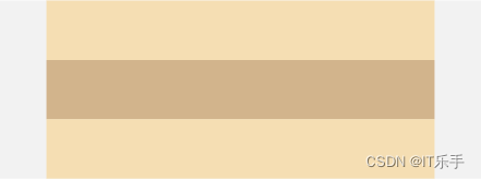
对应代码
Column({}) {
    Column() {}
    .width('80%')
    .height(50)
    .backgroundColor(0xF5DEB3)

    Column() {}
    .width('80%')
    .height(50)
    .backgroundColor(0xD2B48C)

    Column() {}
    .width('80%')
    .height(50)
    .backgroundColor(0xF5DEB3)
 }
.width('100%')
.alignItems(HorizontalAlign.Center)
.backgroundColor('rgb(242,242,242)')
HorizontalAlign.End:子元素在水平方向右对齐
对应代码
 Column({}) {
            Column() {}
            .width('80%')
            .height(50)
            .backgroundColor(0xF5DEB3)

            Column() {}
            .width('80%')
            .height(50)
            .backgroundColor(0xD2B48C)

            Column() {}
            .width('80%')
            .height(50)
            .backgroundColor(0xF5DEB3)
          }
          .width('100%')
          .alignItems(HorizontalAlign.End)
          .backgroundColor('rgb(242,242,242)')
2、Row 容器内子元素在垂直方向上的排列
VerticalAlign.Top:子元素在垂直方向顶部对齐
对应代码
 Row({}) {
     Column() {}
     .width('20%')
     .height(30)
     .backgroundColor(0xF5DEB3)

     Column() {}
     .width('20%')
     .height(30)
     .backgroundColor(0xD2B48C)

     Column() {}
     .width('20%')
     .height(30)
     .backgroundColor(0xF5DEB3)
}
.width('100%')
.height(200)
.alignItems(VerticalAlign.Top)
.backgroundColor('rgb(242,242,242)')
VerticalAlign.Center:子元素在垂直方向顶部对齐
对应代码
Row({}) {
     Column() {}
      .width('20%')
      .height(30)
      .backgroundColor(0xF5DEB3)

      Column() {}
      .width('20%')
      .height(30)
      .backgroundColor(0xD2B48C)

      Column() {}
      .width('20%')
      .height(30)
      .backgroundColor(0xF5DEB3)
 }
 .width('100%')
 .height(200)
 .alignItems(VerticalAlign.Center)
 .backgroundColor('rgb(242,242,242)')
VerticalAlign.Bottom:子元素在垂直方向底部对齐
对应代码
Row({}) {
    Column() {}
     .width('20%')
     .height(30)
     .backgroundColor(0xF5DEB3)

     Column() {}
     .width('20%')
     .height(30)
     .backgroundColor(0xD2B48C)

     Column() {}
     .width('20%')
     .height(30)
     .backgroundColor(0xF5DEB3)
}
.width('100%')
.height(200)
.alignItems(VerticalAlign.Bottom)
.backgroundColor('rgb(242,242,242)')
布局子元素在主轴上的排列方式
1、Column 容器内子元素在垂直方向上的排列
justifyContent(FlexAlign.Start):元素在垂直方向首端对齐,第一个元素与行首对齐,同时后续的元素与前一个对齐
对应代码
 Column({}) {
      Column() {}
      .width('80%')
      .height(50)
      .backgroundColor(0xF5DEB3)

      Column() {}
      .width('80%')
      .height(50)
      .backgroundColor(0xD2B48C)

      Column() {}
      .width('80%')
      .height(50)
      .backgroundColor(0xF5DEB3)
}
.width('100%')
.height(300)
.backgroundColor('rgb(242,242,242)')
.justifyContent(FlexAlign.Start)
justifyContent(FlexAlign.Center):元素在垂直方向中心对齐,第一个元素与行首的距离与最后一个元素与行尾距离相同。
对应代码
 Column({}) {
     Column() {}
     .width('80%')
     .height(50)
     .backgroundColor(0xF5DEB3)

     Column() {}
     .width('80%')
     .height(50)
     .backgroundColor(0xD2B48C)

     Column() {}
     .width('80%')
     .height(50)
     .backgroundColor(0xF5DEB3)
   }
.width('100%')
.height(300)
.backgroundColor('rgb(242,242,242)')
.justifyContent(FlexAlign.Center)
justifyContent(FlexAlign.End):元素在垂直方向底部对齐,最后一个元素与行尾对齐
2、Row 容器内子元素在水平方向上的排列
justifyContent(FlexAlign.Start):元素在水平方向首端对齐,第一个元素与行首对齐,同时后续的元素与前一个对齐
代码部分
Row({}) {
  Column() {}
  .width('20%')
  .height(30)
  .backgroundColor(0xF5DEB3)

  Column() {}
  .width('20%')
  .height(30)
  .backgroundColor(0xD2B48C)

  Column() {}
  .width('20%')
  .height(30)
  .backgroundColor(0xF5DEB3)
}
.width('100%')
.height(200)
.backgroundColor('rgb(242,242,242)')
.justifyContent(FlexAlign.Start)
justifyContent(FlexAlign.Center):元素在水平方向居中对齐
代码部分
Row({}) {
  Column() {}
  .width('20%')
  .height(30)
  .backgroundColor(0xF5DEB3)

  Column() {}
  .width('20%')
  .height(30)
  .backgroundColor(0xD2B48C)

  Column() {}
  .width('20%')
  .height(30)
  .backgroundColor(0xF5DEB3)
}
.width('100%')
.height(200)
.backgroundColor('rgb(242,242,242)')
.justifyContent(FlexAlign.Center)
justifyContent(FlexAlign.End):元素在水平方向右对齐
代码部分
Row({}) {
  Column() {}
  .width('20%')
  .height(30)
  .backgroundColor(0xF5DEB3)

  Column() {}
  .width('20%')
  .height(30)
  .backgroundColor(0xD2B48C)

  Column() {}
  .width('20%')
  .height(30)
  .backgroundColor(0xF5DEB3)
}
.width('100%')
.height(200)
.backgroundColor('rgb(242,242,242)')
.justifyContent(FlexAlign.End)
自适应拉伸
在线性布局下,常用空白填充组件 Blank,在容器主轴方向自动填充空白空间,达到自适应拉伸效果。Row 和 Column 作为容器,只需要添加宽高为百分比,当屏幕宽高发生变化时,会产生自适应效果。
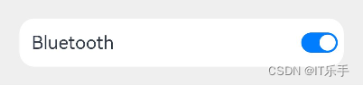
代码部分
Column() {
  Row() {
    Text('Bluetooth').fontSize(18)
    Blank()
    Toggle({ type: ToggleType.Switch, isOn: true })
  }
  .backgroundColor(0xFFFFFF)
  .borderRadius(15)
  .padding({ left: 12 })
  .width('100%')
}
.backgroundColor(0xEFEFEF)
.padding(20)
.width('100%')
自适应缩放
自适应缩放是指子组件随容器尺寸的变化而按照预设的比例自动调整尺寸,适应各种不同大小的设备。在线性布局中,可以使用以下两种方法实现自适应缩放。
父容器尺寸确定时,使用 layoutWeight 属性设置子组件和兄弟元素在主轴上的权重,忽略元素本身尺寸设置,使它们在任意尺寸的设备下自适应占满剩余空间。
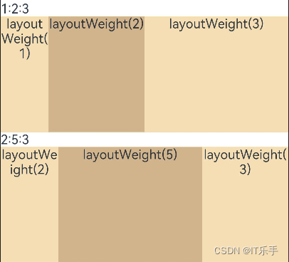
代码部分
Column() {
   Text('1:2:3').width('100%')
    Row() {
      Column() {
        Text('layoutWeight(1)')
          .textAlign(TextAlign.Center)
      }.layoutWeight(1).backgroundColor(0xF5DEB3).height('100%')

      Column() {
        Text('layoutWeight(2)')
          .textAlign(TextAlign.Center)
      }.layoutWeight(2).backgroundColor(0xD2B48C).height('100%')

      Column() {
        Text('layoutWeight(3)')
          .textAlign(TextAlign.Center)
      }.layoutWeight(3).backgroundColor(0xF5DEB3).height('100%')

    }.backgroundColor(0xffd306).height('20%')

    Text('2:5:3').width('100%')
    Row() {
      Column() {
        Text('layoutWeight(2)')
          .textAlign(TextAlign.Center)
      }.layoutWeight(2).backgroundColor(0xF5DEB3).height('100%')

      Column() {
        Text('layoutWeight(5)')
          .textAlign(TextAlign.Center)
      }.layoutWeight(5).backgroundColor(0xD2B48C).height('100%')

      Column() {
        Text('layoutWeight(3)')
          .textAlign(TextAlign.Center)
      }.layoutWeight(3).backgroundColor(0xF5DEB3).height('100%')
    }.backgroundColor(0xffd306).height('20%')
}
自适应延伸
自适应延伸是指在不同尺寸设备下,当页面的内容超出屏幕大小而无法完全显示时,可以通过滚动条进行拖动展示。这种方法适用于线性布局中内容无法一屏展示的场景。通常有以下两种实现方式。
-
在 List 中添加滚动条:当 List 子项过多一屏放不下时,可以将每一项子元素放置在不同的组件中,通过滚动条进行拖动展示。可以通过 scrollBar 属性设置滚动条的常驻状态,edgeEffect 属性设置拖动到内容最末端的回弹效果。
-
使用 Scroll 组件:在线性布局中,开发者可以进行垂直方向或者水平方向的布局。当一屏无法完全显示时,可以在 Column 或 Row 组件的外层包裹一个可滚动的容器组件 Scroll 来实现可滑动的线性布局。
垂直方向布局中使用Scroll组件
水平方向布局中使用 Scroll 组件
代码部分
@Entry
@Component
struct ScrollVerticalPage {

  scroller: Scroller = new Scroller();
  private arr: number[] = [0, 1, 2, 3, 4, 5, 6, 7, 8, 9];

  build() {
    Navigation() {
      Scroll(this.scroller) {
        Column() {
          ForEach(this.arr, (item) => {
            Text(item.toString())
              .width('90%')
              .height(150)
              .backgroundColor(0xFFFFFF)
              .borderRadius(15)
              .fontSize(16)
              .textAlign(TextAlign.Center)
              .margin({ top: 10 })
          }, item => item)
        }.width('100%')
      }
      .backgroundColor(0xDCDCDC)
      .scrollable(ScrollDirection.Vertical) // 滚动方向为垂直方向
      .scrollBar(BarState.On) // 滚动条常驻显示
      .scrollBarColor(Color.Gray) // 滚动条颜色
      .scrollBarWidth(10) // 滚动条宽度
      .edgeEffect(EdgeEffect.Spring) // 滚动到边沿后回弹
    }
    .title('垂直方向布局中使用 Scroll 组件')
    .titleMode(NavigationTitleMode.Mini)
  }
}
水平方向布局中使用 Scroll 组件
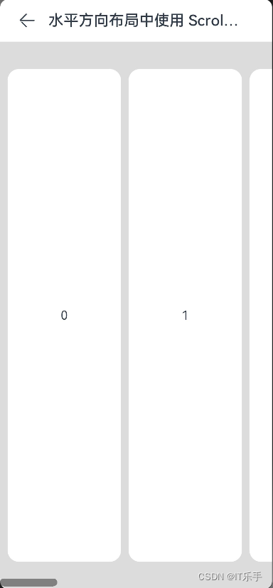
@Entry
@Component
struct ScrollHorizontalPage {

  scroller: Scroller = new Scroller();
  private arr: number[] = [0, 1, 2, 3, 4, 5, 6, 7, 8, 9];

  build() {
    Navigation() {
      Scroll(this.scroller) {
        Row() {
          ForEach(this.arr, (item) => {
            Text(item.toString())
              .height('90%')
              .width(150)
              .backgroundColor(0xFFFFFF)
              .borderRadius(15)
              .fontSize(16)
              .textAlign(TextAlign.Center)
              .margin({ left: 10 })
          })
        }.height('100%')
      }
      .backgroundColor(0xDCDCDC)
      .scrollable(ScrollDirection.Horizontal) // 滚动方向为垂直方向
      .scrollBar(BarState.On) // 滚动条常驻显示
      .scrollBarColor(Color.Gray) // 滚动条颜色
      .scrollBarWidth(10) // 滚动条宽度
      .edgeEffect(EdgeEffect.Spring) // 滚动到边沿后回弹
    }
    .title('水平方向布局中使用 Scroll 组件')
    .titleMode(NavigationTitleMode.Mini)
  }
}


 4450
4450


 被折叠的 条评论
为什么被折叠?
被折叠的 条评论
为什么被折叠?
 到【灌水乐园】发言


