前言
CardView作为卡片控件是在Android5.0系统引入的,继承于FragmentLayout布局在里面添加圆角阴影的效果,Google在5.0中引入了MD设计Elevation和Z轴位移,目的就是突出不同元素之间的层次关系,在显示列表或者网格时候更加的炫酷,说到这里便有跃跃欲试的感觉,Let's Go!
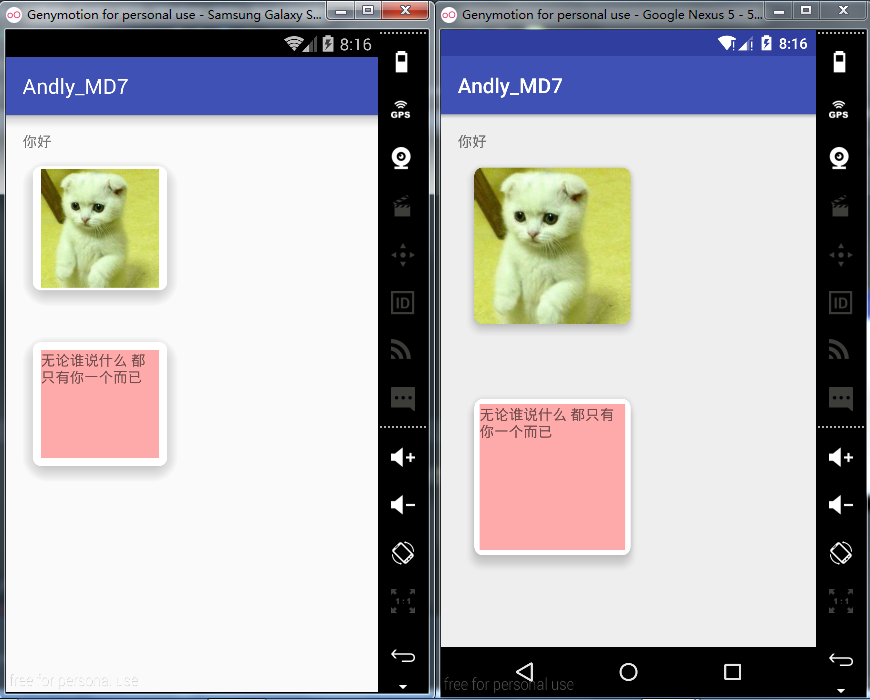
效果~
Part 1、CardView卡片的简单应用
配置
- dependencies {
- compile fileTree(include: ['*.jar'], dir: 'libs')
- androidTestCompile('com.android.support.test.espresso:espresso-core:2.2.2', {
- exclude group: 'com.android.support', module: 'support-annotations'
- })
- compile 'com.android.support:cardview-v7:25.0.1'
- }
代码:
- <android.support.v7.widget.CardView
- android:id="@+id/cardview"
- android:layout_width="150dp"
- android:layout_height="150dp"
- app:cardCornerRadius="8dp"
- app:cardElevation="10dp">
-
- <ImageView
- android:layout_width="wrap_content"
- android:layout_height="wrap_content"
- android:src="@drawable/pic2"/>
-
- </android.support.v7.widget.CardView>
-
- <Space
- android:layout_width="match_parent"
- android:layout_height="20dp"/>
-
- <android.support.v7.widget.CardView
- android:layout_width="150dp"
- android:layout_height="150dp"
- app:cardCornerRadius="8dp"
- app:cardElevation="10dp">
-
- <TextView
- android:layout_width="wrap_content"
- android:layout_height="150dp"
- android:background="#5f00"
- android:singleLine="false"
- android:text="无论谁说什么 都只有你一个而已"
- />
-
- </android.support.v7.widget.CardView>
tips:
1、Space : 空格控件
2、app:cardCornerRadius="" : 设置卡片圆角的半径
3、app:cardElevation="" : Z轴的值
效果~
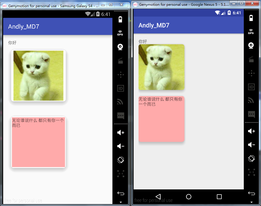
上面的坑:
1、相同cardElevation值,阴影效果4.4要强于5.1
2、5.1中文字紧贴着圆角,不美观
解决方案:
1、在低版本中设置CardElevation之后CardView会自动留出空间供阴影显示,而Lollipop之后需要手动进行设置Margin边距来预留空间,这里我们定义两套布局(当然你也可以写两个dimen.xml)。
在低版本设置
- android:layout_margin="0dp"
在高版本设置(一般和 CardElevation 阴影大小相同)
- android:layout_margin="16dp"
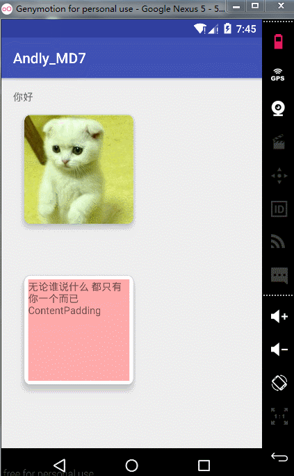
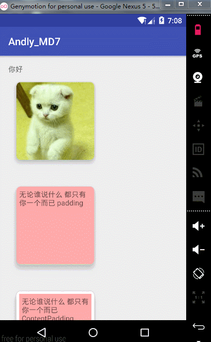
2、对于文字紧贴圆角的问题,需要设置paddingContent属性来兼容,这里给出设置android:padding和android:contentPadding的效果来进行比对,差别很明显便不做解释
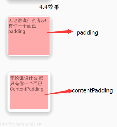
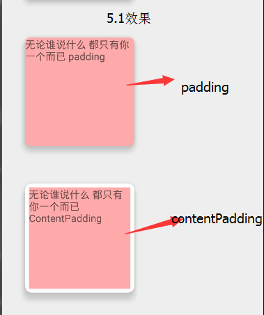
从上面可知需要进行设置contentPadding,但这里注意的是因为5.0以上会自动图片进行裁剪已经很美观了不需要在设置contentPadding。
接下来为CardView设置水波纹效果
- android:clickable="true"
- android:foreground="?attr/selectableItemBackground"
当然你也可以自己用ripple来定义水波纹,上面的代码只在5.0以后有效,之前是没有效果的,这里也别忘了设置clickable
最后为CardView设置动画(这里只是点击让它阴影变大)
- android:stateListAnimator="@drawable/state_animator"
state_animator.xml:
- <selector
- xmlns:android="http://schemas.android.com/apk/res/android">
- <item
- android:state_pressed="true">
- <objectAnimator
- android:duration="@android:integer/config_shortAnimTime"
- android:propertyName="translationZ"
- android:valueTo="15dp"
- android:valueType="floatType"
- ></objectAnimator>
- </item>
- <item>
- <objectAnimator
- android:duration="@android:integer/config_shortAnimTime"
- android:propertyName="translationZ"
- android:valueTo="0dp"
- android:valueType="floatType"></objectAnimator>
- </item>
- </selector>
效果~
附上设置基本属性
app:cardBackgroundColor这是设置背景颜色
app:cardCornerRadius这是设置圆角大小
app:cardElevation这是设置z轴的阴影
app:cardMaxElevation这是设置z轴的最大高度值
app:cardUseCompatPadding是否使用CompatPadding
app:cardPreventCornerOverlap是否使用PreventCornerOverlap
app:contentPadding 设置内容的padding
app:contentPaddingLeft 设置内容的左padding
app:contentPaddingTop 设置内容的上padding
app:contentPaddingRight 设置内容的右padding
app:contentPaddingBottom 设置内容的底padding
Part 2、CardView源码分析
- public class CardView extends FrameLayout {
CardView继承FrameLayout,也就有了FrameLayout层次结构的特点
- private static final CardViewImpl IMPL;
-
- static {
- if (Build.VERSION.SDK_INT >= 21) {
- IMPL = new CardViewApi21();
- } else if (Build.VERSION.SDK_INT >= 17) {
- IMPL = new CardViewJellybeanMr1();
- } else {
- IMPL = new CardViewGingerbread();
- }
- IMPL.initStatic();
- }
一初始化便对版本进行判断,来定义不同的实现类
- final Rect mContentPadding = new Rect();
-
- final Rect mShadowBounds = new Rect();
看到相应的字段可知一个是设置内容内边距,一个设置阴影的大小
进而进入构造方法
- private void initialize(Context context, AttributeSet attrs, int defStyleAttr) {
- TypedArray a = context.obtainStyledAttributes(attrs, R.styleable.CardView, defStyleAttr,
- R.style.CardView);
- ColorStateList backgroundColor;
- if (a.hasValue(R.styleable.CardView_cardBackgroundColor)) {
- backgroundColor = a.getColorStateList(R.styleable.CardView_cardBackgroundColor);
- } else {
-
- final TypedArray aa = getContext().obtainStyledAttributes(COLOR_BACKGROUND_ATTR);
- final int themeColorBackground = aa.getColor(0, 0);
- aa.recycle();
这里它判断你是否设置了cardBackgroundColor,如果没有则从主题中获取android.R.attr.colorBackground属性
查看onMesure方法
- @Override
- protected void onMeasure(int widthMeasureSpec, int heightMeasureSpec) {
- if (!(IMPL instanceof CardViewApi21)) {
- final int widthMode = MeasureSpec.getMode(widthMeasureSpec);
- switch (widthMode) {
- case MeasureSpec.EXACTLY:
- case MeasureSpec.AT_MOST:
- final int minWidth = (int) Math.ceil(IMPL.getMinWidth(mCardViewDelegate));
- widthMeasureSpec = MeasureSpec.makeMeasureSpec(Math.max(minWidth,
- MeasureSpec.getSize(widthMeasureSpec)), widthMode);
- break;
- }
-
- final int heightMode = MeasureSpec.getMode(heightMeasureSpec);
- switch (heightMode) {
- case MeasureSpec.EXACTLY:
- case MeasureSpec.AT_MOST:
- final int minHeight = (int) Math.ceil(IMPL.getMinHeight(mCardViewDelegate));
- heightMeasureSpec = MeasureSpec.makeMeasureSpec(Math.max(minHeight,
- MeasureSpec.getSize(heightMeasureSpec)), heightMode);
- break;
- }
- super.onMeasure(widthMeasureSpec, heightMeasureSpec);
- } else {
- super.onMeasure(widthMeasureSpec, heightMeasureSpec);
- }
- }
这里判断如果API大于5.0则不处理,如果小于则预留出阴影的空间
这里来进入CardViewApi21类
- class CardViewApi21 implements CardViewImpl {
-
- @Override
- public void initialize(CardViewDelegate cardView, Context context,
- ColorStateList backgroundColor, float radius, float elevation, float maxElevation) {
- final RoundRectDrawable background = new RoundRectDrawable(backgroundColor, radius);
- cardView.setCardBackground(background);
-
- View view = cardView.getCardView();
- view.setClipToOutline(true);
- view.setElevation(elevation);
- setMaxElevation(cardView, maxElevation);
- }
这个类目的就是突出API21版本下的独特特性,既然是设置阴影必然是设置padding,进而查看
- @Override
- public void updatePadding(CardViewDelegate cardView) {
- if (!cardView.getUseCompatPadding()) {
- cardView.setShadowPadding(0, 0, 0, 0);
- return;
- }
- float elevation = getMaxElevation(cardView);
- final float radius = getRadius(cardView);
- int hPadding = (int) Math.ceil(RoundRectDrawableWithShadow
- .calculateHorizontalPadding(elevation, radius, cardView.getPreventCornerOverlap()));
- int vPadding = (int) Math.ceil(RoundRectDrawableWithShadow
- .calculateVerticalPadding(elevation, radius, cardView.getPreventCornerOverlap()));
- cardView.setShadowPadding(hPadding, vPadding, hPadding, vPadding);
- }
计算出相应的padding值回传给CardViewDelegate对象CardView,但CardViewDelegate是个接口,通过查看CardView可知CardViewDelegate是CardView的内部类
- private final CardViewDelegate mCardViewDelegate = new CardViewDelegate() {
- private Drawable mCardBackground;
进入setShadowPadding方法
- public void setShadowPadding(int left, int top, int right, int bottom) {
- mShadowBounds.set(left, top, right, bottom);
- CardView.super.setPadding(left + mContentPadding.left, top + mContentPadding.top,
- right + mContentPadding.right, bottom + mContentPadding.bottom);
- }
这里为mShadowBounds设置了边距,也为父级View设置了边距,所以会出现如果你设置了contentPadding之后边缘会显现出CardView的背景
那为什么设置padding没有效果呢?
- @Override
- public void setPadding(int left, int top, int right, int bottom) {
-
- }
-
- public void setPaddingRelative(int start, int top, int end, int bottom) {
-
- }
可以看到CardView的setPadding并没有做任何的操作所以不显示。至此分析完毕


 2万+
2万+

 被折叠的 条评论
为什么被折叠?
被折叠的 条评论
为什么被折叠?
 到【灌水乐园】发言


