


实现tooltip是一个常见的需求,但如何根据tooltip中的内容,在手机端能正常展示自适应宽度的tooltip,先看看效果,如下:
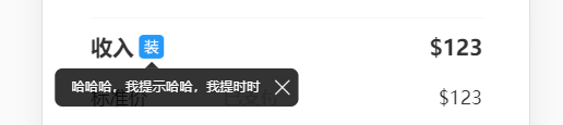

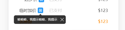
共分为三种情况的自适应:
1.tooltip在侧边,并且内容长度的一半大于需要触发tooltip图标离最外边沿的距离,此时如果让小三角在中间,tooltip左边会显示不全;
2.tooltip长度超过一行,需要换行;
3.tooltip在侧边,并且内容长度的一半小于需要触发tooltip图标离最外边沿的距离。三种情况分别处理,代码如下:
html:
<div class="tooltip" @click="tooltipClick">
    <img v-if="item.promptIcon" class="item-tip-icon" :src="item.promptIcon" />
    <div>
        <div class="tooltiptext">
            <div class="triangle"></div>
            <div class="tooltip-content">{{ item.promptDesc }}</div>
            <img class="tooltip-close"
                src="https://image.ymm56.com/ymmfile/operation-biz/536f5de6-aede-4c12-9f46-                                018e20343ab8.png"
                @click="tooltipClse" />
        </div>
    </div>
</div>
页面布局多用了个空白无class div包裹tooltip,目的是让外层display可以为flex;
js:
tooltipClick (e) {
      e.stopPropagation() // 阻止冒泡
      const allToolTip = document.getElementsByClassName('tooltiptext') // 选中本页所有tooltip
      const tooltip = e.currentTarget.getElementsByClassName('tooltiptext') // 选中点击的图标需要展示的tooltip
      const icon = e.currentTarget.getElementsByClassName('item-tip-icon') // 选中点击的图标
      const triangle = tooltip[0].getElementsByClassName('triangle') // 小三角
      const content = tooltip[0].getElementsByClassName('tooltip-content') // tooltip内容
      console.log(allToolTip, tooltip, content, triangle, content[0].offsetWidth)

      for (const item of allToolTip) {
        item.style.setProperty('visibility', 'hidden') // 循环让所有tooltip不展示
      }
      tooltip[0].style.setProperty('visibility', 'visible') // 让点击的tooltip展示
      console.log(tooltip[0].getBoundingClientRect(), icon[0].getBoundingClientRect())
      if (content[0].offsetWidth < 200) { // 如果内容宽度小于200px,即情况1、3
        if (content[0].offsetWidth / 2 > icon[0].getBoundingClientRect().x) { // 若内容宽度 / 2 大于小icon到最左边的距离,小三角不能居中,只能设置margin,并且margin值与当前内容宽度有关
          triangle[0].style.setProperty('margin-left', content[0].offsetWidth / 2 - 16 + 'px')
          tooltip[0].style.setProperty('margin-left', '10px')
        } else { // 情况3时,tooltip小三角可以居中展示,分别设置小三角与text的位置
          triangle[0].style.setProperty('left', '50%')
          triangle[0].style.setProperty('margin-left', '-3px')
          tooltip[0].style.setProperty('margin-left', 0)
          tooltip[0].style.setProperty('left', '50%')
        }
      }
    },
    tooltipClse(e) { // 点X时关闭tooltip,注意阻止事件冒泡,否则执行父元素方法让tooltip一直展示
      e.stopPropagation()
      e.currentTarget.parentElement.style.setProperty('visibility', 'hidden')
    }
css:
.triangle{
  width: 0;
  height: 0;
  border: px(10) solid transparent;
  border-bottom-color: rgba(0,0,0,0.8);
  margin-left: px(78);
  position: absolute;
  bottom: 100%;
  border-width: 5px;
  border-style: solid;
}
.tooltip {
    position: relative;
    display: flex;
}

.tooltip .tooltiptext {
    width: max-content; // 让外层宽度为最大内容宽
    visibility: hidden;
    background-color: rgba(0,0,0,0.8);
    color: #fff;
    border-radius: 6px;
    padding: px(12) px(8) px(12) px(24);
    position: absolute;
    z-index: 1;
    bottom: px(-15);
    margin-left: px(110);
    transform: translate(-50%, 100%);
    display: flex;
}
.tooltip-close {
  display: inline-block;
  width: px(32);
  height: px(32);
  padding-left: px(16);
}
.tooltip-content {
  max-width: px(400); // 自适应必备,设置内容的最大宽度
}


 539
539


 被折叠的 条评论
为什么被折叠?
被折叠的 条评论
为什么被折叠?
 到【灌水乐园】发言


