


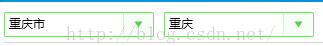
一、样式的样子就是这样的

二、样式Style - 不可编辑请设置 属性为ReadOnly=true属性
<ResourceDictionary xmlns="http://schemas.microsoft.com/winfx/2006/xaml/presentation"
                    xmlns:x="http://schemas.microsoft.com/winfx/2006/xaml">
    <!--下拉按钮-->
    <Style TargetType="ToggleButton" x:Key="ComboxStyleBtn">
        <Setter Property="Template">
            <Setter.Value>
                <ControlTemplate>
                    <Border x:Name="Back" Background="#F7FDF7" BorderThickness="1" BorderBrush="Transparent">
                        <Path Name="PathFill" Fill="#59CA4F" Width="8" Height="6" StrokeThickness="0" Data="M5,0 L10,10 L0,10 z" RenderTransformOrigin="0.5,0.5" Stretch="Fill">
                            <Path.RenderTransform>
                                <TransformGroup>
                                    <ScaleTransform/>
                                    <SkewTransform/>
                                    <RotateTransform Angle="180"/>
                                    <TranslateTransform/>
                                </TransformGroup>
                            </Path.RenderTransform>
                        </Path>
                    </Border>
                    <ControlTemplate.Triggers>
                        <Trigger Property="IsMouseOver" Value="True">
                            <Setter TargetName="PathFill" Property="Fill" Value="White"></Setter>
                            <Setter TargetName="Back" Property="Background" Value="#59CA4F"></Setter>
                            <Setter TargetName="Back" Property="BorderBrush" Value="#59CA4F"></Setter>
                        </Trigger>
                    </ControlTemplate.Triggers>
                </ControlTemplate>
            </Setter.Value>
        </Setter>
    </Style>

    <!--Combox-->
    <Style TargetType="ComboBox" x:Key="ComboBoxStyle">
        <Setter Property="ItemContainerStyle">
            <Setter.Value>
                <!--ComBoxItem-->
                <Style TargetType="ComboBoxItem">
                    <Setter Property="MinHeight" Value="22"></Setter>
                    <Setter Property="MinWidth" Value="60"></Setter>
                    <Setter Property="Template">
                        <Setter.Value>
                            <ControlTemplate TargetType="ComboBoxItem">
                                <Border Name="Back" Background="Transparent"  BorderThickness="0,0,0,0" BorderBrush="#81D779" >
                                    <ContentPresenter ContentSource="{Binding Source}" VerticalAlignment="Center" HorizontalAlignment="Left" Margin="5,0,0,0"></ContentPresenter>
                                </Border>
                                <ControlTemplate.Triggers>
                                    <Trigger Property="IsMouseOver" Value="True">
                                        <Setter TargetName="Back" Property="Background" Value="LightGray"></Setter>
                                    </Trigger>
                                    <Trigger Property="IsHighlighted" Value="True">
                                        <Setter TargetName="Back" Property="Background" Value="LightGray"></Setter>
                                    </Trigger>
                                </ControlTemplate.Triggers>
                            </ControlTemplate>
                        </Setter.Value>
                    </Setter>
                </Style>
            </Setter.Value>
        </Setter>
        <Setter Property="Template">
            <Setter.Value>
                <ControlTemplate TargetType="ComboBox">
                    <Grid Background="#F7FDF7">
                        <Grid.ColumnDefinitions>
                            <ColumnDefinition Width="0.7*"/>
                            <ColumnDefinition Width="0.3*" MaxWidth="30"/>
                        </Grid.ColumnDefinitions>
                        <TextBox  Grid.Column="0" IsReadOnly="{TemplateBinding IsReadOnly}" Text="{TemplateBinding Text}"></TextBox>
                        <Border  Grid.Column="0" BorderThickness="1,1,0,1" BorderBrush="#81D779" CornerRadius="1,0,0,1">

                        </Border>
                        <Border Grid.Column="1" BorderThickness="0,1,1,1" BorderBrush="#81D779" CornerRadius="0,1,1,0">
                            <ToggleButton Style="{StaticResource ComboxStyleBtn}" IsChecked="{Binding Path=IsDropDownOpen, Mode=TwoWay, RelativeSource={RelativeSource TemplatedParent}}" ClickMode="Press"></ToggleButton>
                        </Border>
                        <Popup IsOpen="{TemplateBinding IsDropDownOpen}" Placement="Bottom" x:Name="Popup" Focusable="False" AllowsTransparency="True" PopupAnimation="Slide">
                            <Border CornerRadius="1" MaxHeight="{TemplateBinding MaxDropDownHeight}" MinWidth="{TemplateBinding ActualWidth}" x:Name="DropDown" SnapsToDevicePixels="True">
                                <Border.Effect>
                                    <DropShadowEffect Color="Black" BlurRadius="2" ShadowDepth="0" Opacity="0.5"/>
                                </Border.Effect>
                                <ScrollViewer Margin="4,6,4,6" Style="{DynamicResource ScrollViewerStyle}" MaxHeight="{TemplateBinding MaxDropDownHeight}" SnapsToDevicePixels="True" HorizontalScrollBarVisibility="Auto" VerticalScrollBarVisibility="Auto" CanContentScroll="True">
                                    <!-- StackPanel 用于显示子级,方法是将 IsItemsHost 设置为 True -->
                                    <StackPanel IsItemsHost="True" KeyboardNavigation.DirectionalNavigation="Contained" Background="White"/>
                                </ScrollViewer>
                            </Border>
                        </Popup>
                    </Grid>
                </ControlTemplate>
            </Setter.Value>
        </Setter>
    </Style>
</ResourceDictionary>
<!--ScrollViewer样式-->
<Style TargetType="ScrollViewer" x:Key="ScrollViewerStyle">
<Setter Property="Template">
<Setter.Value>
<ControlTemplate TargetType="{x:Type ScrollViewer}">
<Grid x:Name="Grid" Background="{TemplateBinding Background}">
<Grid.ColumnDefinitions>
<ColumnDefinition Width="*"/>
<ColumnDefinition Width="Auto"/>
</Grid.ColumnDefinitions>
<Grid.RowDefinitions>
<RowDefinition Height="*"/>
<RowDefinition Height="Auto"/>
</Grid.RowDefinitions>
<!--右下角四方形-->
<Rectangle x:Name="Corner" Grid.Row="1" Grid.Column="1" Fill="{DynamicResource {x:Static SystemColors.ControlBrushKey}}"/>
<!--内容区域-->
<ScrollContentPresenter x:Name="PART_ScrollContentPresenter" Grid.Row="0" Grid.Column="0" Content="{TemplateBinding Content}" CanContentScroll="{TemplateBinding CanContentScroll}" ContentTemplate="{TemplateBinding ContentTemplate}" Margin="{TemplateBinding Padding}" />
<!--竖直滚动条-->
<ScrollBar x:Name="PART_VerticalScrollBar" Grid.Row="0" Grid.Column="1" AutomationProperties.AutomationId="VerticalScrollBar" Cursor="Arrow" Maximum="{TemplateBinding ScrollableHeight}" Minimum="0" Visibility="{TemplateBinding ComputedVerticalScrollBarVisibility}" Value="{Binding VerticalOffset, Mode=OneWay, RelativeSource={RelativeSource TemplatedParent}}" ViewportSize="{TemplateBinding ViewportHeight}" Style="{DynamicResource ScrollBarStyle}"/>
<!--水平滚动条-->
<ScrollBar x:Name="PART_HorizontalScrollBar" Grid.Row="1" Grid.Column="0" AutomationProperties.AutomationId="HorizontalScrollBar" Cursor="Arrow" Maximum="{TemplateBinding ScrollableWidth}" Minimum="0" Visibility="{TemplateBinding ComputedHorizontalScrollBarVisibility}" Value="{Binding HorizontalOffset, Mode=OneWay, RelativeSource={RelativeSource TemplatedParent}}" ViewportSize="{TemplateBinding ViewportWidth}" Style="{DynamicResource ScrollBarStyle}" Orientation="Horizontal"/>
</Grid>
<ControlTemplate.Triggers>
<Trigger Property="HorizontalScrollBarVisibility" Value="Disabled">
</Trigger>
</ControlTemplate.Triggers>
</ControlTemplate>
</Setter.Value>
</Setter>
</Style>
<Style x:Key="VerticalScrollBarPageButton" TargetType="{x:Type RepeatButton}">
<Setter Property="OverridesDefaultStyle" Value="true"/>
<Setter Property="Background" Value="Transparent"/>
<Setter Property="Focusable" Value="false"/>
<Setter Property="IsTabStop" Value="false"/>
<Setter Property="Template">
<Setter.Value>
<ControlTemplate TargetType="{x:Type RepeatButton}">
<Rectangle Fill="{TemplateBinding Background}" Height="{TemplateBinding Height}" Width="{TemplateBinding Width}"/>
</ControlTemplate>
</Setter.Value>
</Setter>
</Style>
<Style x:Key="HorizontalScrollBarPageButton" TargetType="{x:Type RepeatButton}">
<Setter Property="OverridesDefaultStyle" Value="true"/>
<Setter Property="Background" Value="Transparent"/>
<Setter Property="Focusable" Value="false"/>
<Setter Property="IsTabStop" Value="false"/>
<Setter Property="Template">
<Setter.Value>
<ControlTemplate TargetType="{x:Type RepeatButton}">
<Rectangle Fill="{TemplateBinding Background}" Height="{TemplateBinding Height}" Width="{TemplateBinding Width}"/>
</ControlTemplate>
</Setter.Value>
</Setter>
</Style>
<!--Theum-->
<Style x:Key="ScrollBarThumb" TargetType="{x:Type Thumb}">
<Setter Property="OverridesDefaultStyle" Value="true"/>
<Setter Property="IsTabStop" Value="false"/>
<Setter Property="Template">
<Setter.Value>
<ControlTemplate TargetType="{x:Type Thumb}">
<Border x:Name="border" CornerRadius="3" Background="#ACACAC" BorderThickness="0" >
</Border>
<ControlTemplate.Triggers>
<Trigger Property="IsMouseOver" Value="True">
<Setter Property="Background" TargetName="border" Value="#888888"/>
</Trigger>
<Trigger Property="IsDragging" Value="True">
<Setter Property="Background" TargetName="border" Value="#888888"/>
</Trigger>
</ControlTemplate.Triggers>
</ControlTemplate>
</Setter.Value>
</Setter>
</Style>
<!--滚动条样式-->
<Style x:Key="ScrollBarStyle" TargetType="{x:Type ScrollBar}">
<Setter Property="Stylus.IsPressAndHoldEnabled" Value="false"/>
<Setter Property="Stylus.IsFlicksEnabled" Value="false"/>
<Setter Property="Foreground" Value="{DynamicResource {x:Static SystemColors.ControlTextBrushKey}}"/>
<Setter Property="Width" Value="{DynamicResource {x:Static SystemParameters.VerticalScrollBarWidthKey}}"/>
<Setter Property="MinWidth" Value="{DynamicResource {x:Static SystemParameters.VerticalScrollBarWidthKey}}"/>
<Setter Property="Template">
<Setter.Value>
<ControlTemplate TargetType="{x:Type ScrollBar}">
<Grid x:Name="Bg" Background="{TemplateBinding Background}" SnapsToDevicePixels="true">
<Grid.RowDefinitions>
<RowDefinition MaxHeight="{DynamicResource {x:Static SystemParameters.VerticalScrollBarButtonHeightKey}}"/>
<RowDefinition Height="0.00001*"/>
<RowDefinition MaxHeight="{DynamicResource {x:Static SystemParameters.VerticalScrollBarButtonHeightKey}}"/>
</Grid.RowDefinitions>
<!--上箭头-->
<RepeatButton Style="{DynamicResource ArrowDownPathButton}" Command="{x:Static ScrollBar.LineUpCommand}" IsEnabled="{TemplateBinding IsMouseOver}"/>
<!--滑动条 ? 是不是Slider中的滑动条??? -是 -->
<Track x:Name="PART_Track" IsDirectionReversed="true" IsEnabled="{TemplateBinding IsMouseOver}" Grid.Row="1">
<!--滑动条上部区域-->
<Track.DecreaseRepeatButton>
<RepeatButton Command="{x:Static ScrollBar.PageUpCommand}" Style="{StaticResource VerticalScrollBarPageButton}"/>
</Track.DecreaseRepeatButton>
<!--滑动条部分-->
<Track.IncreaseRepeatButton>
<RepeatButton Command="{x:Static ScrollBar.PageDownCommand}" Style="{StaticResource VerticalScrollBarPageButton}"/>
</Track.IncreaseRepeatButton>
<!--滑动条下部区域-->
<Track.Thumb>
<Thumb Style="{StaticResource ScrollBarThumb}" Margin="3,0,3,0"/>
</Track.Thumb>
</Track>
<!--下箭头-->
<RepeatButton Command="{x:Static ScrollBar.LineDownCommand}" IsEnabled="{TemplateBinding IsMouseOver}" Grid.Row="2" Style="{DynamicResource ArrowUpPathButton}"/>
</Grid>
<ControlTemplate.Triggers>
<Trigger Property="IsEnabled" Value="false">
<Setter Property="Background" TargetName="Bg" Value="{StaticResource ScrollBarDisabledBackground}"/>
</Trigger>
</ControlTemplate.Triggers>
</ControlTemplate>
</Setter.Value>
</Setter>
<Style.Triggers>
<!--水平摆放时-->
<Trigger Property="Orientation" Value="Horizontal">
<Setter Property="Width" Value="Auto"/>
<Setter Property="MinWidth" Value="0"/>
<Setter Property="Height" Value="{DynamicResource {x:Static SystemParameters.HorizontalScrollBarHeightKey}}"/>
<Setter Property="MinHeight" Value="{DynamicResource {x:Static SystemParameters.HorizontalScrollBarHeightKey}}"/>
<Setter Property="Template">
<Setter.Value>
<ControlTemplate TargetType="{x:Type ScrollBar}">
<Grid x:Name="Bg" Background="{TemplateBinding Background}" SnapsToDevicePixels="true">
<Grid.ColumnDefinitions>
<ColumnDefinition MaxWidth="{DynamicResource {x:Static SystemParameters.HorizontalScrollBarButtonWidthKey}}"/>
<ColumnDefinition Width="0.00001*"/>
<ColumnDefinition MaxWidth="{DynamicResource {x:Static SystemParameters.HorizontalScrollBarButtonWidthKey}}"/>
</Grid.ColumnDefinitions>
<RepeatButton Command="{x:Static ScrollBar.LineLeftCommand}" IsEnabled="{TemplateBinding IsMouseOver}" Style="{DynamicResource ArrowLeftPathButton}"/>
<Track x:Name="PART_Track" Grid.Column="1" IsEnabled="{TemplateBinding IsMouseOver}">
<Track.DecreaseRepeatButton>
<RepeatButton Command="{x:Static ScrollBar.PageLeftCommand}" Style="{StaticResource HorizontalScrollBarPageButton}"/>
</Track.DecreaseRepeatButton>
<Track.IncreaseRepeatButton>
<RepeatButton Command="{x:Static ScrollBar.PageRightCommand}" Style="{StaticResource HorizontalScrollBarPageButton}"/>
</Track.IncreaseRepeatButton>
<Track.Thumb>
<Thumb Style="{StaticResource ScrollBarThumb}" Margin="0,3,0,3"/>
</Track.Thumb>
</Track>
<RepeatButton Grid.Column="2" Command="{x:Static ScrollBar.LineRightCommand}" IsEnabled="{TemplateBinding IsMouseOver}" Style="{DynamicResource ArrowRightPathButton}"/>
</Grid>
<ControlTemplate.Triggers>
<Trigger Property="IsEnabled" Value="false">
<Setter Property="Background" TargetName="Bg" Value="{StaticResource ScrollBarDisabledBackground}"/>
</Trigger>
</ControlTemplate.Triggers>
</ControlTemplate>
</Setter.Value>
</Setter>
</Trigger>
</Style.Triggers>
</Style>
<!--下箭头-->
<Style x:Key="ArrowDownPathButton" TargetType="RepeatButton">
<Setter Property="Template">
<Setter.Value>
<ControlTemplate TargetType="RepeatButton">
<Grid Background="Transparent">
<Path x:Name="PathFill" Fill="#868999" Width="13" Height="8" StrokeThickness="0" Data="M5.0000001,0 L10,10 L-2.0915641E-08,10 z" RenderTransformOrigin="0.500000001045782,0.5" Stretch="Fill">
<Path.RenderTransform>
<TransformGroup>
<ScaleTransform/>
<SkewTransform/>
<RotateTransform Angle="180"/>
<TranslateTransform/>
</TransformGroup>
</Path.RenderTransform>
</Path>
</Grid>
<ControlTemplate.Triggers>
<Trigger Property="IsMouseOver" Value="True">
<Setter Property="Fill" TargetName="PathFill" Value="#1C97EA"></Setter>
</Trigger>
<Trigger Property="IsPressed" Value="True">
<Setter Property="Fill" TargetName="PathFill" Value="#FF4D84AE"></Setter>
</Trigger>
</ControlTemplate.Triggers>
</ControlTemplate>
</Setter.Value>
</Setter>
</Style>
<!--上箭头-->
<Style x:Key="ArrowUpPathButton" TargetType="RepeatButton">
<Setter Property="Template">
<Setter.Value>
<ControlTemplate TargetType="RepeatButton">
<Grid Background="Transparent">
<Path x:Name="PathFill" Fill="#868999" Width="13" Height="8" VerticalAlignment="Center" HorizontalAlignment="Center" StrokeThickness="0" Data="M5.0000001,0 L10,10 L-2.0915641E-08,10 z" RenderTransformOrigin="0.500000001045782,0.5" Stretch="Fill">
<Path.RenderTransform>
<TransformGroup>
<ScaleTransform/>
<SkewTransform/>
<RotateTransform Angle="0"/>
<TranslateTransform/>
</TransformGroup>
</Path.RenderTransform>
</Path>
</Grid>
<ControlTemplate.Triggers>
<Trigger Property="IsMouseOver" Value="True">
<Setter Property="Fill" TargetName="PathFill" Value="#1C97EA"></Setter>
</Trigger>
<Trigger Property="IsPressed" Value="True">
<Setter Property="Fill" TargetName="PathFill" Value="#FF4D84AE"></Setter>
</Trigger>
</ControlTemplate.Triggers>
</ControlTemplate>
</Setter.Value>
</Setter>
</Style>
<!--左箭头-->
<Style x:Key="ArrowLeftPathButton" TargetType="RepeatButton">
<Setter Property="Template">
<Setter.Value>
<ControlTemplate TargetType="RepeatButton">
<Grid Background="Transparent">
<Path x:Name="PathFill" Fill="#868999" Width="13" Height="8" StrokeThickness="0" Data="M5.0000001,0 L10,10 L-2.0915641E-08,10 z" RenderTransformOrigin="0.500000001045782,0.5" Stretch="Fill">
<Path.RenderTransform>
<TransformGroup>
<ScaleTransform/>
<SkewTransform/>
<RotateTransform Angle="-90"/>
<TranslateTransform/>
</TransformGroup>
</Path.RenderTransform>
</Path>
</Grid>
<ControlTemplate.Triggers>
<Trigger Property="IsMouseOver" Value="True">
<Setter Property="Fill" TargetName="PathFill" Value="#1C97EA"></Setter>
</Trigger>
<Trigger Property="IsPressed" Value="True">
<Setter Property="Fill" TargetName="PathFill" Value="#FF4D84AE"></Setter>
</Trigger>
</ControlTemplate.Triggers>
</ControlTemplate>
</Setter.Value>
</Setter>
</Style>
<!--右箭头-->
<Style x:Key="ArrowRightPathButton" TargetType="RepeatButton">
<Setter Property="Template">
<Setter.Value>
<ControlTemplate TargetType="RepeatButton">
<Grid Background="Transparent">
<Path x:Name="PathFill" Fill="#868999" Width="13" Height="8" VerticalAlignment="Center" HorizontalAlignment="Center" StrokeThickness="0" Data="M5.0000001,0 L10,10 L-2.0915641E-08,10 z" RenderTransformOrigin="0.500000001045782,0.5" Stretch="Fill">
<Path.RenderTransform>
<TransformGroup>
<ScaleTransform/>
<SkewTransform/>
<RotateTransform Angle="90"/>
<TranslateTransform/>
</TransformGroup>
</Path.RenderTransform>
</Path>
</Grid>
<ControlTemplate.Triggers>
<Trigger Property="IsMouseOver" Value="True">
<Setter Property="Fill" TargetName="PathFill" Value="#1C97EA"></Setter>
</Trigger>
<Trigger Property="IsPressed" Value="True">
<Setter Property="Fill" TargetName="PathFill" Value="#FF4D84AE"></Setter>
</Trigger>
</ControlTemplate.Triggers>
</ControlTemplate>
</Setter.Value>
</Setter>
</Style>


 扫一扫
扫一扫

 被折叠的 条评论
为什么被折叠?
被折叠的 条评论
为什么被折叠?
 到【灌水乐园】发言


