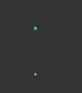
效果代码
<!DOCTYPE html>
<html>
<head>
<meta charset="utf-8">
<meta name="viewport" content="width=device-width,initial-casle=1.0,user-scalable=no" />
<title>圆点扩散</title>
<style type="text/css">
body {
background:
}
.tips {
width: 6px;
height: 6px;
position: relative;
cursor: pointer;
margin: 120px auto 0;
}
.tips b {
width: 100%;
height: 100%;
background:
border-radius: 50%;
display: block;
background-color: rgba(255, 255, 255, 0.6);
position: absolute;
left: 0;
top: 0;
z-index: 1;
}
.tips b:nth-of-type(1) {
-webkit-animation: click1 1s linear infinite;
animation: click1 1s linear infinite;
background-color:
/* opacity: .7; */
}
.tips b:nth-of-type(2) {
-webkit-animation: click2 1s linear infinite;
animation: click2 1s linear infinite;
background-color:
/* opacity: .7; */
}
@-webkit-keyframes click1 {
0% {
opacity: .8;
-webkit-transform: scale(1);
transform: scale(1);
}
100% {
opacity: 0;
-webkit-transform: scale(2);
transform: scale(2);
}
}
@keyframes click1 {
0% {
opacity: .8;
-webkit-transform: scale(1);
transform: scale(1);
}
100% {
opacity: 0;
-webkit-transform: scale(2);
transform: scale(2);
}
}
@-webkit-keyframes click2 {
0% {
opacity: .8;
-webkit-transform: scale(1);
transform: scale(1);
}
100% {
opacity: 0;
-webkit-transform: scale(3);
transform: scale(3);
}
}
@keyframes click2 {
0% {
opacity: .8;
-webkit-transform: scale(1);
transform: scale(1);
}
100% {
opacity: 0;
-webkit-transform: scale(3);
transform: scale(3);
}
}
.tips2 {
width: 6px;
height: 6px;
position: relative;
cursor: pointer;
margin: 120px auto 0;
}
.tips2 b {
width: 100%;
height: 100%;
background:
border-radius: 50%;
display: block;
background-color: rgba(255, 255, 255, 0.6);
position: absolute;
left: 0;
top: 0;
z-index: 1;
}
.tips2 b:nth-of-type(1) {
-webkit-animation: click1 1s linear infinite;
animation: click1 1s linear infinite;
background-color:
/* opacity: .7; */
}
.tips2 b:nth-of-type(2) {
-webkit-animation: click2 1s linear infinite;
animation: click2 1s linear infinite;
background-color:
/* opacity: .7; */
}
@-webkit-keyframes click1 {
0% {
opacity: .8;
-webkit-transform: scale(1);
transform: scale(1);
}
100% {
opacity: 0;
-webkit-transform: scale(2);
transform: scale(2);
}
}
@keyframes click1 {
0% {
opacity: .8;
-webkit-transform: scale(1);
transform: scale(1);
}
100% {
opacity: 0;
-webkit-transform: scale(2);
transform: scale(2);
}
}
@-webkit-keyframes click2 {
0% {
opacity: .8;
-webkit-transform: scale(1);
transform: scale(1);
}
100% {
opacity: 0;
-webkit-transform: scale(3);
transform: scale(3);
}
}
@keyframes click2 {
0% {
opacity: .8;
-webkit-transform: scale(1);
transform: scale(1);
}
100% {
opacity: 0;
-webkit-transform: scale(3);
transform: scale(3);
}
}
</style>
</head>
<body>
<div class="tips">
<span></span>
<b></b>
<b></b>
<b></b>
</div>
<div class="tips2">
<span></span>
<b></b>
<b></b>
<b></b>
</div>
</body>
</html>


 3781
3781


 被折叠的 条评论
为什么被折叠?
被折叠的 条评论
为什么被折叠?
 到【灌水乐园】发言


