


前言
CSS伪类是一种允许选择文档中特定状态或位置的CSS选择器。它们用于选择不同状态下的元素,而无需改变HTML标记的内容。伪类以冒号(:)开头,紧随其后的是伪类的名称。它们与选择器结合使用,以定义在特定条件下应用的样式。伪类的主要作用是允许开发者根据用户的交互、文档结构或其他条件来选择元素,从而实现更加动态和交互性的样式。
一、结构性伪类:
1. :first-child:选择父元素下的第一个子元素
选择父元素下的第一个子元素。
li:first-child {
color: red;
}
2. :last-child:选择父元素下的最后一个子元素
选择父元素下的最后一个子元素。
li:last-child {
color: blue;
}
3. :nth-child(n):选择父元素下的第n个子元素
选择父元素下的第n个子元素。
li:nth-child(odd) {
background-color: #f2f2f2;
}
4. :nth-last-child(n):从最后一个子元素开始计数,选择第n个子元素
从最后一个子元素开始计数,选择第n个子元素。
li:nth-last-child(2) {
font-weight: bold;
}
5. :nth-of-type(n):选择与同类型的兄弟元素中的第n个元素
选择与同类型的兄弟元素中的第n个元素。
p:nth-of-type(2n) {
color: green;
}
6. :nth-last-of-type(n):从同类型的兄弟元素的最后一个开始计数,选择第n个元素
从同类型的兄弟元素的最后一个开始计数,选择第n个元素。
p:nth-last-of-type(odd) {
text-decoration: underline;
}
7. :first-of-type:选择同类型的兄弟元素中的第一个元素
选择同类型的兄弟元素中的第一个元素。
h2:first-of-type {
font-size: 24px;
}
8. :last-of-type:选择同类型的兄弟元素中的最后一个元素
选择同类型的兄弟元素中的最后一个元素。
span:last-of-type {
border: 1px solid #ccc;
}
9. :only-child:选择是其父元素中唯一的子元素的元素
选择是其父元素中唯一的子元素的元素。
div:only-child {
background-color: yellow;
}
10. :only-of-type:选择是其父元素中唯一的特定类型的子元素的元素
选择是其父元素中唯一的特定类型的子元素的元素。
p:only-of-type {
color: purple;
}
二、功能性伪类:
1.:not(selector):选择不匹配给定选择器的元素
选择不匹配给定选择器的元素。
input:not([type=“submit”]) {
border: 1px solid #999;
}
三、界面状态伪类:
1. :hover:鼠标悬停时应用的样式
鼠标悬停时应用的样式。
a:hover {
color: orange;
}
2. :active:元素被激活时应用的样式
元素被激活时(例如,按钮被按下)应用的样式。
button:active {
background-color: #ccc;
}
3. :focus:元素获得焦点时应用的样式
元素获得焦点时应用的样式,通常与表单元素一起使用。
input:focus {
border: 2px solid blue;
}
四、界面结构伪类:
1. :target:选择当前活动的目标元素
选择当前活动的目标元素,通常与页面内链接(锚点)一起使用。
#section1:target {
background-color: lightyellow;
}
五、链接伪类:
1. :link:选择未被访问的链接
选择未被访问的链接。
a:link {
color: blue;
}
2. :visited:选择已被访问的链接
选择已被访问的链接。
a:visited {
color: purple;
}
六、动态变化伪类:
1. :focus-within:选择包含有焦点元素的元素
选择包含有焦点元素的元素。
form:focus-within {
border: 2px solid #555;
}
七、表单伪类:
1. :checked:选择被选中的表单元素
选择被选中的表单元素,例如复选框或单选按钮。
input[type=“checkbox”]:checked {
border-color: green;
}
2. :disabled:选择被禁用的表单元素
选择被禁用的表单元素。
input:disabled {
background-color: #eee;
}
3. :enabled:选择处于启用状态的表单元素
选择处于启用状态的表单元素。
input:enabled {
background-color: #fff;
}
八、其他伪类:
1. :empty :选择没有子元素的元素
选择没有子元素的元素。
p:empty {
display: none;
}
2. :is():选择器匹配元素,类比组合选择器
用法::is(selector) 或 :matches(selector)
示例:选择所有段落和标题元素,其中至少一个具有类名为 “important” 的元素。
:is() 伪类允许您组合多个选择器,只要其中至少一个选择器匹配元素,整个选择器就匹配。这有助于简化复杂的选择器,提高代码的可读性。
:is(p, h1, h2, h3):is(.important)
3. :where():选择器匹配元素,优先级低
用法::where(selector) 或 :matches(selector)
示例:选择所有段落和标题元素,其中至少一个具有类名为 “important” 的元素。
:where() 与 :is() 类似,允许组合多个选择器。与 :is() 不同的是,:where() 不会影响特异性,因此它更适合用于提高代码的可读性而不引入额外的特异性。
:where(p, h1, h2, h3):where(.important)
4. :has():选择器匹配元素
用法::has(selector)
示例:选择所有包含至少一个带有类名为 “highlight” 的子元素的 div 元素。
:has() 伪类用于选择包含特定后代的元素。如果指定的选择器匹配元素的后代,那么包含这些后代的元素就会被选择。这在需要选择包含特定内容的父元素时非常有用。
div:has(.highlight)
5. :matches():多条件支持
:matches()多条件支持:允许在一个选择器中同时匹配多个条件,类似于逗号分隔的选择器列表,但更灵活。
p:matches(:hover, :active) {}
经典案例分析
添加前缀/后缀
伪元素最常用的技巧就是利用 ::before 和 ::after伪元素给某个元素添加前缀或后缀,例如简单的 DOM 结构:
<div className="error-message">系统异常,请稍后再试</div>
应用下面的 CSS 样式之后:
.error-message {
  position: relative;
  color: #666666;
  padding: 12px 30px;
  background-color: #FFECE4;
  border-radius: 5px;
}

.error-message::before {
  content: '';
  background-image: url('/public/icon-error.svg');
  background-size: 15px;
  position: absolute;
  left: 10px;
  display: inline-block;
  width: 15px;
  height: 15px;
}
可以得到如下效果:

注意:创建 ::before和 ::after的元素时,必须要设置 content 属性,否则就不存在了。另外宿主元素的 position 别忘记设置成 relative 或 absolute 了,否则布局可能会乱掉。
虽然使用左右两个元素来布局也能实现上述效果,伪元素的优势是只需要创建一个元素即可。类似的场景还有在 input 输入框前面增加红色 require 星号。
消息气泡
我们在聊天时都会遇到带箭头的消息对话框,如下图所示:
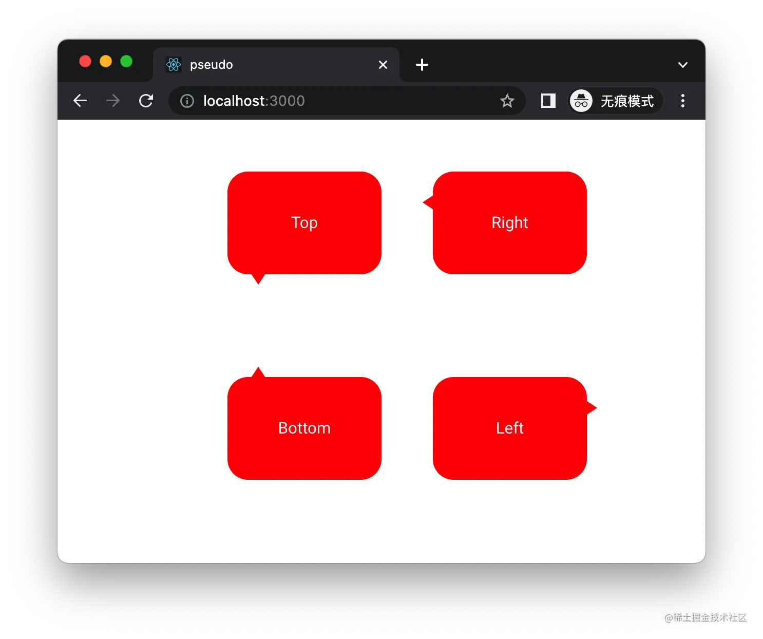
实现上面布局也很简单,也是用的 ::before和 ::after伪元素,HTML 结构:
<div className="container">
  <div className="box top-arrow">Top </div>
  <div className="box right-arrow">Right</div>
  <div className="box bottom-arrow">Bottom</div>
  <div className="box left-arrow">Left</div>
</div>
CSS 代码:
.container {
  display: grid;
  grid-template-columns: 200px 200px;
  grid-template-rows: 200px 200px;
}

.box {
  width: 150px;
  height: 100px;
  background-color: red;
  color: white;
  position: relative;
  border-radius: 20px;
  display: flex;
  justify-content: center;
  align-items: center;
  font-size: 16px;
}

.box::after {
  content: '';
  width: 0;
  height: 0;
  position: absolute;
}

.box.bottom-arrow::after {
  border-left: 8px solid transparent;
  border-right: 8px solid transparent;
  border-bottom: 12px solid red;
  left: 22px;
  top: -10px;
}

.box.right-arrow::after {
  border-top: 8px solid transparent;
  border-bottom: 8px solid transparent;
  border-right: 12px solid red;
  top: 22px;
  left: -10px;
}

.box.left-arrow::after {
  border-top: 8px solid transparent;
  border-bottom: 8px solid transparent;
  border-left: 12px solid red;
  top: 22px;
  right: -10px;
}

.box.top-arrow::after {
  border-left: 8px solid transparent;
  border-right: 8px solid transparent;
  border-top: 12px solid red;
  left: 22px;
  bottom: -10px;
}
斑马条纹效果
在一个列表中,为奇数行和偶数行显示不同的颜色,效果如下:
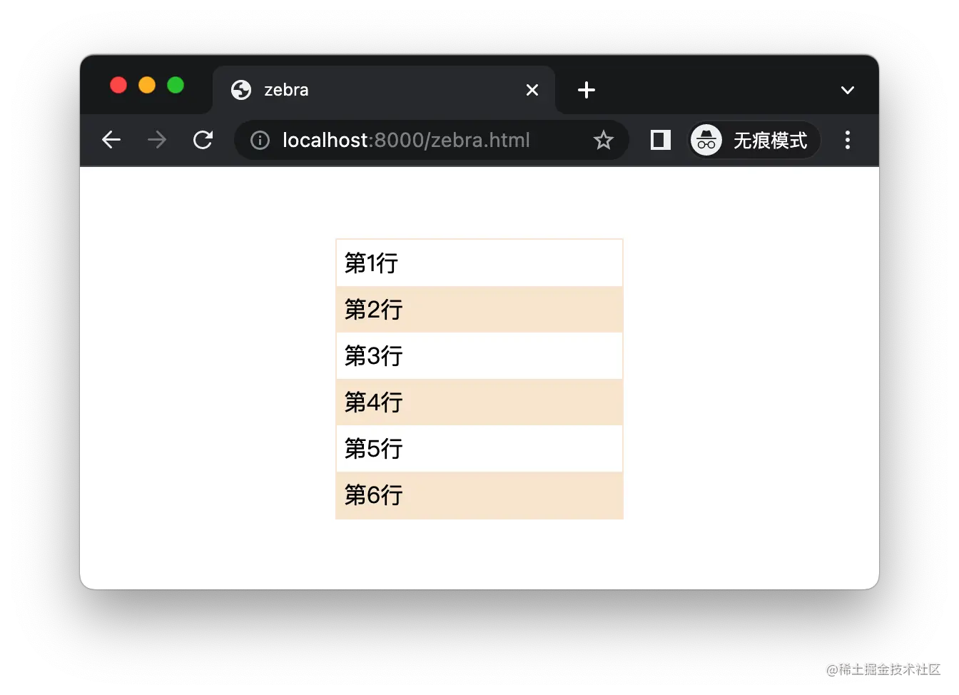
HTML 结构:
<div class="container">
  <div>第1行</div>
  <div>第2行</div>
  <div>第3行</div>
  <div>第4行</div>
  <div>第5行</div>
  <div>第6行</div>
</div>
CSS 样式:
.container {
  width: 200px;
  margin: 50px auto;
  border: 1px solid antiquewhite;
}

.container div {
  padding: 5px;
}

.container div:nth-child(even) {
  background-color: antiquewhite;
}
悬浮高亮效果
在电商网站购物时,当用户鼠标悬浮在当前商品上面的时候,通过放大尺寸、增加阴影来突出显示,:

HTML 结构:
<div class="container">
  <div class="product"></div>
  <div class="product"></div>
  <div class="product"></div>
</div>
CSS 样式:
body {
  margin: 0;
  background-color: rgb(245, 245, 245);
}

.container {
  height: 200px;
  width: 360px;
  margin: auto;
  display: flex;
  justify-content: space-around;
  align-items: center;
}

.product {
  width: 100px;
  height: 100px;
  background: white;
  background-image: url(//cdn.cnbj1.fds.api.mi-img.com/nr-pub/202207011841_084ed41d67f248677914605b73faf582.png?thumb=1&w=400&h=400&f=webp&q=90);
  background-size: cover;
}

.product:hover {
  box-shadow: 0 15px 30px rgb(0 0 0 / 10%);
  transform: translate3d(0, -5px, 0) scale(1.2);
  cursor: pointer;
}
自定义复选框样式
默认的复选框比较单调,利用伪类和伪元素配合,可以自定义 checkbox 样式,效果如下:
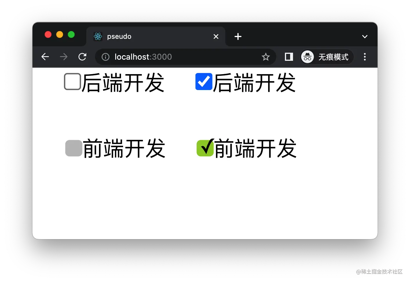
HTML 结构:
<div className="container">
  <div>
    <input type="checkbox" id="backend" />
    <label htmlFor="backend">后端开发</label>
  </div>

  <div>
    <input type="checkbox" id="backend" />
    <label htmlFor="backend">后端开发</label>
  </div>

  <div>
    <input type="checkbox" id="frontend" />
    <label htmlFor="checkbox">前端开发</label>
  </div>

  <div>
    <input type="checkbox" id="frontend" />
    <label htmlFor="checkbox">前端开发</label>
  </div>
</div>
CSS 样式:
input[type="checkbox"] {
  margin: 0;
}

#frontend {
  opacity: 0;
}

#frontend+label {
  margin-left: -12px;
  pointer-events: none;
}

#frontend+label::before {
  content: '\a0';
  display: inline-block;
  vertical-align: 0.1em;
  width: 0.8em;
  height: 0.8em;
  border-radius: 0.2em;
  background-color: silver;
  text-indent: 0.15em;
  line-height: 0.65;
  cursor: pointer;
}

#frontend:checked+label::before {
  content: '\2713';
  background-color: yellowgreen;
}
自定义滚动条样式
浏览器自带的滚动条样式非常单一,不够美观,我们可以利用伪元素和伪类自定义一个滚动条,将其背景颜色改成淡灰,宽度为 6px,当鼠标悬浮上去之后宽度变为 10px。
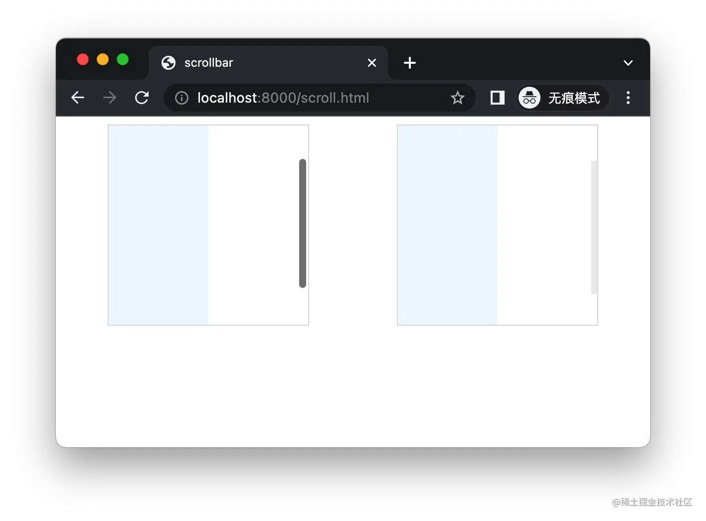
HTML 结构:
<div class="container">
  <div class="rect">
    <div class="box"></div>
  </div>
  <div class="rect2">
    <div class="box"></div>
  </div>
</div>
CSS 样式:
.container {
  display: flex;
  justify-content: space-around;
}

.rect,
.rect2 {
  width: 200px;
  height: 200px;
  overflow: scroll;
  border: 1px solid gainsboro;
}

.rect2::-webkit-scrollbar {
  width: 10px;
  height: 0;
  background-color: transparent;
}

.rect2::-webkit-scrollbar-thumb {
  background-color: rgba(0, 0, 0, 0.08);
  border-left: 4px solid transparent;
  background-clip: padding-box;
}

.rect2::-webkit-scrollbar-thumb:hover {
  background-color: rgba(0, 0, 0, 0.08);
  border: 0;
}

.box {
  width: 100px;
  height: 300px;
  background-color: aliceblue;
}
附送250套精选项目源码
源码截图
源码获取:
关注公众号「码农园区」,回复 【源码】,即可获取全套源码下载链接


 844
844


 被折叠的 条评论
为什么被折叠?
被折叠的 条评论
为什么被折叠?
 到【灌水乐园】发言


