Python画图
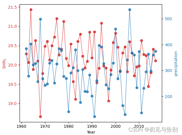
双折线图代码示例
import matplotlib.pyplot as plt
import pandas as pd
data = pd.read_excel(r'1.xlsx',header=None)
fig, ax1 = plt.subplots()
color = 'tab:red'
ax1.set_xlabel('Year')
ax1.set_ylabel('SHRL', color=color)
ax1.plot(data.iloc[1:,0], data.iloc[1:,1], color=color, alpha=0.8, linewidth=1)
ax1.tick_params(axis='y', labelcolor=color)
ax2 = ax1.twinx()
color = 'tab:blue'
ax2.set_ylabel('precipitation', color=color)
ax2.plot(data.iloc[1:,0], data.iloc[1:,2], color=color, alpha=0.8, linewidth=1)
ax2.tick_params(axis='y', labelcolor=color)
fig.tight_layout()
plt.savefig("1.jpg",bbox_inches='tight',dpi=300)
plt.show()
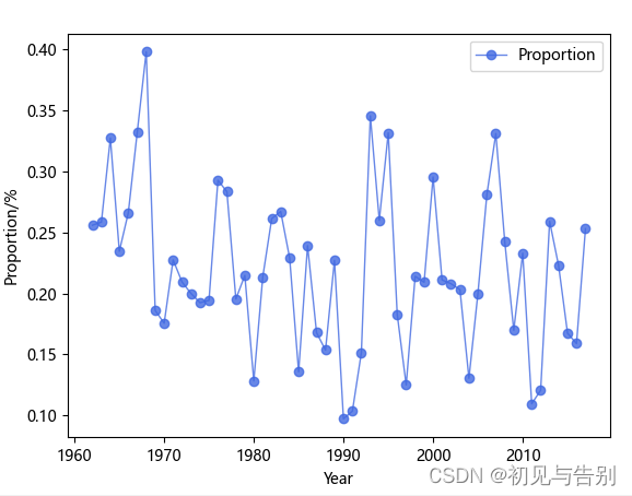
单折线图代码示例
import pandas as pd
import matplotlib.pyplot as plt
plt.rcParams['font.sans-serif'] = ['Microsoft YaHei']
plt.rcParams['axes.unicode_minus'] = False
c = pd.read_excel(r'占比.xlsx')
plt.plot(c.year, c.Percentage, 'ro-', color='#4169E1', alpha=0.8, linewidth=1, label='Proportion')
plt.legend(loc="upper right")
plt.xlabel('Year')
plt.ylabel('Proportion/%')
plt.show()
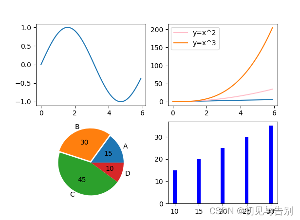
多个子图画图示例
import numpy as np
import pandas as pd
import matplotlib.pyplot as plt
from math import sin,cos
x=np.arange(0,6,0.1)
plt.subplot(221)
plt.plot(x,np.sin(x))
plt.subplot(222)
plt.plot(x,x)
plt.plot(x,x*x,color='pink',label='y=x^2')
plt.plot(x,x*x*x,label='y=x^3')
plt.legend()
plt.subplot(223)
plt.pie(x=[15,30,45,10],labels=list('ABCD'),autopct='%.0f',explode=[0,0.05,0,0])
plt.subplot(224)
plt.bar([20,10,30,25,15],[25,15,35,30,20],color='b')
plt.show()
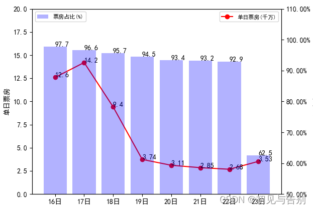
折线图与柱状图在同一图中显示,不同坐标系
import matplotlib.pyplot as plt
import numpy as np
import matplotlib.ticker as mtick
from matplotlib.font_manager import FontProperties
font = FontProperties(fname=r"c:\windows\fonts\simsun.ttc", size=14)
a = [12.6, 14.2, 9.4, 3.74, 3.11, 2.85, 2.68, 3.53]
b = [97.7,96.6,95.7,94.5,93.4,93.2,92.9,62.5]
l = [i for i in range(8)]
plt.rcParams['font.sans-serif'] = ['SimHei']
fmt = '%.2f%%'
yticks = mtick.FormatStrFormatter(fmt)
lx = ["16日", "17日", "18日", "19日", "20日", "21日", "22日", "23日"]
fig = plt.figure()
ax1 = fig.add_subplot(111)
ax1.plot(l, a, 'or-', label=u'单日票房(千万)');
for i, (_x, _y) in enumerate(zip(l, a)):
plt.text(_x, _y, a[i], color='black', fontsize=10)
ax1.legend(loc=1)
ax1.set_ylim([0, 20]);
ax1.set_ylabel('单日票房');
plt.legend(prop={'family': 'SimHei', 'size': 8})
ax2 = ax1.twinx()
plt.bar(l, b, alpha=0.3, color='blue', label=u'票房占比(%)')
for i, (_x, _y) in enumerate(zip(l, b)):
plt.text(_x, _y, b[i], color='black', ha='center',va='top',fontsize=10)
ax2.legend(loc=2)
ax2.set_ylabel('票房占比');
ax2.set_ylim([50, 110])
ax2.yaxis.set_major_formatter(yticks)
plt.legend(prop={'family': 'SimHei', 'size': 8}, loc="upper left")
plt.xticks(l, lx)
plt.show()


 1万+
1万+


 被折叠的 条评论
为什么被折叠?
被折叠的 条评论
为什么被折叠?
 到【灌水乐园】发言


