


P79-前端基础动画效果-变形平移
1.概述
这篇文章介绍水平和垂直平移动画效果
变形就是指通过CSS来改变元素的形状或位置
- 变形不会影响到页面的布局,当前元素的变形不会影响相邻元素布局位置。
- transform 用来设置元素的变形效果
- 平移:平移元素,百分比是相对于自身计算的
- translateX() 沿着x轴方向平移
- translateY() 沿着y轴方向平移
- translateZ() 沿着z轴方向平移
2.变形平移
2.1.在元素大小确定下设置居中效果
当元素宽和高是固定的情况下,我们设置元素水平居中和垂直居中可以通过margin:auto满足等式方式设置。如下:
<!DOCTYPE html>
<html>

<head>
  <meta charset="UTF-8">
  <title>平移</title>

  <style>
    body {
      background-color: rgb(236, 236, 236);
    }
    .box3 {
      background-color: orange;
      position: absolute;

        /* 这种居中方式,只适用于元素的大小确定 */
        /*设置元素宽和高*/
        width: 200px;
        height: 200px;
        /*设置上下左右都是0*/
        top: 0;
        left: 0;
        bottom: 0;
        right: 0;
        /*设置上下左右满足等式居中*/
        margin: auto;
    }
  </style>
</head>

<body>
  <div class="box3"></div>

</body>

</html>

2.2.在元素大小不确定下设置居中效果
- 当元素宽和高是变化的情况下,上面的方式就不适合居中。因为当宽和高是变化时,等式会优先调整宽和高的大小,因此margin:auto就不会居中。
- 我们使用平移来实现元素大小变化情况下,自动居中。
<!DOCTYPE html>
<html>

<head>
  <meta charset="UTF-8">
  <title>平移</title>

  <style>
    body {
      background-color: rgb(236, 236, 236);
    }

    .box1 {
      width: 200px;
      height: 200px;
      background-color: #bfa;
      margin: 0 auto;
      margin-top: 200px;
    }

    /*
                变形就是指通过CSS来改变元素的形状或位置
                -   变形不会影响到页面的布局
                - transform 用来设置元素的变形效果
                    - 平移:
                        translateX() 沿着x轴方向平移
                        translateY() 沿着y轴方向平移
                        translateZ() 沿着z轴方向平移
                            - 平移元素,百分比是相对于自身计算的
            */

    .box3 {
      background-color: orange;
      position: absolute;

        /* 这种居中方式,只适用于元素的大小确定 */
        /* width: 200px;
        height: 200px;
        top: 0;
        left: 0;
        bottom: 0;
        right: 0;
        margin: auto; */

        /* 设置当前元素距离上个包含块元素左边50%,上边50%距离 */
        left: 50%;
        top: 50%;

        /* 设置元素本身水平和垂直的50%,使元素水平垂直居中 */
        transform: translateX(-50%) translateY(-50%);
    }
  </style>
</head>

<body>
  <div class="box3">box3</div>

</body>

</html>

2.3.设置水平和垂直移动
<!DOCTYPE html>
<html>

<head>
  <meta charset="UTF-8">
  <title>平移</title>

  <style>
    body {
      background-color: rgb(236, 236, 236);
    }
	/*
                变形就是指通过CSS来改变元素的形状或位置
                -   变形不会影响到页面的布局
                - transform 用来设置元素的变形效果
                    - 平移:
                        translateX() 沿着x轴方向平移
                        translateY() 沿着y轴方向平移
                        translateZ() 沿着z轴方向平移
                            - 平移元素,百分比是相对于自身计算的
            */
    .box1 {
      width: 200px;
      height: 200px;
      background-color: #bfa;
      margin: 0 auto;
      margin-top: 200px;

      /* 向右边移动100%:这个百分比是根据元素自身宽度计算 */
      transform: translateX(100%);

      /* 向上移动100px */
      /* transform: translateY(-100px); */
    }

  </style>
</head>

<body>
  <div class="box1"></div>
</body>

</html>
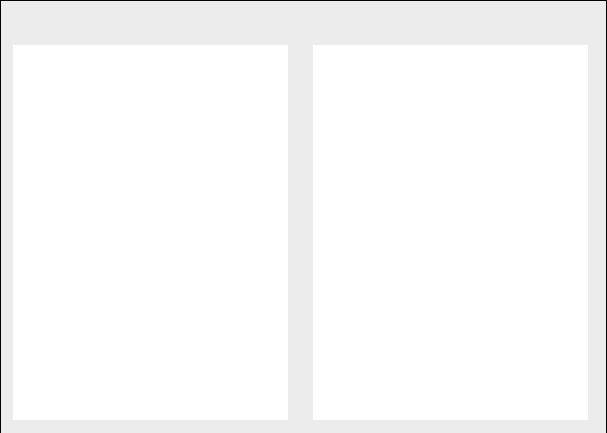
2.4.设置移动动效
<!DOCTYPE html>
<html>

<head>
  <meta charset="UTF-8">
  <title>平移</title>

  <style>
    body {
      background-color: rgb(236, 236, 236);
    }


    .box4, .box5 {
      width: 220px;
      height: 300px;
      background-color: #fff;
      float: left;
      margin: 0 10px;
      transition: all .3s;
    }

    .box4:hover,
    .box5:hover {
      transform: translateY(-4px);
      box-shadow: 0 0 10px rgba(0, 9, 0, .3);
    }
  </style>
</head>

<body>
  <div class="box4"></div>
  <div class="box5"></div>
</body>

</html>
- 移动动效
3.完整代码
<!DOCTYPE html>
<html>

<head>
  <meta charset="UTF-8">
  <title>平移</title>

  <style>
    body {
      background-color: rgb(236, 236, 236);
    }

    .box1 {
      width: 200px;
      height: 200px;
      background-color: #bfa;
      margin: 0 auto;
      margin-top: 200px;

      /* 向右边移动100%:这个百分比是根据元素自身宽度计算 */
      transform: translateX(100%);

      /* 向上移动100px */
      /* transform: translateY(-100px); */
    }

    /*
                变形就是指通过CSS来改变元素的形状或位置
                -   变形不会影响到页面的布局
                - transform 用来设置元素的变形效果
                    - 平移:
                        translateX() 沿着x轴方向平移
                        translateY() 沿着y轴方向平移
                        translateZ() 沿着z轴方向平移
                            - 平移元素,百分比是相对于自身计算的
            */

    .box3 {
      background-color: orange;
      position: absolute;

        /* 这种居中方式,只适用于元素的大小确定 */
        /* width: 200px;
        height: 200px;
        top: 0;
        left: 0;
        bottom: 0;
        right: 0;
        margin: auto; */

        /* 设置当前元素距离上个包含块元素左边50%,上边50%距离 */
        left: 50%;
        top: 50%;

        /* 设置元素本身水平和垂直的50%,使元素水平垂直居中 */
        transform: translateX(-50%) translateY(-50%);
    }

    .box4, .box5 {
      width: 220px;
      height: 300px;
      background-color: #fff;
      float: left;
      margin: 0 10px;
      transition: all .3s;
    }

    .box4:hover,
    .box5:hover {
      transform: translateY(-4px);
      box-shadow: 0 0 10px rgba(0, 9, 0, .3);
    }
  </style>
</head>

<body>
  <div class="box1"></div>
  <div class="box3">box3</div>

  <div class="box4"></div>
  <div class="box5"></div>

</body>

</html>


 447
447


 被折叠的 条评论
为什么被折叠?
被折叠的 条评论
为什么被折叠?
 到【灌水乐园】发言


