


线和区域图表

步长bar图表
library(echarts4r)

df <- data.frame(
  x = seq(50),
  y = rnorm(50, 10, 3),
  z = rnorm(50, 11, 2),
  w = rnorm(50, 9, 2)
)

df |>
  e_charts(x) |>
  e_line(z) |>
  e_area(w) |>
  e_title("Line and area charts")

步长bar图表
library(echarts4r)

df <- data.frame(
  x = seq(50),
  y = rnorm(50, 10, 3),
  z = rnorm(50, 11, 2),
  w = rnorm(50, 9, 2)
)
df |>
  e_charts(x) |>
  e_bar(y, name = "Serie 1") |>
  e_step(z, name = "Serie 2") |>
  e_title("Bar and step charts")

library(echarts4r)

df <- data.frame(
  x = seq(50),
  y = rnorm(50, 10, 3),
  z = rnorm(50, 11, 2),
  w = rnorm(50, 9, 2)
)
df |>
  e_charts(x) |>
  e_scatter(y, z) |>
  e_visual_map(z, scale = e_scale) |> # scale color
  e_legend(FALSE) # hide legend

散点效果
library(echarts4r)

df <- data.frame(
  x = seq(50),
  y = rnorm(50, 10, 3),
  z = rnorm(50, 11, 2),
  w = rnorm(50, 9, 2)
)
df |>
  head(10) |>
  e_charts(x) |>
  e_effect_scatter(y, z) |>
  e_visual_map(z) |> # scale color
  e_legend(FALSE) # hide legend

极效果
library(echarts4r)

df <- data.frame(
  x = seq(50),
  y = rnorm(50, 10, 3),
  z = rnorm(50, 11, 2),
  w = rnorm(50, 9, 2)
)
df |>
  e_charts(x) |>
  e_polar() |>
  e_angle_axis(x) |> # angle = x
  e_radius_axis() |>
  e_bar(y, coord_system = "polar") |>
  e_scatter(z, coord_system = "polar")

df |>
  head(10) |>
  e_charts(x) |>
  e_polar() |>
  e_angle_axis() |>
  e_radius_axis(x) |>
  e_bar(y, coord_system = "polar") |>
  e_scatter(z, coord_system = "polar")
管道
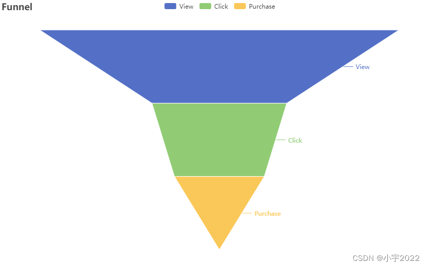
funnel <- data.frame(stage = c("View", "Click", "Purchase"), value = c(80, 30, 20))

funnel |>
  e_charts() |>
  e_funnel(value, stage) |>
  e_title("Funnel")
桑葚图

sankey <- data.frame(
  source = c("a", "b", "c", "d", "c"),
  target = c("b", "c", "d", "e", "e"),
  value = ceiling(rnorm(5, 10, 1)),
  stringsAsFactors = FALSE
)

sankey |>
  e_charts() |>
  e_sankey(source, target, value) |>
  e_title("Sankey chart")
热点图
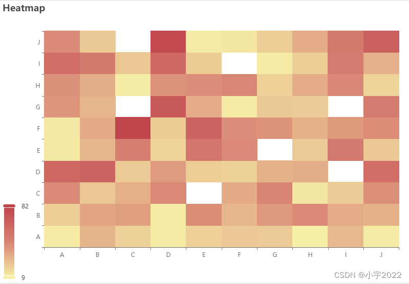
并行图表
v <- LETTERS[1:10]
matrix <- data.frame(
  x = sample(v, 300, replace = TRUE),
  y = sample(v, 300, replace = TRUE),
  z = rnorm(300, 10, 1),
  stringsAsFactors = FALSE
) |>
  dplyr::group_by(x, y) |>
  dplyr::summarise(z = sum(z)) |>
  dplyr::ungroup()
#> `summarise()` has grouped output by 'x'. You can override using the `.groups`
#> argument.

matrix |>
  e_charts(x) |>
  e_heatmap(y, z) |>
  e_visual_map(z) |>
  e_title("Heatmap")

df <- data.frame(
  price = rnorm(5, 10),
  amount = rnorm(5, 15),
  letter = LETTERS[1:5]
)

df |>
  e_charts() |>
  e_parallel(price, amount, letter) |>
  e_title("Parallel chart")
Pie图表

mtcars |>
  head() |>
  tibble::rownames_to_column("model") |>
  e_charts(model) |>
  e_pie(carb) |>
  e_title("Pie chart")
圆圈饼图表

圆圈饼图表
mtcars |>
  head() |>
  tibble::rownames_to_column("model") |>
  e_charts(model) |>
  e_pie(carb, radius = c("50%", "70%")) |>
  e_title("Donut chart")

半径图表
mtcars |>
  head() |>
  tibble::rownames_to_column("model") |>
  e_charts(model) |>
  e_pie(hp, roseType = "radius")

树形图表
df <- data.frame(
  parents = c("","earth", "earth", "mars", "mars", "land", "land", "ocean", "ocean", "fish", "fish", "Everything", "Everything", "Everything"),
  labels = c("Everything", "land", "ocean", "valley", "crater", "forest", "river", "kelp", "fish", "shark", "tuna", "venus","earth", "mars"),
  value = c(0, 30, 40, 10, 10, 20, 10, 20, 20, 8, 12, 10, 70, 20)
)

# create a tree object
universe <- data.tree::FromDataFrameNetwork(df)

# use it in echarts4r
universe |>
  e_charts() |>
  e_sunburst()
树状图

树映射图
library(tibble)

tree <- tibble(
  name = "earth",        # 1st level
  children = list(
    tibble(name = c("land", "ocean"),             # 2nd level
           children = list(
             tibble(name = c("forest", "river")),   # 3rd level
             tibble(name = c("fish", "kelp"),
                    children = list(
                      tibble(name = c("shark", "tuna"),  # 4th level
                             NULL  # kelp
                      ))
             )
           ))
  )
)

tree |>
  e_charts() |>
  e_tree() |>
  e_title("Tree graph")

universe |>
  e_charts() |>
  e_treemap() |>
  e_title("Treemap chart")
河流图表

dates <- seq.Date(Sys.Date() - 30, Sys.Date(), by = "day")

river <- data.frame(
  dates = dates,
  apples = runif(length(dates)),
  bananas = runif(length(dates)),
  pears = runif(length(dates))
)

river |>
  e_charts(dates) |>
  e_river(apples) |>
  e_river(bananas) |>
  e_river(pears) |>
  e_tooltip(trigger = "axis") |>
  e_title("River charts", "(Streamgraphs)")
日历
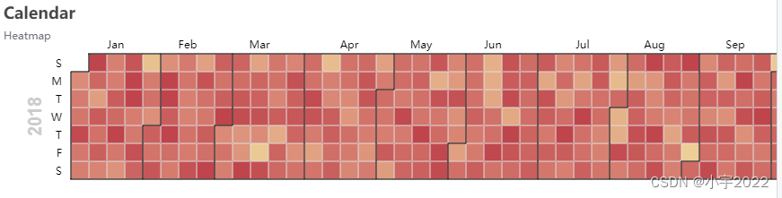
dates <- seq.Date(as.Date("2017-01-01"), as.Date("2018-12-31"), by = "day")
values <- rnorm(length(dates), 20, 6)

year <- data.frame(date = dates, values = values)

year |>
  e_charts(date) |>
  e_calendar(range = "2018") |>
  e_heatmap(values, coord_system = "calendar") |>
  e_visual_map(max = 30) |>
  e_title("Calendar", "Heatmap")
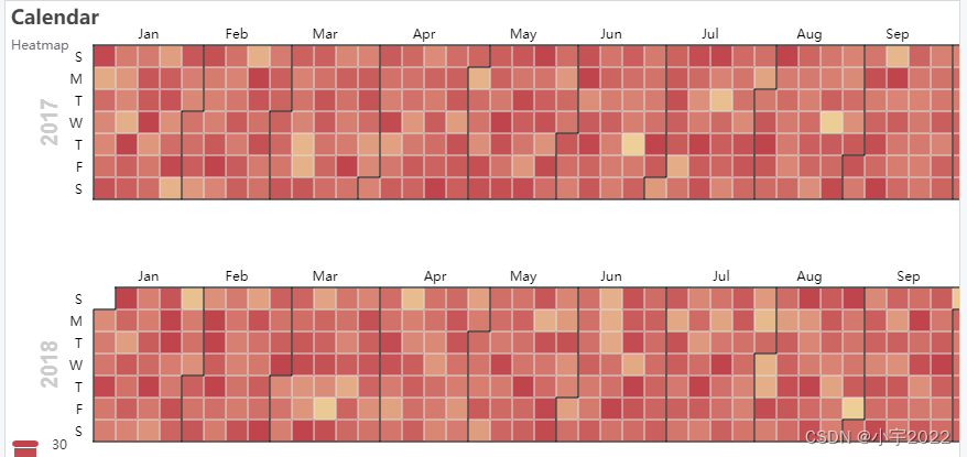
百分比
year |>
  dplyr::mutate(year = format(date, "%Y")) |> # get year from date
  group_by(year) |>
  e_charts(date) |>
  e_calendar(range = "2017",top="40") |>
  e_calendar(range = "2018",top="260") |>
  e_heatmap(values, coord_system = "calendar") |>
  e_visual_map(max = 30) |>
  e_title("Calendar", "Heatmap")|>
  e_tooltip("item")

雷达
e_charts() |>
  e_gauge(41, "PERCENT") |>
  e_title("Gauge")

世界云
df <- data.frame(
  x = LETTERS[1:5],
  y = runif(5, 1, 5),
  z = runif(5, 3, 7)
)

df |>
  e_charts(x) |>
  e_radar(y, max = 7, name = "radar") |>
  e_radar(z, max = 7, name = "chart") |>
  e_tooltip(trigger = "item")
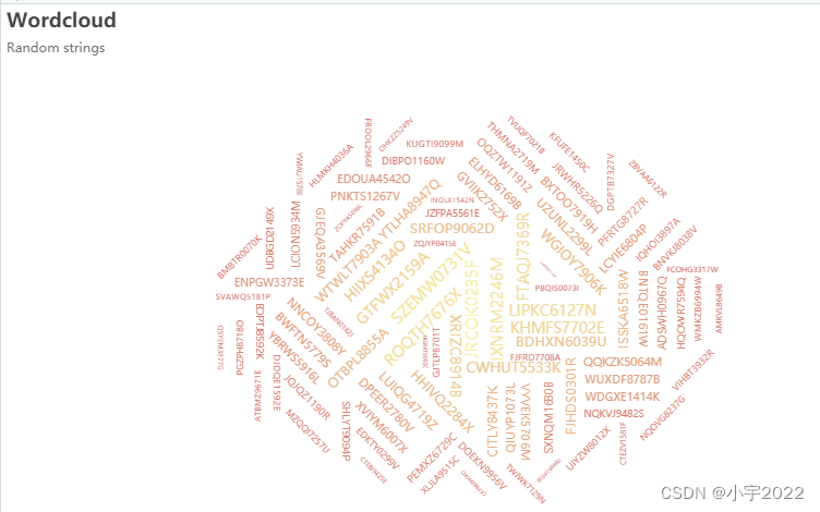
words <- function(n = 5000) {
  a <- do.call(paste0, replicate(5, sample(LETTERS, n, TRUE), FALSE))
  paste0(a, sprintf("%04d", sample(9999, n, TRUE)), sample(LETTERS, n, TRUE))
}

tf <- data.frame(terms = words(100),
                 freq = rnorm(100, 55, 10)) |>
  dplyr::arrange(-freq)

tf |>
  e_color_range(freq, color) |>
  e_charts() |>
  e_cloud(terms, freq, color, shape = "circle", sizeRange = c(3, 15)) |>
  e_title("Wordcloud", "Random strings")
液体表

liquid <- data.frame(val = c(0.6, 0.5, 0.4))

liquid |>
  e_charts() |>
  e_liquid(val)
参考资料:
https://echarts4r.john-coene.com/articles/chart_types.html


 被折叠的 条评论
为什么被折叠?
被折叠的 条评论
为什么被折叠?
 到【灌水乐园】发言


