


目录
CSS属性书写顺序
建议遵循下面顺序:
- 布局定位属性:display / position / float / clear / visibility / overflow(建议display第一个写)
- 自身属性:width / height / margin / padding / border / background
- 文本属性:color / font / text-decoration / text-align / vertical-align / white-space / break-word
- 其他属性(CSS3):content / cursor / border-radius / box-shadow / text-shadow / background....
定位
定位 = 定位模式 + 边偏移
边偏移
| 边偏移属性 | 描述 |
| top | 顶端偏移量,相对于父元素上边线的距离 |
| bottom | 底部偏移量,相对于父元素下边线的距离 |
| left | 左侧偏移量,相对于父元素左边线的距离 |
| right | 右侧偏移量,相对于父元素右边线的距离 |
一般情况下,有定位就有边偏移
定位模式
选择器 {position:属性值;}
| 值 | 语义 |
| static | 静态定位 |
| relative | 相对定位 |
| absolute | 绝对定位 |
| fixed | 固定定位 |
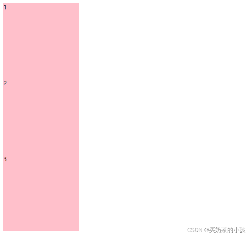
静态定位
相对于没有定位
相对定位relative
特点:
- 相对于自己原来在标准流中的位置来移动的
- 原来在标准流的区域继续占有,后面的盒子仍然以标准流的方式对待它
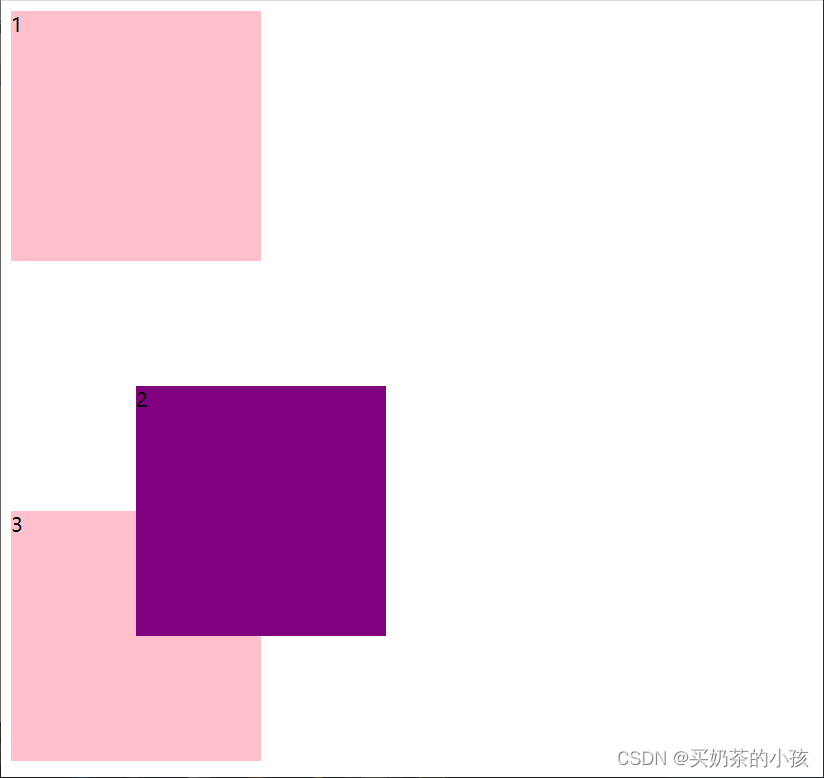
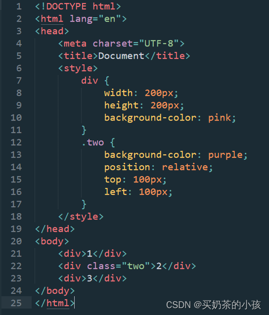
绝对定位absolute
绝对定位是元素以带有定位的父级元素来移动位置
1.标准流的盒子总是以父级为准移动位置
2.父元素没有定位,绝对定位子盒子,则以浏览器为准定位
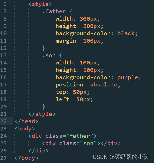
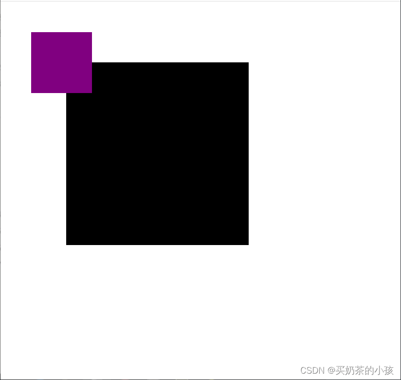
3.父元素有定位,绝对定位子盒子,以父级为准移动位置
将元素依据最近的已经定位(绝对、固定或相对定位)的父元素(祖先)进行定位。
绝对定位特点:
- 是参照带有定位的父级元素来移动位置的,如果父级都没有定位,则以浏览器文档为准移动位置
- 不保留原来的位置,完全是脱标的
- 可以自由的移动位置
父级用相对定位,子级用绝对定位
因为父级要占有位置,子级要随意摆放
固定定位fixed
固定定位是绝对定位的一种特殊形式
- 完全不占位置
- 只认浏览器的可视窗口——浏览器可视窗口 + 边偏移属性 来设置元素的位置
- 跟父元素没有任何关系
- 不随滚动条滚动
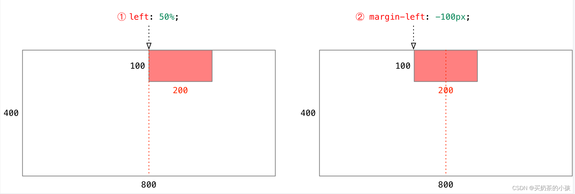
绝对定位的盒子居中
注意:绝对定位/固定定位的盒子不能通过设置margin:auto设置水平居中
方法:
- left:50%; :让盒子的左侧移动到父级元素的水平中心位置;
- margin-left:-100px; :让盒子向左移动自身宽度的一半。
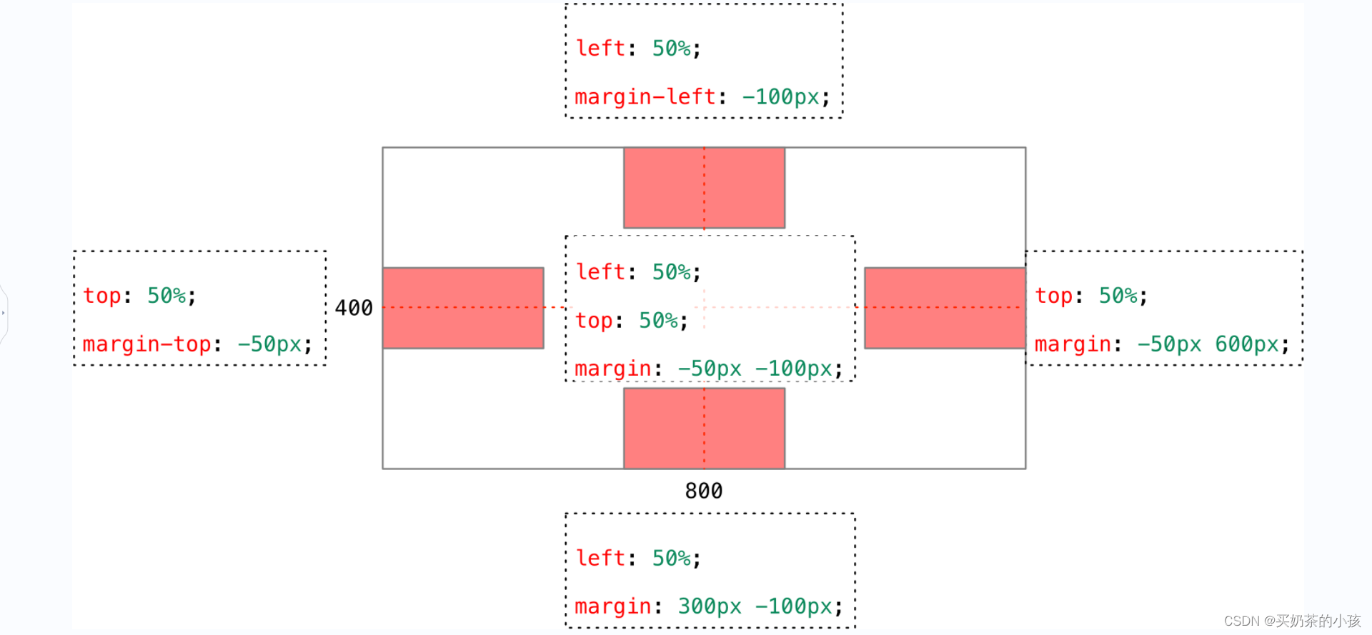
侧面固定导航栏方法:
- left:50%;
- 往侧面走版心的一半 + 自己的宽度
练习
<!DOCTYPE html>
<html lang="en">
<head>
<meta charset="UTF-8">
<title>居中练习</title>
<style>
div {
position: fixed;
width: 300px;
height: 200px;
background-color: #ccc;
}
.top {
top: 0;
left: 50%;
margin-left: -150px;
}
.bottom {
bottom: 0;
left: 50%;
margin-left: -150px;
}
.left {
left: 0;
top: 50%;
margin-top: -100px;
}
.right {
right: 0;
top: 50%;
margin-top: -100px;
}
</style>
</head>
<body>
<div class="top"></div>
<div class="bottom"></div>
<div class="left"></div>
<div class="right"></div>
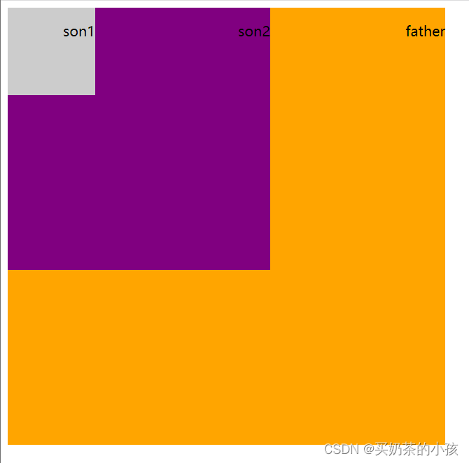
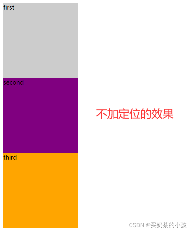
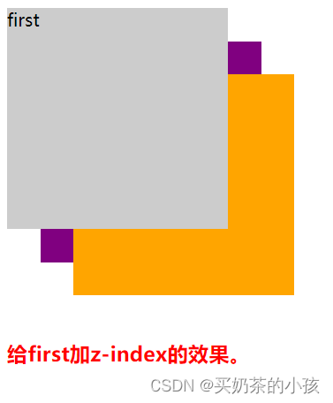
</body>堆叠顺序(z-index)
在使用定位布局时,可能会出现盒子重叠的情况
使用z-index层叠等级属性可以调整盒子的堆叠顺序
理解:可以按照坐标系理解,x轴(横向)、y轴(纵向)、z轴(向屏幕外的延伸)
特性:
- 属性值:正整数、负整数或0,默认值是0,数值越大,盒子越靠上;
- 如果属性值相同,按照书写顺序,后写的在最上面;
- 数字后面没有单位。
注意:z-index只能应用于相对定位、绝对定位和固定定位的元素,其他标准流、浮动和静态定位无效。

给first加z-index代码
<!DOCTYPE html>
<html lang="en">
<head>
	<meta charset="UTF-8">
	<title>堆叠练习</title>
	<style>
		.total {
			width: 300px;
			position: relative;
		}
		div {
			width: 200px;
			height: 200px;
			position: absolute;
		}
		.fir {
			background-color: #ccc;
			z-index: 1;
		}
		.sec {
			top:30px;
			left: 30px;
			background-color: purple;
		}
		.third {
			top: 60px;
			left: 60px;
			background-color: orange;
		}
		h3 {
			margin-top: 100px;
			color: red;
		}
	</style>
</head>
<body>
	<div class="total">
		<div class="fir">first</div>
		<div class="sec">second</div>
		<div class="third">third</div>
	</div>
	<h3>给first加z-index的效果。</h3>
</body>
改变成行内块元素方法
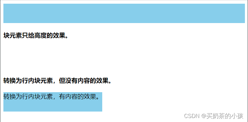
行内块元素(inline-block)的特性:只给高度,宽度默认为内容的宽度
块元素(block)的特性:只给高度,宽度默认为浏览器的宽度
方法(只给高度):
- display:inline-block;
- 浮动也可以转换 float:left;
- 绝对定位(固定定位)也可以转换
一个行内元素的盒子,如果加了浮动、固定定位和绝对定位,就不用转换为块,可以直接给这个盒子设置宽度和高度等。
<!DOCTYPE html>
<html lang="en">
<head>
	<meta charset="UTF-8">
	<title>行内块练习</title>
	<style>
		.only-h {
			height: 50px;
			background-color: skyblue;
		}
		.no-content {
			height: 50px;
			display: inline-block;
			background-color: skyblue;
		}
		.inblock {
			height: 50px;
			/*display: inline-block;*/
			/*float: left;*/
			position: absolute;
			background-color: skyblue;
		}
	</style>
</head>
<body>
	<div class="only-h"></div>
	<h4>块元素只给高度的效果。</h4>
	<div class="no-content"></div>
	<h4>转换为行内块元素,但没有内容的效果。</h4>
	<div class="inblock">转换为行内块元素,有内容的效果。</div>
</body>
顶部固定导航栏
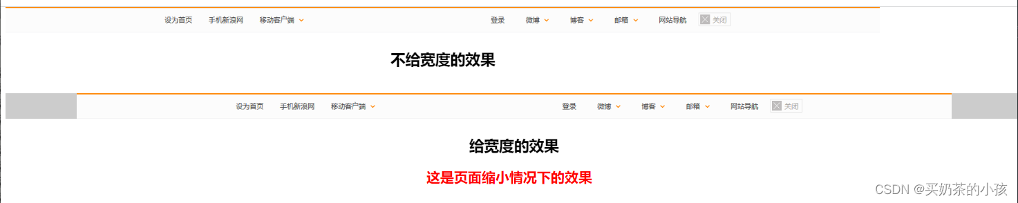
注意:
- 定位的盒子,很多情况下,需要单写宽度,如果需要通栏,宽度直接写成100%
- 导航栏下面的内容要给它设置个margin/padding值,要不然会被上面的导航栏挡住(因为fixed的属性不占位)
<!DOCTYPE html>
<html lang="en">
<head>
<meta charset="UTF-8">
<title>导航栏练习</title>
<style>
.top,
.top1 {
position: fixed;
height: 44px;
}
.top {
/*没有写宽度,默认的宽度是内容的宽度*/
top: 0;
background-color: #ccc;
text-align: center;
}
.top1 {
/*可以解决导航栏能够居中对齐*/
width: 100%;
top: 150px;
background-color: #ccc;
text-align: center;
}
p {
font-size: 26px;
font-weight: 700;
}
h2 {
margin-top: 280px;
text-align: center;
color: red;
}
</style>
</head>
<body>
<div class="top">
<img src="D:\top.png" alt="">
<p>不给宽度的效果</p>
</div>
<div class="top1">
<img src="D:\top.png" alt="">
<p>给宽度的效果</p>
</div>
<h2>这是页面缩小情况下的效果</h2>
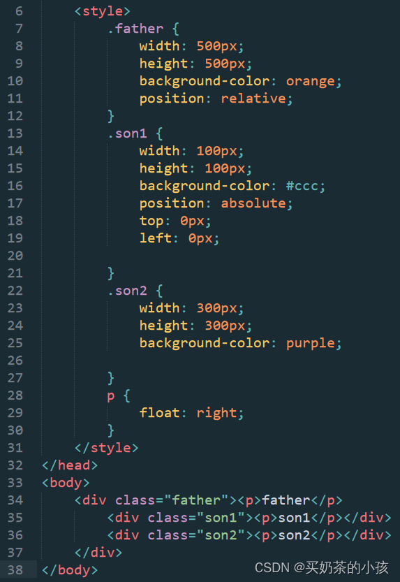
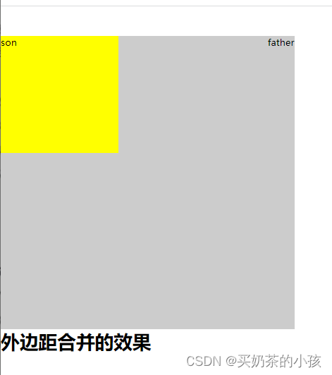
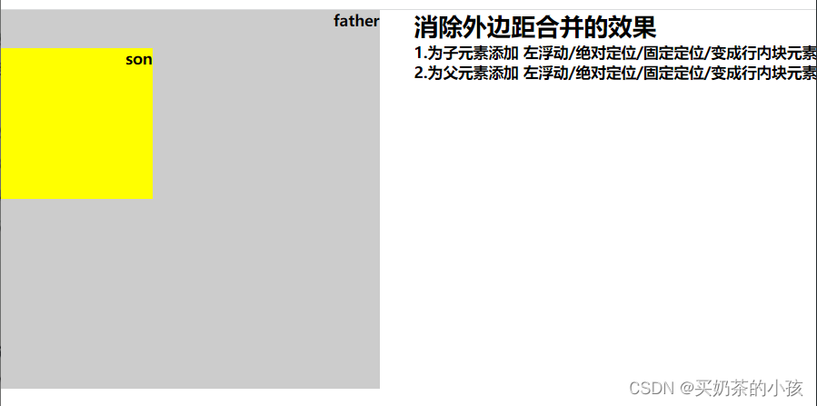
</body>外边距合并问题
浮动元素、绝对定位(固定定位)元素都不会触发外边距合并的问题。(之前使用的是padding border overflow解决的),就是把盒子转换成行内块元素。
<!DOCTYPE html>
<html lang="en">
<head>
<meta charset="UTF-8">
<title>外边距合并练习</title>
<style>
* {
margin: 0;
padding: 0;
}
.father {
/*position: absolute;*/
float: left;
width: 500px;
height: 500px;
background-color: #ccc;
}
.son {
/*float: left;*/
/*position: absolute;*/
/*position: fixed;*/
/*display: inline-block;*/
width: 200px;
height: 200px;
background-color: yellow;
margin-top: 50px;
}
p {
float: right;
font-size: 20px;
font-weight: 600;
}
.text {
float: right;
}
</style>
</head>
<body>
<div class="father">
<p>father</p>
<div class="son">
<p>son</p>
</div>
</div>
<div class="text">
<h1>消除外边距合并的效果</h1>
<p>1.为子元素添加 左浮动/绝对定位/固定定位/变成行内块元素</p><br>
<p>2.为父元素添加 左浮动/绝对定位/固定定位/变成行内块元素</p>
</div>
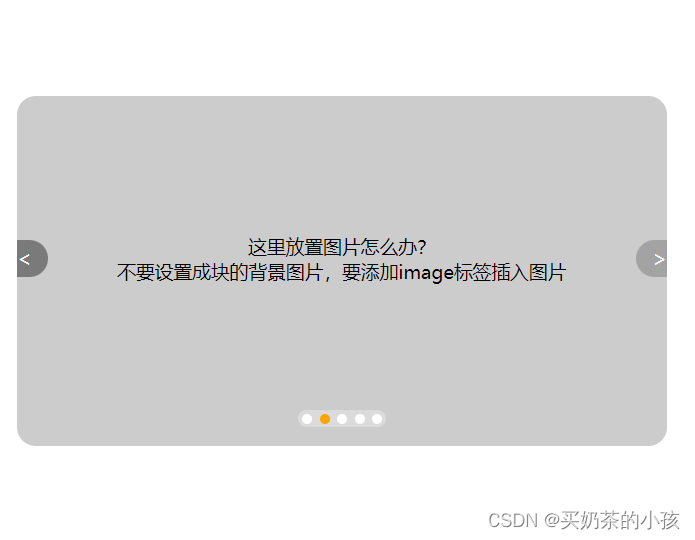
</body>图片展示案例
类似tb网首页的图片展示效果

圆角矩形的设置
| border-top-left-radius | 设置左上角的圆角 |
| border-top-right-radius | 设置右上角的圆角 |
| border-bottom-left-radius | 设置左下角的圆角 |
| border-bottom-right-radius | 设置右下角的圆角 |
4个角数值相同
border-radius:15px;
数值不同,可以简写(顺时针)
border-radius:左上角 右上角 右下角 左下角;
<!DOCTYPE html>
<html lang="en">
<head>
<meta charset="UTF-8">
<title>图片展示练习</title>
<style>
* {
margin: 0;
padding: 0;
}
a {
text-decoration: none;
}
li {
list-style: none;
}
.pic {
position: relative;
margin: 100px auto;
width: 520px;
height: 280px;
background-color: #ccc;
border-radius: 15px;
}
.arrow-l,
.arrow-r {
position: absolute;
top: 50%;
margin-top: -25px;
width: 25px;
height: 30px;
background-color: rgba(0, 0, 0, .2);
line-height: 30px;
color: white;
}
.arrow-l {
left: 0;
border-radius: 0 15px 15px 0;
text-align: left;
}
.arrow-r {
right: 0;
border-radius: 15px 0 0 15px;
text-align: right;
}
.arrow-l:hover,
.arrow-r:hover {
background: rgba(0, 0, 0, .4);
}
.circle {
position: absolute;
bottom: 15px;
left: 50%;
margin-left: -35px;
width: 70px;
height: 14px;
border-radius: 7px;
background: rgba(255, 255, 255, .3);
}
li {
/*让li标签变成一行,这里刚开始没写出来,注意!*/
float: left;
width: 8px;
height: 8px;
margin: 3px;
background-color: white;
border-radius: 4px;
}
/*注意优先级的问题!*/
.circle .light {
background-color: orange;
}
p {
position: absolute;
top: 50%;
margin-top: -30px;
left: 80px;
font-size: 15px;
text-align: center;
}
</style>
</head>
<body>
<div class="pic">
<p>这里放置图片怎么办?<br>
不要设置成块的背景图片,要添加image标签插入图片</p>
<a href="#" class="arrow-l"><</a>
<a href="#" class="arrow-r">></a>
<ul class="circle">
<li></li>
<li class="light"></li>
<li></li>
<li></li>
<li></li>
</ul>
</div>
</body>总结
定位
| 定位模式 | 是否脱标占有位置 | 移动位置基准 | 模式转换(行内块) | 使用情况 |
| 静态static | 不脱标,正常模式 | 正常模式 | 不能 | 几乎不用 |
| 相对定位relative | 不脱标,占有位置 | 相对自身位置移动 | 不能 | 基本单独使用 |
| 绝对定位absolute | 完全脱标,不占有位置 | 相对于定位父级移动位置 | 能 | 要和定位父级元素搭配使用 |
| 固定定位fixed | 完全脱标,不占有位置 | 相对于浏览器移动位置 | 能 | 单独使用,不需要父级 |
网页布局
一个完整的网页,有标准流、浮动、定位一起完成布局的。
(1)标准流
可以让盒子上下排列或者左右排列
(2)浮动
可以让多个块级元素一行显示或者左右对齐盒子,浮动的盒子就是按照左右顺序排列的
(3)定位
定位最大的特点就是有层叠的概念,可以让多个盒子前后叠压来显示,每个盒子都要测量数值,因为定位是和边偏移配套使用的,所以如果想对齐盒子最好用浮动。


 793
793


 被折叠的 条评论
为什么被折叠?
被折叠的 条评论
为什么被折叠?
 到【灌水乐园】发言


