


CSS盒子模型
1 盒子模型
1.1 网页布局本质
1、准备好网页相关元素,网页元素基本都是盒子box。
2、利用CSS设置好盒子样式,然后摆放到相应位置。
3、往盒子里面装内容。
1.2 盒子模型(Box Model)组成
CSS盒子包括边框、外边框、内边框和实际内容。

1.3 边框(border)
border可以设置元素的边框,边框有三部分组成:边框宽度、边框样式、边框颜色
<style>
div {
width: 200px;
height: 50px;
/* border-width: 边框的粗细,一般使用px */
border-width: 5px;
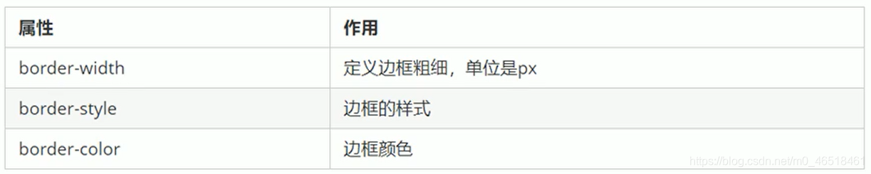
/* border-style: 边框的样式;solid :实线 dashed:虚线 dotted:点线*/
border-style: solid;
/* 点线 */
/* border-style: dotted; */
/* 边框颜色 border-color: */
border-color: red;
}
</style>
<body>
<div></div>
</body>
实际开发过程为了效率边框可以简写,也就是边框的复合写法:简写没有顺序要求
    <style>
        div {
            width: 200px;
            height: 50px;
            border: 5px solid red;
        }
    </style>
效果图:

边框也可以分开写,即各条边框都不一样的写法:
    <style>
        div {
            width: 200px;
            height: 50px;
            /* 上边框的写法 */
            border-top: 5px solid red;
            /* 下边框的写法 */
            border-bottom: 5px dashed yellow;
        }
    </style>
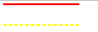
例1.3 给一个200200的盒子设置边框,上边框为红色,其余边框为蓝色。
    <style>
        div {
            width: 200px;
            height: 200px;
            /* border-top: 5px solid red;
            border-bottom: 5px solid blue;
            border-left: 5px solid blue;
            border-right: 5px solid blue; */
            /* border:包含四条边框 */
            border: 5px solid blue;
            /* 层叠性,就近原则 */
            border-top: 5px solid red;
        }
    </style>
1.4 表格的细线边框
前面讲的是表格的边框属性使用html实现的,现在可以单独使用css来完成相应的边框样式。如:(这里只展示CSS部分)
    <style>
        table {
            /* 给表格设置大小 */
            width: 500px;
            height: 245px;
        }
        table,
        td {
            /* 给表格和单元格设置边框 */
            border: 1px solid red;
        }
    </style>
上面的样式出现一个问题就是相邻的边框线比较粗,这里因为两个单元格的边框相互重叠,此时应该增加下面的属性:
border-collapse属性控制浏览器绘制表格边框的方式,它控制相邻单元格的边框
    <style>
        table {
            /* 给表格设置大小 */
            width: 500px;
            height: 245px;
        }

        table,
        th,
        td {
            /* 给表格和单元格设置边框 */
            border: 1px solid red;
            /* 控制相邻单元格边框 */
            border-collapse: collapse;
            text-align: center;
        }
    </style>

1.5 边框会影响盒子实际大小
边框会额外增加盒子的实际大小,因此我们有两种解决方法:
(1)测量盒子大小时不量边框
(2)如果测量的时候包含了边框,则需要width/height减去边框宽度
1.6 内边距(padding)
padding属性用于设置内边距,即边框与内容之间的距离。
| 属性 | 作用 |
|---|---|
| padding-left | 左内边距 |
| padding-right | 右内边距 |
| padding-top | 上内边距 |
| padding-bottom | 下内边距 |
    <style>
        div {
            width: 300px;
            height: 200px;
            background-color: pink;
            /* 左内边距 */
            padding-left: 20px;
            /* 上内边距 */
            padding-top: 30px;
        }
    </style>

<body>
    <div>
        盒子内容是content盒子内容是content盒子内容是content盒子内容是content
    </div>
</body>

padding属性可以有1-4个值
| 值的个数 | 表达意思 |
|---|---|
| padding:5px; | 1个值,代表上下左右都有5像素 |
| padding:5px 10px; | 2个值,代表上下内边距是5像素,左右内边距是10像素 |
| padding:5px 10px 20px; | 3个值,代表上为5,左右为10,下为20 |
| padding:5px 10px 20px 30px; | 4个值,上是5,右是10,下是20,左是30 顺时针 |
当我们给盒子指定padding值之后,发生了2件事情:
(1)padding影响了盒子实际大小。
(2)内容和边框有了距离,添加了内边距。
也就是说,如果盒子已经有了宽度和高度,此时再指定内边框,会撑大盒子。
解决方案:如果保证盒子跟效果图大小保持一致, 则让width/height减去多出来的内边距大小即可。
例1.6 新浪微博导航栏布局
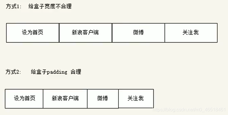
这里我们遇到的是盒子里面的文字不一样多,就不指定宽度,采用方式二,通过padding值将盒子撑开,效果是每个盒子里面的内容间的间距都相等。
    <style>
        .nav {
            /* 盒子的高度 */
            height: 41px;
            /* 上边距 */
            border-top: 3px solid #ff8500;
            /* 下边距 */
            border-bottom: 1px solid #edeef0;
            /* 背景颜色 */
            background-color: #fcfcfc;
            /* 文字垂直居中 */
            line-height: 41px;
        }

        .nav a {
            /* a标签为行内元素,不能指定高度,要转换为行内块元素 */
            display: inline-block;
            height: 41px;
            /* 内边距 */
            padding: 0 20px;
            /* 字体大小 */
            font-size: 12px;
            color: #4c4c4c;
            /* 去除下划线 */
            text-decoration: none;
        }

        .nav a:hover {
            /* 伪类选择器,背景变色,选中字体变色 */
            background-color: #eee;
            color: #ff8500;
        }
    </style>
<body>
    <div class="nav">
        <a href="#">手机新浪网</a>
        <a href="#">新浪导航</a>
        <a href="#">客户端</a>
        <a href="#">微博</a>
        <a href="#">联系</a>

    </div>
</body>
效果图:

如果盒子本身没有指定width/height属性,则此时padding不会撑开盒子大小
1.7 外边距( margin )
| 属性 | 作用 |
|---|---|
| margin-left | 左外边距 |
| margin-right | 右外边距 |
| margin-top | 上外边距 |
| margin-bottom | 下外边距 |
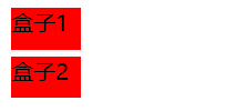
margin属性用于设置外边距,即控制盒子和盒子之间的距离。
    <style>
        div {
            width: 50px;
            height: 30px;
            background-color: red;
        }
        /* .one {
            站在1的角度是下边距
            margin-bottom: 5px;
        } */

        .two {
            /* 站在2的角度是上边距 */
            margin-top: 5px;
        }
    </style>
<body>
    <div class="one">盒子1</div>
    <div class="two">盒子2</div>
</body>
margin简写方式代表的意义跟padding完全一致。
1.7.1 外边距的典型应用
外边距可以让块级元素水平居中,但必须满足下面两个要求:
(1)盒子必须指定了宽度( width)。
(2)盒子左右的外边距都设置为 auto。
常见的写法,以下三种都可以:
●margin-left: auto; margin-right auto;
●margin: auto;
●margin: 0 auto;
注意:以上方法是让块级元素水平居中,行内元素或者行内块元素水平居中给其父元素添加text- align:center即可。
    <style>
        .header {
            width: 100px;
            height: 50px;
            background-color: red;
            /* 盒子水平居中 */
            margin: 0 auto;
            /* 文字水平垂直居中 */
            line-height: 50px;
            text-align: center;
        }
    </style>
<body>
    <div class="header">盒子</div>
</body>

1.8 外边距的合并
使用margin定义块元素的垂直外边距时,可能会出现外边距的合并。
嵌套块元素垂直外边距的塌陷
对于两个嵌套关系(父子关系)的块元素,父元素有上外边距同时子元素也有上外边距,此时父元素会塌陷较大的外边距值。
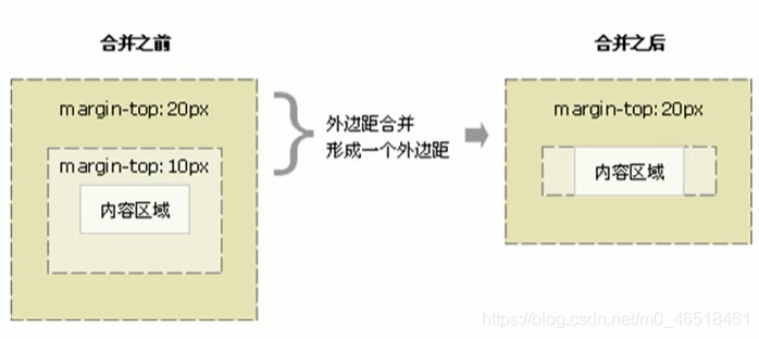
解决方案:
①可以为父元素定义上边框。
②可以为父元素定义上内边距。
③可以为父元素添加overflow:hidden。
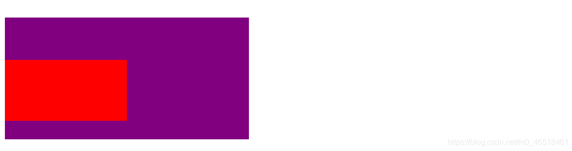
    <style>
        .father {
            width: 400px;
            height: 200px;
            background-color: purple;
            margin-top: 50px;
            /* 方案一:为父元素定义上边框(边框) */
            /* border-top: 5px solid yellow; */
            /* 方案二:为父元素定义上内边距(内边距) */
            /* padding-top: 5px; */
            /* 方案三:为父元素添加overflow:hidden */
            overflow: hidden;
        }

        .son {
            width: 200px;
            height: 100px;
            background-color: red;
            margin-top: 70px;
        }
    </style>
<body>
    <div class="father">
        <div class="son"></div>
    </div>
</body>
1.9 清除内外边框
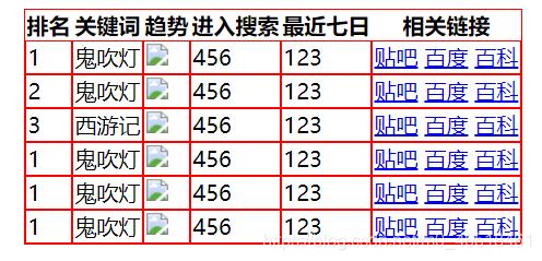
每个网页元素都带有自己的内外边框,不同的网页元素的内外边框可能不同。如下图所示:
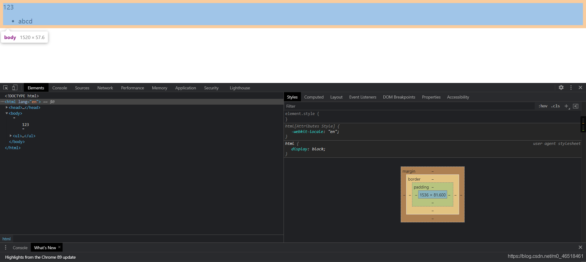
所以我们在布局时,要清理一下网页元素的内外边框。
    <!-- 清理方法: -->
    <style>
        * {
            /* CSS中的第一行代码 */
            padding: 0;
            margin: 0;
        }
    </style>
注意:行内元素为了照顾兼容性,尽量只设置左右内外边距,不要设置上下内外边距。但是转换为块级和行内块元素就可以了
2 PS基本操作
●文件->打开:可以打开我们要测量的图片
●CtrI+R :可以打开标尺,或者视图→标尺
●右击标尺,把里面的单位改为像素
●Ctrl+ 加号(+)可以放大视图,Ctrl+ 减号(-)可以缩小视图
●按住空格键,鼠标可以变成小手,拖动PS视图
●用选区拖动可以测量大小
●Ctrl+ D可以取消选区,或者在旁边空白处点击一下也可以取消选区
3 综合案例
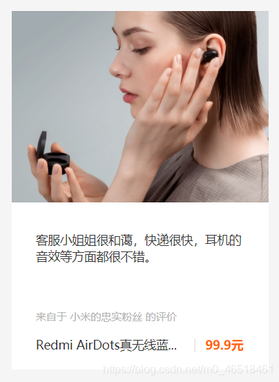
3.1 案例1:产品模块
完成以下图片模块样式的布局。
分析布局细节:
案例布局完整源码:
<!DOCTYPE html>
<html lang="en">
<head>
<meta charset="UTF-8">
<meta http-equiv="X-UA-Compatible" content="IE=edge">
<meta name="viewport" content="width=device-width, initial-scale=1.0">
<title>产品模块</title>
<style>
* {
/* 清理内外边距 */
margin: 0;
padding: 0;
}
body {
/* 页面的背景颜色 */
background-color: #f5f5f5;
}
a {
/* 设置所有的超链接标签颜色和去除下划线 */
color: #333;
text-decoration: none;
}
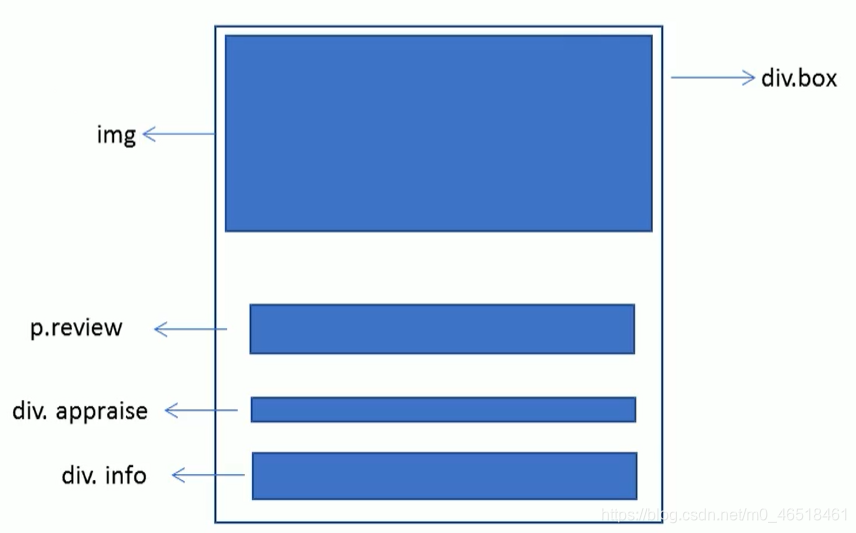
.box {
/* 盒子的宽度和高度 */
width: 298px;
height: 415px;
background-color: #fff;
/* 让块级元素水平居中对齐 */
margin: 100px auto;
}
.box img {
/* 图片最大尺寸为父元素的尺寸 */
width: 100%;
}
.review {
height: 70px;
font-size: 14px;
/* 此段落没有盒子的宽度,所以padding不会撑开盒子的大小 */
padding: 0 28px;
margin-top: 30px;
}
.appraise {
color: #b0b0b0;
font-size: 12px;
margin-top: 20px;
padding: 0 28px;
}
.info {
font-size: 14px;
margin-top: 15px;
padding: 0 28px;
}
.info h4 {
display: inline-block;
font-weight: normal;
}
.info span {
color: #ff6700;
font-weight: 700;
}
.info em {
font-style: normal;
color: #ebe4e0;
margin: 0 6px 0 15px;
}
</style>
</head>
<body>
<div class="box">
<a href="#"><img src="images/img.jpg" alt=""></a>
<p class="review"><a href="#">客服小姐姐很和蔼,快递很快,耳机的音效等方面都很不错。</a></p>
<div class="appraise">来自于 小米的忠实粉丝 的评价</div>
<div class="info">
<h4><a href="#">Redmi AirDots真无线蓝...</a></h4>
<em>|</em>
<span>99.9元</span></div>
</div>
</body>
</html>
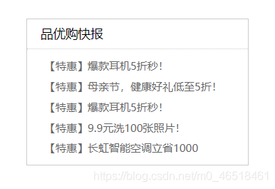
3.2 案例2:快报模块
布局效果图:
完整源码:
<!DOCTYPE html>
<html lang="en">

<head>
    <meta charset="UTF-8">
    <meta http-equiv="X-UA-Compatible" content="IE=edge">
    <meta name="viewport" content="width=device-width, initial-scale=1.0">
    <title>快报模块</title>
    <style>
        * {
            margin: 0;
            padding: 0;
        }

        li {
            /* 去掉li前面的项目符号(小圆点) */
            list-style: none;
        }

        .box {
            width: 248px;
            height: 163px;
            border: 1px solid #ccc;
            /* 外边距水平居中的应用 */
            margin: 100px auto;
        }

        .box h3 {
            height: 32px;
            border-bottom: 1px dotted #ccc;
            font-size: 14px;
            font-weight: normal;
            line-height: 32px;
            padding-left: 15px;
        }

        .box ul li a {
            font-size: 12px;
            color: #666;
            text-decoration: none;
        }

        .box ul li a:hover {
            text-decoration: underline;
        }

        .box ul li {
            height: 23px;
            padding-left: 20px;
        }

        .box ul {
            margin-top: 7px;
        }
    </style>
</head>

<body>
    <div class="box">
        <h3>品优购快报</h3>
        <ul>
            <li><a href="#">【特惠】爆款耳机5折秒!</a></li>
            <li><a href="#">【特惠】母亲节,健康好礼低至5折!</a></li>
            <li><a href="#">【特惠】爆款耳机5折秒!</a></li>
            <li><a href="#">【特惠】9.9元洗100张照片!</a></li>
            <li><a href="#">【特惠】长虹智能空调立省1000</a></li>
        </ul>
    </div>
</body>

</html>
4 圆角边框
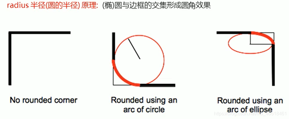
使用语法:
border radius:length;
●参数可以为数值或百分比来表示。
●如果是正方形,想要设置为一个圆,把数值修改为高度或者宽度的一半即可,或者直接写为50%
●如果是个矩形,设置为高度的一半就可以做
●该属性是一个简写属性,可以跟四个值,分别代表左上角、右上角、右下角、左下角
●分开写: border-top-left-radius、border-top-right-radius、 border-bottom-right- radius和border- bottom-left- radius
设置样式:
<style>
.yuanxing {
width: 100px;
height: 100px;
background-color: red;
/* border-radius: 50px; */
/* 50%为宽度和高度的一半 */
border-radius: 50%;
}
.juxing {
width: 300px;
height: 100px;
background-color: red;
/* 圆角矩形设置高度的一半 */
border-radius: 50px;
}
.radius {
width: 100px;
height: 100px;
background-color: red;
border-radius: 10px 20px 30px 40px
}
</style>
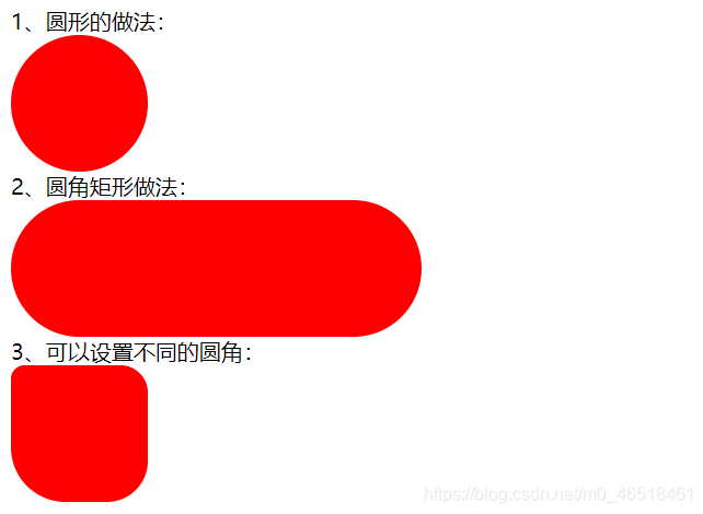
<body>
1、圆形的做法:
<div class="yuanxing"></div>
2、圆角矩形做法:
<div class="juxing"></div>
3、可以设置不同的圆角:
<div class="radius"></div>
</body>
5 盒子阴影
CSS3中新增了盒子阴影,我们可以使用box- shadow属性为盒子添加阴影。
语法:
box-shadow: h-shadow v- shadow blur spread color inset;
| 值 | 描述 |
|---|---|
| h-shadow | 必需。水平阴影的位置。允许负值 |
| v-shadow | 必需。垂直阴影的位置。允许负值。 |
| blur | 可选。模糊距离。 |
| spread | 可选。阴影的尺寸。 |
| color | 可选。阴影的颜色,请参阅CSS颜色值。 |
| inset | 可选。将外部阴影(outset) 改为内部阴影。 |
注意:
1.默认的是外阴影(outset),但是不可以写这个单词,否则导致阴影无效
2.盒子阴影不占用空间,不会影响其他盒子排列。
    <style>
        div {
            width: 200px;
            height: 200px;
            background-color: red;
            margin: 100px auto;
        }
        /* 原先没有影子,当鼠标经过的时候出现影子效果 */

        div:hover {
            box-shadow: 10px 10px 10px 10px rgb(0, 0, 0, .3);
        }
    </style>
<body>
    <div></div>
</body>

6 文字阴影
在CSS3中,我们可以使用text-shadow属性将阴影应用于文本
语法:
text-shadow: h-shadow v-shadow blur color;
| 值 | 描述 |
|---|---|
| h-shadow | 必需。水平阴影的位置。允许负值 |
| v-shadow | 必需。垂直阴影的位置。允许负值。 |
| blur | 可选。模糊距离。 |
| color | 可选。阴影的颜色,请参阅CSS颜色值。 |
<style>
div {
font-size: 50px;
font-weight: normal;
color: orangered;
text-shadow: 5px 5px 6px rgb(0, 0, 0, .3);
}
</style>
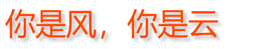
<body>
<div>
你是风,你是云
</div>
</body>


 797
797


 被折叠的 条评论
为什么被折叠?
被折叠的 条评论
为什么被折叠?
 到【灌水乐园】发言


