


最近公司网站需要大量增加动画效果,这让我这个许久未接触动画CSS的开发者不得不重新翻开笔记,温习相关知识。
一、动画基础概念
1.1 两种核心动画类型
-
过渡动画 (Transition)
-
用于属性值的平滑变化
-
需要触发条件(如:hover)
-
语法示例:
.box {
  transition: all 0.3s ease-in-out;
}
-
-
关键帧动画 (Keyframes)
-
创建复杂的多阶段动画
-
无需触发自动运行
-
语法示例:
@keyframes slide {
  from { transform: translateX(-100%); }
  to { transform: translateX(0); }
}
-
二、核心动画属性详解
2.1 Transition属性组
| 属性 | 说明 | 可选值 | 示例 |
|---|---|---|---|
| transition-property | 指定动画属性 | all, width, opacity等 | width |
| transition-duration | 动画持续时间 | 0.3s, 500ms | 0.5s |
| transition-timing-function | 速度曲线 | ease, linear, cubic-bezier() | cubic-bezier(0.4, 0, 0.2, 1) |
| transition-delay | 动画延迟 | 同duration | 0.2s |
2.2 Animation属性组
.element {
  animation:
    slide 1s ease-in-out 0.2s 3 alternate forwards;
  /* 简写顺序: name duration timing-function delay iteration-count direction fill-mode */
  /* 核心结构: name duration timing-function delay iteration-count direction fill-mode play-state;*/
}
2.2.1 animation-name
-
作用:指定关键帧动画名称
-
值:
@keyframes定义的动画名 -
示例:
@keyframes slide {
  from { transform: translateX(-100%); }
  to { transform: translateX(0); }
}

.box {
  animation-name: slide;
}
2.2.2 animation-duration
-
作用:动画单次循环的时长
-
值:时间单位 (
s/ms) -
示例:
.box {
  animation-duration: 2s; /* 完成一次动画需 2 秒 */
}
2.2.3 animation-timing-function
-
作用:控制动画速度曲线
-
常用值:
值 效果 linear匀速 ease慢→快→慢(默认) cubic-bezier(n,n,n,n)自定义贝塞尔曲线 steps(n)分步动画 -
示例:
.box {
  animation-timing-function: cubic-bezier(0.4, 0, 0.2, 1);
}
2.2.4 animation-delay
-
作用:动画开始前的延迟时间
-
值:时间单位 (
s/ms) -
示例:
.box {
  animation-delay: 0.5s; /* 0.5 秒后开始动画 */
}
2.2.5 animation-iteration-count
-
作用:动画播放次数
-
值:
-
数字:
2(播放两次) -
infinite:无限循环
-
-
示例:
.box {
  animation-iteration-count: 3; /* 播放 3 次后停止 */
}
2.2.6 animation-direction
-
作用:控制动画播放方向
-
值:
值 效果 normal正向播放(默认) reverse反向播放 alternate奇数次正向,偶数次反向 alternate-reverse奇数次反向,偶数次正向 -
示例:
.box {
  animation-direction: alternate; /* 往返运动 */
}
2.2.7 animation-fill-mode
-
作用:控制动画开始/结束时的样式
-
值:
值 效果 none默认状态 forwards保留最后一帧样式 backwards应用第一帧样式(含延迟期间) both同时应用 forwards 和 backwards -
示例:
.box {
  animation-fill-mode: forwards; /* 动画结束后保持最终状态 */
}
2.2.8 animation-play-state
-
作用:控制动画播放状态
-
值:
值 效果 running播放(默认) paused暂停 -
示例:
.box {
  animation-fill-mode: forwards; /* 动画结束后保持最终状态 */
}
三、关键帧动画进阶技巧
3.1 多阶段动画定义
@keyframes complex-animation {
  0% {
    opacity: 0;
    transform: scale(0.5);
  }
  30% {
    opacity: 1;
    transform: scale(1.2);
  }
  70% {
    transform: rotate(45deg);
  }
  100% {
    transform: scale(1) rotate(0);
  }
}
3.2 动画控制属性
-
animation-iteration-count: 1 | infinite | 3
-
animation-direction: normal | reverse | alternate
-
animation-fill-mode: forwards | backwards | both
-
animation-play-state: running | paused
四、性能优化指南
4.1 高性能动画属性
| 优化级 | 属性示例 | 说明 |
|---|---|---|
| ✅ 优秀 | transform, opacity | 触发合成层 |
| ⚠️ 一般 | color, background | 需要重绘 |
| ❌ 避免 | width, margin | 触发布局计算 |
4.2 优化技巧
-
使用
will-change属性预声明变化.animated-element { will-change: transform, opacity; } -
限制动画元素数量
-
使用
requestAnimationFrame同步刷新 -
避免连续触发回流属性
五、实战案例库
5.1 加载动画
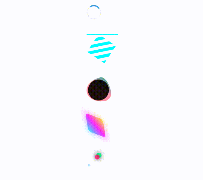
<!DOCTYPE html>
<html lang="en">

<head>
    <meta charset="UTF-8">
    <meta name="viewport" content="width=device-width, initial-scale=1.0">
    <title>加载动画</title>
    <style>
        /* demo1 普通加载*/
        .loader {
            width: 40px;
            height: 40px;
            border: 4px solid #f3f3f3;
            border-top: 4px solid #3498db;
            border-radius: 50%;
            animation: spin 1s linear infinite;
        }

        @keyframes spin {
            0% {
                transform: rotate(0deg);
            }

            100% {
                transform: rotate(360deg);
            }
        }

        /* demo2 赛博风*/
        .cyber-loader {
            width: 100px;
            height: 100px;
            position: relative;
        }

        .glow {
            position: absolute;
            width: 100%;
            height: 100%;
            border: 3px solid #0ff;
            box-shadow:
                0 0 15px #0ff,
                inset 0 0 15px #0ff;
            animation:
                scan 2s infinite linear,
                hue 4s infinite linear;
        }

        .core {
            position: absolute;
            width: 70%;
            height: 70%;
            top: 15%;
            left: 15%;
            background:
                repeating-linear-gradient(45deg,
                    transparent,
                    transparent 10px,
                    #0ff 10px,
                    #0ff 20px);
            animation: rotate 3s infinite linear;
        }

        @keyframes scan {
            0% {
                clip-path: polygon(0 0, 100% 0, 100% 0, 0 0);
            }

            50% {
                clip-path: polygon(0 0, 100% 0, 100% 100%, 0 100%);
            }

            100% {
                clip-path: polygon(0 100%, 100% 100%, 100% 100%, 0 100%);
            }
        }

        @keyframes rotate {
            to {
                transform: rotate(360deg);
            }
        }

        @keyframes hue {
            to {
                filter: hue-rotate(360deg);
            }
        }

        /* demo3 液态金属 */
        .liquid-loader {
            width: 80px;
            height: 80px;
            position: relative;
            background: linear-gradient(45deg,
                    #ff6b6b,
                    #4ecdc4,
                    #45b7d1);
            border-radius: 50%;
            animation: liquid 3s infinite;
        }

        .liquid-loader::after {
            content: '';
            position: absolute;
            inset: 5px;
            background: rgba(0, 0, 0, 0.9);
            border-radius: 50%;
        }

        @keyframes liquid {

            0%,
            100% {
                border-radius: 63% 37% 54% 46% / 55% 48% 52% 45%;
                filter:
                    hue-rotate(0deg) drop-shadow(0 0 10px rgba(255, 255, 255, 0.3));
            }

            50% {
                border-radius: 30% 70% 70% 30% / 30% 52% 48% 70%;
                filter:
                    hue-rotate(180deg) drop-shadow(0 0 20px rgba(255, 255, 255, 0.6));
                transform: rotate(180deg);
            }
        }

        /* demo4  */
        .hologram-loader {
            width: 60px;
            height: 60px;
            position: relative;
            animation: hologram 2s infinite linear;
            background:
                linear-gradient(45deg,
                    rgba(0, 255, 255, 0.8),
                    rgba(255, 0, 255, 0.8),
                    rgba(255, 255, 0, 0.8));
            border-radius: 10px;
        }

        .hologram-loader::before {
            content: '';
            position: absolute;
            inset: -5px;
            background: inherit;
            filter: blur(10px);
            opacity: 0.5;
        }

        @keyframes hologram {
            0% {
                transform:
                    rotate(0deg) skew(15deg, 15deg);
            }

            100% {
                transform:
                    rotate(360deg) skew(15deg, 15deg);
            }
        }

        /* demo5 粒子 */
        .loader-particle {
            position: relative;
            width: 80px;
            height: 80px;
        }

        .particle {
            position: absolute;
            width: 16px;
            height: 16px;
            background: #00ff88;
            border-radius: 50%;
            animation: pulse 1.2s infinite ease-in-out;
        }

        .particle:nth-child(2) {
            animation-delay: -0.4s;
            background: #ff0066;
        }

        .particle:nth-child(3) {
            animation-delay: -0.8s;
            background: #00a8ff;
        }

        @keyframes pulse {

            0%,
            100% {
                transform:
                    translate(0, 0) scale(0.5);
                opacity: 0.3;
            }

            50% {
                transform:
                    translate(40px, -40px) scale(1.2);
                opacity: 1;
                box-shadow: 0 0 20px currentColor;
            }
        }
    </style>
</head>

<body>
    <div class="loader"></div>
    <div class="cyber-loader">
        <div class="glow"></div>
        <div class="core"></div>
    </div>
    <div class="liquid-loader"></div>
    <div class="hologram-loader"></div>
    <div class="loader-particle">
        <div class="particle"></div>
        <div class="particle"></div>
        <div class="particle"></div>
    </div>
</body>

</html>
5.2 卡片悬停效果
<!DOCTYPE html>
<html lang="en">
<head>
    <meta charset="UTF-8">
    <meta name="viewport" content="width=device-width, initial-scale=1.0">
    <style>
        .card {
            transition: transform 0.3s, box-shadow 0.3s;
        }

        .card:hover {
            transform: translateY(-5px) rotate(-1deg);
            box-shadow: 0 10px 20px rgba(0, 0, 0, 0.1);
        }
    </style>
</head>

<body>

    <div class="card">
        <h3>Card Title</h3>
        <p>Card content goes here...</p>
    </div>
    <div class="card">
        <h3>Card Title</h3>
        <p>Card content goes here...</p>
    </div>
</body>

</html>
5.3 导航动画
<!DOCTYPE html>
<html lang="en">
<head>
    <meta charset="UTF-8">
    <meta name="viewport" content="width=device-width, initial-scale=1.0">
    <title>导航动画演示</title>
    <style>
        :root {
            --primary-color: #2563eb;
            --hover-color: #1d4ed8;
            --text-color: #1f2937;
            --bg-color: #f3f4f6;
            --transition: all 0.3s cubic-bezier(0.4, 0, 0.2, 1);
        }

        * {
            margin: 0;
            padding: 0;
            box-sizing: border-box;
        }

        body {
            font-family: 'Segoe UI', sans-serif;
            line-height: 1.6;
            background-color: var(--bg-color);
            min-height: 200vh;
        }

        .nav-container {
            position: fixed;
            top: 0;
            width: 100%;
            background: rgba(255, 255, 255, 0.95);
            backdrop-filter: blur(10px);
            box-shadow: 0 2px 10px rgba(0, 0, 0, 0.1);
            z-index: 1000;
        }

        /* 加载入场动画 */
        .nav-wrapper {
            max-width: 1200px;
            margin: 0 auto;
            padding: 1rem 2rem;
            opacity: 0;
            transform: translateY(-20px);
            animation: navEnter 1s ease forwards;
        }

        @keyframes navEnter {
            to {
                opacity: 1;
                transform: translateY(0);
            }
        }

        .nav-content {
            display: flex;
            justify-content: space-between;
            align-items: center;
        }

        .logo {
            font-size: 1.5rem;
            font-weight: 700;
            color: var(--primary-color);
            text-decoration: none;
            position: relative;
        }

        .logo::after {
            content: '';
            position: absolute;
            bottom: -5px;
            left: 0;
            width: 0;
            height: 2px;
            background: var(--primary-color);
            transition: var(--transition);
        }

        .logo:hover::after {
            width: 100%;
        }
        .nav-menu {
            display: flex;
            gap: 2rem;
            list-style: none;
        }

        .nav-item {
            position: relative;
        }

        .nav-link {
            text-decoration: none;
            color: var(--text-color);
            padding: 0.5rem 1rem;
            transition: var(--transition);
        }

        .nav-link::after {
            content: '';
            position: absolute;
            bottom: -5px;
            left: 50%;
            width: 0;
            height: 2px;
            background: var(--primary-color);
            transition: var(--transition);
        }

        .nav-link:hover::after {
            width: 100%;
            left: 0;
        }

        .nav-item.active .nav-link {
            color: var(--primary-color);
        }

        .nav-item.active::before {
            content: '';
            position: absolute;
            top: -10px;
            left: 50%;
            transform: translateX(-50%);
            width: 8px;
            height: 8px;
            background: var(--primary-color);
            border-radius: 50%;
            animation: bounce 1s infinite;
        }

        @keyframes bounce {
            0%, 100% { transform: translate(-50%, 0); }
            50% { transform: translate(-50%, -8px); }
        }

        .menu-toggle {
            display: none;
            background: none;
            border: none;
            cursor: pointer;
            padding: 0.5rem;
        }

        .hamburger {
            width: 30px;
            height: 2px;
            background: var(--text-color);
            position: relative;
            transition: var(--transition);
        }

        .hamburger::before,
        .hamburger::after {
            content: '';
            position: absolute;
            width: 100%;
            height: 100%;
            background: inherit;
            transition: var(--transition);
        }

        .hamburger::before { top: -8px; }
        .hamburger::after { top: 8px; }

        @media (max-width: 768px) {
            .nav-menu {
                position: fixed;
                top: 70px;
                right: -100%;
                flex-direction: column;
                background: white;
                width: 80%;
                max-width: 300px;
                padding: 2rem;
                box-shadow: -5px 5px 20px rgba(0, 0, 0, 0.1);
                transition: right 0.4s ease;
            }

            .nav-menu.active {
                right: 0;
            }

            .menu-toggle {
                display: block;
            }

            .menu-toggle.active .hamburger {
                background: transparent;
            }

            .menu-toggle.active .hamburger::before {
                transform: rotate(45deg) translate(5px, 5px);
            }

            .menu-toggle.active .hamburger::after {
                transform: rotate(-45deg) translate(5px, -5px);
            }
        }

        .nav-container.scrolled {
            background: rgba(255, 255, 255, 0.98);
            box-shadow: 0 4px 20px rgba(0, 0, 0, 0.08);
            padding: 0.5rem 2rem;
        }

        .demo-content {
            max-width: 800px;
            margin: 120px auto;
            padding: 2rem;
        }

        .scroll-trigger {
            margin: 400px 0;
            padding: 4rem;
            background: white;
            border-radius: 1rem;
            opacity: 0;
            transform: translateY(50px);
            transition: var(--transition);
        }

        .scroll-trigger.visible {
            opacity: 1;
            transform: translateY(0);
        }
    </style>
</head>
<body>
    <nav class="nav-container">
        <div class="nav-wrapper">
            <div class="nav-content">
                <a href="#" class="logo">NavDemo</a>

                <ul class="nav-menu">
                    <li class="nav-item active"><a href="#" class="nav-link">Home</a></li>
                    <li class="nav-item"><a href="#" class="nav-link">About</a></li>
                    <li class="nav-item"><a href="#" class="nav-link">Services</a></li>
                    <li class="nav-item"><a href="#" class="nav-link">Contact</a></li>
                </ul>

                <button class="menu-toggle">
                    <span class="hamburger"></span>
                </button>
            </div>
        </div>
    </nav>

    <main class="demo-content">
        <h1>动画演示页面</h1>
        <div class="scroll-trigger">向下滚动查看动画效果</div>
        <div class="scroll-trigger">第二个触发元素</div>
    </main>

    <script>
        const menuToggle = document.querySelector('.menu-toggle');
        const navMenu = document.querySelector('.nav-menu');

        menuToggle.addEventListener('click', () => {
            navMenu.classList.toggle('active');
            menuToggle.classList.toggle('active');
        });

        const scrollTriggers = document.querySelectorAll('.scroll-trigger');

        const observer = new IntersectionObserver((entries) => {
            entries.forEach(entry => {
                if (entry.isIntersecting) {
                    entry.target.classList.add('visible');
                }
            });
        }, {
            threshold: 0.1
        });

        scrollTriggers.forEach(trigger => {
            observer.observe(trigger);
        });

        window.addEventListener('scroll', () => {
            const navContainer = document.querySelector('.nav-container');
            if (window.scrollY > 100) {
                navContainer.classList.add('scrolled');
            } else {
                navContainer.classList.remove('scrolled');
            }
        });

        document.querySelectorAll('.nav-link').forEach(link => {
            link.addEventListener('click', (e) => {
                e.preventDefault();
                document.querySelector('.nav-item.active').classList.remove('active');
                e.target.closest('.nav-item').classList.add('active');
            });
        });
    </script>
</body>
</html>
今天就为大家简单演示以上几个小技巧,点赞+关注我会持续分享更多实用经验,欢迎关注我一起交流学习!


 扫一扫
扫一扫


 被折叠的 条评论
为什么被折叠?
被折叠的 条评论
为什么被折叠?
 到【灌水乐园】发言


