


Flex伸缩盒子详解+实操——容器属性完结
justify-content属性
属性详解:
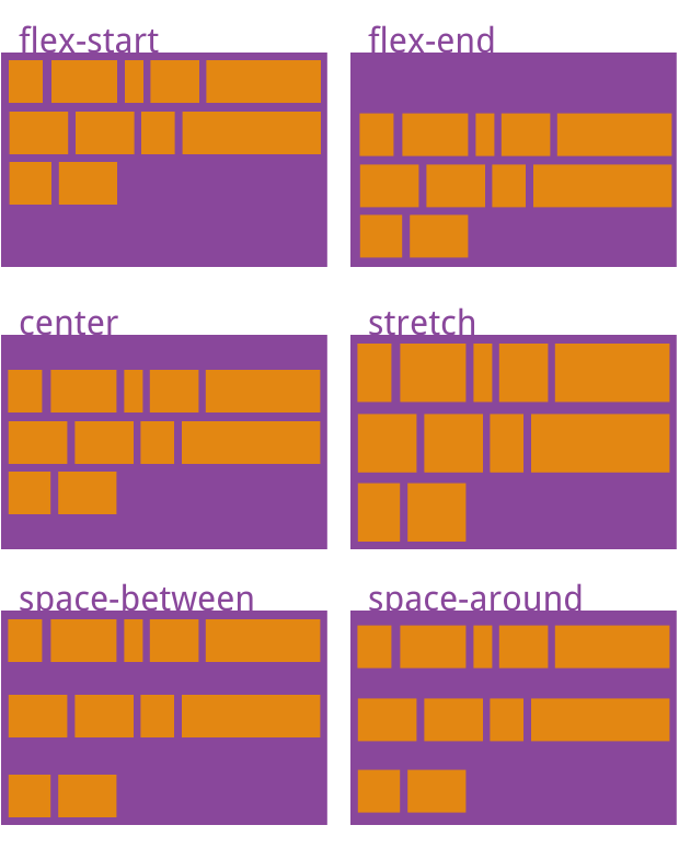
justify-content属性定义了块元素在主轴上排列的方式。
justify-content属性定义了5种值:
flex-start(默认值):左对齐flex-end:右对齐center: 居中space-between:两端对齐,项目之间的间隔都相等。space-around:每个项目两侧的间隔相等。所以,项目之间的间隔比项目与边框的间隔大一倍。
代码实操
index.html
<div class="box2">
	<div class="square2"></div>
	<div class="square3"></div>
	<div class="square2"></div>
</div>
demo.css
.box2{
	display: flex;
	justify-content:flex-start;
/* 	justify-content: flex-end;
	justify-content: center;
	justify-content: space-between;
	justify-content: space-around; */
}

.square2{
	height: 50px;
	width: 50px;
	border:1px sienna;
	background-color: coral;
	margin:1.25rem;
}

.square3{
	height: 50px;
	width: 80px;
	border:1px sienna;
	background-color: chartreuse;
	margin:1.25rem;
}
五种值的排列方式如下图所示。
align-items属性
属性详解:
align-items属性定义元素块在交叉轴上如何对齐。
align-items属性定义了五个属性:
flex-start:交叉轴的起点对齐。flex-end:交叉轴的终点对齐。center:交叉轴的中点对齐。baseline: 项目的第一行文字的基线对齐。stretch(默认值):如果项目未设置高度或设为auto,将占满整个容器的高度。 (块元素不设置高度的时候)
index.html
	<div class="box3">
		<div class="square4">我是一号文本</div>
		<div class="square5">我是二号文本</div>
		<div class="square6">我是三号文本</div>
		<div class="square7">我是四号文本</div>
		<div class="square8">我是五号文本</div>
	</div>
demo.css
.box3{
	display: flex;
/* 	align-items: flex-start; */
/* 	align-items: flex-end; */
	/* align-items: center; */
	align-items: stretch;
/* 	align-items: baseline; */
	height: 18.75rem;
}


.square4{
/* 	height: 100px; */
	width: 80px;
	border:1px  solid #000;
	background-color: blue;
	margin: 10px;
}
.square5{
/* 	height: 130px; */
	width: 80px;
	border:1px  solid #000;
	background-color: blue;
	margin: 10px;
}
.square6{
/* 	height: 90px; */
	width: 80px;
	border:1px  solid #000;
	background-color: blue;
	margin: 10px;
}
.square7{
/* 	height: 80px; */
	width: 80px;
	border:1px  solid #000;
	background-color: blue;
	margin: 10px;
}
.square8{
/* 	height: 150px; */
	width: 80px;
	border:1px  solid #000;
	background-color: blue;
	margin: 10px;
}
五种值的排列方式如下图所示。
align-content属性
align-content属性定义了多根轴线的对齐方式。如果项目只有一根轴线,该属性不起作用。
align-content定义了6个值,分别是:
flex-start:与交叉轴的起点对齐。flex-end:与交叉轴的终点对齐。center:与交叉轴的中点对齐。space-between:与交叉轴两端对齐,轴线之间的间隔平均分布。space-around:每根轴线两侧的间隔都相等。所以,轴线之间的间隔比轴线与边框的间隔大一倍。stretch(默认值):轴线占满整个交叉轴。
index.html
	<div class="box">
		<div class="box4">
			<div class="square4">我是一号文本</div>
			<div class="square5">我是二号文本</div>
			<div class="square6">我是三号文本</div>
			<div class="square7">我是四号文本</div>
		</div>
		<div class="box4">
			<div class="square8">我是五号文本</div>
			<div class="square4">我是一号文本</div>
			<div class="square5">我是二号文本</div>
			<div class="square6">我是三号文本</div>
			<div class="square7">我是四号文本</div>
		</div>
		<div class="box4">
			<div class="square8">我是五号文本</div>
			<div class="square4">我是一号文本</div>
			<div class="square5">我是二号文本</div>
			<div class="square6">我是三号文本</div>
			<div class="square7">我是四号文本</div>
			<div class="square8">我是五号文本</div>
		</div>
	</div>
demo.css
.square4{
	height: 100px;
	width: 80px;
	border:1px  solid #000;
	background-color: blue;
	margin: 10px;
}
.square5{
	height: 130px;
	width: 80px;
	border:1px  solid #000;
	background-color: blue;
	margin: 10px;
}
.square6{
	height: 90px;
	width: 80px;
	border:1px  solid #000;
	background-color: blue;
	margin: 10px;
}
.square7{
	height: 80px;
	width: 80px;
	border:1px  solid #000;
	background-color: blue;
	margin: 10px;
}
.square8{
	height: 150px;
	width: 80px;
	border:1px  solid #000;
	background-color: blue;
	margin: 10px;
}


.box4{
	display: flex;
	align-content: center;
}
展示效果如下所致。
background-color: blue;
margin: 10px;
}
.square8{
height: 150px;
width: 80px;
border:1px solid #000;
background-color: blue;
margin: 10px;
}
.box4{
display: flex;
align-content: center;
}
展示效果如下所致。


 664
664


 被折叠的 条评论
为什么被折叠?
被折叠的 条评论
为什么被折叠?
 到【灌水乐园】发言


