


两栏以及三栏自适应布局
左边宽度200px, 右边自适应宽度
1. 左右都absolute,右right:0
左右两边都绝对定位,父元素相对定位
<div class="parent">
    <div class="left">
        <p>left</p>
    </div>
    <div class="right">
        <p>right</p>
        <p>right</p>
    </div>
</div>
.parent{
    position: relative;
}
.left{
  border: 1px solid red;
  position: absolute;

    width: 100px;
}
.right{
    position: absolute;
    border: 1px solid red;
    left: 120px;
    right:0;

}
父元素 relative
左边列 absolute
右边 absolute, left: 100px, right:0 【实现自适应】
2. float:left + overflow:hidden
左边设置Margin 可把两列分开
<div class="parent">
    <div class="left">
        <p>left</p>
    </div>
    <div class="right">
        <p>right</p>
        <p>right</p>
    </div>
</div>
.left{
    float: left;
    width: 100px;
    margin-right: 20px;
    border: 1px solid red;
}
.right{
    overflow: hidden;
   border: 1px solid red;
}
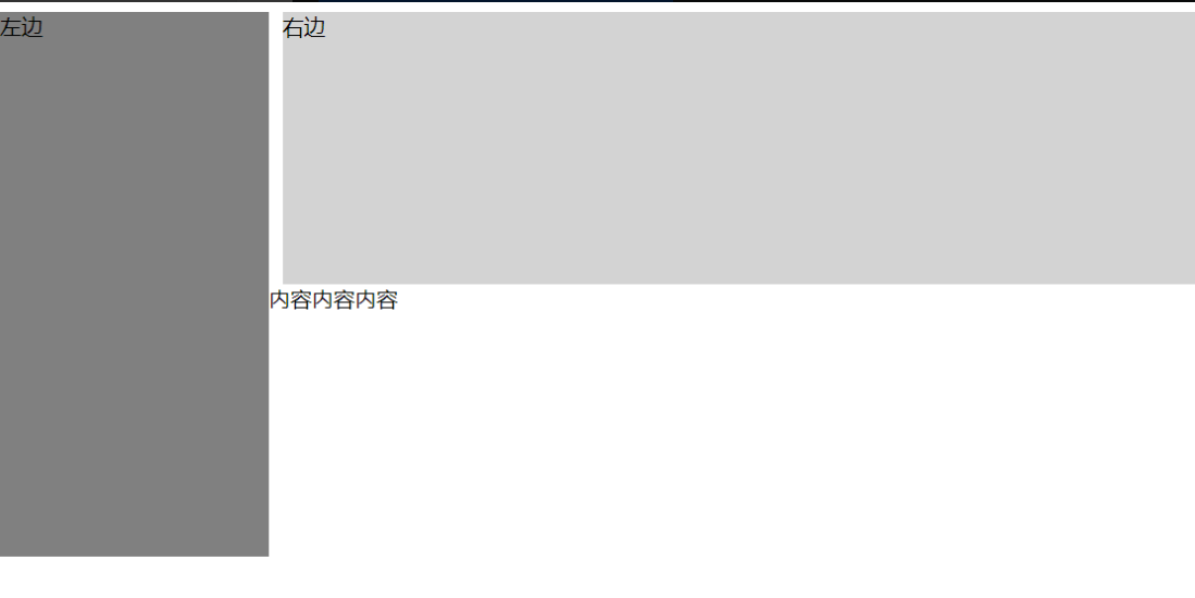
3. float + margin
.left {
    float: left;
    width: 200px;
    background-color: gray;
    height: 400px;
}
.right {
    margin-left: 210px;
    background-color: lightgray;
    height: 200px;
}
效果
三栏布局
1. 左边float:left, 中间Overflow:hidden; 右边 float:right
 <div class="container">
        <div class="left"></div>
        <div class="right"></div>
        <div class="main"></div>
    </div>
.left {
        float: left;
        height: 200px;
        width: 100px;
        margin-right: 20px;
        background-color: red;
    }
    .right {
        width: 200px;
        height: 200px;
        float: right;
        margin-left: 20px;
        background-color: blue;
    }
    .main {
        height: 200px;
        overflow: hidden;
        background-color: green;
    }
2. absolute + margin
<div class="box">
    <div class="left">左边</div>
    <div class="middle">中间</div>
    <div class="right">右边</div>
</div>
左右两边都设置绝对定位,中间的设置margin-left 和 margin-right
.box {
    position: relative;
}
.left {
    position: absolute;
    top: 0;
    left: 0;
    width: 200px;
    height: 200px;
    background-color: gray;
}
.right {
    position: absolute;
    top: 0;
    right: 0;
    width: 200px;
    height: 200px;
    background-color: gray;
}
.middle {
    margin-left: 210px;
    margin-right: 210px;
    background-color: lightgray;
    height: 200px;
}


 750
750


 被折叠的 条评论
为什么被折叠?
被折叠的 条评论
为什么被折叠?
 到【灌水乐园】发言


