


移动端rem适配实现自适应(以下案例以750px为标准)
1.设置根元素大小,然后以rem为单位(root em),rem的基准是相对于html元素的字体大小 ,使用方法如下
<!DOCTYPE html>
<html lang="en">

<head>
    <meta charset="UTF-8">
    <meta http-equiv="X-UA-Compatible" content="IE=edge">
    <meta name="viewport" content="width=device-width, initial-scale=1.0">
    <title>Document</title>
    <style>
        html {
            font-size: 50px;
        }

        div {
            width: 2rem;
            height: 2rem;
            background-color: pink;
        }
    </style>
</head>

<body>
    <div>
    </div>
</body>

</html>
这里会生成一个100px*100px的盒子
2. 技术方案一:媒体查询@media+rem(苏宁首页案例)
媒体查询可以根据不同屏幕尺寸设置不同样式:使用规范[https://developer.mozilla.org/zh-CN/docs/Web/CSS/@media]
3.案例:苏宁首页
文件夹创建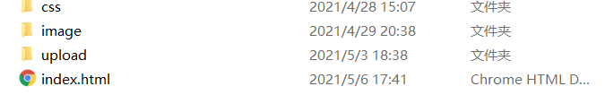
这里用媒体查询设置常见屏幕尺寸下的根元素字体大小命名为common.css
html {
  font-size: 50px;
}
@media screen and (min-width: 320px) {
  html {
    font-size: 21.33333333px;
  }
}
@media screen and (min-width: 360px) {
  html {
    font-size: 24px;
  }
}
@media screen and (min-width: 375px) {
  html {
    font-size: 25px;
  }
}
@media screen and (min-width: 400px) {
  html {
    font-size: 26.66666667px;
  }
}
@media screen and (min-width: 414px) {
  html {
    font-size: 27.6px;
  }
}
@media screen and (min-width: 424px) {
  html {
    font-size: 28.26666667px;
  }
}
@media screen and (min-width: 480px) {
  html {
    font-size: 32px;
  }
}
@media screen and (min-width: 540px) {
  html {
    font-size: 36px;
  }
}
@media screen and (min-width: 720px) {
  html {
    font-size: 48px;
  }
}
@media screen and (min-width: 750px) {
  html {
    font-size: 50px;
  }
}
设置首页样式命名为index.css
a {
  text-decoration: none;
}
body {
  min-width: 320px;
  width: 15rem;
  margin: 0 auto;
  line-height: 1.5;
  font-family: Arial, Helvetica;
  background-color: #f2f2f2;
}
.search-content {
  display: flex;
  position: fixed;
  top: 0;
  left: 50%;
  transform: translateX(-50%);
  width: 15rem;
  height: 1.76rem;
  background-color: #ffc001;
}
.search-content .classify {
  width: 0.88rem;
  height: 1.4rem;
  background: url(../image/classify.png) no-repeat;
  background-size: 0.88rem 1.4rem;
  margin: 0.22rem 0.5rem 0.14rem 0.48rem;
}
.search-content .search {
  flex: 1;
}
.search-content .search input {
  outline: none;
  width: 100%;
  border: 0;
  height: 1.32rem;
  border-radius: 0.66rem;
  margin-top: 0.24rem;
  font-size: 0.5rem;
  padding-left: 1.1rem;
  color: #757575;
}
.search-content .login {
  width: 1.5rem;
  height: 1.4rem;
  margin: 0.2rem;
  font-size: 0.5rem;
  text-align: center;
  color: #fff;
  line-height: 1.4rem;
}
.banner {
  width: 15rem;
  height: 7.36rem;
}
.banner img {
  width: 100%;
  height: 100%;
}
.ad {
  display: flex;
}
.ad a {
  flex: 1;
}
.ad a img {
  width: 100%;
}
nav {
  width: 15rem;
}
nav a {
  float: left;
  width: 3rem;
  height: 2.8rem;
  text-align: center;
}
nav a img {
  display: block;
  width: 1.64rem;
  height: 1.64rem;
  margin: 0.2rem auto 0;
}
nav span {
  font-size: 0.5rem;
  color: #333;
}
首页框架index.html
<!DOCTYPE html>
<html lang="en">

<head>
    <meta charset="UTF-8">
    <meta http-equiv="X-UA-Compatible" content="IE=edge">
    <meta name="viewport" content="width=device-width, initial-scale=1.0, maximum-scale=1.0, user-scalable=0" />
    <link rel="stylesheet" href="css/normalize.css">
    <link rel="stylesheet" href="css/index.css">
    <title>Document</title>
</head>

<body>
    <!-- 顶部搜索框 -->
    <div class="search-content">
        <a href="javarsctipt:" class="classify"></a>
        <div class="search">
            <form action="">
                <input type="search">
            </form>
        </div>
        <a href="javrscript:" class="login">登录</a>
    </div>
    <!-- banner部分 -->
    <div class="banner">
        <img src="./upload/banner.gif" alt="">
    </div>
    <!-- 广告部分 -->
    <div class="ad">
        <a href="javascript:;"><img src="./upload/ad1.gif" alt=""></a>
        <a href="javascript:;"><img src="./upload/ad2.gif" alt=""></a>
        <a href="javascript:;"><img src="./upload/ad3.gif" alt=""></a>
    </div>
    <!-- nav部分 -->
    <nav>
        <a href="#">
            <img src="./upload/nav1.png" alt="">
            <span>爆款手机</span>
        </a>
        <a href="#">
            <img src="./upload/nav1.png" alt="">
            <span>爆款手机</span>
        </a>
        <a href="#">
            <img src="./upload/nav1.png" alt="">
            <span>爆款手机</span>
        </a>
        <a href="#">
            <img src="./upload/nav1.png" alt="">
            <span>爆款手机</span>
        </a>
        <a href="#">
            <img src="./upload/nav1.png" alt="">
            <span>爆款手机</span>
        </a>
        <a href="#">
            <img src="./upload/nav1.png" alt="">
            <span>爆款手机</span>
        </a>
        <a href="#">
            <img src="./upload/nav1.png" alt="">
            <span>爆款手机</span>
        </a>
        <a href="#">
            <img src="./upload/nav1.png" alt="">
            <span>爆款手机</span>
        </a>
        <a href="#">
            <img src="./upload/nav1.png" alt="">
            <span>爆款手机</span>
        </a>
        <a href="#">
            <img src="./upload/nav1.png" alt="">
            <span>爆款手机</span>
        </a>
    </nav>
    //图片素材自己去官网爬欧
</body>

</html>
效果如图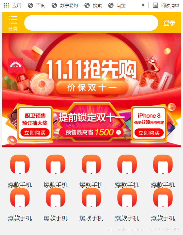
技术方案二:flexible.js+rem
flexible.js下载地址【https://github.com/amfe/lib-flexible】
选用index.js
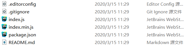
文件创建如下
设置视口标签以及引入初始化样式还有js文件
<meta name="viewport" content="width=device-width, user-scalable=no,initial-scale=1.0, maximum-scale=1.0, minimum-scale=1.0">

    <meta http-equiv="X-UA-Compatible" content="ie=edge">
    <link rel="stylesheet" href="css/normalize.css">
    <link rel="stylesheet" href="css/index.css">
    <!-- 引入我们的flexible.js 文件 -->
    <script src="js/flexible.js"></script>
这里代码只演示了收缩栏,剩余部分和上面的一样,自行补充
代码如下
index.html
<!DOCTYPE html>
<html lang="en">

<head>
    <meta charset="UTF-8">
    <meta name="viewport" content="width=device-width, user-scalable=no,initial-scale=1.0, maximum-scale=1.0, minimum-scale=1.0">

    <meta http-equiv="X-UA-Compatible" content="ie=edge">
    <link rel="stylesheet" href="css/normalize.css">
    <link rel="stylesheet" href="css/index.css">
    <!-- 引入我们的flexible.js 文件 -->
    <script src="js/flexible.js"></script>
    <title>Document</title>
</head>

<body>
    <div class="search-content">
        <a href="#" class="classify"></a>
        <div class="search">
            <form action="">
                <input type="search" value="月薪过万">
            </form>
        </div>
        <a href="#" class="login">登录</a>
    </div>
</body>

</html>
index.css
body {
    min-width: 320px;
    max-width: 750px;
    /* flexible 给我们划分了 10 等份 */
    width: 10rem;
    margin: 0 auto;
    line-height: 1.5;
    font-family: Arial, Helvetica;
    background: #f2f2f2;
}

a {
    text-decoration: none;
    font-size: .333333rem;
}


/*
img {
    width: 5.125rem;
    height: 4rem;
    width: 1rem;
    width: 1.093333rem;
    height: 1rem;
} */


/* 如果我们的屏幕超过了 750px  那么我们就按照 750设计稿来走 不会让我们页面超过750px */

@media screen and (min-width: 750px) {
    html {
        font-size: 75px!important;
    }
}


/* search-content */

.search-content {
    display: flex;
    position: fixed;
    top: 0;
    left: 50%;
    transform: translateX(-50%);
    width: 10rem;
    height: 1.173333rem;
    background-color: #FFC001;
}

.classify {
    width: .586667rem;
    height: .933333rem;
    margin: .146667rem .333333rem .133333rem;
    background: url(../images/classify.png) no-repeat;
    background-size: .586667rem .933333rem;
}

.search {
    flex: 1;
}

.search input {
    outline: none;
    border: 0;
    width: 100%;
    height: .88rem;
    font-size: .333333rem;
    background-color: #FFF2CC;
    margin-top: .133333rem;
    border-radius: .44rem;
    color: #757575;
    padding-left: .733333rem;
}

.login {
    width: 1rem;
    height: .933333rem;
    margin: .133333rem;
    color: #fff;
    text-align: center;
    line-height: .933333rem;
    font-size: .333333rem;
}
实现效果如图:


 762
762


 被折叠的 条评论
为什么被折叠?
被折叠的 条评论
为什么被折叠?
 到【灌水乐园】发言


