


1.CSS简介
CSS(Cascading Style Sheets)层叠样式表,是用来为结构化文档(HTML、XML等应用)添加样式,比如字体、颜色、大小、间距的计算机语言。CSS目前已经发展到了CSS3.0了。
2.CSS导入方式
CSS有三种导入方式:
1.行内样式:直接在标签元素中编写style属性,在其中编写样式即可:
<p style="color: paleturquoise">你好,这是CSS</p>2.内部样式:在头部head标签中,我们写上<style>标签,然后就可以在其中写入CSS样式了:
      <style>
        p{
          color: paleturquoise;
          font-size: 20px;
        }
</style>3.外部样式:外部样式就是新建一个.css文件,在其中编写css样式然后引入html文件之中,引入方式有两种:
连接式:
<link type="text/css" rel="stylesheet" href="first.css">
导入式:
<style>
    @import url("first.css");
</style>
3.选择器
可以选择页面中的某一个或者某一类元素,然后设置它们的样式:
3.1. 基本选择器
1.标签选择器:选择一类标签:标签{xxx样式},比如:
/*标签选择器*/
h1{
    color: pink;
    background-color: #eeeeee;
    font-family: 楷体;
}
p{
    color: pink;
    background-color: #eeeeee;
    font-family: 楷体;
}2.类选择器:可以选择class一致的标签,在class名前面加上一个小点 .className {xxx样式}
/*类选择器*/
.font1{
    color: pink;
    background-color: #eeeeee;
    font-family: 楷体;
}
.font2{
    color: pink;
    background-color: #eeeeee;
    font-family: 楷体;
}3.Id选择器:这是全局唯一的样式,指定某个id,设置样式,在id名字前加上井号,如:#idName{xxx样式}
/*Id选择器*/
#demo1{
    color: pink;
    background-color: #eeeeee;
    font-family: 楷体;
}
#demo2{
    color: pink;
    background-color: #eeeeee;
    font-family: 楷体;
}
优先级对比:
前面三个的优先级对比:id > class > 标签
3.2.层次选择器:
1.后代选择器:选中某个元素内的元素
/*后代选择器*/
body p{
    background-color: pink;
}
2.子选择器:只选择一代
/*后代选择器*/
body>p{
    background-color: pink;
}
3. 同辈选择器:选择相邻的兄弟选择器
<!DOCTYPE html>
<html lang="en">
    <head>
        <meta charset="UTF-8">
        <title>Title</title>
        <style>
            .d1+.d2{
                background-color: #aaaaaa;
            }
        </style>
    </head>
    <body>
        <div class="d1">你好</div>
        <div class="d2">hello</div>
    </body>
</html>
4.通用选择器:选择这个元素向下的所有同辈元素
<!DOCTYPE html>
<html lang="en">
    <head>
        <meta charset="UTF-8">
        <title>Title</title>
        <style>
            .d1~div{
                background-color: #aaaaaa;
            }
        </style>
    </head>
    <body>
        <div class="d1">你好</div>
        <div class="d2">hello</div>
        <div class="d3">oook</div>
    </body>
</html>
3.3. 结构伪类选择器

(上图引用至:CSS结构伪类选择器-CSDN博客)
<!DOCTYPE html>
<html lang="en">
  <head>
    <meta charset="UTF-8">
    <title>Title</title>

    <!--避免使用,class,id选择器-->
    <style>
      /*ul的第一个子元素*/
      ul li:first-child{
        background: firebrick;
      }
      /*ul的最后一个子元素*/
      ul li:last-child{
        background: darkcyan;
      }

      /*选中p1:定位到父元素,选择当前的第一个元素
      选择当前p元素的父级元素,选中父级元素的第一个子元素为p的
      按顺序
      */
      p:nth-child(2){
        background: salmon;
      }

      /*选中父元素下的p元素的第二个,按类型*/
      p:nth-of-type(1){
        background: gold;
      }

      p:nth-child(3){
        background-color: whitesmoke;
      }

      a:hover{
        background: violet;
      }
    </style>
  </head>
  <body>
    <!--<h1>h1</h1>-->
    <p>p1</p>
    <p>p2</p>
    <p>p3</p>
    <ul>
      <li>li1</li>
      <li>li2</li>
      <li>li3</li>
    </ul>

    <a href="">链接标签</a>
  </body>
</html>
4.CSS样式
css能够设计出多种多样的样式,现在我们详细的介绍这些样式。
4.1. 背景:
CSS可以定义的背景效果:
- background-color 背景颜色。
- background-image 背景图片。
- background-repeat 背景图像是否重复。
- background-attachment 背景图像是否固定或者随着页面的其余部分滚动。
- background-position 设置背景图像的起始位置。
- background 属性简写,包含上面的几种写法。
.div1    {
    width: 600px;
    height: 208px;
    background-image: url("../20231115/button.png");
    background-repeat: no-repeat;
    background-size: cover;
}
4.2. 文本
文本的属性:
| 属性 | 描述 |
| color | 设置文字颜色 |
| direction | 文本方向 |
| letter-spacing | 字符间距 |
| line-height | 行高 |
| text-align | 对齐方式 |
| text-decoration | 设置划线的位置 |
| text-indent | 缩进 |
| text-shadow | 设置文本阴影 |
| text-transform | 控制元素中的字母 |
| vertical-align | 垂直对齐 |
| white-space | 设置元素中空白的处理方式 |
| word-spacing | 设置字间距 |
写个代码试一试:
<!DOCTYPE html>
<html lang="en">
    <head>
        <meta charset="UTF-8">
        <title>Title</title>
      <style>
          p{
              color: rebeccapurple;
              direction: initial;
              letter-spacing: 10px;
              line-height: 20px;
              text-decoration: line-through;
              text-shadow: darkolivegreen;
              word-spacing: 50px;
          }
      </style>
    </head>
    <body>
        <p>hello world</p>
    </body>
</html>
4.3. 字体
CSS提供了多种属性修改字体的样式:
| 属性 | 描述 |
| font-family | 文本的字体系列 |
| font-size | 字体大小 |
| font- style | 字体样式 |
| font-variant | 以小型大型显示文本 |
| font-weight | 字体粗细 |
4.4. 链接
CSS可以修改连接的状态样式:
- a:link - 正常,未访问过的链接
- a:visited - 用户已访问过的链接
- a:hover - 当用户鼠标放在链接上时
- a:active - 链接被点击的那一刻
4.5. 显示状态
CSS中可以使用display和visibility来设置元素的显示与隐藏
visibility:hidden:可以隐藏某个元素,但隐藏的元素仍需占用与未隐藏之前一样的空间。也就是说,该元素虽然被隐藏了,但仍然会影响布局。
display:none:可以隐藏某个元素,且隐藏的元素不会占用任何空间。也就是说,该元素不但被隐藏了,而且该元素原本占用的空间也会从页面布局中消失。
display中的inline和block分别会把元素设置为内联元素和块元素。
<!DOCTYPE html>
<html lang="en">
    <head>
        <meta charset="UTF-8">
        <title>Title</title>
        <style>
            .hidden {
                visibility: hidden;
            }

            .none {
                display: none;
            }
        </style>
    </head>
    <body>
        <p>hello world</p>
        <p class="none">hello world</p>
        <p>hello world</p>
        <p class="hidden">hello world</p>
        <p>hello world</p>
    </body>
</html>
4.6. 定位 Position
CSS定位Position拥有五个值:static、relative、fixed、absolute、sticky
详细介绍见代码:
<!DOCTYPE html>
<html lang="en">
    <head>
        <meta charset="UTF-8">
        <title>定位</title>
    </head>
  <style>
    .sta{      /*静态定位---默认  静态定位的元素不会受到 top, bottom, left, right影响。*/
      position: static;
      border: 2px solid red;
    }
    .fix{ /*固定位置  元素的位置相对于浏览器窗口是固定位置。即使窗口是滚动的它也不会移动:*/
      position: fixed;
      top: 30px;
      left: 50px;
    }
    .rel{ /* 相对定位 相对定位元素的定位是相对其正常位置*/
      position: relative;
      left: -30px;
    }
    .abs{ /* 绝对定位的元素的位置相对于最近的已定位父元素,如果元素没有已定位的父元素,那么它的位置相对于<html>: */
      position: absolute;
      left: 100px;
      top: 100px;
      z-index: -1;
    }
    .sti{ /* 粘性定位 元素定位表现为在跨越特定阈值前为相对定位,之后为固定定位。*/
      position: -webkit-sticky;
      width: 300px;
      height: 50px;
      background-color: whitesmoke;
      position: sticky;
      top: 0;
    }
  </style>
    <body>
      <p class="sta">静态定位</p>
      <p class="rel">相对定位</p>
      <p class="fix">页面固定位置</p>
      <p class="abs">绝对位置</p>
      <div class="sti"></div>
      <p>666666666666666666666666</p>
      <p>777777777777777777777777</p>
      <p>777777777777777777777777</p>
      <p>777777777777777777777777</p>
      <p>777777777777777777777777</p>
      <p>777777777777777777777777</p>
      <p>777777777777777777777777</p>
      <p>777777777777777777777777</p>
      <p>777777777777777777777777</p>
      <p>777777777777777777777777</p>
      <p>777777777777777777777777</p>
      <p>777777777777777777777777</p>
      <p>777777777777777777777777</p>
      <p>777777777777777777777777</p>
      <p>777777777777777777777777</p>
      <p>777777777777777777777777</p>
      <p>777777777777777777777777</p>
      <p>777777777777777777777777</p>
      <p>777777777777777777777777</p>
      <p>777777777777777777777777</p>
      <p>777777777777777777777777</p>
      <p>777777777777777777777777</p>
      <p>777777777777777777777777</p>
      <p>777777777777777777777777</p>
      <p>777777777777777777777777</p>
      <p>777777777777777777777777</p>
      <p>777777777777777777777777</p>
      <p>777777777777777777777777</p>
      <p>777777777777777777777777</p>
      <p>777777777777777777777777</p>
      <p>777777777777777777777777</p>
      <p>777777777777777777777777</p>
      <p>777777777777777777777777</p>
      <p>777777777777777777777777</p>

    </body>
</html>
4.7.布局--Overflow
| 值 | 描述 |
|---|---|
| visible | 默认值。内容不会被修剪,会呈现在元素框之外。 |
| hidden | 内容会被修剪,并且其余内容是不可见的。 |
| scroll | 内容会被修剪,但是浏览器会显示滚动条以便查看其余的内容。 |
| auto | 如果内容被修剪,则浏览器会显示滚动条以便查看其余的内容。 |
| inherit | 规定应该从父元素继承 overflow 属性的值。 |
代码展示了这几种情况:
<!DOCTYPE html>
<html lang="en">
    <head>
        <meta charset="UTF-8">
        <title>Title</title>
        <style>
            .all{
                display: flex;
                flex-direction: row;
            }
            #visible {
                background: #4CAF50;
                color: black;
                padding: 15px;
                width: 100px;
                height: 100px;
                overflow: visible;
                border: 1px solid #ccc;
            }

            #hidden{
                background: #4CAF50;
                color: black;
                padding: 15px;
                width: 100px;
                height: 100px;
                overflow: hidden;
                border: 1px solid #ccc;
            }

            #scroll {
                background: #4CAF50;
                color: black;
                padding: 15px;
                width: 100px;
                height: 100px;
                overflow: scroll;
                border: 1px solid #ccc;
            }
            #auto {
                background: #4CAF50;
                color: black;
                padding: 15px;
                width: 100px;
                height: 100px;
                overflow: auto;
                border: 1px solid #ccc;
            }

        </style>
    </head>
    <body>
        <div class="all">
            <div id="visible">
                <p>第一种: visible</p>
                <p>visible</p>
                <p>visible</p>
                <p>visible</p>
                <p>visible</p>
                <p>visible</p>
                <p>visible</p>
                <p>visible</p>
                <p>visible</p>
                <p>visible</p>
            </div>

            <div id="hidden">
                <p>第二种: hidden</p>
                <p>hidden</p>
                <p>hidden</p>
                <p>hidden</p>
                <p>hidden</p>
                <p>hidden</p>
                <p>hidden</p>
                <p>hidden</p>
                <p>hidden</p>
            </div>

            <div id="scroll">
                <p>第三种:scroll</p>
                <p>scroll</p>
                <p>scroll</p>
                <p>scroll</p>
                <p>scroll</p>
                <p>scroll</p>
                <p>scroll</p>
                <p>scroll</p>
                <p>scroll</p>
            </div>

            <div id="auto">
                <p>第四种:auto</p>
                <p>auto</p>
                <p>auto</p>
                <p>auto</p>
                <p>auto</p>
                <p>auto</p>
                <p>auto</p>
                <p>auto</p>
                <p>auto</p>
            </div>


        </div>

    </body>
</html>
如图所示,会溢出来。
4.8. 浮动 --- Float
<!DOCTYPE html>
<html lang="en">
    <head>
        <meta charset="UTF-8">
        <title>Title</title>
      <style>
        .image{
          float: left;
          width: 300px;
          height: 300px;
        }
      </style>
    </head>
    <body>
      <h2>图片库</h2>
      <p>调整串口试一试</p>
      <div>
        <img src="dog.jpg" class="image">
        <img src="dog.jpg" class="image">
        <img src="dog.jpg" class="image">
        <img src="dog.jpg" class="image">
        <img src="dog.jpg" class="image">
        <img src="dog.jpg" class="image">
        <img src="dog.jpg" class="image">
        <img src="dog.jpg" class="image">
        <img src="dog.jpg" class="image">
        <img src="dog.jpg" class="image">
      </div>
    </body>
</html>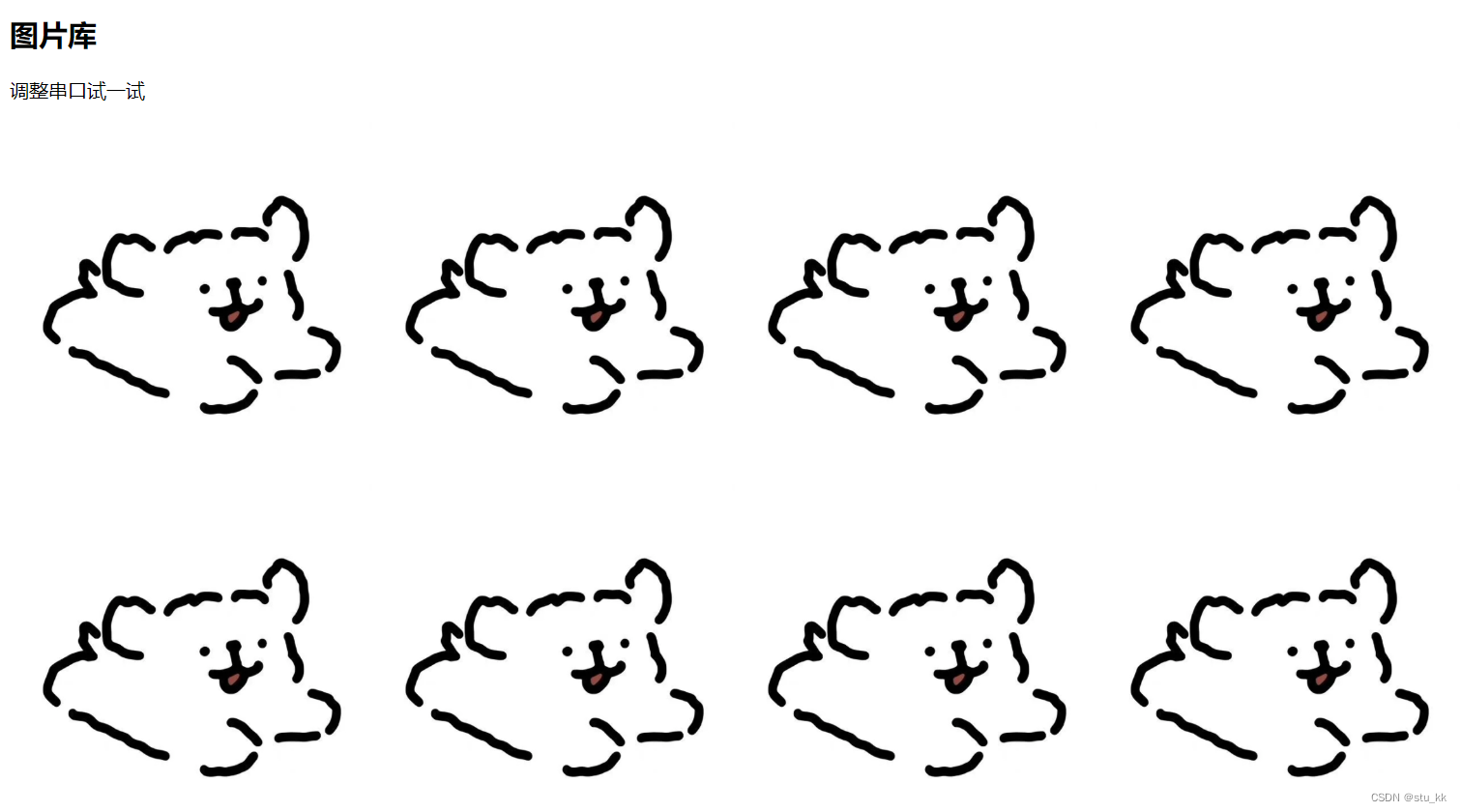
4.9. 居中方式
手打了一遍代码,详细的介绍了多种方式,也写清注释了。
<!DOCTYPE html>
<html lang="en">
    <head>
        <meta charset="UTF-8">
        <title>居中方式</title>
      <style>
        *{
          margin: 0;
          padding: 0;
        }
        h4{
          margin: 10px 0 10px 0;
        }
        .all{
          width: auto;
          height: 100vh;
          background-color: whitesmoke;
          display: flex;
          flex-direction: row;
          justify-content: space-around;
        }
        .shuiping, .chuizhi, .shuipingcuizhi{
          height: 100%;
          width: 30%;
        }
        .content{
          width: 300px;
          height: 100px;
          background-color: salmon;
          border: 1px solid black;
        }
        .item{
          background-color: #4CAF50;
          width: 100px;
          height: 100px;
        }
        /*    ===============1===============*/
        /* 使用 margin:auto 实现居中 */
        .margin-center{
          margin: auto;
        }
        /*    ===============2===============  */
        .content2{
          text-align: center;
        /* 这里的text-align:center子元素会继承该属性 */
        /* 我们的目的是将元素居中而不是文本居中 */
        }
        .block-center{
          display: inline-block;
        }
        /*    ================3================  */
        .content3{
          position: relative;
        }
        .absolute-center{
          position: absolute;
          left: 50%;
          transform: translateX(-50%);
        }

      /*   ==================4===================   */
        .content4{
          display: flex;
          justify-content: center;
        }

      /*  ======================垂直居中=======================*/
        .Ccontent{
          width: 300px;
          height: 100px;
          background-color: olive;
          border: 1px solid black;
        }
        .item2{
          width: 300px;
          height: 30px;
          background-color: gold;
        }
        /*    ========== 1 =========*/
        .Ccontent1{
          display: table-cell;
          vertical-align: middle;
        }

      /*  =============2=================*/
        .Ccontent2{
          line-height: 100px;
        }
        .vertical-center{
          display: inline-block;
          vertical-align: middle;
        }

      /*  ==========3===================*/
        .Ccontent3{
          display: flex;
          align-items: center;
        }

      /*  =========4================= */
        .Ccontent4{
          position: relative;
        }
        .abs-center{
          position: absolute;
          top: 50%;
          transform: translateY(-50%);
        }

      /*  ==============================水平垂直居中====================*/
        .SCcontent{
          background-color: paleturquoise;
          width: 100px;
          height: 100px;
        }
        .item3{
          background-color: lightgoldenrodyellow;
          width: 50px;
          height: 50px;
        }

      /*  ===================1 =================*/
        .SCcontent1{
          position: relative;
        }
        .abso-center{
          position: absolute;
          top: 50%;
          left: 50%;
          transform: translate(-50% , -50%);
        }
      /*  ====================2==================*/
       .SCcontent2{
         display: flex;
         justify-content: center;
         align-items: center;
       }
      /*================ 3 ========================*/
        .SCcontent3{
          text-align: center;
          line-height: 100px;
        }
        .SCitem3{
          display: inline-block;
          vertical-align: middle;
        }
      /*  ===================== 4 =========================*/
        .SCcontent4{
          display: table-cell;
          text-align: center;
          vertical-align: middle;
        }
        .SCitem4{
          display: inline-block;
        }


      </style>
    </head>
    <body>
      <div class="all">
        <div class="shuiping">
          <h3>水平居中方式:</h3>
          <h4>第一种方式: margin:auto</h4>
          <div class="content">
            <div class="margin-center item"></div>
          </div>

          <h4>第二种方式: 使用inline-block 和 text-align实现 </h4>

          <div class="content content2">
            <div class="item block-center"></div>
          </div>

          <h4>第三种方式: 使用绝对定位 实现 </h4>

          <div class="content content3">
            <div class="item absolute-center"></div>
          </div>

          <h4>第四种方式: 使用flex布局 实现 </h4>

          <div class="content content4">
            <div class="item"></div>
          </div>
        </div>
        <div class="chuizhi">
          <h3>垂直居中方式:</h3>
          <h4>第一种方式:使用display:table-cell来实现</h4>
          <div class="Ccontent Ccontent1">
            <div class="item2"></div>
          </div>
          <h4>第二种方式:使用line-height、 inline-block 来实现</h4>
          <div class="Ccontent Ccontent2">
            <div class="item2 vertical-center"></div>
          </div>
          <h4>第三种方式:使用flex布局 来实现</h4>
          <div class="Ccontent Ccontent3">
            <div class="item2"></div>
          </div>

          <h4>第四种方式:使用 绝对定位 来实现</h4>
          <div class="Ccontent Ccontent4">
            <div class="item2 abs-center"></div>
          </div>

        </div>

        <div class="shuipingcuizhi">
          <h3>水平 + 垂直居中方式:</h3>
          <h4>第一种方式:使用absolute绝对定位 来实现</h4>
          <div class="SCcontent SCcontent1 ">
            <div class="item3 abso-center"></div>
          </div>

          <h4>第二种方式:使用flex布局来实现</h4>
          <div class="SCcontent SCcontent2 ">
            <div class="item3"></div>
          </div>

          <h4>第三种方式:用inline-block.text-align和vertical-align来实现</h4>
          <div class="SCcontent SCcontent3 ">
            <div class="item3 SCitem3"></div>
          </div>

          <h4>第四种方式:table-cell+display: inline-block来实现</h4>
          <div class="SCcontent SCcontent4 ">
            <div class="item3 SCitem4"></div>
          </div>

        </div>
      </div>


    </body>
</html>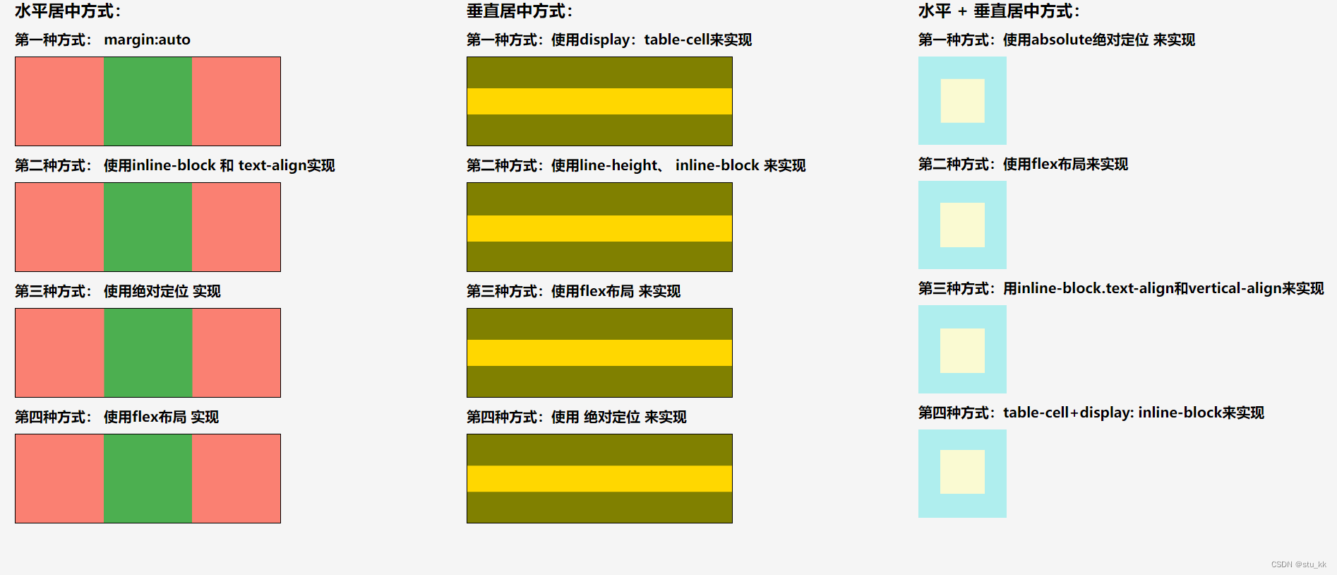
4.10.提示框
实现一个提示框,练练手
<!DOCTYPE html>
<html lang="en">
    <head>
        <meta charset="UTF-8">
        <title>Title</title>
    </head>
  <style>
    .main{
      position: relative;
      display: inline-block;
    }
    .main:hover .jian{
      visibility: visible;
    }
    .jian{
      color: white;
      text-align: center;

      visibility: hidden;
      top: -5px;
      left: 120%;
      padding-top: 5px;
      background-color: black;
      border-radius: 6px;
      width: 200px;
      height: 30px;
      position: absolute;
    }
    .jian::after{
      position: absolute;
      content: "";
      top: 50%;
      right: 100%;
      transform: translateY(-50%);
      z-index: 1;
      border-width: 5px;
      border-style: solid;
      border-color: transparent black transparent transparent;
    }

  </style>
    <body>
      <h1>提示框</h1>
      <div class="main">
        显示我
        <div class="jian">
          提示框成功了
        </div>
      </div>
    </body>
</html>
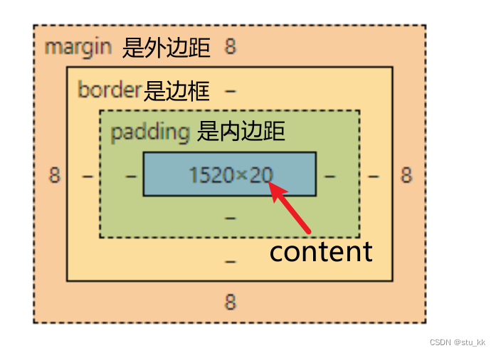
5. 盒子模型 Box Model
我们可以把每一个标签元素看成一个盒子,盒子中包括了边距、边框、填充和实际内容,盒子模型允许在盒子周围的空间放置其他元素。
6. CSS3
CSS3是CSS的技术新版本,拥有很多新的特性,下面是新的特性介绍:
6.1. CSS3边框
由三个新的边框属性:border-radius、box-shadow、border-image
border-radius:圆角
使用border-radius:10px 就可以轻易实现圆角了,值越大圆角的弧度越大。
box-shadow:阴影:使用它就可以实现阴影效果。
border-image:边界图片
<!DOCTYPE html>
<html lang="en">
    <head>
        <meta charset="UTF-8">
        <title>css3边框</title>
      <style>
        .css3-border{
          /*width: 400px;*/
          /*height: 400px;*/
          /*background-color: #4CAF50;*/
          /*border-radius: 100px;*/
          border: 15px solid transparent;
          border-image: url(border.png) 30 30 stretch;

          /*box-shadow: 10px 10px 30px #4CAF50;*/
        }
      </style>
    </head>
    <body>
      <div class="css3-border" >
        你好
      </div>
    </body>
</html>
6.2. 渐变
CSS3提供了新的渐变属性:linear-gradient
<!DOCTYPE html>
<html lang="en">
    <head>
        <meta charset="UTF-8">
        <title>Title</title>
      <style>
        .jianBian1{
          width: 300px;
          height: 100px;
          /*上到下*/
          background-image: linear-gradient(to bottom, black , pink);
        }
        .jianBian2{
          width: 300px;
          height: 100px;
          /*从右到左*/
          background-image: linear-gradient(to left, orange , blue);
        }
        .jianBian3{
          width: 300px;
          height: 100px;
          /*对角线*/
          background-image: linear-gradient(to bottom right, blanchedalmond , purple);
        }
        .jianBian4{
          width: 300px;
          height: 100px;
          /* 使用角度 */
          background-image: linear-gradient(-30deg, lawngreen , palegoldenrod);
        }
      </style>
    </head>
    <body>
      <div class="jianBian1">
      </div>

      <div class="jianBian2">
      </div>

      <div class="jianBian3">
      </div>

      <div class="jianBian4">
      </div>

    </body>
</html>
6.3. 文本效果
1.文本阴影:text-shadow
2. 文本溢出属性:text-overflow
3. text-outline
<!DOCTYPE html>
<html lang="en">
    <head>
        <meta charset="UTF-8">
        <title>文本效果</title>
      <style>
        p{
          width: 200px;
          overflow: hidden;
          white-space: nowrap;
          text-shadow: 10px 10px 5px red;
        }
        .ellipsis{
          /*添加省略号*/
          text-overflow: ellipsis;
        }
        .clip{
          /*直接断开*/
          text-overflow: clip;
        }
      </style>
    </head>

    <body>
      <p class="ellipsis"> 你好,如果超出的话会怎么样呢??? </p>
      <p class="clip"> 你好,如果超出的话会怎么样呢??? </p>

    </body>
</html>
6.4. 过渡
CSS3 过渡是元素从一种样式逐渐改变为另一种的效果。
要实现这一点,必须规定两项内容:
- 指定要添加效果的CSS属性
- 指定效果的持续时间。
使用transition: 变化的属性 时间
<!DOCTYPE html>
<html lang="en">
    <head>
        <meta charset="UTF-8">
        <title>过渡</title>
      <style>
        .transition{
          width: 100px;
          height: 100px;
          background-color: #4CAF50;
          transition: background-color 2s, width 2s, height 2s, transform 2s;
        }
        .transition:hover{
          width: 200px;
          height: 200px;
          background-color: purple;
          transform: rotate(90deg);

        }
      </style>
    </head>
    <body>
      <div class="transition">
        哥们你好
      </div>
    </body>
</html>
6.5.动画
要创建 CSS3 动画,你需要了解 @keyframes 规则。
@keyframes 规则是创建动画。
@keyframes 规则内指定一个 CSS 样式和动画将逐步从目前的样式更改为新的样式。
<!DOCTYPE html>
<html lang="en">
    <head>
        <meta charset="UTF-8">
        <title>Title</title>
      <style>
        .animation{
          width: 100px;
          height: 100px;
          background-color: red;
          position: relative;
          /*动画名称*/
          animation-name: move;
          /*动画运行时间*/
          animation-duration: 5s;
          /*速度曲线*/
          animation-timing-function: linear;
          /*动画何时开始*/
          animation-delay: 2s;
          /*动画运行次数*/
          animation-iteration-count: infinite;
          /*动画再下一个周期是否逆向运行*/
          animation-direction: alternate;
          /*规定是否运行*/
          animation-play-state: running;
        }
        /*设置动画*/
        @keyframes move {
          0% {background-color: red; left: 0px; top: 0px;}
          25% {background-color: yellow; left: 200px; top: 0px;}
          50% {background-color: blue; left: 200px; top: 200px;}
          75% {background-color: green; left: 0px; top: 200px;}
          100% {background-color: red; left: 0px; top: 0px;}
        }
      </style>
    </head>
    <body>
      <div class="animation">

      </div>
    </body>
</html>
6.6. CSS3图片
CSS3对图片样式有了新的属性:
<!DOCTYPE html>
<html lang="en">
    <head>
        <meta charset="UTF-8">
        <title>Title</title>
      <style>
        .yuan{
          /*  圆形图片  */
          width: 100px;
          border: solid black;
          border-radius: 50%;
        }
        /*如果你需要自由缩放图片,且图片放大的尺寸不大于其原始的最大值,则可使用以下代码:*/
        .xiangYing{
          max-width: 100%;
          height: auto;
        }
      /*  卡片式图片*/
        div.polaroid{
          width: 200px;
          background-color: white;
          box-shadow: 0 4px 8px 0 gray, 0 10px 20px 0 lightgray;
          margin-bottom: 25px;
        }
        img.dog:hover{
          opacity: 0.7;
        }
        div.container{
          text-align: center;
          padding: 5px 10px;
        }


      </style>
    </head>
    <body>
      <a href="../20231118/dog.jpg">
        <img src="../20231118/dog.jpg" class="yuan" />
      </a>
      <h1>响应式图片</h1>
      <img src="../20231118/border.png" class="xiangYing">

      <h1>这是响应式卡片</h1>
      <div class="polaroid">
        <img src="../20231118/dog.jpg" alt="Norway" class="dog" style="width:100%;">
        <div class="container">
          <p>The Troll's tongue in Hardanger, Norway</p>
        </div>
      </div>
    </body>
</html>
7. 总结
通过对CSS的学习,我们可以使得html页面变得更加好看了,接下来我们就要开始学习JavaScript来操控页面元素了。


 4366
4366


 被折叠的 条评论
为什么被折叠?
被折叠的 条评论
为什么被折叠?
 到【灌水乐园】发言


