


小时候大家应该都看过《喜洋洋与灰太狼》动画片吧?还记得里面的潇洒哥吗?经典台词:“我要画个圈圈诅咒你”,今天这个形象大使站出来出来替你们对心中不悦之人画个圈圈吧?为什么不是羊和狼,又或者是黑大帅,不瞒你们,因为它们比较难,而且实现它们的技术应该有其他的,我选择了一个简单的潇洒哥来锻炼自己的html+css。
主要是css用的比较多,需要用到动画,不会动画的,可以学习一下哦CSS 动画 | 菜鸟教程
讲解潇洒哥之前我想说一下,写这个的动机是什么,是看到了一个可爱的不倒翁,就玩起了不倒翁 ,这个不倒翁比较简单,“倒”那里用到了动画,挺简单的我就不详细说明了,直接上代码。

不倒翁的html结构:
  <div class="cont">
        <!-- 蛋 -->
        <div class="ellipse">
            <!-- 内容 -->
            <div class="egg">
                <!-- 蛋眼镜 -->
                <div class="eye"></div>
                <div class="eye"></div>
                <!-- 蛋嘴巴 -->
                <div class="mouth"></div>
                <!-- 蛋齿纹 -->
                <ul>
                    <li></li>
                    <li></li>
                    <li></li>
                    <li></li>
                    <li></li>
                </ul>

            </div>
        </div>
    </div>
不倒翁的css样式:
 *{
            margin: 0;
            padding: 0;
            box-sizing: border-box;
            list-style: none;
        }
        .cont{
           width: 500px;
           height: 500px;
           margin: 50px auto;
           display: flex;
           justify-content: center;
           align-items: center;
           position: relative;
        }
        .ellipse{
            position: relative;
        }
        .egg{
            width: 290px;
            height: 340px;
            border: 18px solid black;
            border-radius: 50% 50% 50% 50% / 60% 60% 40% 40%;
            position: relative;
            z-index: 5;
        }
        .eye{
            position: absolute;
            width: 30px;
            height: 30px;
            border-radius: 50%;
            background-color: #000;
            top:18%
        }
        .eye:nth-child(1){
            left: 23%;
        }
        .eye:nth-child(2){
            right: 23%;
        }
        .eye::after{
            content: "";
            width: 13px;
            height: 13px;
            background-color: #fff;
            border-radius: 50%;
            position: absolute;
            left: 2px;
            top: 3px;
        }
        .mouth{
            width: 28px;
            height: 28px;
            background-color: #000;
            /* border-radius: 12% / 4%; */
            border-radius: 50%;
            transform: rotate(45deg) translateX(-50%);
            transform-origin: left;
            position: absolute;
            top: 35%;
            left: 50%;
        }
        .egg ul li {
            position: absolute;
            height: 51px;
            transform: rotate(220deg);
            border-left: 18px solid black;
            border-top: 18px solid black;
        }

        .egg ul li:nth-child(1) {
            top: 53%;
            height: 40px;
            width: 45px;
            left: -4px;
        }

        .egg ul li:nth-child(2) {
            top: 49.5%;
            width: 58px;
            left: 16%;
        }

        .egg ul li:nth-child(3) {
            top: 49.5%;
            width: 58px;
            left: 36.5%;
        }

        .egg ul li:nth-child(4) {
            top: 49.5%;
            width: 58px;
            left: 57%;
        }

        .egg ul li:nth-child(5) {
            top: 49.5%;
            width: 62px;
            left: 77.5%;
        }
        /* 下半身 */
        .ellipse::after{
            content: "";
            position: absolute;
            width: calc(100% - 25px);
            height: 39%;
            background-color: pink;
            bottom: 0;
            left: 10px;
            border-radius: 0 0 50% 50%/ 0 0 100% 100%;
            z-index: 0;
        }
        .ellipse {
            animation: swing 3s linear infinite;
            transform-origin: center bottom;
        }
        @keyframes swing {
            0% {
                transform: rotate(0deg);
            }

            25% {
                transform: rotate(10deg);
            }

            50% {
                transform: rotate(0deg);
            }

            75% {
                transform: rotate(-10deg);
            }

            100% {
                transform: rotate(0deg);
            }
        }
可爱的不倒翁先告一段落了,鉴于不倒翁,现在说一下潇洒哥。
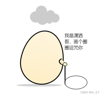
首先需要html结构来打底:
<div class="cont">
        <!-- 蛋 -->
        <div class="ellipse">
            <!-- 内容 -->
            <div class="egg">

            </div>
            <!-- 手 -->
            <div class="hand">
                <div class="fang"></div>
                <div class="yuan"></div>
                <div class="gun"></div>
            </div>
            <!-- 乌云 -->
            <div class="cloudy"></div>
            <!-- 椭圆 -->
            <div class="circle"></div>
            <div class="text">我是潇洒哥,画个圈圈诅咒你</div>
        </div>
    </div>
潇洒哥的css:
 * {
            margin: 0;
            padding: 0;
            box-sizing: border-box;
            list-style: none;
        }

        .cont {
            width: 500px;
            height: 500px;
            margin: 150px auto;
            display: flex;
            justify-content: center;
            align-items: center;
            position: relative;
        }

        .ellipse {
            position: relative;
            /* width: 500px;
            height: 500px; */
        }

        .egg {
            width: 190px;
            height: 240px;
            border: 4px solid black;
            border-radius: 50% 50% 50% 50% / 60% 60% 40% 40%;
            position: absolute;
            z-index: 5;
            transform: rotate(10deg);
            background: linear-gradient(to top, rgb(254, 238, 198), rgb(254, 238, 198, 0.6));
        }


        .cloudy {
            width: 50px;
            height: 50px;
            position: absolute;
            top: -80px;
            left: 100px;
            margin-left: -60px;
            background: #ccc;
            border-radius: 50%;
            box-shadow: #ccc 65px -10px 0 -5px,
                #ccc 25px -25px,
                #ccc 30px 10px,
                #ccc 60px 15px 0 -10px,
                #ccc 85px 5px 0 -5px;
            animation: cloudy 5s ease-in-out infinite;

        }

        @keyframes cloudy {
            50% {
                transform: translateY(-20px);
            }
        }

        .cloudy::after {
            content: '';
            width: 260px;
            height: 15px;
            position: absolute;
            bottom: -280px;
            left: -90px;
            background: #000;
            border-radius: 50%;
            opacity: 0.2;
            animation: cloudy-shadow 5s ease-in-out infinite;
            transform: scale(0.7);
        }

        @keyframes cloudy-shadow {
            50% {
                transform: translateY(20px) scale(1);
                opacity: 0.05;
            }
        }
        .hand{
            width: 100px;
            height: 100px;
            position: relative;

        }
        .fang{
            position: absolute;
            top: 127%;
            left: 168%;
            width: 20px;
            height: 26px;
            border-top: 4px solid #000;
            border-left: 4px solid #000;
            border-right: 1px solid #000;
            background-color: rgb(254, 238, 198);
            border-radius: 50% 0 10% 50%;
            z-index: 9;
            transform: rotate(-40deg);

        }
        .yuan{
            position: absolute;
            top: 142%;
            left: 184%;
            width: 20px;
            height: 16px;
            border: 2px solid #000;
            background-color: rgb(254, 238, 198);
            border-radius: 50% 50% 50% 50%;
            z-index: 9;
            transform: rotate(10deg);
        }
        .gun{
            position: absolute;
            top: 142%;
            left: 192%;
            width: 4px;
            height: 100px;
            border-radius: 0% 0% 50% 50%;
            background-color: #000;
        }

        .circle{
            height: 60px;
            width: 100px;
            position: absolute;
            top: 200%;
            left: 192%;
            /* margin-left: -60px; */
            box-sizing: border-box;
            border: 2px solid #000;
            border-radius: 50%;
        }
        .text{
            width: 100px;
            position: absolute;
            top: 10%;
            left: 192%;
            font-size: 20px;
        }
以上潇洒哥头上的云和脚下的阴影是动态的。圆圈是可以通过动画做成动态的,先准备一个圆,通过一个遮板动画旋转,来使得圆是被画出来的假象
写到这里,我希望路过的大神,能指导一下,潇洒哥画圈想要做一个动态的,需要如何将棍子靠近手的那端固定,另一端沿着圆圈画圆呢?


 扫一扫
扫一扫


 被折叠的 条评论
为什么被折叠?
被折叠的 条评论
为什么被折叠?
 到【灌水乐园】发言


