


r语言绘图结果展示
在分析交通上本文分别绘制了柱状图,条形图,线路图,热力密度图;对应的r语言代码在后面。


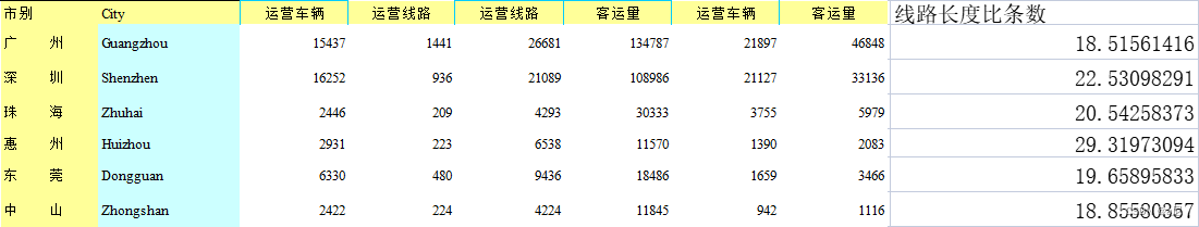
r语言代码以及对应数据
柱状图
library(ggplot2)
library(xlsx)
data1 <- read.xlsx("D:/curriculums/vis/production/car_info.xls",sheetIndex = 1,header = T)
ggplot(data1,aes(reorder(市别,线路长度比条数),线路长度比条数))+
  geom_bar(stat="identity", position=position_dodge(),
           color="black", width=.8, fill="lightblue")+
  geom_hline(aes(yintercept = 21.29862,colour="均线"), size = 1)+
  annotate('text',x=1,y=22,label="21.3",
           size=4,color='red')+
  labs(title = "广东省公交线路信息", # 定义主标题
       subtitle = "长度和条数之比", # 定义子标题
       x = "城市", # 定义x轴文本
       y = "线路长度/线路条数")+# 定义y轴文本
  theme(legend.title = element_blank(),
        legend.background = element_blank(),
        legend.position = c(0.08,0.9),#位置
        plot.title = element_text(hjust = 0.5),
        plot.subtitle = element_text(hjust = 0.5))
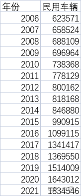
折线图
library(xlsx)
library(ggplot2)
data <- read.xlsx("D:\\curriculums\\vis\\production\\惠州市统计局数据--民用车辆.xlsx",sheetIndex = 1,header = T)
p1<-ggplot(data, aes(年份, 民用车辆))+
 geom_point(size=2)+
 geom_line(size=1)+
 scale_y_continuous(labels = scales::scientific)+
 labs(title = "惠州民用车辆数量", # 定义主标题
      x = "年份", # 定义x轴文本
      y = "民用车辆")+# 定义y轴文本
 theme(plot.title = element_text(hjust = 0.5))+
 scale_x_continuous(breaks=data$年份, labels = data$年份)
p1
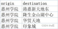
线路图
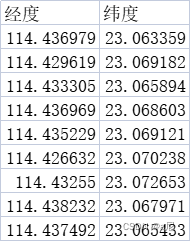
lonlat.csv
od.csv
library(REmap)
geodata1 = read.csv("D:/curriculums/vis/production/lonlat.csv",header = T,sep=",",encoding = "UTF-8")
data = read.csv("D:/curriculums/vis/production/od.csv",header = T,sep=",",encoding = "UTF-8")
remapB(center = c(114.42309,23.065869),
       zoom = 13,
       color = "Bright",
       title = "",
       subtitle = "",
       markLineData = data,
       markLineTheme = markLineControl(symbol = NA,
                                       symbolSize = c(0,4),
                                       smooth = T,
                                       smoothness = 0.2,
                                       effect = T,
                                       lineWidth = 2,
                                       lineType = "dotted",
                                       color = "red"),
       markPointTheme = markPointControl(symbol = "triangle",
                                         symbolSize = "Random",
                                         effect = T,
                                         effectType = "scale",
                                         color = "Random"),
       geoData = geodata1)
代码会生成一个网页
热力密度图
部分数据太多了,这里只展示部分数据
节假日.csv
这里需要填入百度地图自己申请的apk密钥,如果要做简单实验的可以私我,我自己有申请了一个,不过申请很简单的,大家自行去试试吧!
library(stringr)
library(baidumap)
library(ggplot2)
library(RgoogleMaps)
library(png)
library(ggmap)
library(patchwork)
options(baidumap.key='请填入key')
df <- read.csv("D:/curriculums/vis/production/jw/节假日.csv",sep=",",header = T,encoding = "UTF-8")
q <- getBaiduMap(c(114.42151,23.067396),width = 500, height = 500, zoom = 13, scale = 2,
                 color = "color", messaging = FALSE)
map1 <- ggmap(q)+stat_density_2d(data = df,aes(x=经度,y=纬度,
                                               fill = ..level..,
                                               alpha = ..level..),
                                 bins = 4,
                                 geom = "polygon",
                                 contour_var = "count",
                                 show.legend = F)+
        scale_fill_gradient(low = "black", high = "red")

map1


# contour lines
map1 + geom_density_2d_filled(alpha = 0.5)

# contour bands and contour lines
m + geom_density_2d_filled(alpha = 0.5) +
  geom_density_2d(size = 0.25, colour = "black")
set.seed(4393)
dsmall <- diamonds[sample(nrow(diamonds), 1000), ]
d <- ggplot(dsmall, aes(x, y))
# If you map an aesthetic to a categorical variable, you will get a
# set of contours for each value of that variable
d + geom_density_2d(aes(colour = cut))
柱状图进阶
我自称为分类柱状图,就是在简单的柱状图上多了按照类别分类展示的柱状图。
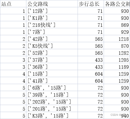
港惠to惠院.csv
library(ggplot2)
library(xlsx)
df <- read.csv("D:/curriculums/vis/production/港惠to惠院.csv",header = T,sep = ",",encoding = "utf-8")
a<-ggplot(df, aes(x=reorder(公交路线,各路公交耗时时间), y=各路公交耗时时间, fill=站点)) +
  geom_bar(stat="identity", position=position_dodge(),
           color="black", width=.8) +
  theme_bw()+
  scale_y_continuous(expand=c(0,0))+
  coord_cartesian(ylim = c(500, 1500))+
  theme(axis.text.x = element_text(size = 6, color = "black"))+##设置x轴字体大小
  theme(axis.text.y = element_text(size = 10, color = "black"))+##设置y轴字体大小
  theme(legend.title = element_blank(),
        legend.background = element_blank(),
        legend.position = c(0.05,0.88),#位置
        plot.title = element_text(hjust = 0.5),
        plot.subtitle = element_text(hjust = 0.5))+
  labs(title = "惠州公交线路信息", # 定义主标题
       subtitle = "从港惠到惠州学院", # 定义子标题
       x = "线路", # 定义x轴文本
       y = "各路公交耗时时间")# 定义y轴文本
a
上一篇主要讲了数据的获取方法,这篇主要介绍了如何通过r语言对数据进行合理的可视化,至此简单的数据分析以及可视化就完成咯!关于细节的部分,数据处理或许会在后面另出一篇进行补充!
ps:地名大家可以根据自己的需要进行修改,经纬度的获取方法链接如下
百度坐标拾取网址,点击可跳转,如不行,复制下方链接搜索也行
http://api.map.baidu.com/lbsapi/getpoint/index.html


 被折叠的 条评论
为什么被折叠?
被折叠的 条评论
为什么被折叠?
 到【灌水乐园】发言


