


目录
前言
-
熟悉Python的数据处理。(后续会分享python数据处理的相关知识点)
-
熟悉Pyecharts的使用
-
通过python对相关数据进行处理,再用pyecharts实现静态图和实时动态图的展示
一、系统概述
- 在2019年末爆发了具有传染特性的新冠肺炎疫情,首当其冲的是武汉地区,经历了一场惊心动魄的新年开局。疫情初期,由于对这种新型病毒的认知不足无法快速制定解决方案,导致疫情快速蔓延至全球。在这种情况下,疫情数据实时更新与可视化系统成为了疫情防控的主要工具。
二、系统需求分析
- 图表能体现多国疫情数据变化对比。
- 辅助元素能准确帮助看图者迅速辨别图表要表达的意思。
- 能够实现随时间变化的动画效果。
- 使用pyechart完成
三、概要设计
- 数据类型:二维数据表
-
从表中处理数据,将每天的数据写进世界地图里,并实时更新每天的数据。
-
从表中处理数据,将确证人数每天排名前十的国家拿取出来写进条形图,饼图,折线图中,并实时更新
-
图表展示
四、代码处理
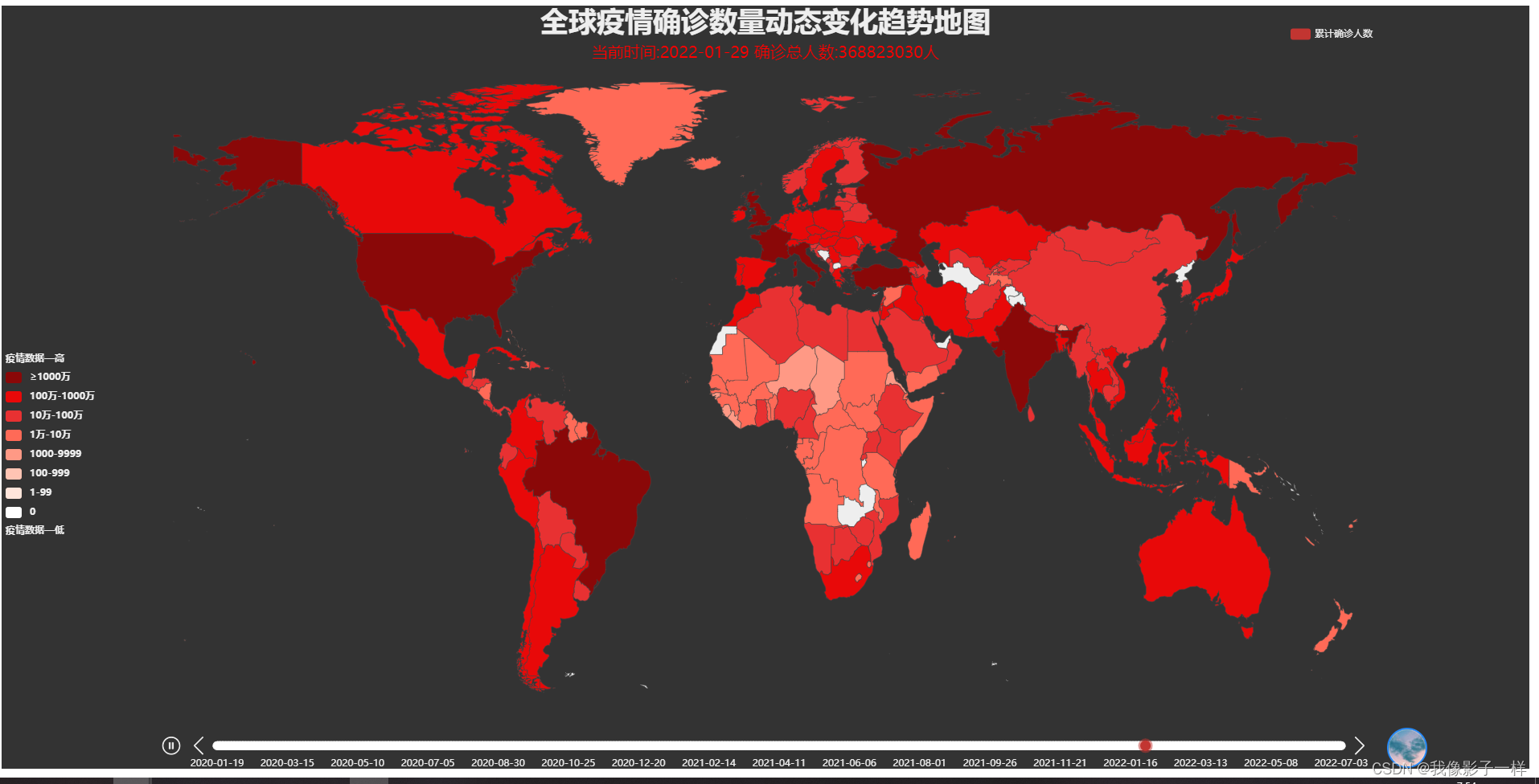
全球疫情确诊数量动态变化趋势地图
# 全球疫情确诊数量动态变化趋势地图
# 导入所用库
import json
import pandas as pd
from pyecharts import options as opts
from pyecharts.charts import Map,Timeline
from pyecharts.globals import ThemeType
# 读取疫情数据
df = pd.read_csv('./data/各国累计确诊人数.csv')
# 加载JSON文件显示中文国家名
with open('./data/全球地图.json','r',encoding='utf8') as f:
    name_map = json.load(f)
# 定义两个变量,分别存储所有国家名称数据和所有确诊人数
df_country = [i for i in (df.columns[1:])]
df_number = df.iloc[:,1:].values
# 再定义一个变量,存储时间数据
dates = df['dateId']
# 定义方法整合国家和确诊人数数据
def get_merge(df1,df2):
    data = []
    for x in range(len(df.columns[1:])):
        merge = [df1[x],int(df2[x])] # 由于df2[x]的类型是numpy.ndarray,即后面的df_number[y][x]是numpy.int64类型,
        # 所以需要转为int类型,否则地图无数据显示
        data.append(merge)
    return data
# 创建Timeline类对象,并指定画布大小和主题
timeline = Timeline(init_opts=opts.InitOpts(width="1900px", height="950px", theme=ThemeType.DARK))
# timeline = Timeline(init_opts=opts.InitOpts(width="1500px", height="700px", theme=ThemeType.DARK)) # 笔记本电脑画布

# 将处理好的数据绘制成图形
for y in range(len(df['dateId'])):
    # 定义变量存储每天的时间
    series = f'{str(dates[y])[0:4]}-{str(dates[y])[4:6]}-{str(dates[y])[6:]}' # 转字符串索引拿时间
    # 创建Map类对象
    map = (
        Map()
        .add(
            "累计确诊人数", # 图例
             get_merge(df_country,df_number[y]), # 调用方法拿数据
            'world', # 地图类型
            label_opts=opts.LabelOpts(is_show=False), # 不显示标签
            name_map=name_map, # 将国家名变成中文
            is_map_symbol_show=False # 不显示标记图形
        )
        .set_global_opts(
            title_opts=opts.TitleOpts(
                title='全球疫情确诊数量动态变化趋势地图', # 主标题
                title_textstyle_opts=opts.TextStyleOpts(font_size=35), # 主标题大小
                subtitle='当前时间:'+series+' 确诊总人数:'+f'{df_number[y].sum()}'+'人', # 副标题
                subtitle_textstyle_opts=opts.TextStyleOpts(font_size=20,color='red'), # 副标题大小和颜色
                pos_left='center'  # 居中
            ),
            legend_opts=opts.LegendOpts(
                pos_right='10%', # 图例放置位置
                pos_bottom='95%'
            ),
            visualmap_opts=opts.VisualMapOpts(
                pos_bottom='30%', # 组件位置
                range_text=['疫情数据—高','疫情数据—低'], # 两端的文本
                textstyle_opts=opts.TextStyleOpts(font_weight='bold'), # 粗文本
                is_piecewise=True, # 为分段型
                # 分段数据
                pieces=[
                    {"min": 10000000,"label": "≥1000万", "color": "#8A0808"},
                    {"max": 9999999, "min": 1000000, "label": "100万-1000万", "color": "#E80909"},
                    {"max": 999999, "min": 100000, "label": "10万-100万", "color": "#E83132"},
                    {"max": 99999, "min": 10000, "label": "1万-10万", "color": "#FF6A57"},
                    {"max": 9999, "min": 1000, "label": "1000-9999", "color": "#FF9985"},
                    {"max": 999, "min": 100, "label": "100-999", "color": "#FFC4B3"},
                    {"max": 99, "min": 1, "label": "1-99", "color": "#FFE5DB"},
                    {"value": 0,"label":"0","color":"#FFFFFF"}
                ]
            )
        )
    )
    timeline.add(
        map,
        series # 时间点
    )
    timeline.add_schema(
#         is_auto_play=True, # 自动播放
        is_loop_play=False, # 循环播放
        play_interval=500, # 播放速度
        width="1500", # 时间轴区域的宽度
        pos_left='center', # 组件位置
        itemstyle_opts=opts.ItemStyleOpts(
            color='white' # 时间轴的图形样式颜色
        )
    )
timeline.render('./tmp/全球疫情确诊数量动态变化趋势地图.html')
全球疫情确诊数量国家Top10动态变化图
# 全球疫情确诊数量国家Top10动态变化图
import pandas as pd
from pyecharts import options as opts
from pyecharts.charts import Timeline,Pie,Line,Scatter,Bar,Grid
from pyecharts.globals import ThemeType
# 读取疫情数据
df = pd.read_csv('./data/各国累计确诊人数.csv')
# 定义一个变量,存储所有国家的确诊数据
df_country = df.iloc[:,1:]
# 再定义一个变量,存储时间数据
dates = df['dateId']
# 创建时间类对象,并指定画布大小和主题
timeline = Timeline(init_opts=opts.InitOpts(width='1900px',height='950px',theme=ThemeType.DARK))
# timeline = Timeline(init_opts=opts.InitOpts(width="1500px", height="700px", theme=ThemeType.DARK)) # 笔记本电脑画布

# 处理数据并绘制图形
for i in range(len(df)):
    series = f'{str(dates[i])[0:4]}-{str(dates[i])[4:6]}-{str(dates[i])[6:]}' # 转字符串索引拿时间
    df_country_rank = df_country.loc[i].sort_values(ascending=False).head(10) # 将排名前10的国家的确诊人数取出
    df_country_name = df_country_rank.index # 排名前10的国家名取出
    bar = (
        Bar()
        .add_xaxis(list(df_country_name)) # 将国家名转为列表形式
        .add_yaxis(
            "",
            list(df_country_rank),# 将人数转为列表形式
            label_opts=opts.LabelOpts(position='right') # 标签位置
        )
        .set_global_opts(
            title_opts=opts.TitleOpts(
                title='全球疫情确诊数量国家Top10动态变化图', # 主标题
                title_textstyle_opts=opts.TextStyleOpts(font_size=35), # 字体大小
                subtitle='当前时间:'+series+' 确诊总人数:'+f'{df_country_rank.sum()}'+'人', # 副标题
                subtitle_textstyle_opts=opts.TextStyleOpts(font_size=20,color='red'), # 字体大小及颜色
                pos_left='center',pos_top='5%' # 标题位置
            ),
            visualmap_opts=opts.VisualMapOpts(
                dimension=0, # 组件映射维度
                pos_left="10", # 组件位置
                pos_top="2%",
                range_text=['疫情数据—高','疫情数据—低'], # 两端文本
                textstyle_opts=opts.TextStyleOpts(font_weight='bold'), # 粗文本
                is_piecewise=True, # 为分段型
                # 分段数据
                pieces=[
                    {"min": 10000000,"label": "≥1000万", "color": "#8A0808"},
                    {"max": 9999999, "min": 1000000, "label": "100万-1000万", "color": "#E80909"},
                    {"max": 999999, "min": 100000, "label": "10万-100万", "color": "#E83132"},
                    {"max": 99999, "min": 10000, "label": "1万-10万", "color": "#FF6A57"},
                    {"max": 9999, "min": 1000, "label": "1000-9999", "color": "#FF9985"},
                    {"max": 999, "min": 100, "label": "100-999", "color": "#FFC4B3"},
                    {"max": 99, "min": 1, "label": "1-99", "color": "#FFE5DB"},
                    {"value": 0,"label":"0","color":"#FFFFFF"}
                ]
            )
        )
        .reversal_axis() # 翻转xy轴

    )
    line = (
        Line()
        .add_xaxis(list(df_country_name)) # x轴标签
        .add_yaxis(
            "", # 图例
            list(df_country_rank), # y轴数据
            label_opts=opts.LabelOpts(
                font_weight='bold' # 粗标签
            )
        )
        .set_global_opts(
             xaxis_opts=opts.AxisOpts(
                 axislabel_opts=opts.LabelOpts(rotate=30) # x轴的刻度标签旋转
             )
         )
    )
    pie = (
        Pie()
        .add(
            "",
            [z for z in zip(list(df_country_name),list(df_country_rank))], # 饼图数据,格式为 [(key1, value1), (key2, value2)]
            rosetype='area', # 展示成南丁格尔图,area表示所有扇区圆心角相同,仅通过半径展现数据大小
            radius=[30,150], # 饼图的半径,[内半径,外半径]
            label_opts=opts.LabelOpts(
                font_weight='bold' # 粗标签
            )
        )
        .set_global_opts(
            legend_opts=opts.LegendOpts(is_show=False) # 不展示饼图图例
            )
    )
    grid = (
        Grid()
        .add(
            bar, # 条形图
            grid_opts=opts.GridOpts(
                pos_left="6%", pos_right="45%", pos_top="35%", pos_bottom="16%" # 条形图位置
            ),
        )
        .add(
            line, # 线形图
            grid_opts=opts.GridOpts(
                pos_left="100%", pos_right="35%", pos_top="38%", pos_bottom="16%" # 折线图位置
            ),
        )
        .add(
            pie, # 饼图
            grid_opts=opts.GridOpts(),
        )
    )
    timeline.add(
        grid, # 图表实例
        series # 时间点
    )
    timeline.add_schema(
#         is_auto_play=True, # 自动播放
        is_loop_play=False, # 循环播放
        play_interval=500, # 播放速度
        width=1500, # 时间轴区域的宽度
        pos_left='center', # 组件位置
        itemstyle_opts=opts.ItemStyleOpts(
            color='white' # 时间轴的图形样式颜色
        )
    )
timeline.render('./tmp/全球疫情确诊数量国家Top10动态变化图.html')
五、图形效果展示
全球疫情确诊数量动态变化趋势地图
全球疫情确诊数量国家Top10动态变化图

Tips:关于所用数据及文件
所用数据和json文件都上传了,大家可以免费下载自取。(在资源哪里都可以找到并且下载)


 3万+
3万+


 被折叠的 条评论
为什么被折叠?
被折叠的 条评论
为什么被折叠?
 到【灌水乐园】发言


