


1.购物车字体图标
字体图标要点:
- 类名使用更多
- 字体图标都是使用单独的盒子
- 字体图标我们喜欢用i标签
CSS代码:
.car {
        width: 120px;
        height: 40px;
        border: 1px solid red;
        text-align: center;
        line-height: 40px;
        font-size: 16px;
     }

.icon-icon-test1 {
        color: red;
     }
HTML代码:
<div class="car">
    <i class="iconfont icon-icon-test1"></i>
        购物车
    <i class="iconfont icon-arrow-down-bold"></i>
</div>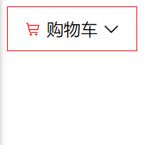
效果图
2.字体图标伪类元素
在复杂嵌套标签时,可使用伪类元素插入字体图标。
CSS代码:
.options {
            width: 200px;
            height: 40px;
            padding: 0 10px;
            border: 1px solid red;
            color: red;
            font-size: 16px;
            line-height: 40px;
        }

.options::after {
            float: right;
            content: "\e687";
            font-family: "iconfont";
            color: red;
        }
HTML代码:
<div class="options">选项</div>
效果图
3.变形之位移
margion-top会影响盒子布局,transform不会影响盒子布局。
CSS代码:
    div {
        width: 200px;
        height: 200px;
    }

    .box1 {
        background-color: pink;
        /* margin-top: 50px; */
        /* transform: translate(x,y); */
        transform: translateY(50px);
      }

    .box2 {
        background-color: black;
      }
HTML代码:
<div class="box1"></div>
<div class="box2"></div>
使用margin-top图

使用transfrom图
4.盒子水平和垂直居中的三种方法
CSS代码:
        .father {
            position: relative;
            width: 400px;
            height: 400px;
            background-color: pink;
        }

        .son {
            position: absolute;
            width: 100px;
            height: 100px;

            /* 第一种 */
            /* top: 50%;
            left: 50%;
            margin-top: -50px;
            margin-left: -50px; */

            /* 第二种 */
            /* top: 0;
            bottom: 0;
            left: 0;
            right: 0;
            margin: auto; */

            /* 第三种 */
            top: 50%;
            left: 50%;
            transform: translate(-50%, -50%);

            background-color: purple;
        }
HTML代码:
<div class="father">
<div class="son"></div>
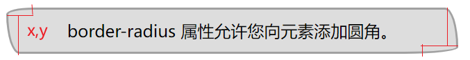
</div>5.border-radius属性(椭圆角)

6.多重变化
属性:transfrom:rotate(360deg);
- 当需要多个transfrom属性共存时,应采用复合写法,否则会被层叠。
    .box {
      width: 800px;
      border: 2px solid #f2ce78;
    }

    img {
      transition: all .8s;
    }

    .box:hover img {
      /* 先移动后旋转 */
      transform: translateX(500px) rotate(720deg);
    }
HTML代码:
  <div class="box">
    <img src="image/p4-tx3.png" alt="">
</div>- 当已有translate确定定位时,一定要在transfrom类重新添加translate属性。
CSS代码:
    .box {
      position: relative;
      width: 600px;
      height: 600px;
      background-color: pink;
    }

    img {
      position: absolute;
      top: 50%;
      left: 50%;
      transform: translate(-50%, -50%);
      transition: all .6s;
    }

    .box:hover img {
      /* transform: rotate(360deg); */
      transform: translate(-50%, -50%) rotate(360deg);
    }
HTML代码:
  <div class="box">
    <img src="image/p4-tx3.png" alt="">
  </div>
没有在transfrom类重新添加translate属性图
7.缩放、透明
缩放:transfrom:scale();
透明:opcity:$;
渐变:background-image: linear-gradient();
8.华为实例
通过华为实例加深对字体图标、移动、旋转、缩放、渐变知识点的了解。
CSS代码:
* {
    margin: 0;
    padding: 0;
}
.box {
    overflow: hidden;
    position: relative;
    width: 445px;
    height: 315px;
    margin: 200px auto;
}

.box img {
    width: 100%;
    height: 100%;
    transition: all .6s;
}

.info {
    position: absolute;
    z-index: 2;
    font-size: 14px;
    left: 0;
    bottom: -54px;
    padding: 25px 30px;
    color: #fff;
    transition: all .6s;
}

.info h3 {
    margin: 6px 0;
}

.info .text {
    line-height: 22px;
}

.more {
    margin-top: 16px;
}

.more .iconfont {
    color: red;
}

.box:hover .info {
    transform: translateY(-54px);
}

.box:hover img {
    transform: scale(1.2);
}

.tm {
    position: absolute;
    z-index: 1;
    width: 100%;
    height: 100%;
    top: 0;
    left: 0;
}

.box:hover .tm {
    background-image: linear-gradient(rgba(0,0,0,0),rgba(0,0,0,0.3));
}
HTML代码:
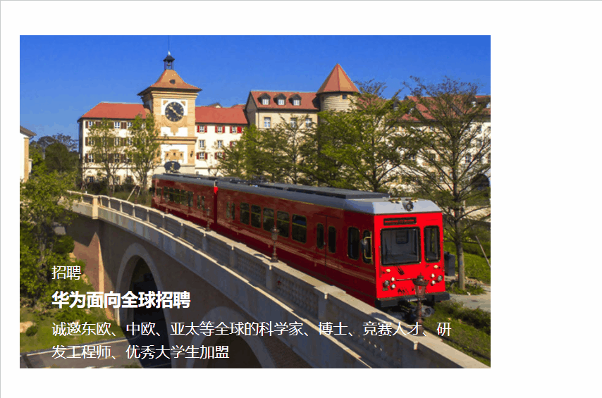
    <div class="box">
        <img src="image/huawei.jpg" alt="">
        <div class="info">
            <p>招聘</p>
            <h3>华为面向全球招聘</h3>
            <p class="text">诚邀东欧、中欧、亚太等全球的科学家、博士、竞赛人才、研发工程师、优秀
            大学生加盟</p>
            <div class="more">了解更多<i class="iconfont icon-arrow-right"></i></div>
        </div>
        <div class="tm"></div>
    </div>
效果:
9.总结
通过移动web第一天的学习,了解到了怎样插入字体图标、样式变形的用法,能够独立完成包含所学知识点的模块练习,下去应该多加练习,并孰练掌握所学知识。


 683
683


 被折叠的 条评论
为什么被折叠?
被折叠的 条评论
为什么被折叠?
 到【灌水乐园】发言


